Verloop Knits
Brand identity refresh for Verloop Knits—an innovative, contemporary, D2C, knitwear brand that creates unique accessories by infusing traditional knits with unexpected details, materials and industrial techniques. Designed in collaboration with FormNation Design.
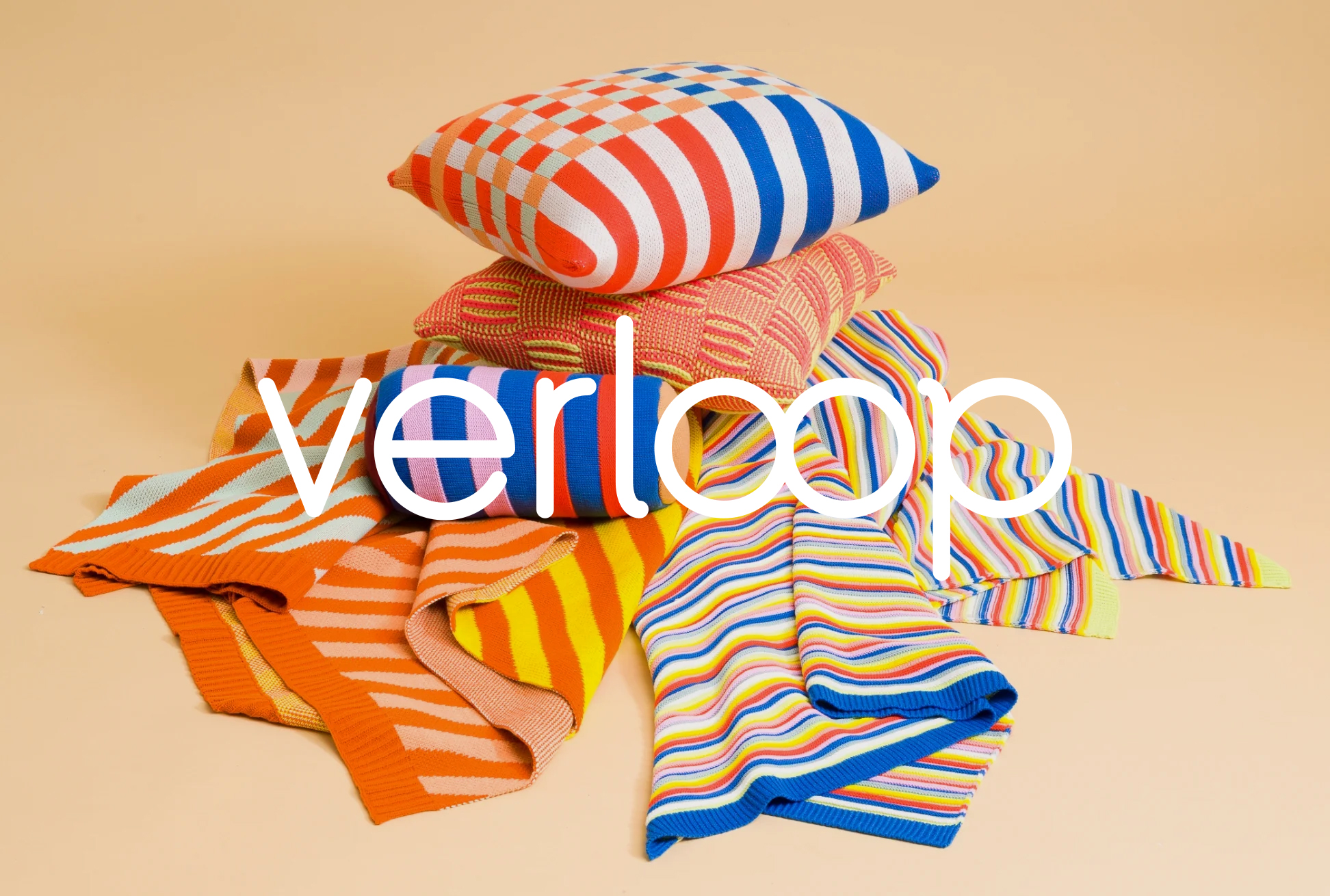

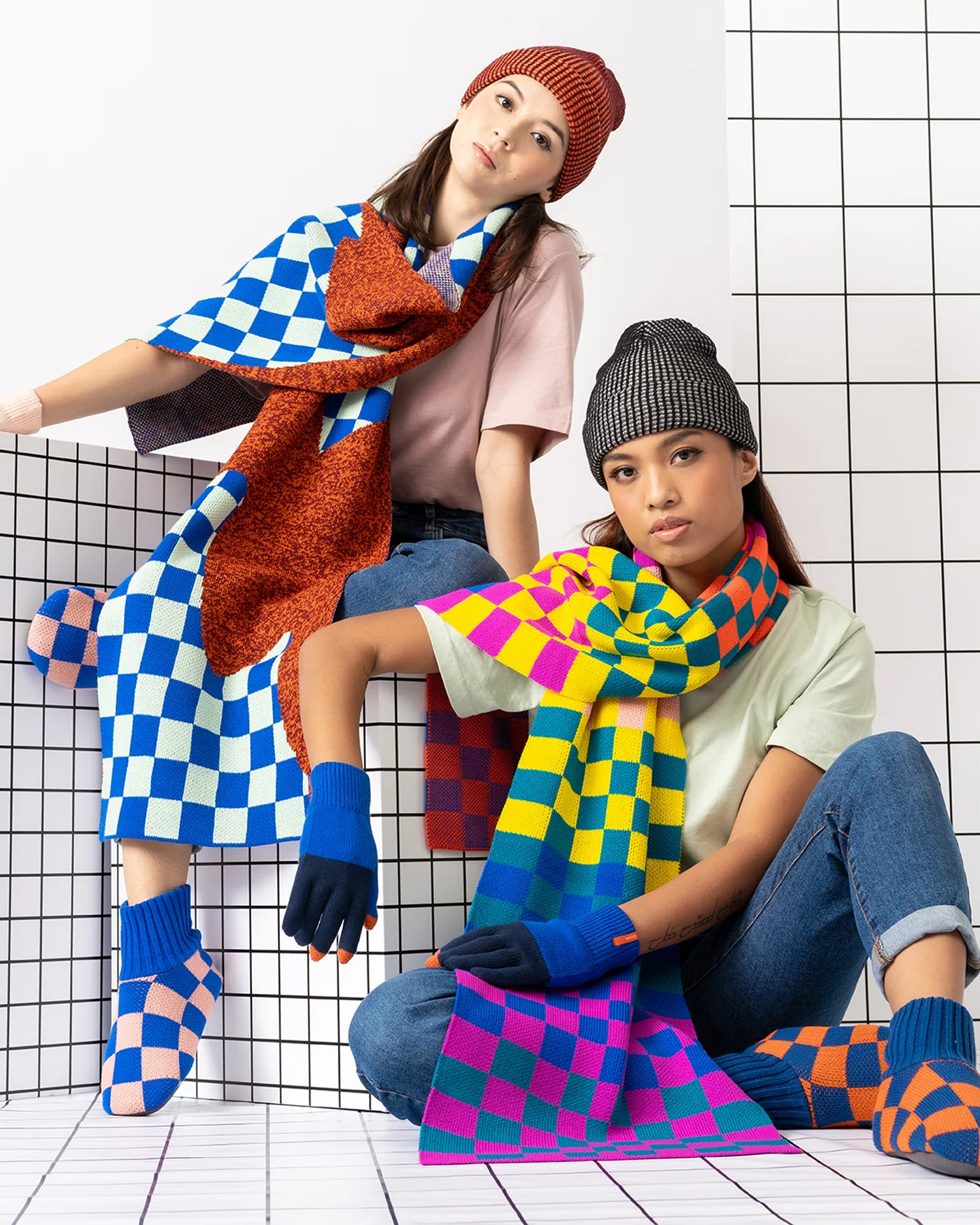
Inspiration

Visual Explorations


Logo
The redesigned, rounded, monoline,
custom wordmark communicated a soft,
playful, friendliness and contemporary
innovation without being pretentious.
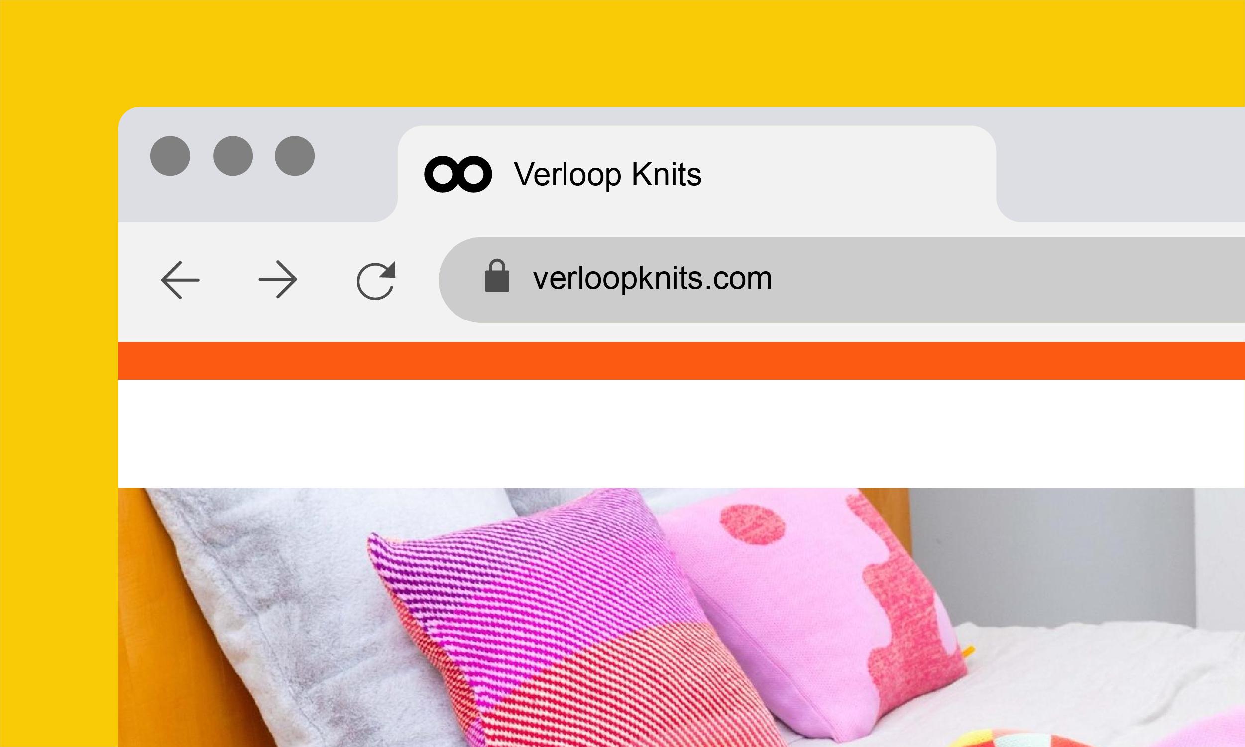
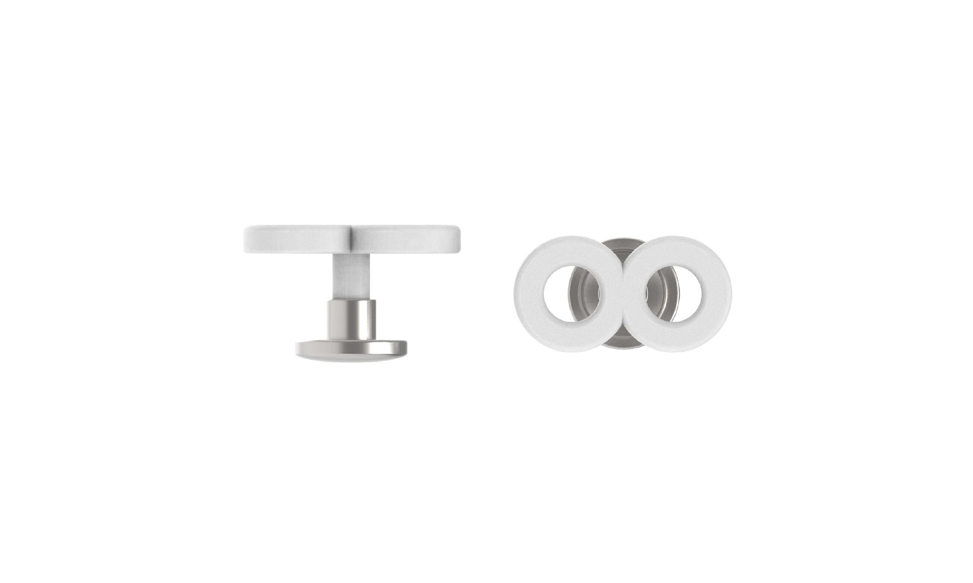
Like the products themselves, the “infinity loop” brand icon reflects the continuous nature of a knitted piece of fabric.
The Pattern


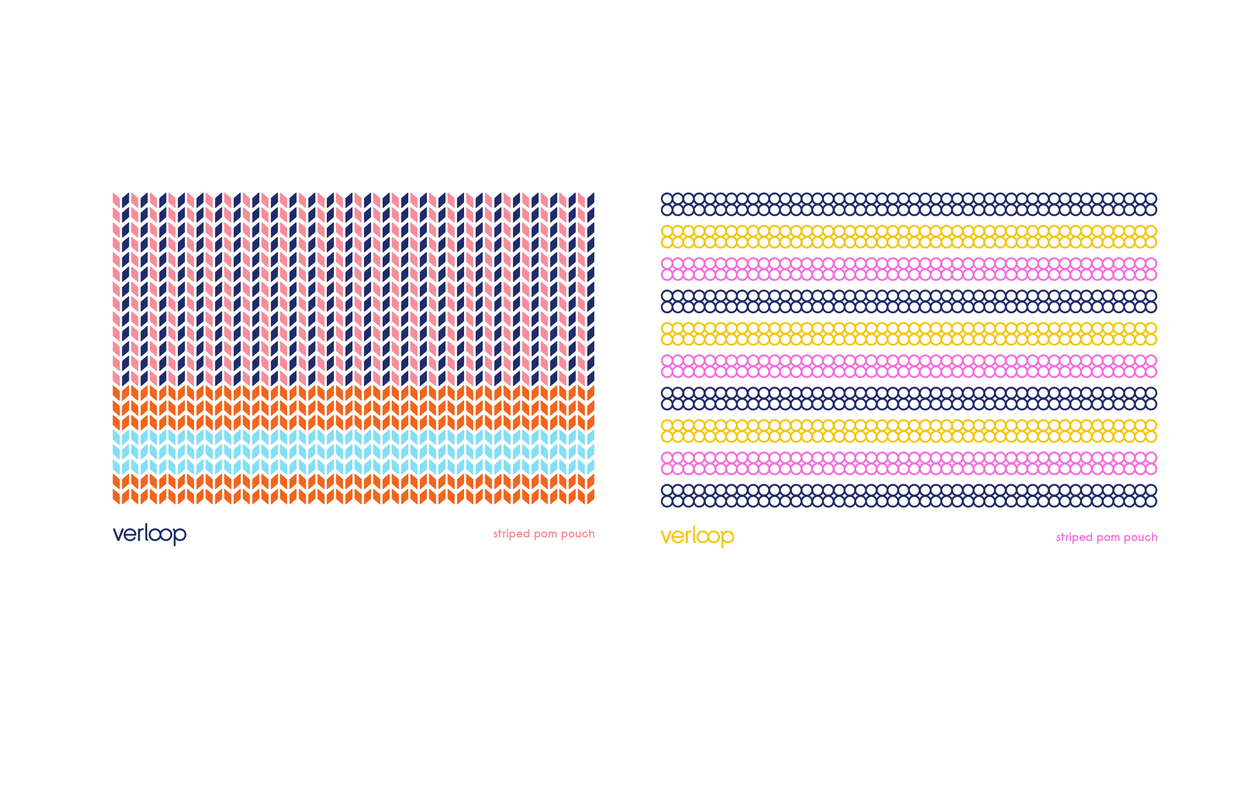
A tactile brand pattern was created to mimic the texture of knitted fabric.
Color & Typography


The bold and cheerful color palette was informed by the colorful yarn used in the products.
Konigsberg is a rounded, monoline typeface that communicated a sense of softness and visual uniformity when used as a pattern.
Konigsberg is a rounded, monoline typeface that communicated a sense of softness and visual uniformity when used as a pattern.
Website
The website featured a modular grid based design that focused on clear navigation, functionality and ease of use.
Print
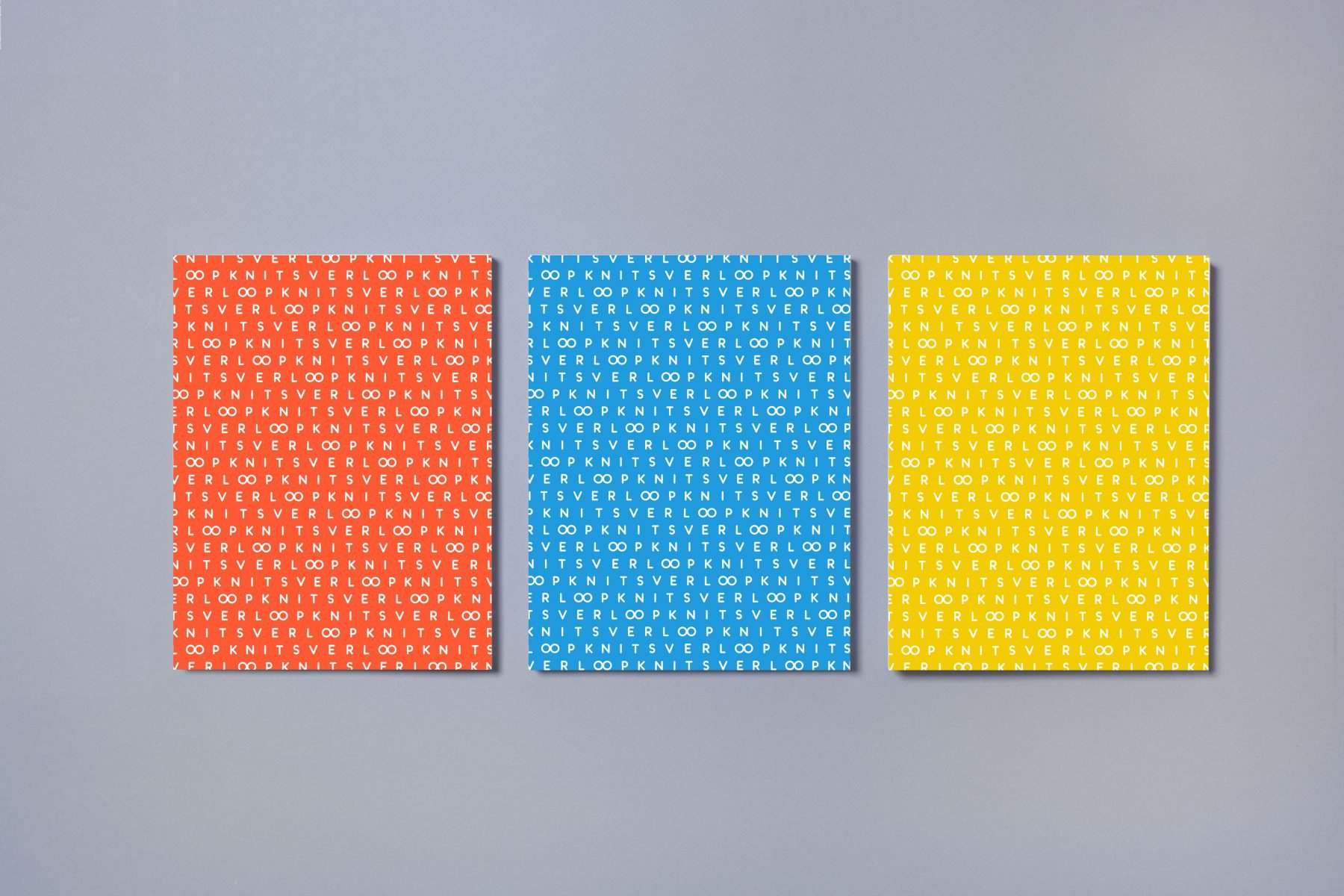
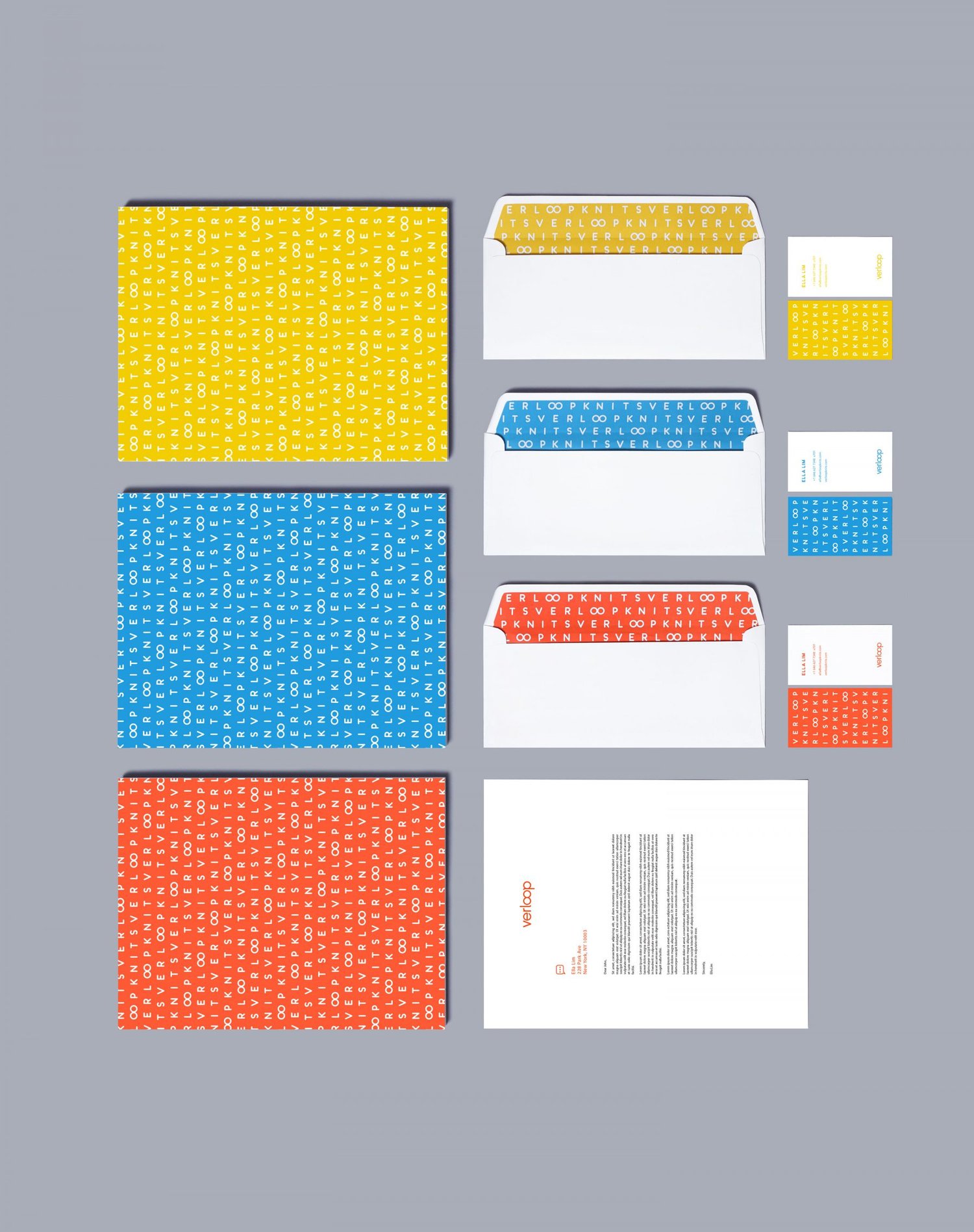
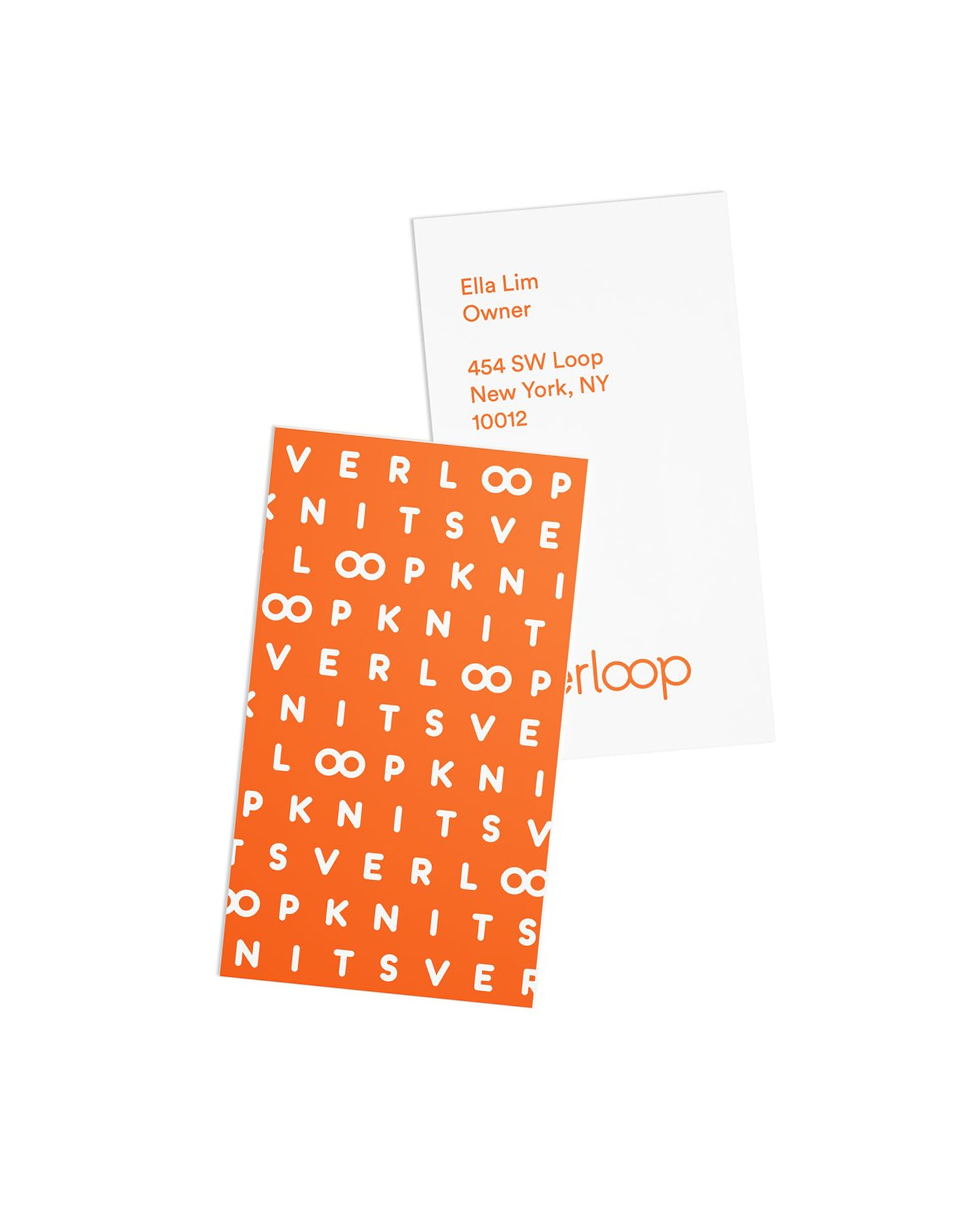


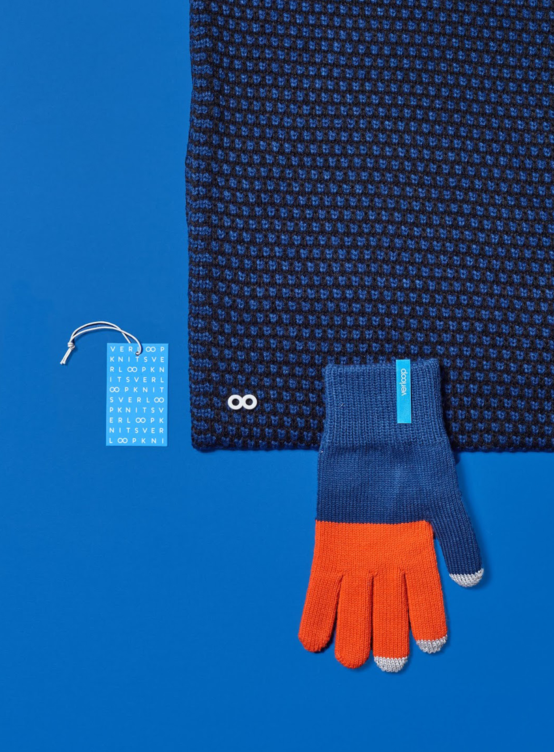

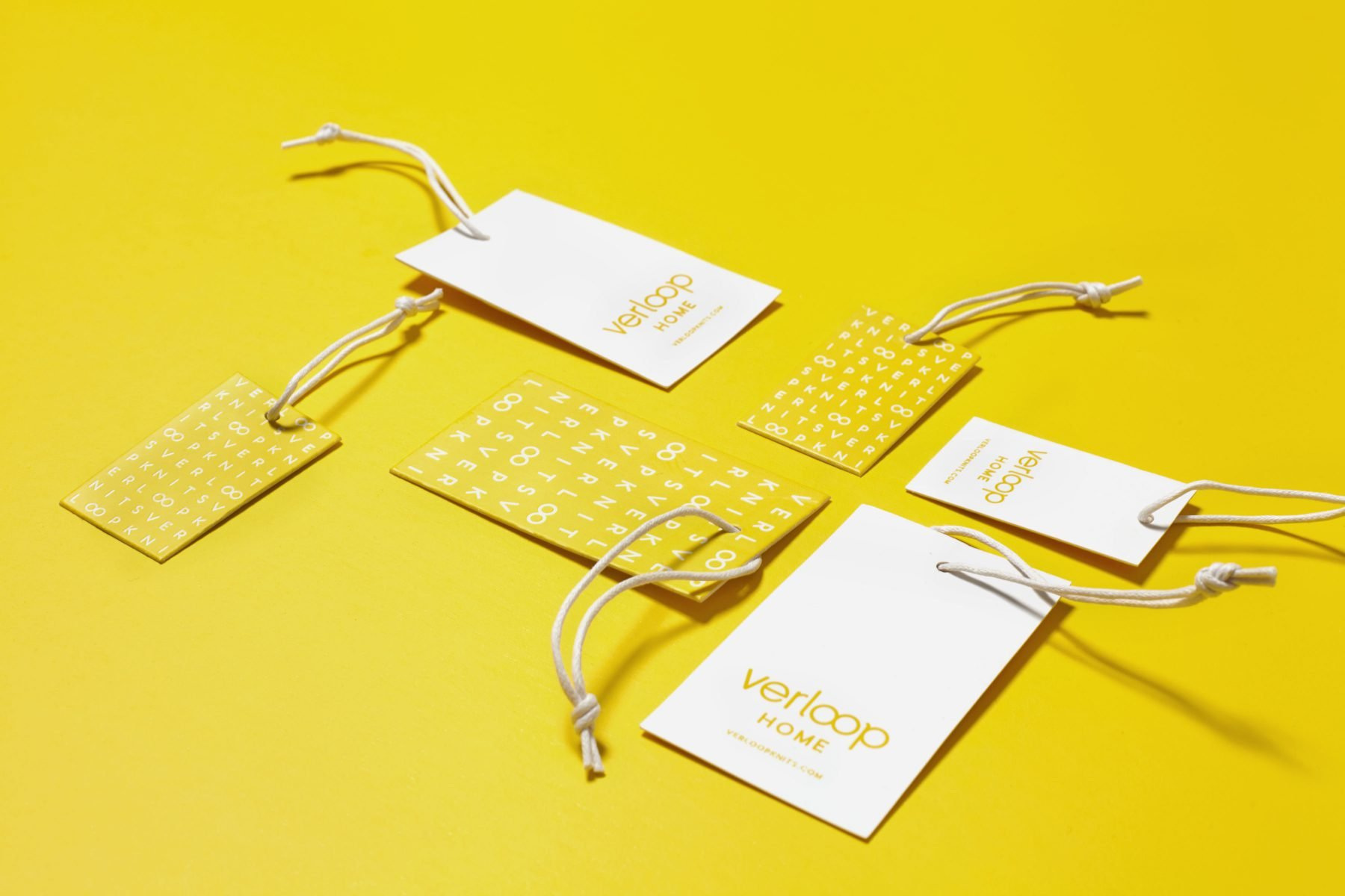
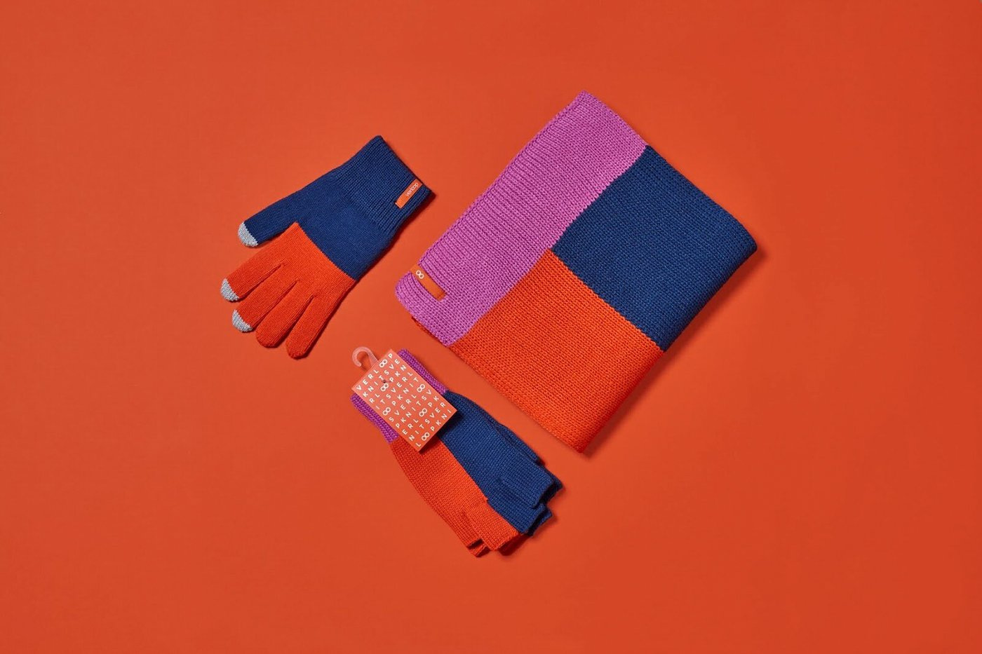
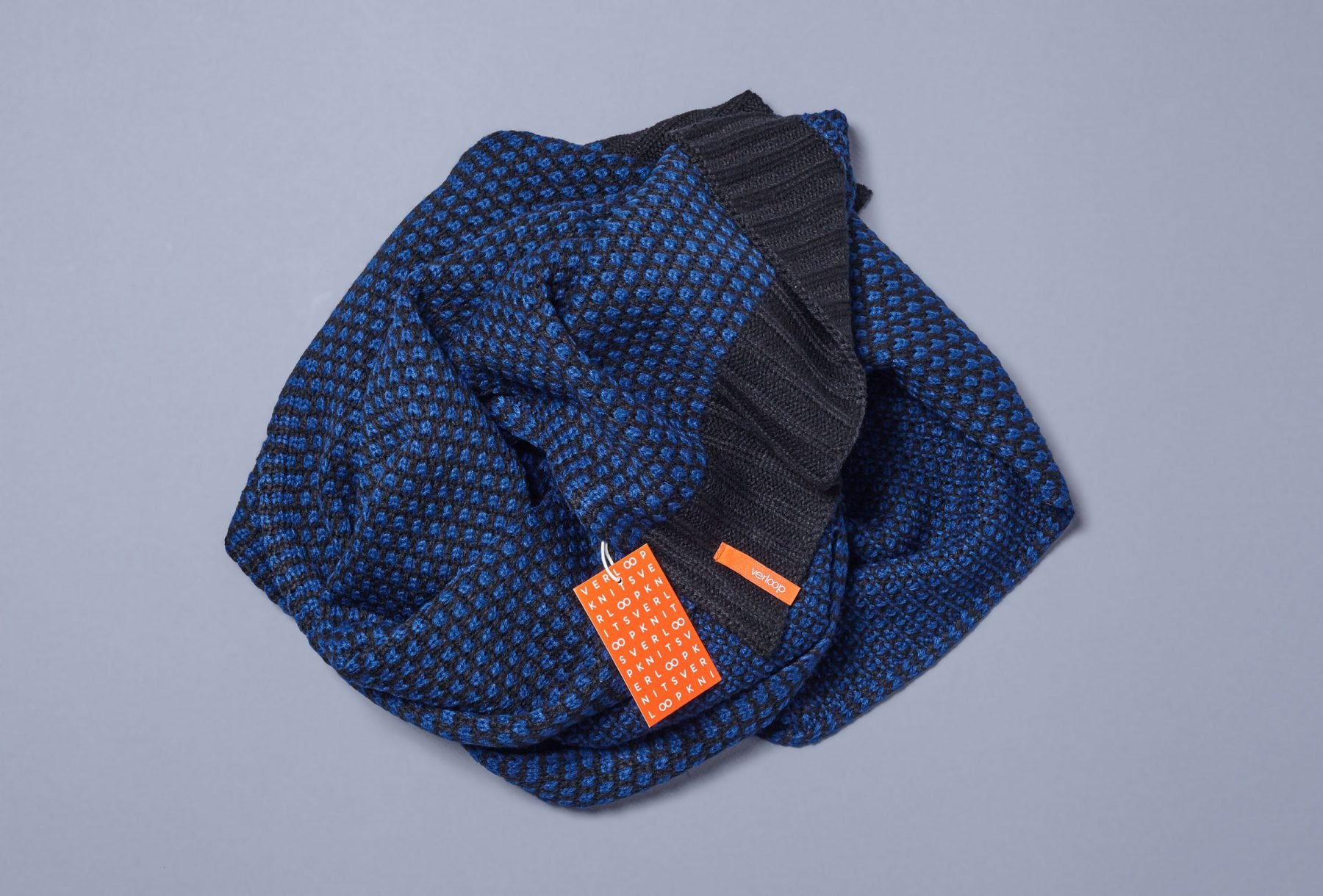
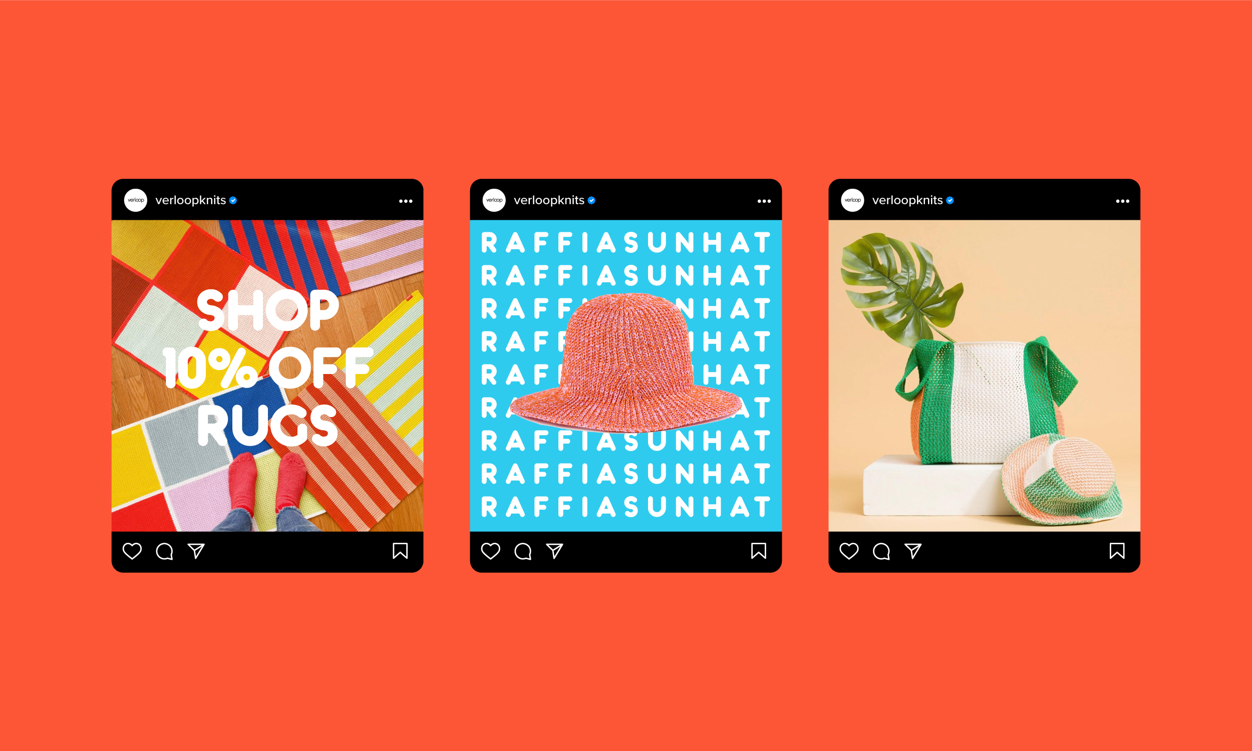
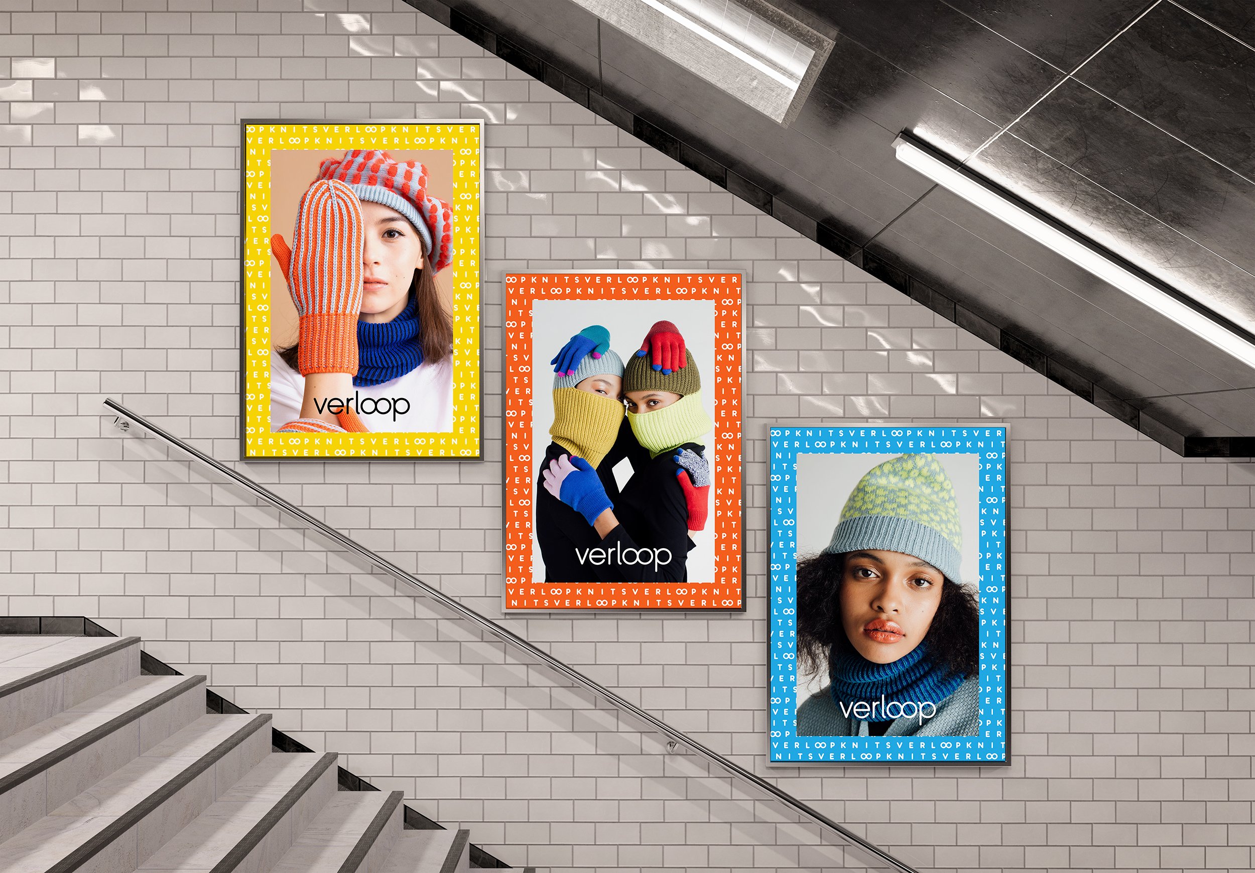
The branding system was unified across print and digital touchpoints including social, packaging and OOH ads.
Social
Package

Advertising & OOH
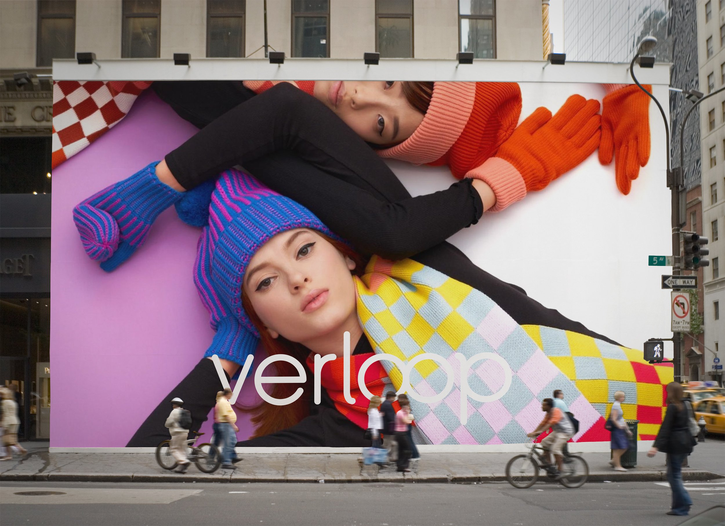
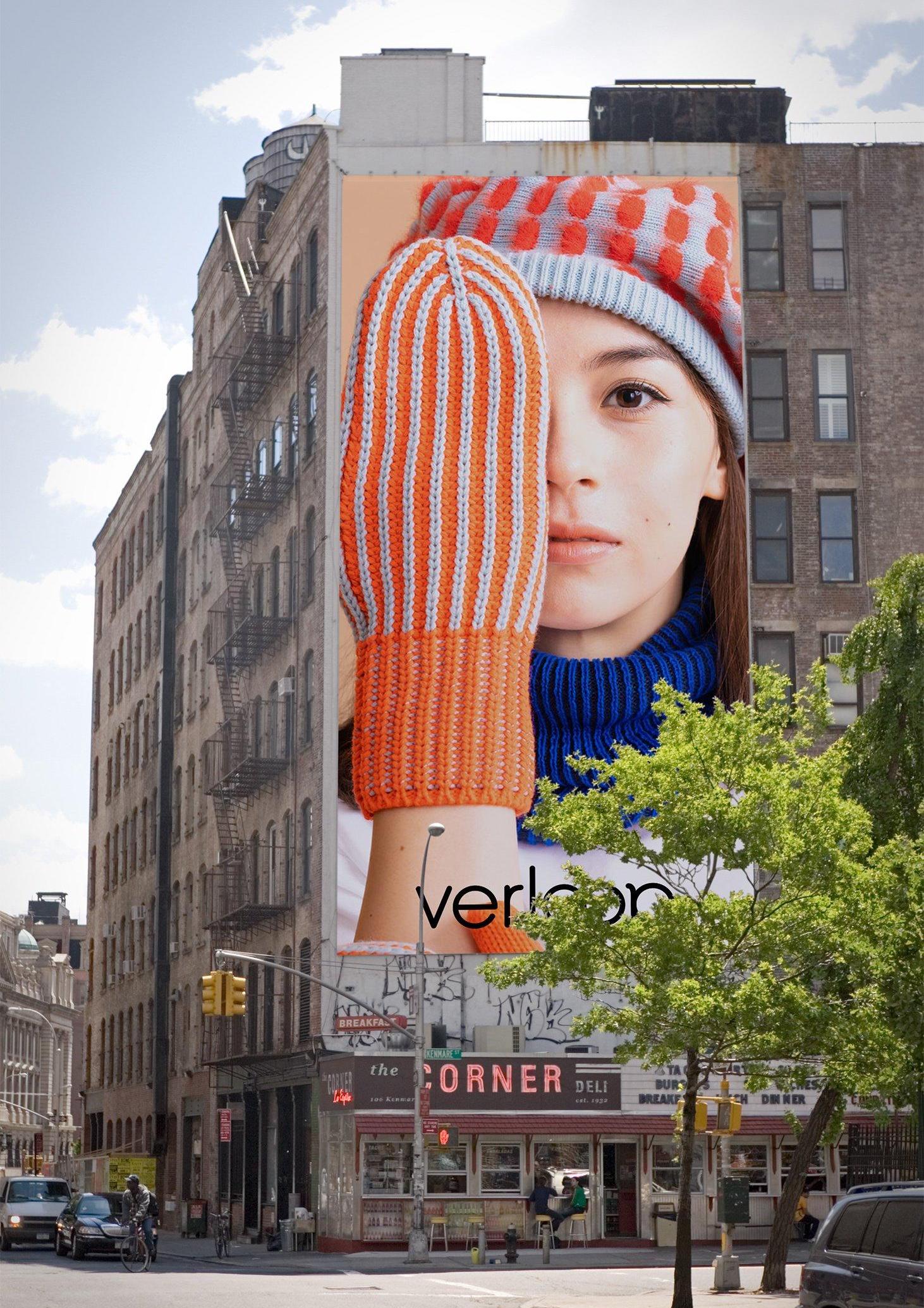
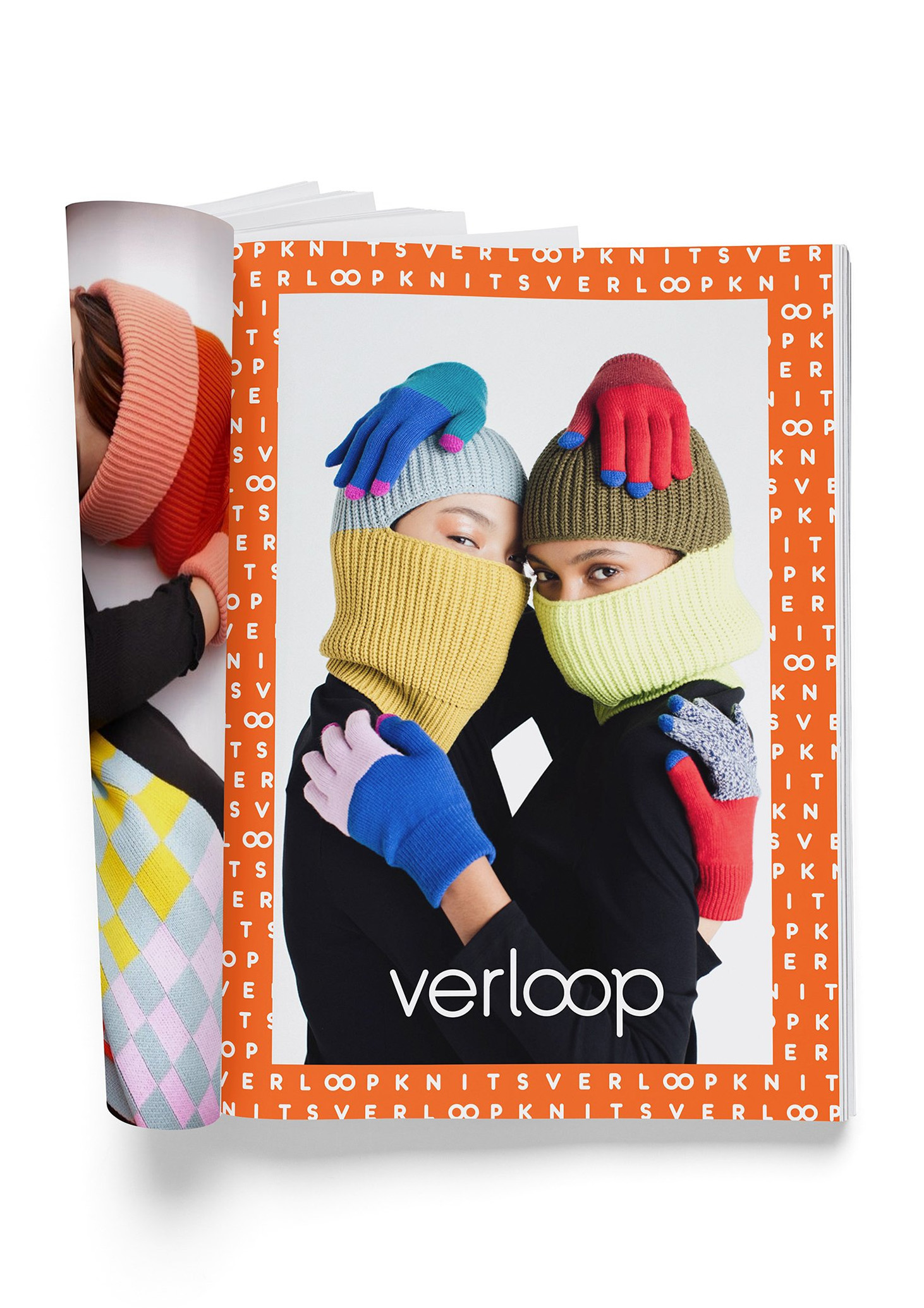
Letting the products speak for themselves, the campaign used pattern, color and photography to tell the brand story.

Agency:
FormNation
Client:
Verloop Knits
Sector:
Fashion/Retail, B2C
Type:
Brand Identity
Position:
Lead Designer
What I Did:
Logo Design
Visual Identity
Website Design
Package Design
Animation
Brand Guidelines
OOH
Team:
Jan Habraken, CD
Lotte Van Velzen, AD
Rachael Elle, Graphic Designer
Alissia Melka-Teichroew, Styling
Lisa Klappe, Photography
Challenge:
Verloop Knits approached us because the brand was disconnected and they needed a brand identity refresh to unify their brand language across all touchpoints and better reflect the spirit and nature of their products.
Insight:
Verloop means “process” in Dutch.
Solution:
Informed by their products, I designed a new custom, rounded, monoline wordmark that communicated softness and friendliness. Woven into the logo, the two O letterforms were also joined to represent a circular, “infinity loop” brand mark that is symbolic of a continuous piece of thread.
The brand typeface is Konigsberg—a soft, monoline typeface that was chosen for its visual uniformity when used as a pattern and as a counterpart to the wordmark.
A typographic brand pattern was created to represent the weave and tactile nature of the products while the cheerful and bold color palette was informed by the innovative and colorful spirit of the brand and products.
Results:
The new identity was successfully implemented across the entire brand ecosystem and resulted in significant increases in site traffic, conversions and YoY e-comm revenue.