Verizon
Global brand identity refresh for Verizon that launched in June 2024. Designed in collaboration with Turner Duckworth SF and Verizon.

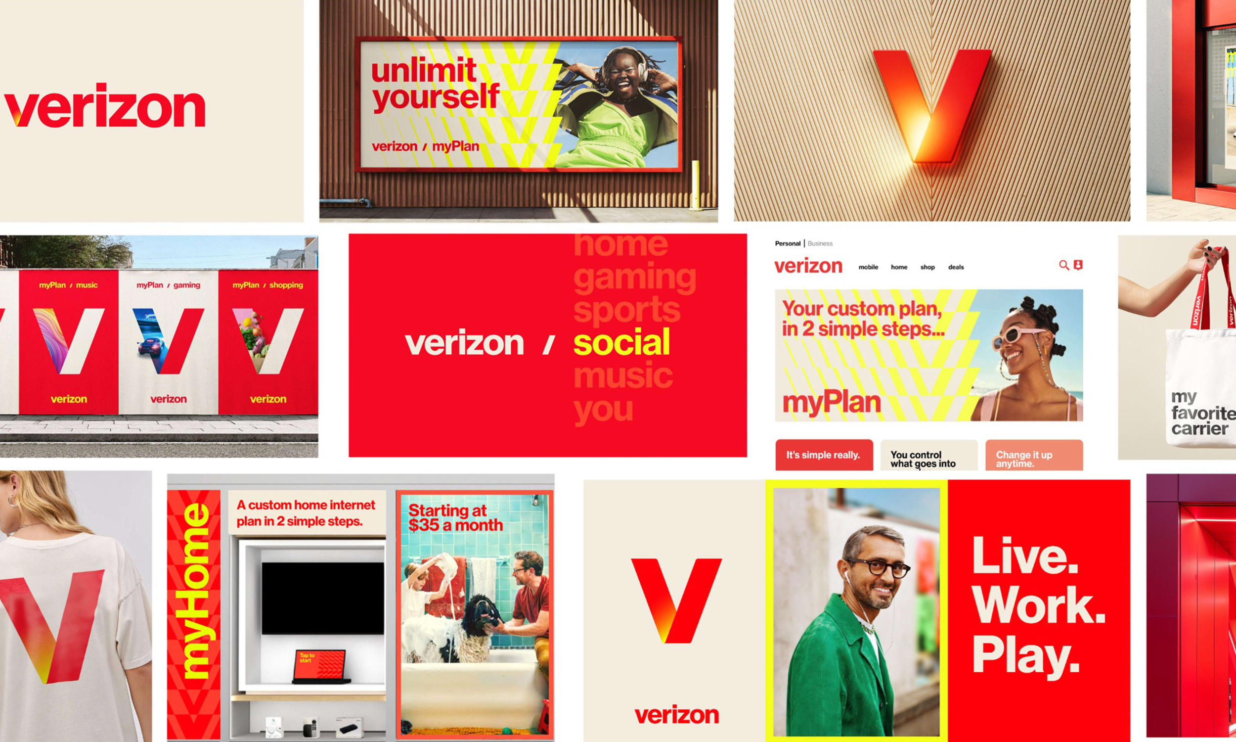
The new identity is an open and flexible system that enables the
brand to speak to different audiences and engage with culture.
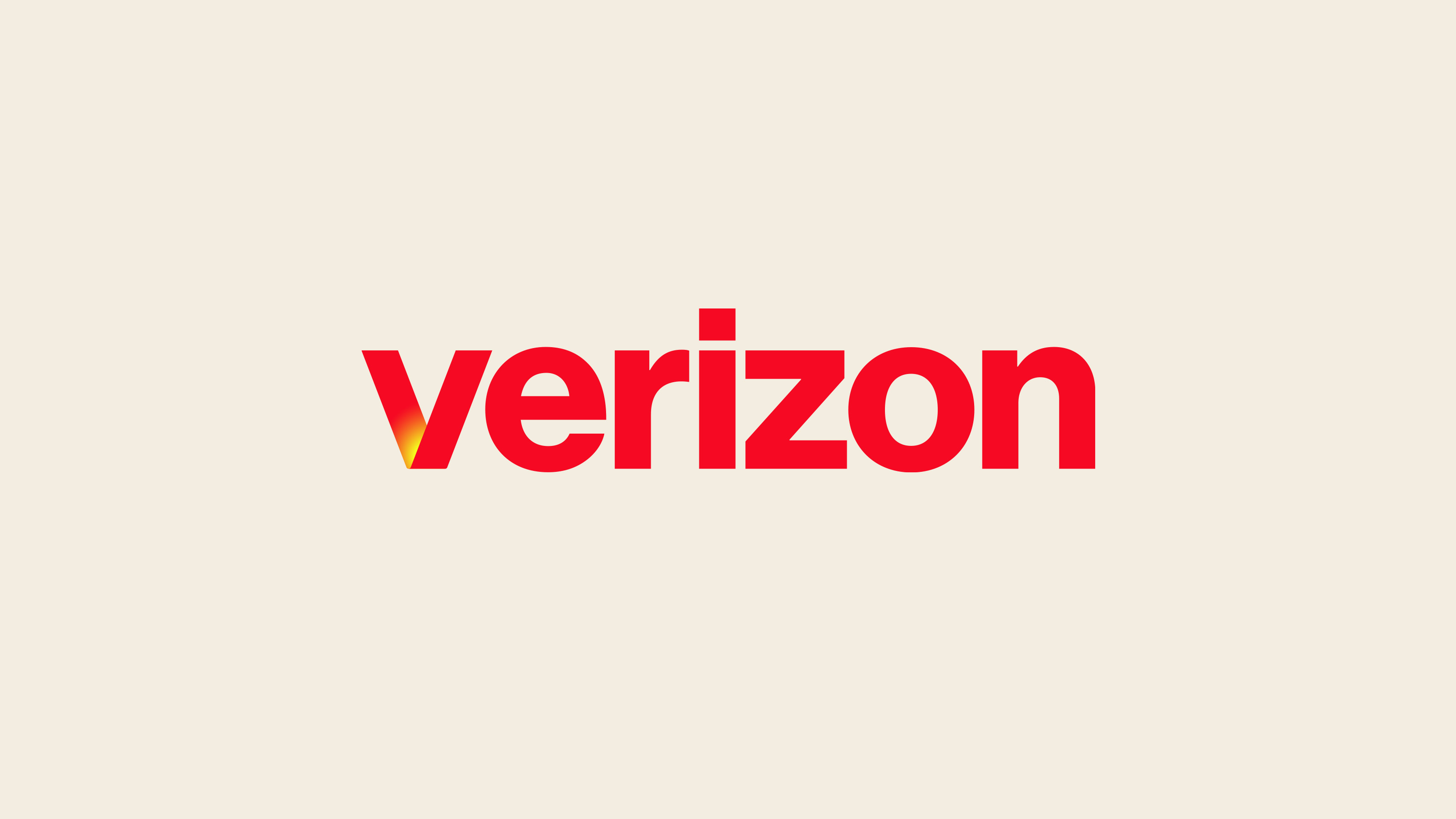
The glowing “sun” V embodies energy, connection and power and reflects back on Verizon’s name—a portmanteau of veritas and horizon.
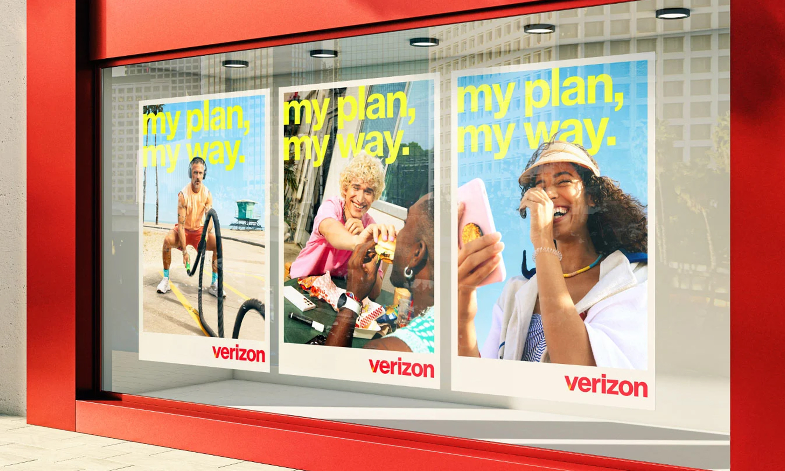
Combined with bold typography, the new photography celebrates empowered
individuals, free to express and enjoy themselves out in the world.

The vibrant color palette driven by red and yellow infuses the brand with energy and youthfulness.

Monotype designed a custom cut of Neue Haas Grotesk in 3 weights.


“Verizon is a strong, trusted brand that plays a critical role in people’s lives, but most of what we do is often invisible and behind the scenes. We want to make the invisible, visible.”
—Verizon CMO, Leslie BerlandThrough personalized plans, the brand empowers consumers
to choose how they want to be entertained and connected.

Dynamic graphic patterns further extend the brand
language while allowing for maximum flexibility.

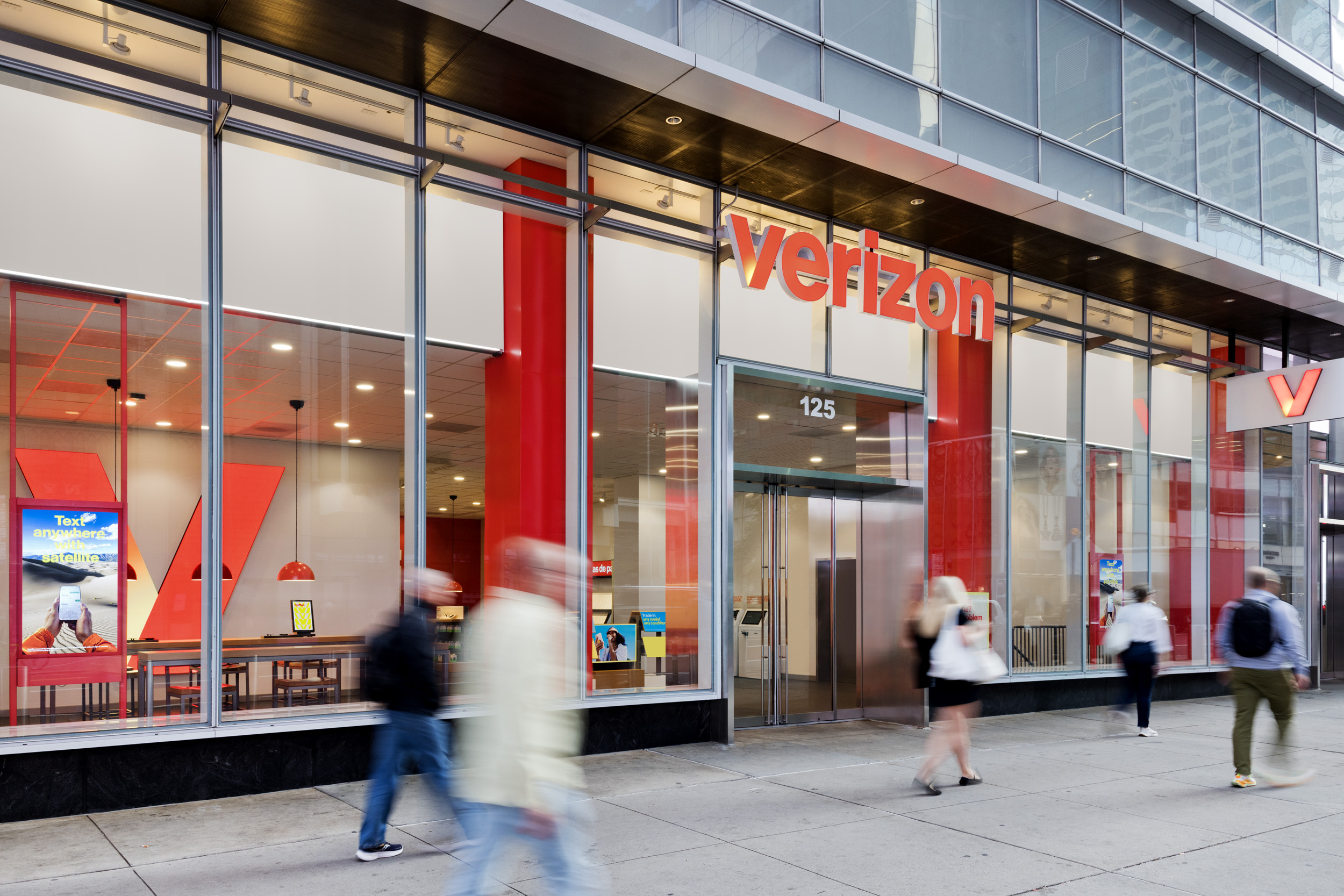
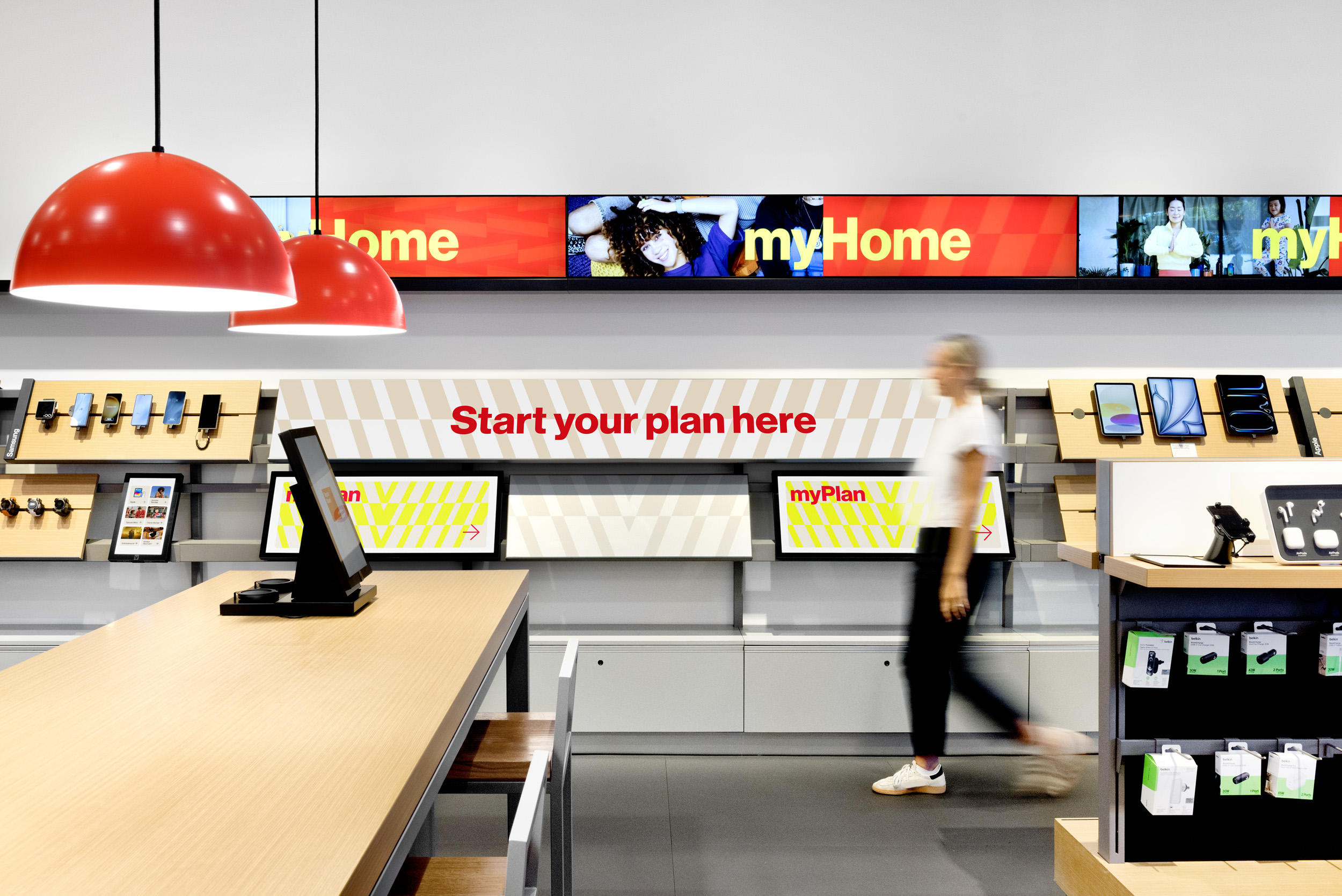
Updated signage at Verizon’s flagship store in NYC.

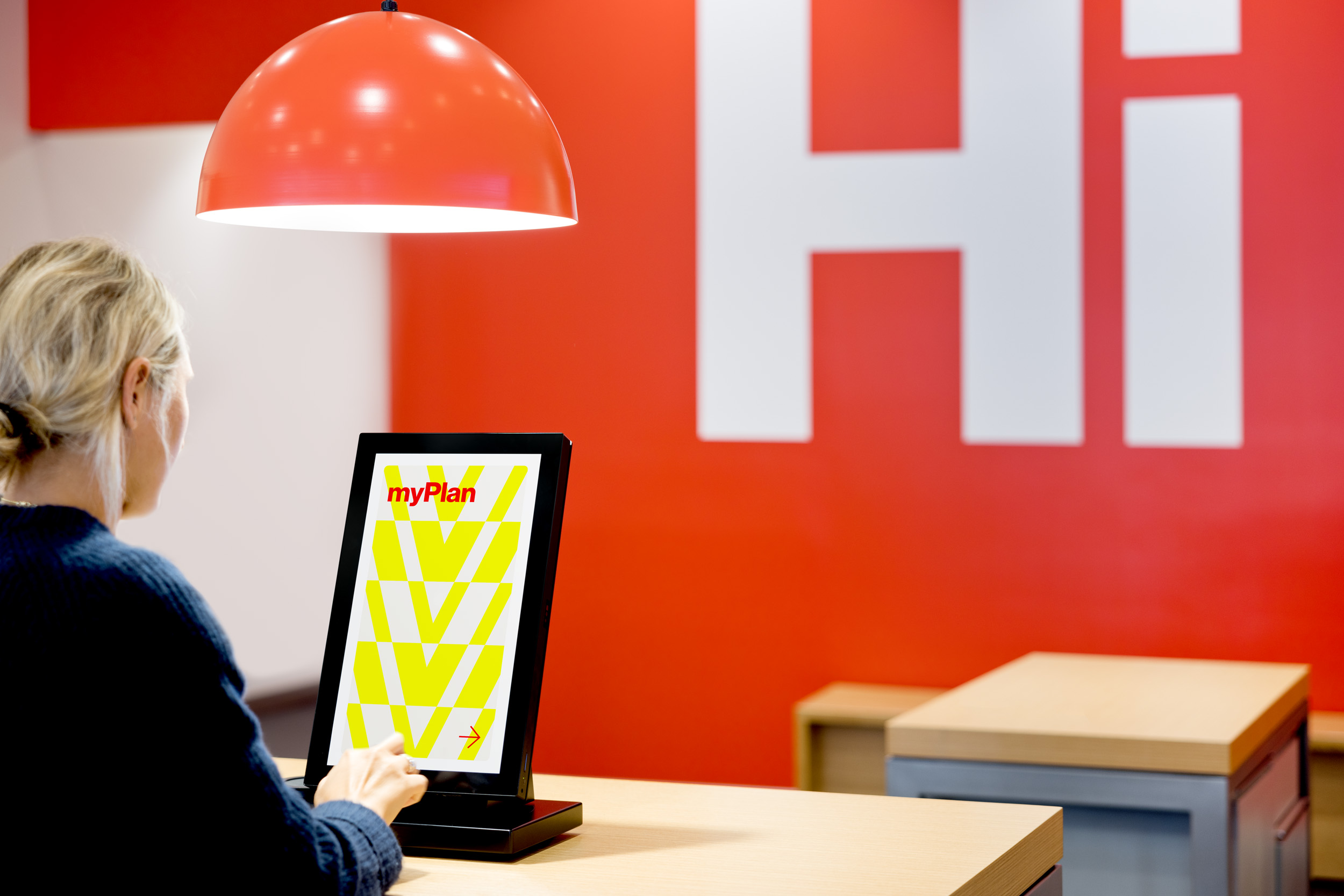
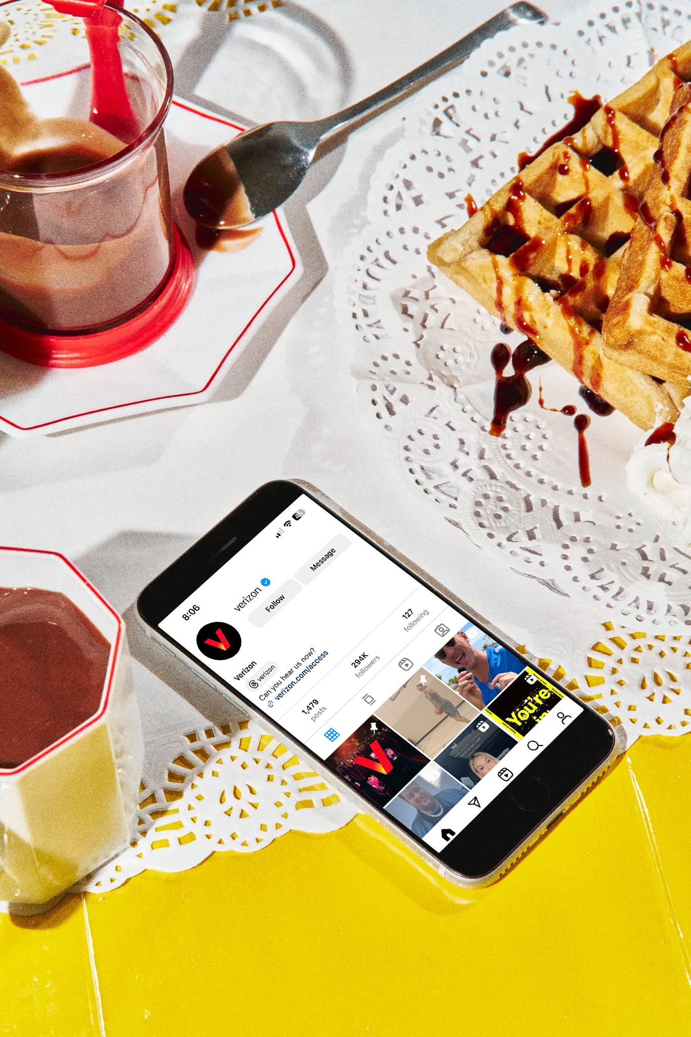
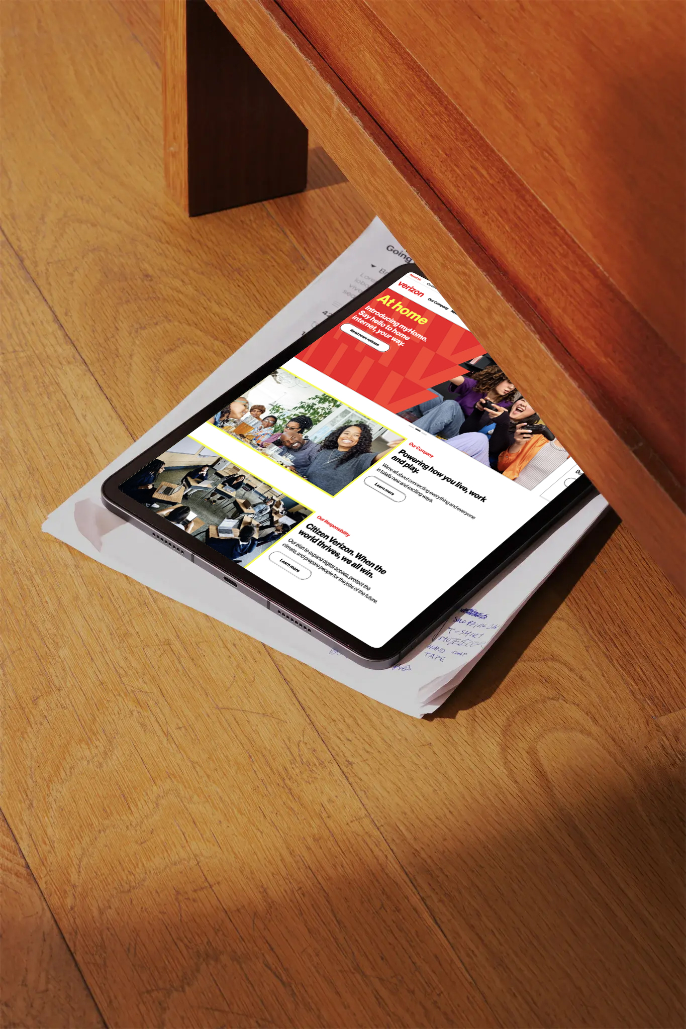
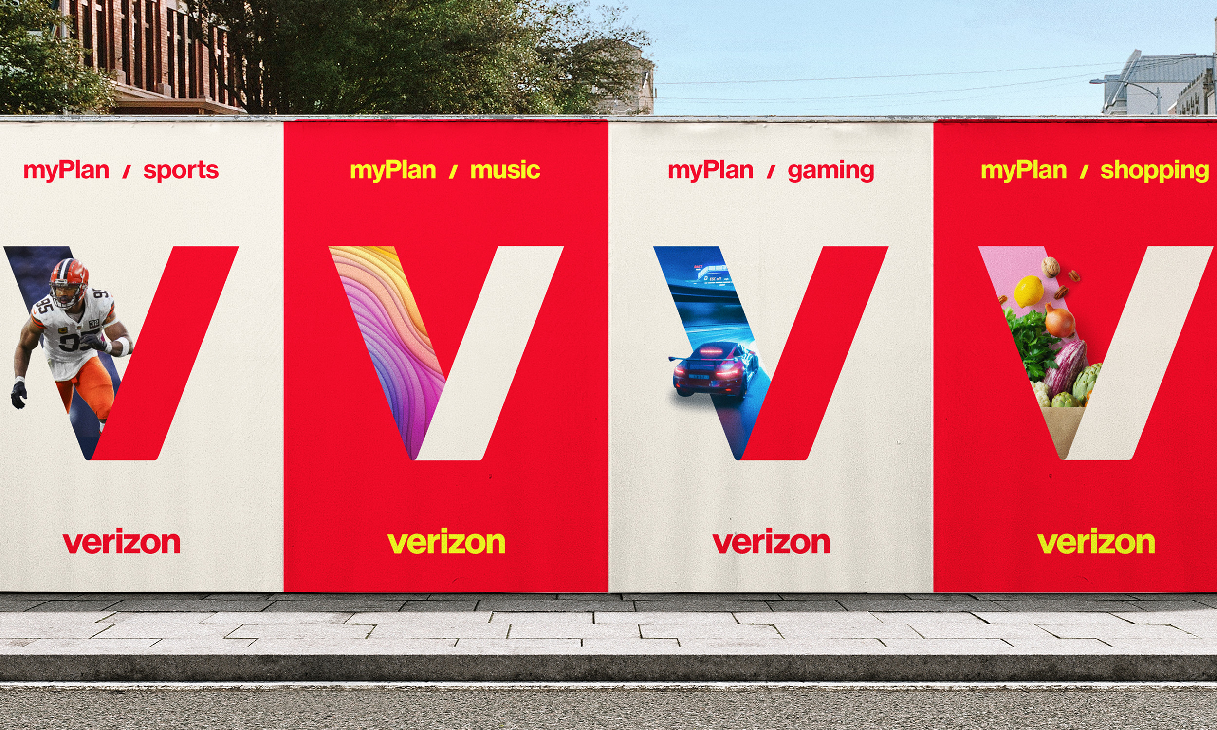
The V lettermark also becomes a portal into the world of
Verizon by highlighting all of the things Verizon has to offer.
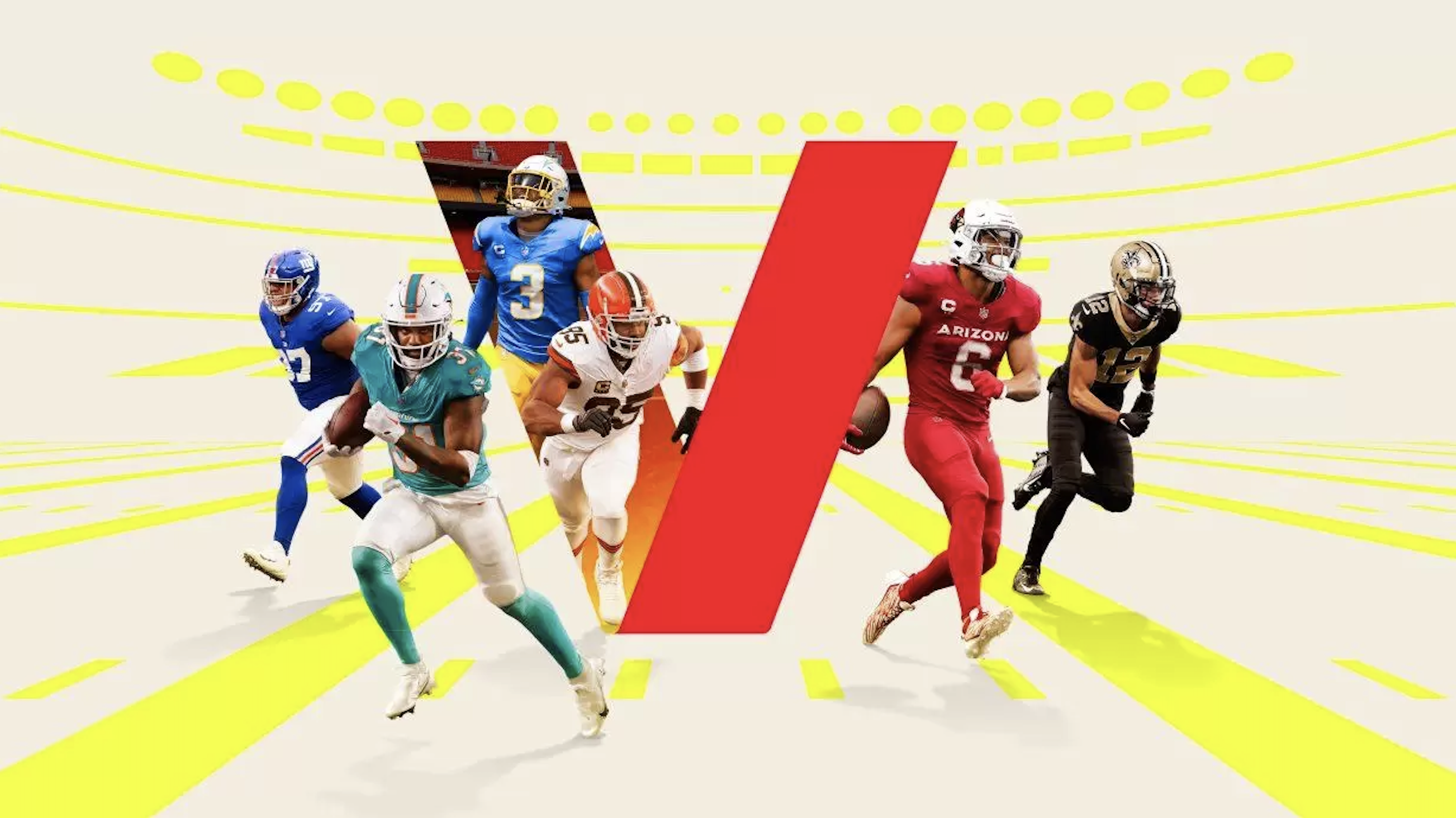
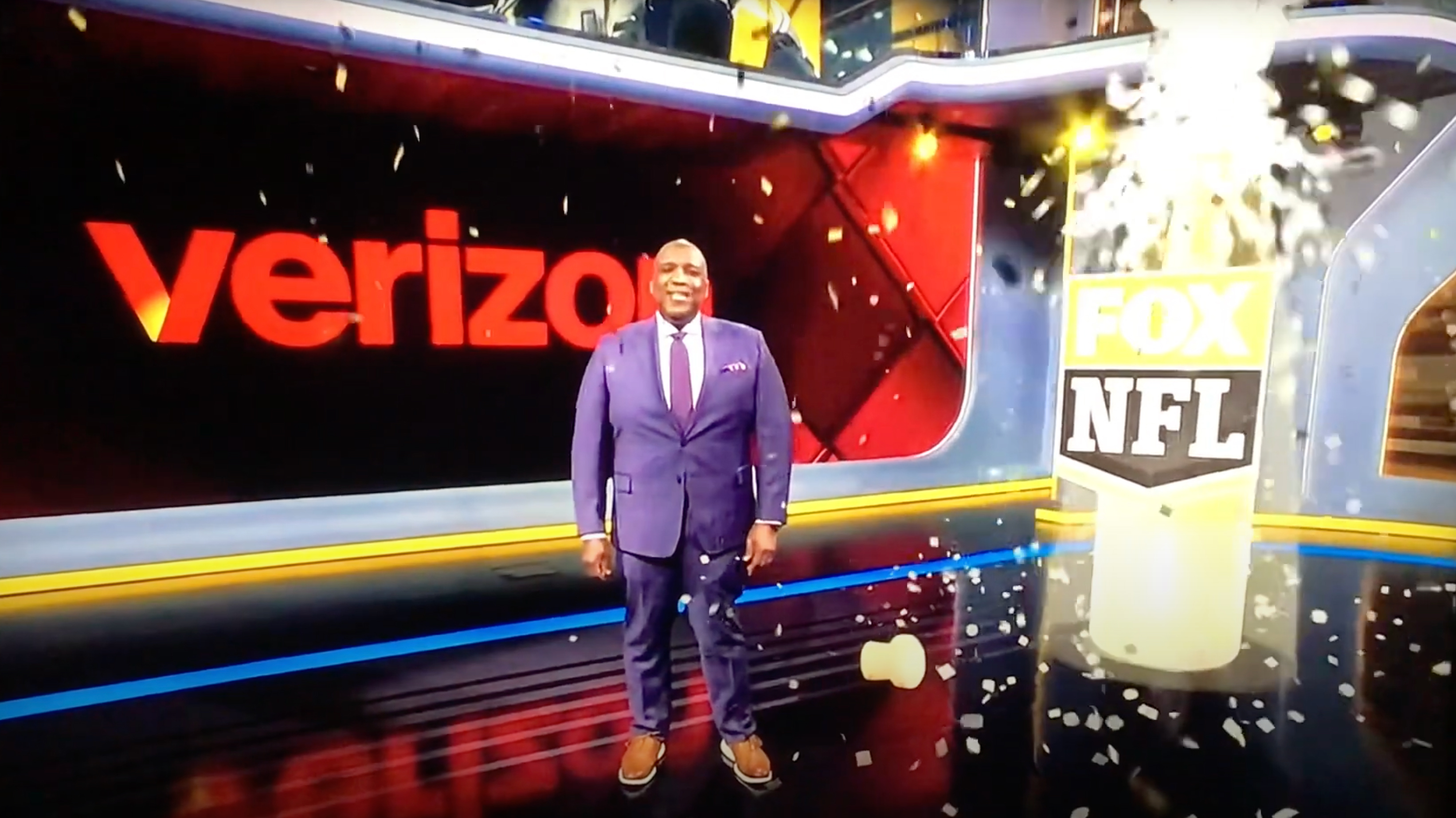

The refresh was also applied across all of Verizon’s B2B segment as well,
incorporating different color palettes and visual patterns.


The scalable identity is also flexible enough to include holiday campaigns, collaborations and brand activations.

Agency:
Turner Duckworth SF
Client:
Verizon
Sector:
Tech, B2B/B2C
Type:
Brand Identity
Position:
Senior Designer
What I Did:
Logo Design
Visual Identity
Graphics Creation
Apparel Design
B2B Design
Brand Research
Team:
Hans Vestberg, CEO, Verizon
Leslie Berland, CMO, Verizon
Ricardo Aspiazu, SVP Creative, Verizon
Chris Garvey, ECD
Jared Britton, CD
Dan Kennington, CD
Katie Barger, Sr. Designer
Matt Knight, Sr. Designer
Bennett Wantz, Designer
Eli Walters, Designer
Daphne Huang, Designer
Monotype
Press:
Ad Age︎︎︎
Adweek︎︎︎
Fast Company︎︎︎
USA Today︎︎︎
MSN︎︎︎
Challenge:
Reposition Verizon in a way that better reflects Verizon’s current position as a contemporary media brand while also preserving its heritage and showcasing all of its current product offerings. As a data, content and network provider, how can we make the invisible, visible?
Insight:
During consumer testing, there was 99% brand recognition but only 30% of people were able to recognize the existing checkmark icon that was designed by Pentagram as belonging to Verizon. This told us we needed to find a new symbol that Verizon could own.
Solution:
We updated the entire brand identity by creating a flexible design system that emphasized the idea of “connection” throughout all of the different brand expressions. We replaced the existing monochromatic wordmark and check icon with an updated glowing ‘V’ lettermark and vibrant color wordmark that injected the brand with life and better captured the contemporary power, energy and universal reach of the brand. The flexibility of the lettermark also speaks to the personalized and customizable nature of the brand for consumers and businesses alike.
A complete visual overhaul for both the consumer and business arms included new graphic patterns, typefaces, color palettes and photography styles while still remaining grounded in the brands roots of Swiss Modernism.
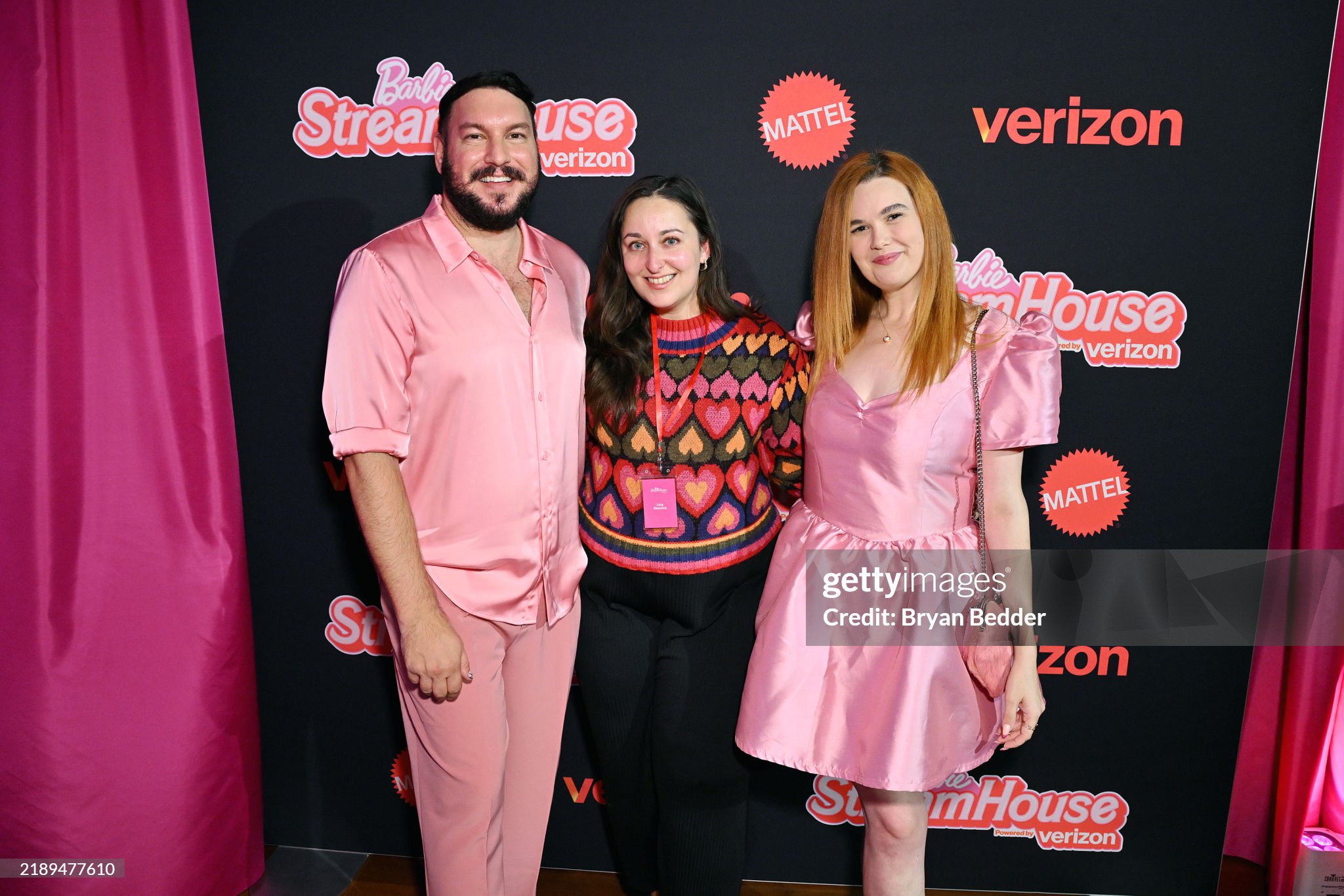
The new identity is also flexible enough to be used for seasonal campaigns, collaborations and activations and premiered with Verizon’s collaboration with Barbie for the 2024 holiday season.
Pulling inspiration from the company’s heritage, the new identity celebrates individuals and speaks to the contemporary energy and personal experience of everything Verizon offers as a leading technology and media provider in the 21st Century.
Result:
The new mark and identity was launched globally across the entire Verizon brand in June 2024 and injects new life, energy and flexibility into a brand that had become outdated, unrecognizable and constrained. The identity attracted significant online chatter and attention from several major media outlets.