Überliss
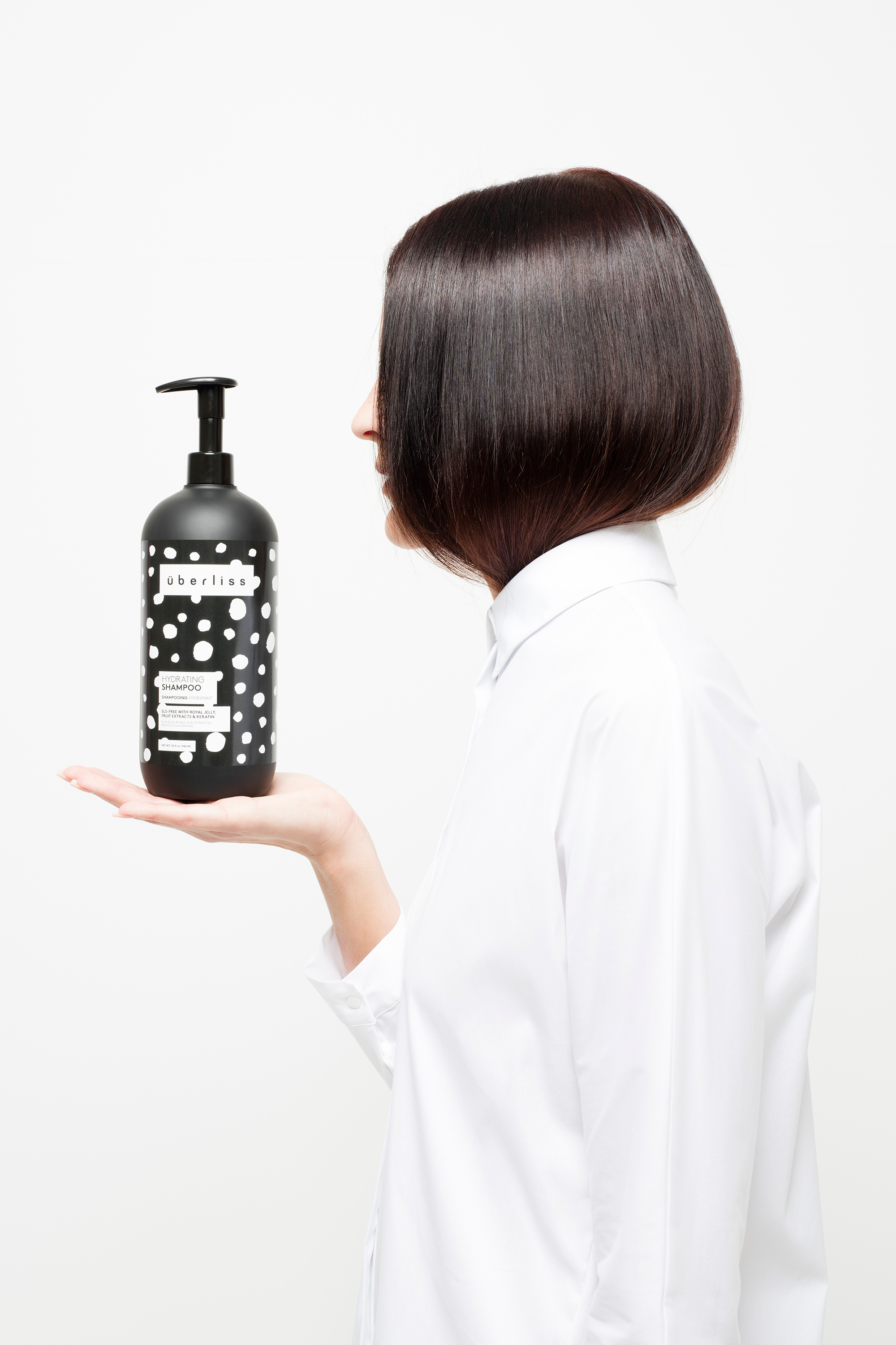


Previous Branding
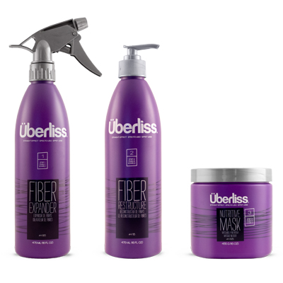
Inspiration

Explorations

Logo
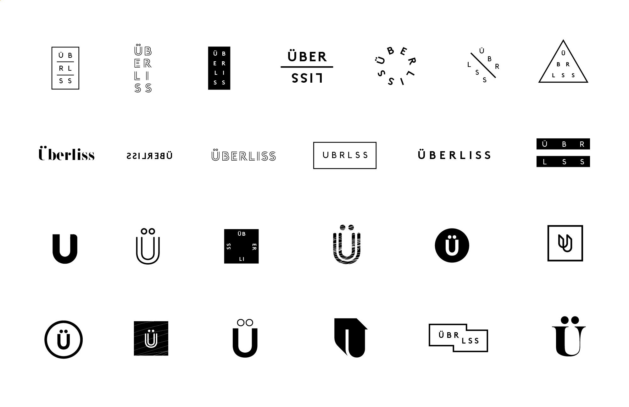
To preserve brand equity and recognizability, we opted to retain and slightly modify the existing custom wordmark.
To ensure visual contast, the wordmark was placed inside a frame by using lowercase and opening up the tracking. Adjustments were also made to the diacritical marks for visual uniformity. The new emblem allows for more flexibility while retaining the character of the original logo.
To ensure visual contast, the wordmark was placed inside a frame by using lowercase and opening up the tracking. Adjustments were also made to the diacritical marks for visual uniformity. The new emblem allows for more flexibility while retaining the character of the original logo.
Website

The responsive website prioritized usability and functionality through clean, grid-based design and typography.
Typography & Color
LL Brown is a contemporary, geometric, sans serif by Lineto and was chosen for its legibility and elegant sophistication.
A black and white color palette introduced an elevated high fashion aesthetic and a timeless stylishness.
A black and white color palette introduced an elevated high fashion aesthetic and a timeless stylishness.
The Patterns
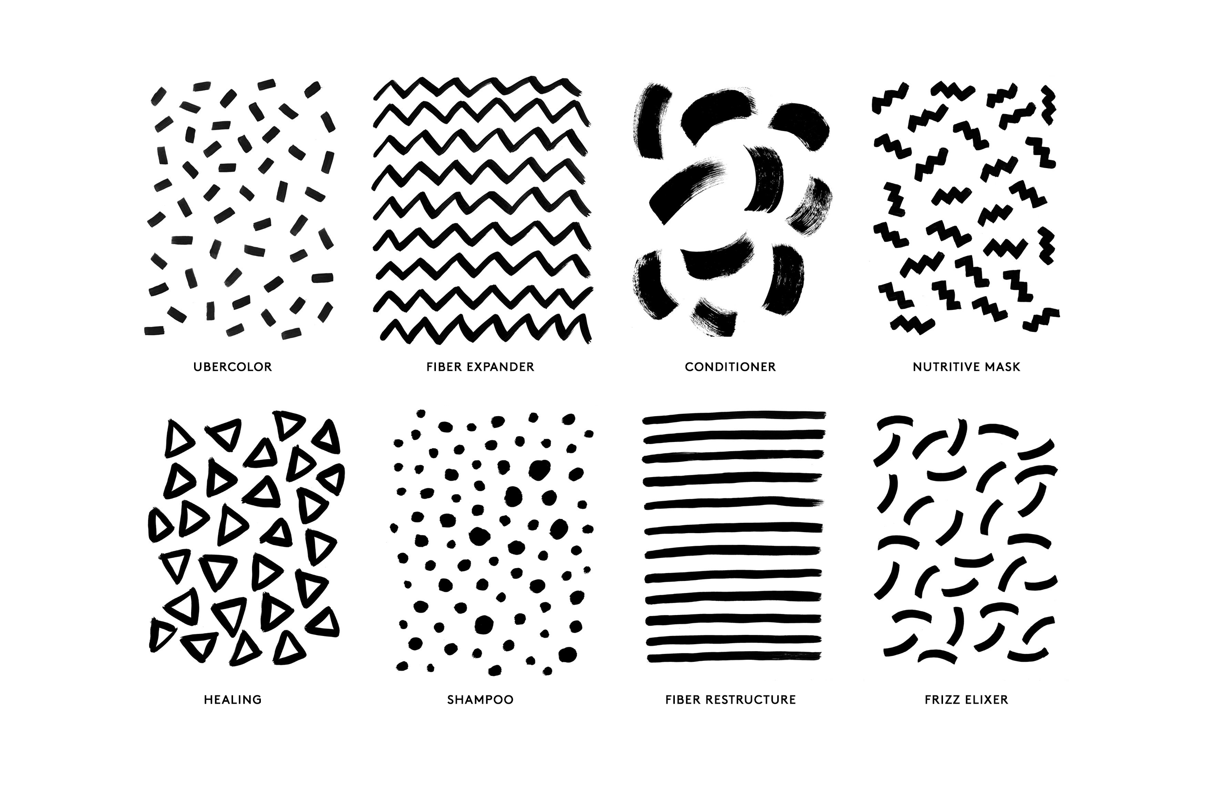
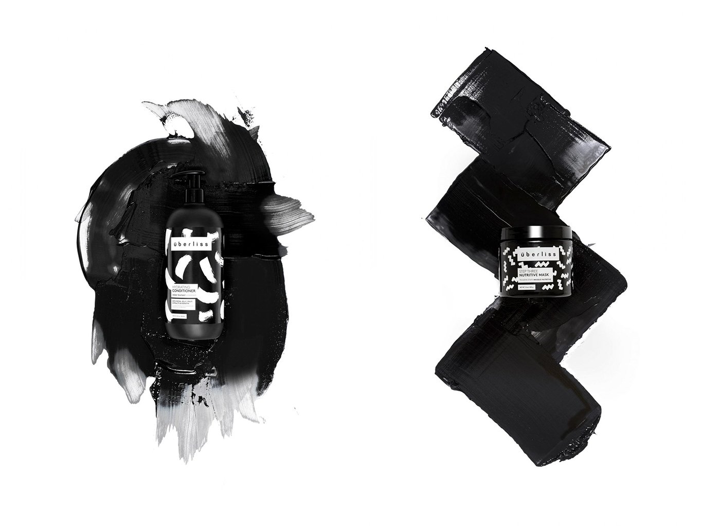
Using paint, I created a series of handmade patterns. The patterns have a playful rebelliousness and the viscous nature of the paint also reflected the nature of the products themselves.
Using paint, I created a series of handmade patterns. The patterns have a playful rebelliousness and the viscous nature of the paint also reflected the nature of the products themselves.
The System
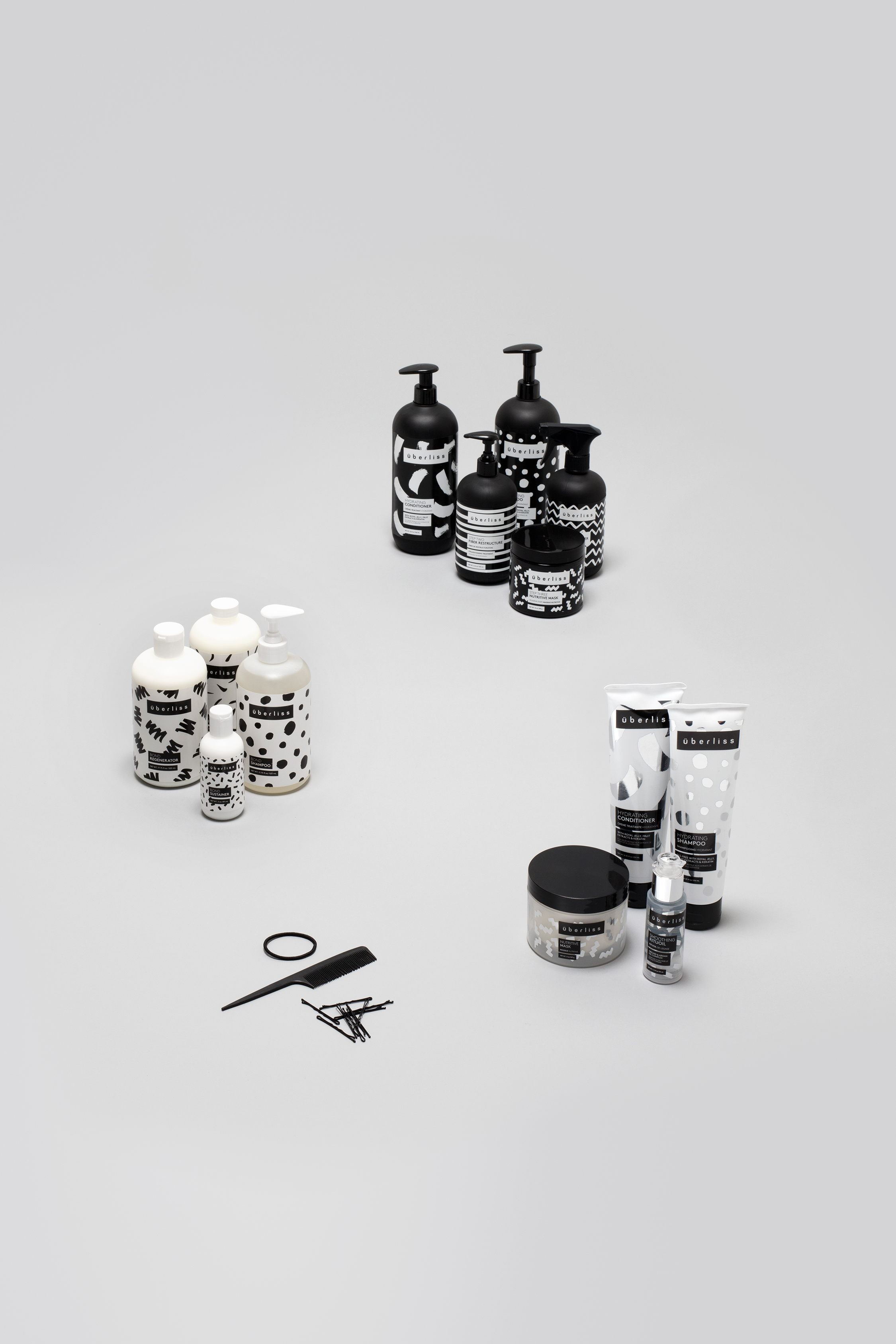
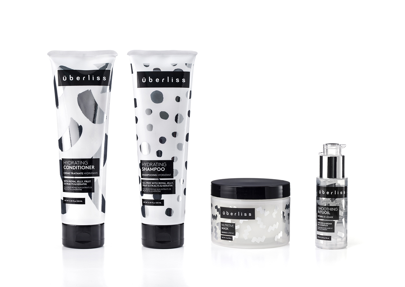
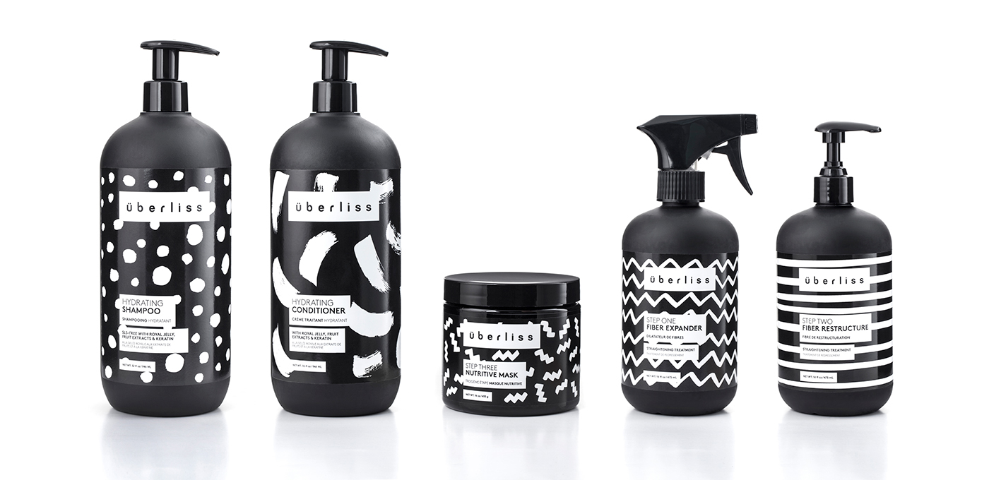
Keeping all the typography within a left justified fixed frame, the interchangeable patterns were used to define each separate product line. This flexible system was designed to be customizable for future releases, allowing the brand to grow and expand.

The Maintenance Collection
The Keratin Collection

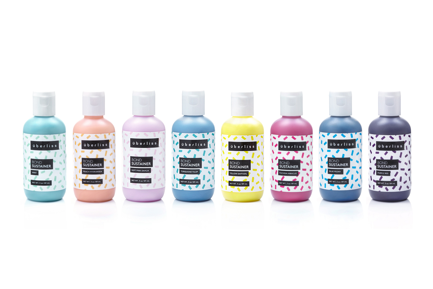
The Bond Collection
Social
Print & Collateral


Tradeshow
![]()
Advertising & OOH

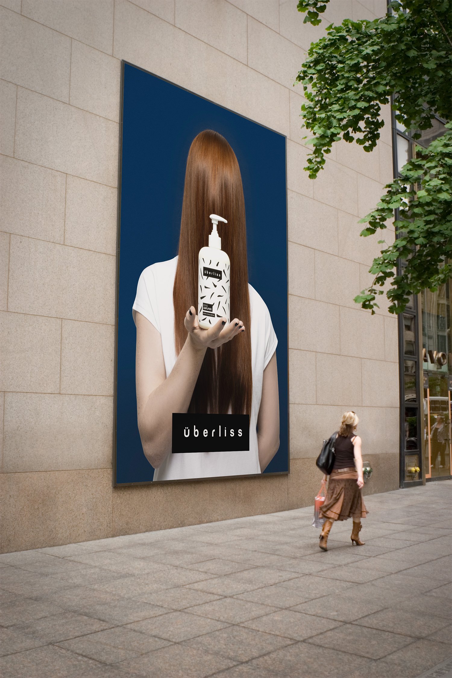
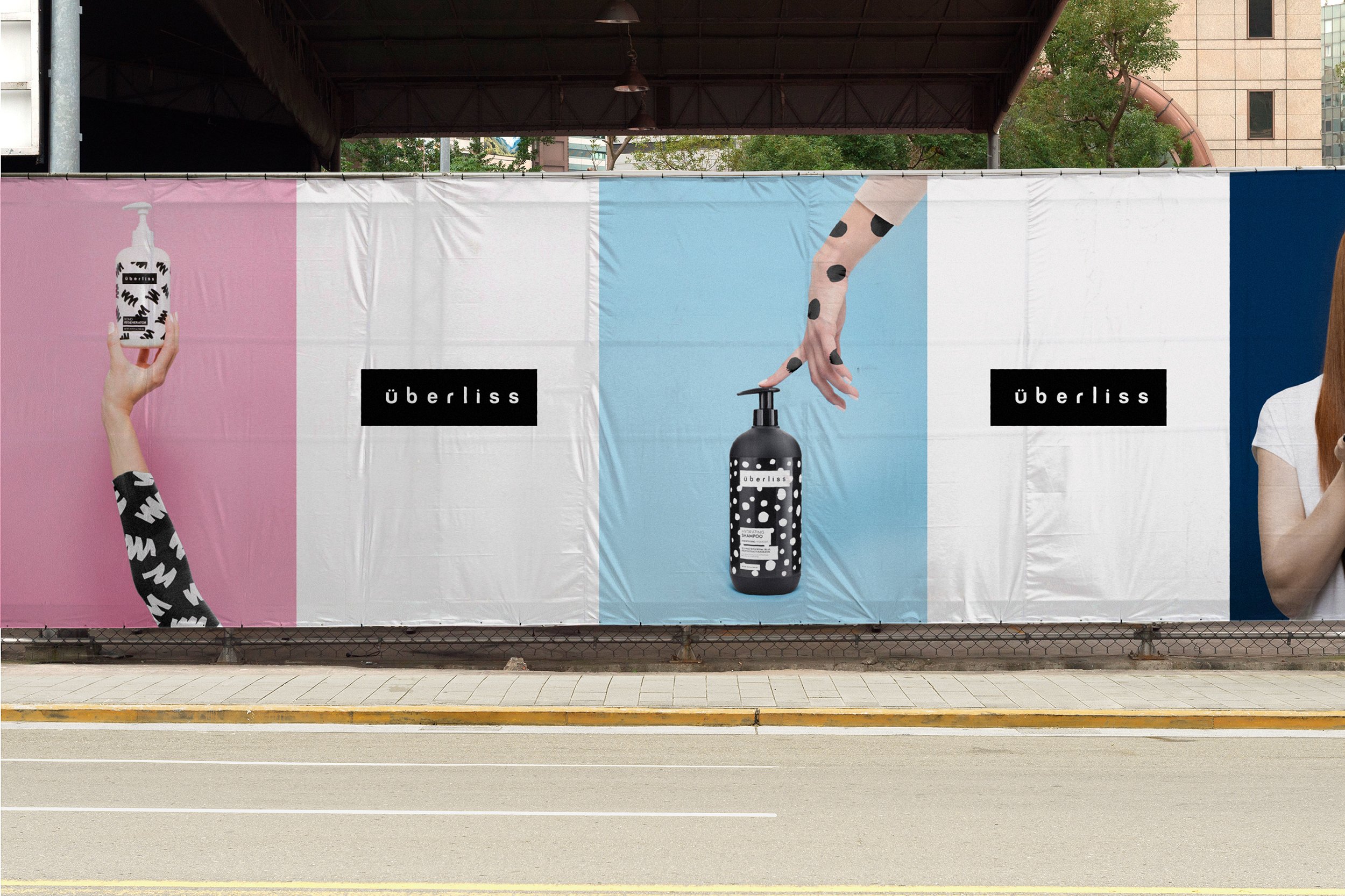
For the campaign, stylish and minimal art directed photography placed emphasis on the products and patterns.

Brand Guidelines

Agency:
FormNation
Client:
Überliss
Sector:
Health & Beauty, B2C
Type:
Brand Identity
Position:
Lead Designer
What I Did:
Logo Design
Pattern Design
Website Design
Print Design
Package Design
Visual Identity
Brand Guidelines
Team:
Jan Habraken, CD
Lotte Van Velzen, AD
Rachael Elle, Graphic Designer
Alissia Melka-Teichroew, Styling
Lisa Klappe, Photography
Press:
Computer Arts Magazine
Brand Magazine
The Dieline︎︎︎
Wallpaper︎︎︎
Graphic Design USA︎︎︎
iDN︎︎︎
Challenge:
Überliss specializes in creating products that deliver amazing shine, softness, and silkiness all while showcasing exotic and natural ingredients with the help of cutting edge research. They approached us to develop a complete brand refresh that would better reflect how their products make their customers feel confident, bold and stylish while also reflecting core brand values of honesty, rebelliousness, youthfulness and vibrancy.
Additionally, the different product lines in the brand all needed to be unique with the ability to easily expand and grow in the future.
Insight:
The company has its origins in the Brazilian haircare industry, where smooth and straight hair is a beauty ideal. The word Überliss means “Super Smooth.”
Solution:
Retaining the original wordmark to preserve existing brand equity and recognition, the logo was slightly modified and placed inside of a frame.
The new identity and package designs are centered around a flexible graphic system that is primarily driven by a mix of bold, hand-painted patterns designed for maximum visual impact and pop on the shelf.
Inspired by what each product does for the hair, while also speaking to the organic and viscous nature of the product itself, they cover both the brand’s salon-only and white-bottled consumer line of products. The patterns were designed as a flexible system that could grow and evolve as the brand added new product lines in the future.
LL Brown is a contemporary, geometric sans by Lineto and was chosen for its legibility and elegant sophistication. The black and white color palette communicated an elevated high fashion aesthetic and timeless stylishness.
Stylish and minimal art directed photography placed emphasis on the products and patterns.
Results:
The new visual identity embodies the core ideals of the brand and customer while also differentiating itself from the competition. The identity was successfully implemented across the entire brand with significant YoY increases in website conversions, revenue and site traffic.