Coast Brewing Co.
A fictional craft beer company inspired by the rich history and lifestyle of Southern California surf culture.

Logo

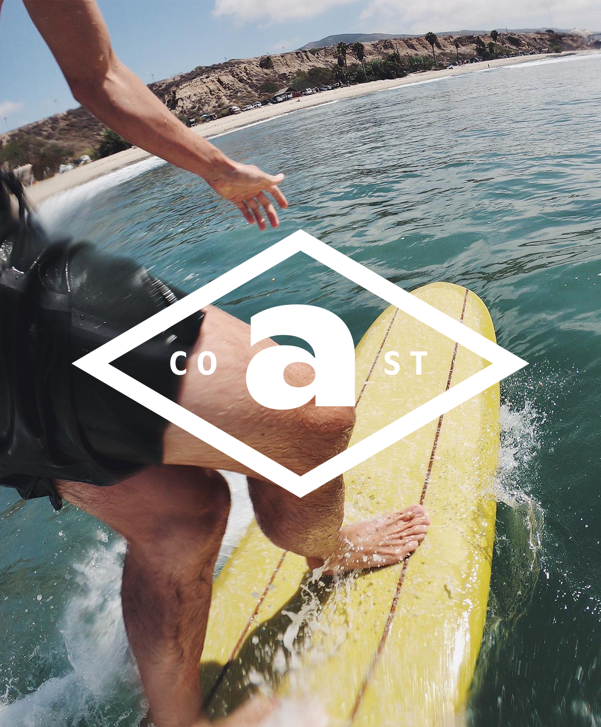
Like waves slowly rolling in, the extended letterforms give the logo a relaxed, calming and “laid back” feel.
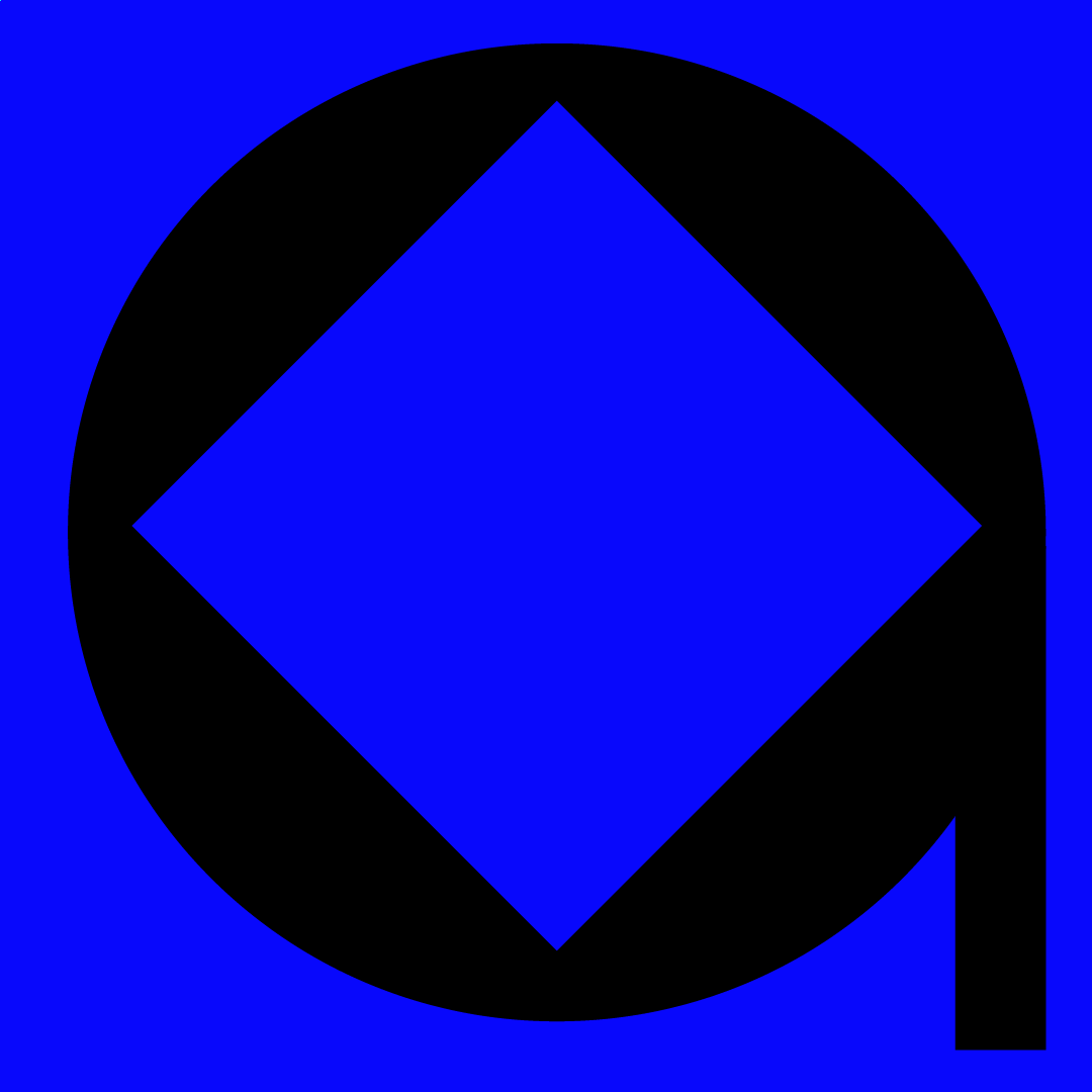
Brand Mark
Acting as a visual mnemonic, a breaking ocean wave is reflected in the negative space of the letterform mark.
Website
Package


The cans feature unique artwork based on different seasonal lines released throughout the year.

Color & Typography
Avoiding the interlocking letterforms used in classic surf posters, ABC Ginto Nord is a playful, geometric-humanist, sans serif typeface by Dinamo that mimics the soft curves of ocean waves.
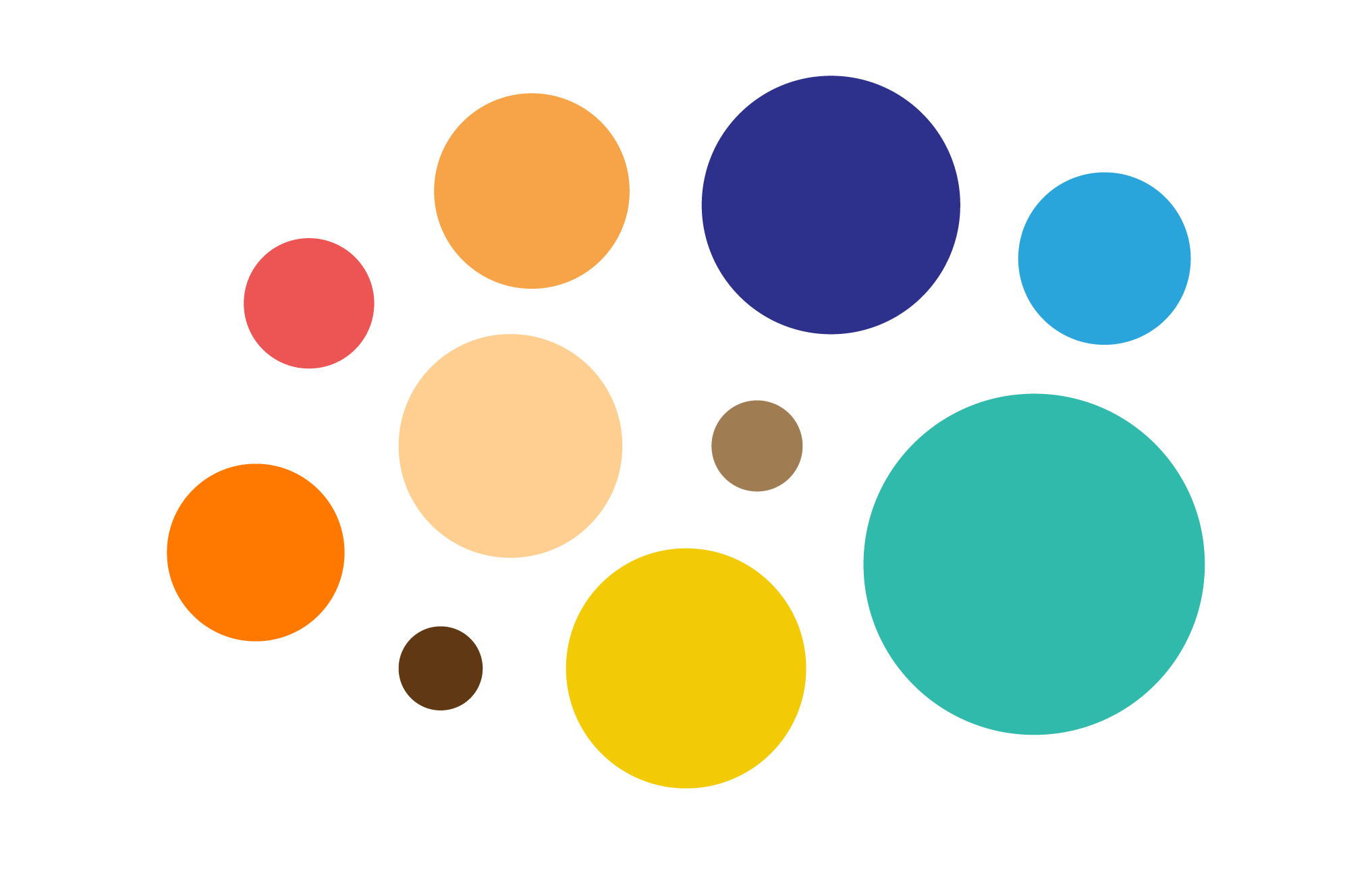
The vibrant and natural color palette was inspired by cool and warm tones commonly found in the coastal environment.
Grid System

The grid system was based on a flexible, modular layout.
Photography


High-key, colorful, lifestyle photography of people and places was used to communicate the essence of the brand.
Lockups


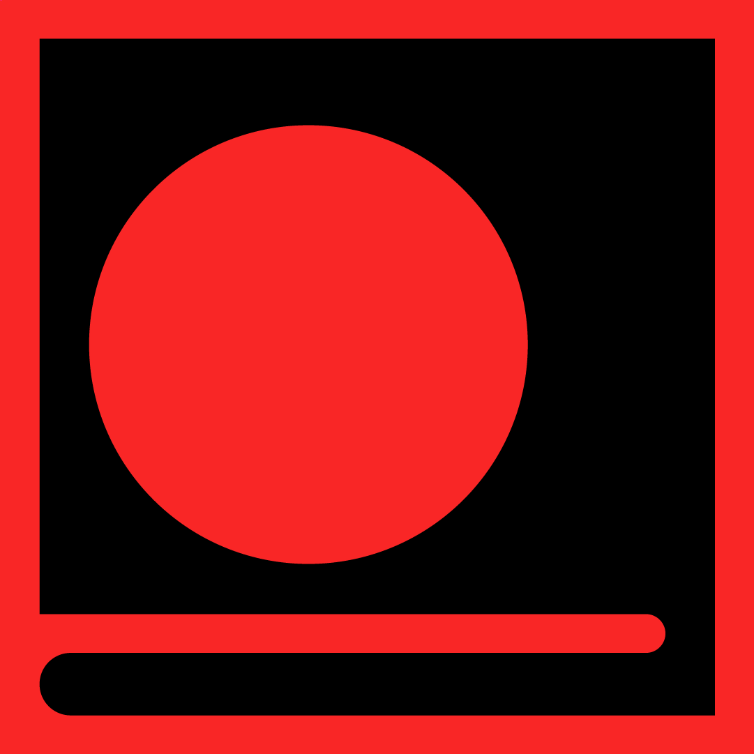
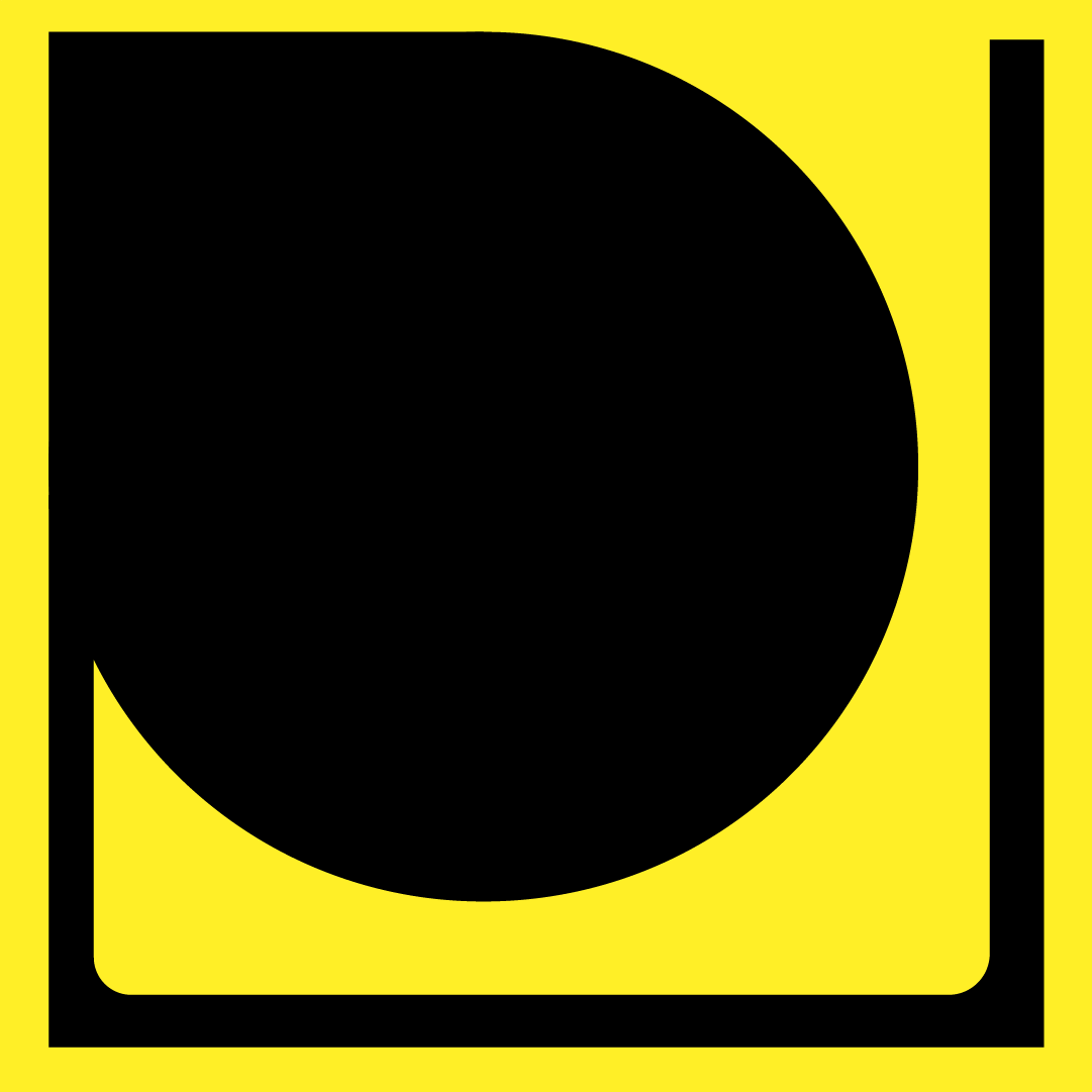
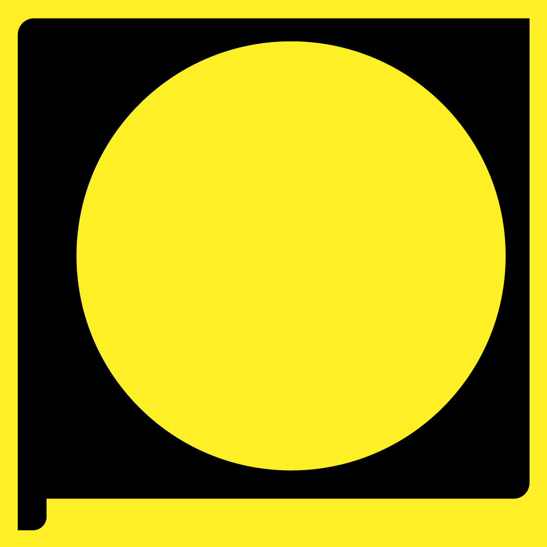
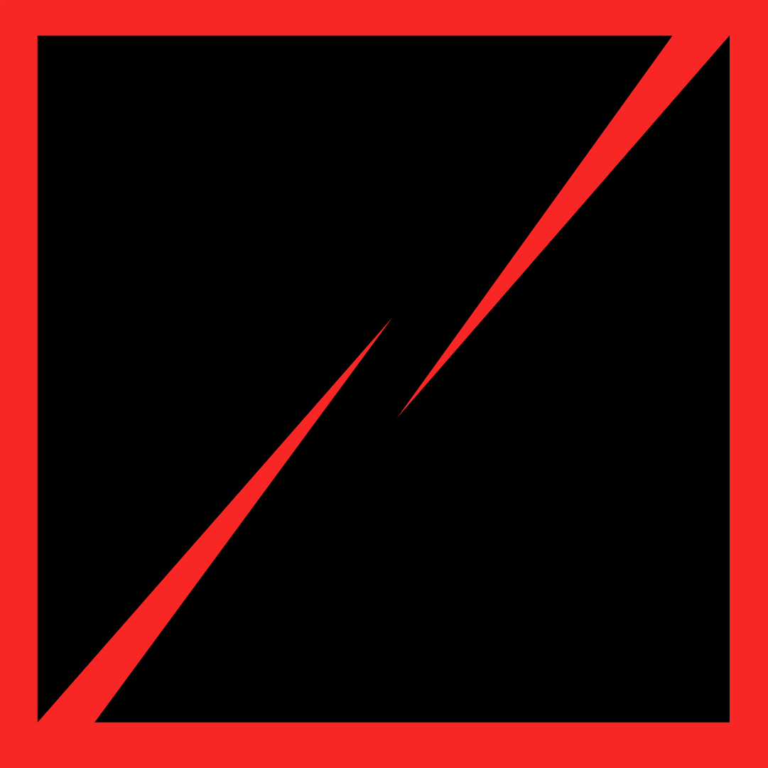
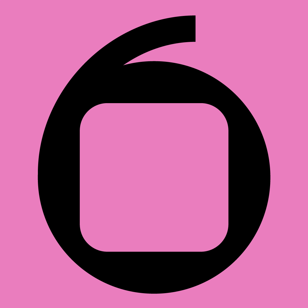
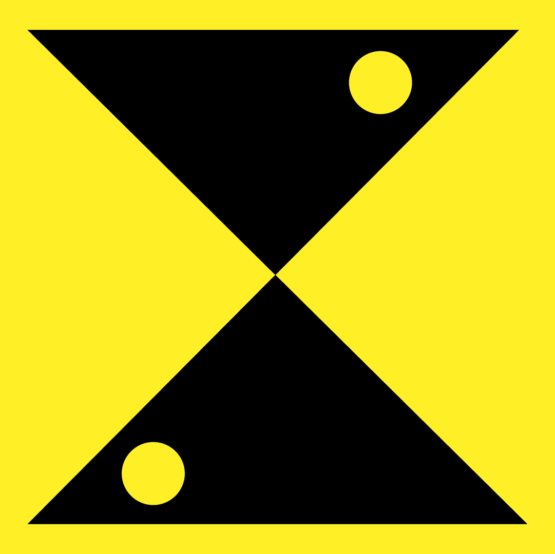
Illustration


![]()
![]()
![]()
Collaborations


Limited edition brand collaborations feature iconic surf artists and photographers.

Collateral


Social & OOH


Agency:
Studio B
(Personal Work)
Client:
Coast Brewing Co.
Sector:
Food & Beverage
Type:
Brand Identity
What I Did:
Art Direction
Illustration
Design
Animation
Studio B
(Personal Work)
Client:
Coast Brewing Co.
Sector:
Food & Beverage
Type:
Brand Identity
What I Did:
Art Direction
Illustration
Design
Animation
This was a self-initated personal project.
Challenge:
The brief was to create a unique, craft beer brand identity that celebrated Southern California’s rich surfing culture and history and also captured the timeless freedom, playfulness and youthful spirit of surfing. The brand also needed the flexibility to be able to grow and expand in the future.
Insights:
Southern California is famous for its rich surf culture and history.
Surfing is seen as a quintessential summertime activity.
Surfing is primarily a fun, youthful, recreational activity.
Solution:
While there are hundreds of craft beer brands, many are generic and lack character and originality. Coast Brewing Co. draws on the rich history, longstanding traditions and lifestyle of surfing in Southern California that has become a cultural phenonmenon, sport and popular lifestyle specific to the region.
Embracing the youthful spirit, vitality and lifestyle of surf culture, the visual language of the brand is driven by fun, playful illustrations and a vibrant, coastal-inspired color palette.
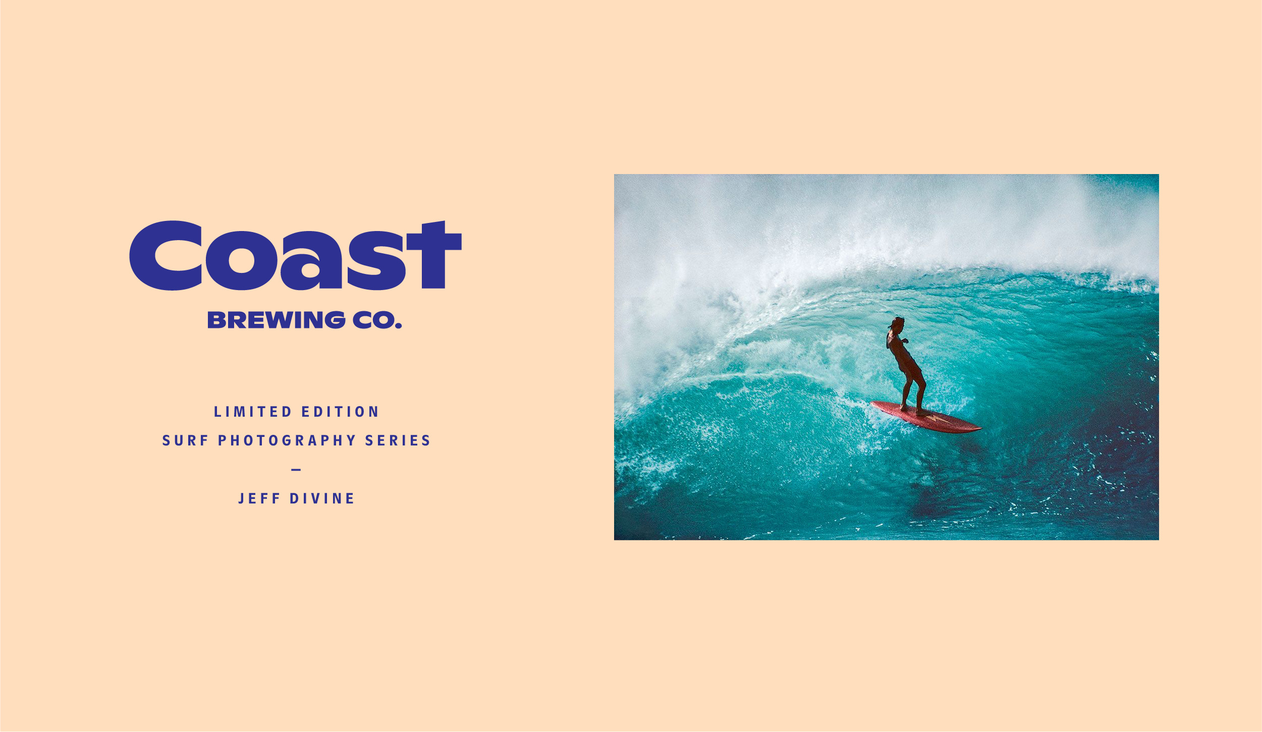
ABC Ginto Nord was used for the wordmark—a contemporary, geometric-humanist typeface by Dinamo Type Foundry, that mimics the soft, rounded curves of ocean waves. The high x-height in the extended weight of the letterforms gives the logo a “laid back” and relaxed quality. Reflecting a breaking ocean wave in the negative space, the letterform A acts as a visual mnemonic and was naturally employed as the letterform brand mark.
A suite of lockups further extended the brand language and the rich, down-to-earth color palette features a combination of warm and cool tones commonly found in the coastal environment.
Drawing on the influence of Mid-century modern graphic designers Paul Rand and Saul Bass, hand-drawn, custom illustrations were created using flat colors and shapes. Stylistic variations allowed for maximum flexiblity across different seasonal product lines.
Art directed lifestyle photography sought to communicate summer, youth and fun by using warm color tones and dreamy, overexposed images.
Results:
The new identity captures the spirit and history of surf culture in an authentic way.
Challenge:
The brief was to create a unique, craft beer brand identity that celebrated Southern California’s rich surfing culture and history and also captured the timeless freedom, playfulness and youthful spirit of surfing. The brand also needed the flexibility to be able to grow and expand in the future.
Insights:
Southern California is famous for its rich surf culture and history.
Surfing is seen as a quintessential summertime activity.
Surfing is primarily a fun, youthful, recreational activity.
Solution:
While there are hundreds of craft beer brands, many are generic and lack character and originality. Coast Brewing Co. draws on the rich history, longstanding traditions and lifestyle of surfing in Southern California that has become a cultural phenonmenon, sport and popular lifestyle specific to the region.
Embracing the youthful spirit, vitality and lifestyle of surf culture, the visual language of the brand is driven by fun, playful illustrations and a vibrant, coastal-inspired color palette.
ABC Ginto Nord was used for the wordmark—a contemporary, geometric-humanist typeface by Dinamo Type Foundry, that mimics the soft, rounded curves of ocean waves. The high x-height in the extended weight of the letterforms gives the logo a “laid back” and relaxed quality. Reflecting a breaking ocean wave in the negative space, the letterform A acts as a visual mnemonic and was naturally employed as the letterform brand mark.
A suite of lockups further extended the brand language and the rich, down-to-earth color palette features a combination of warm and cool tones commonly found in the coastal environment.
Drawing on the influence of Mid-century modern graphic designers Paul Rand and Saul Bass, hand-drawn, custom illustrations were created using flat colors and shapes. Stylistic variations allowed for maximum flexiblity across different seasonal product lines.
Art directed lifestyle photography sought to communicate summer, youth and fun by using warm color tones and dreamy, overexposed images.
Results:
The new identity captures the spirit and history of surf culture in an authentic way.
36 Days of Type
36 Days of Type is a project that invites designers, illustrators and visual artists to express their unique interpretation of the letters and numbers of the Latin alphabet.


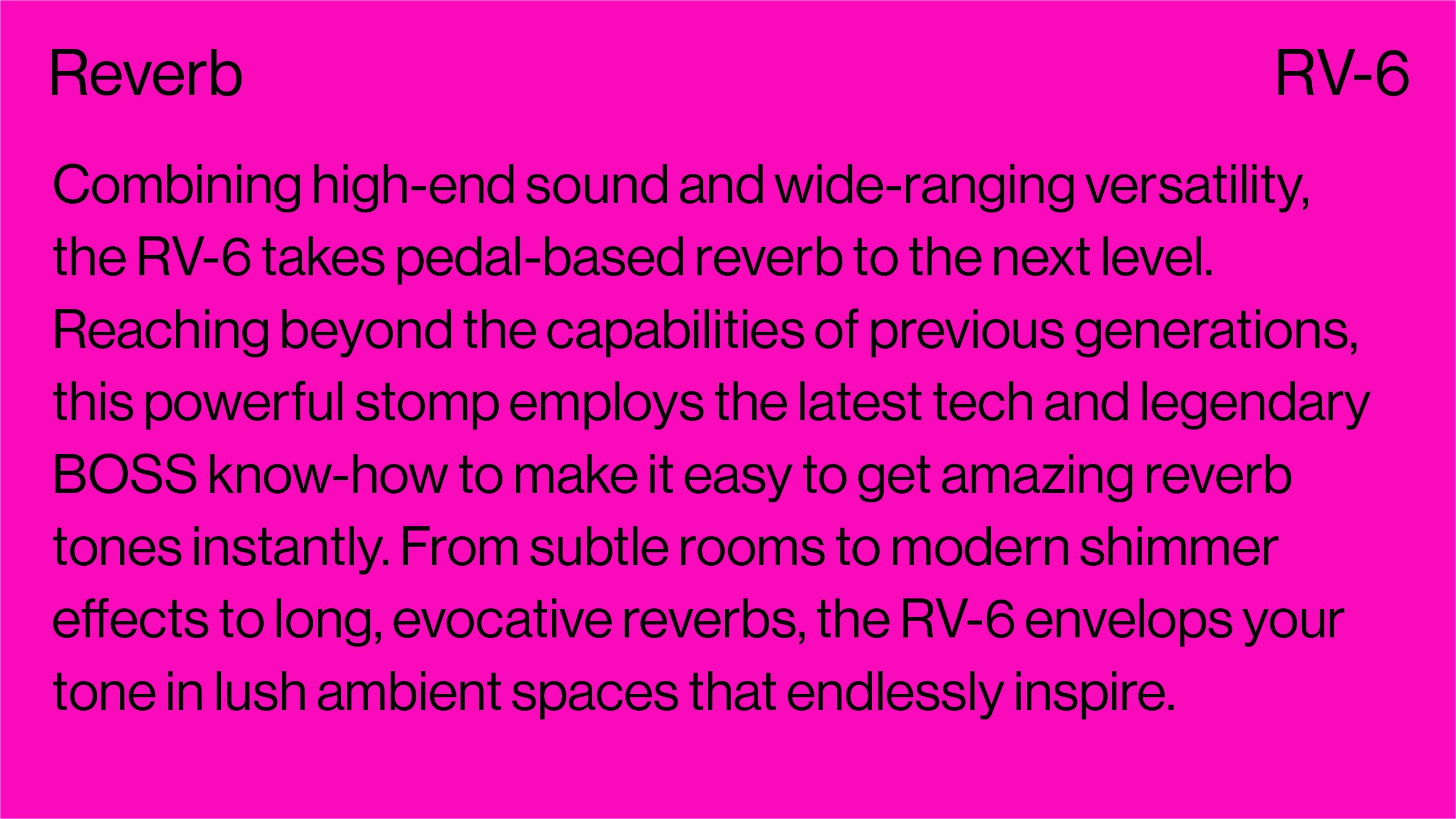
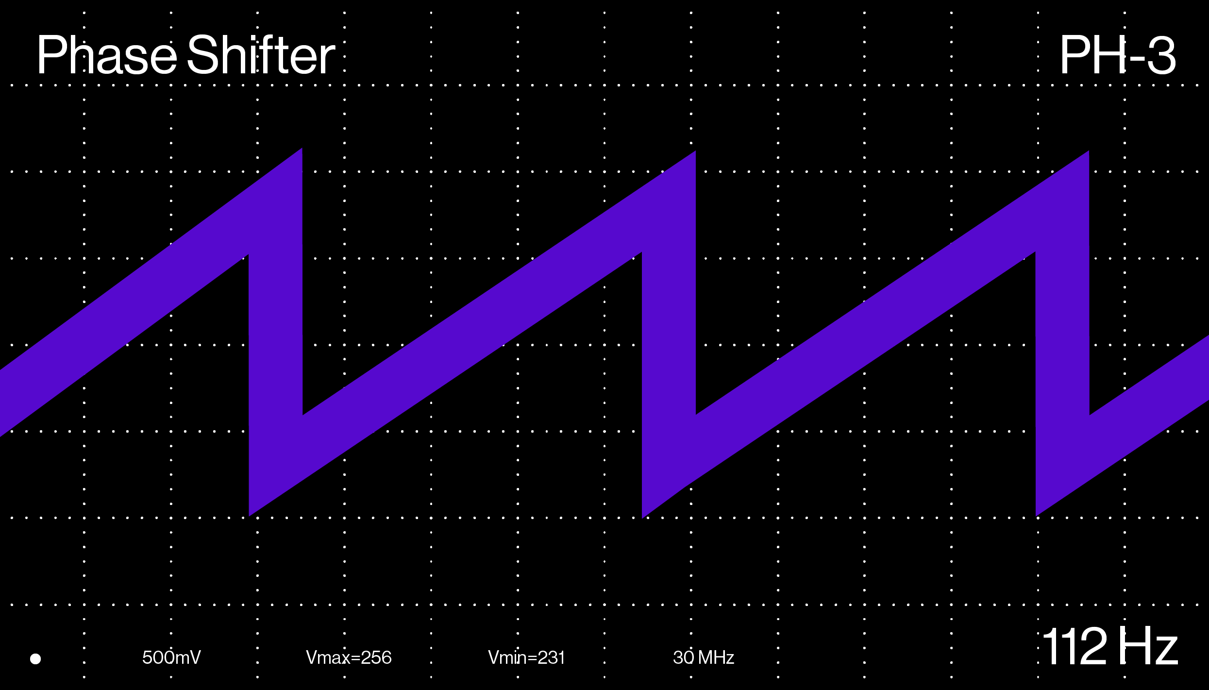
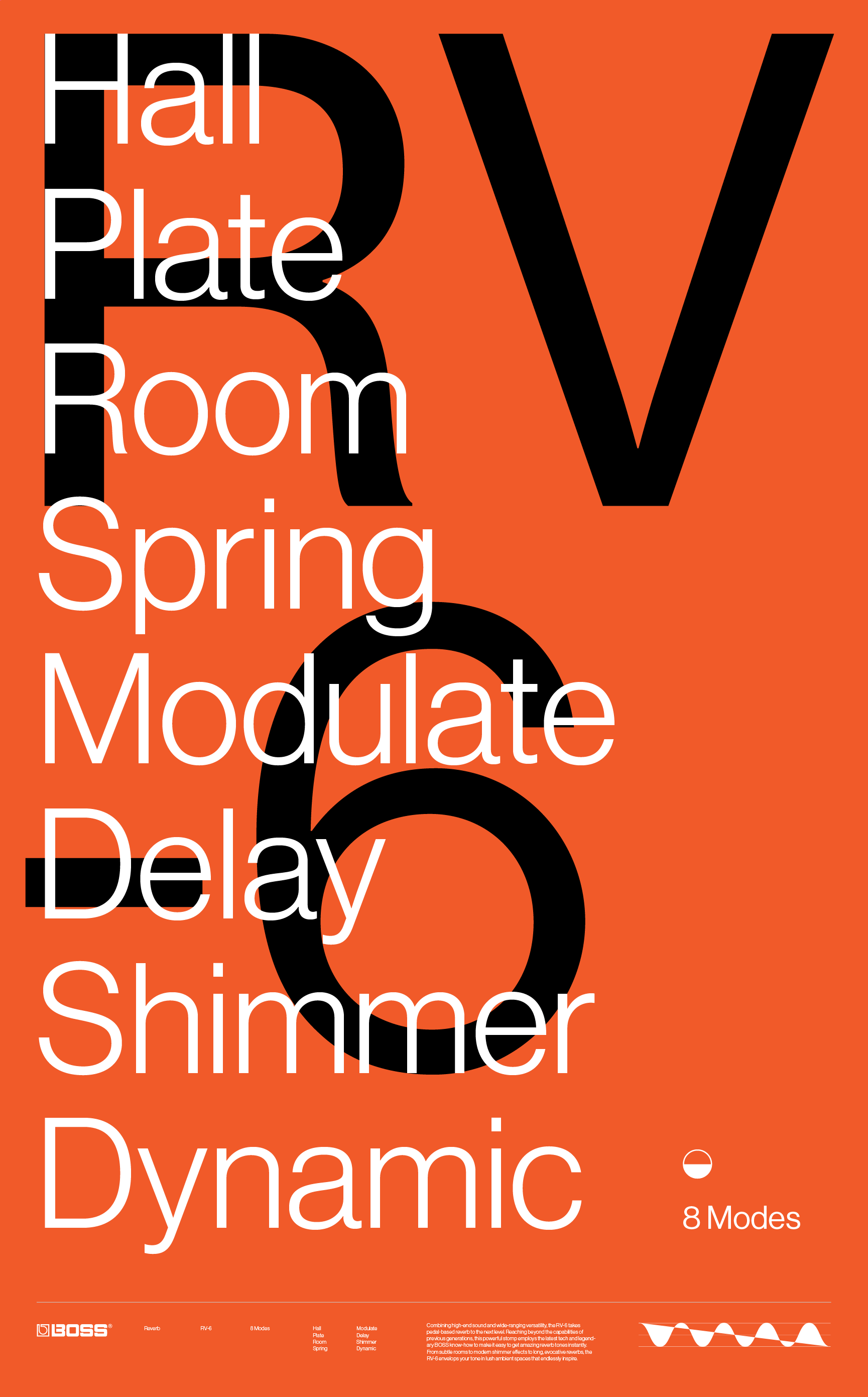
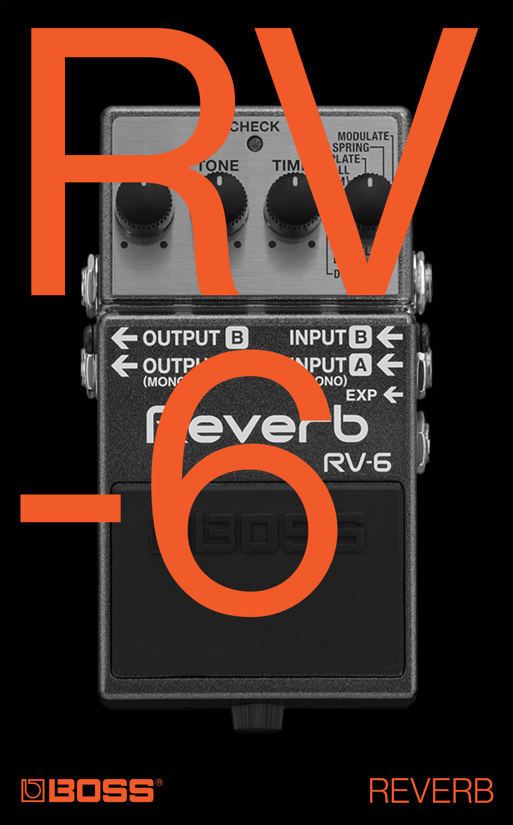
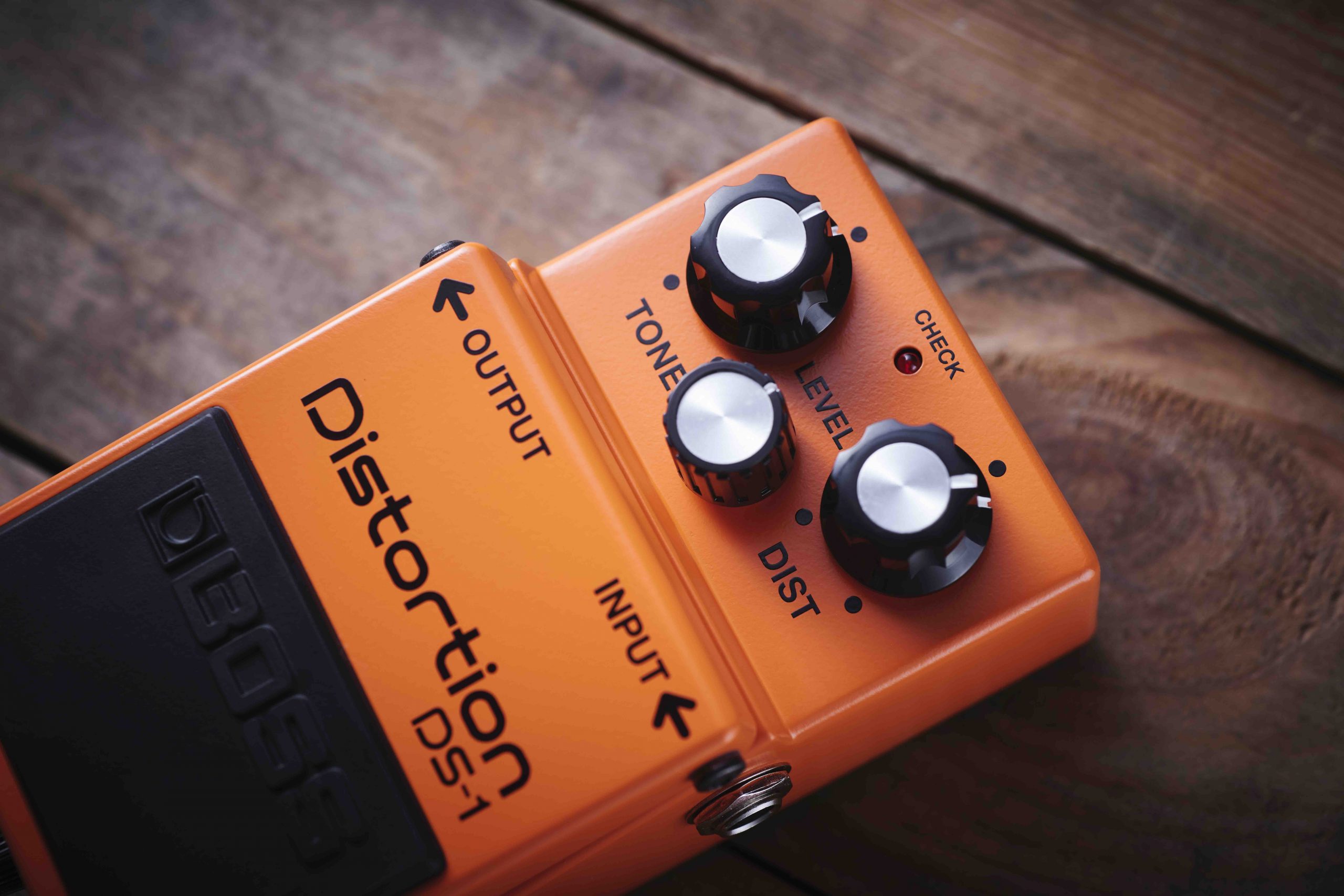
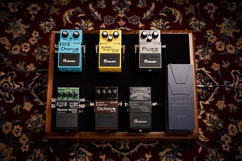
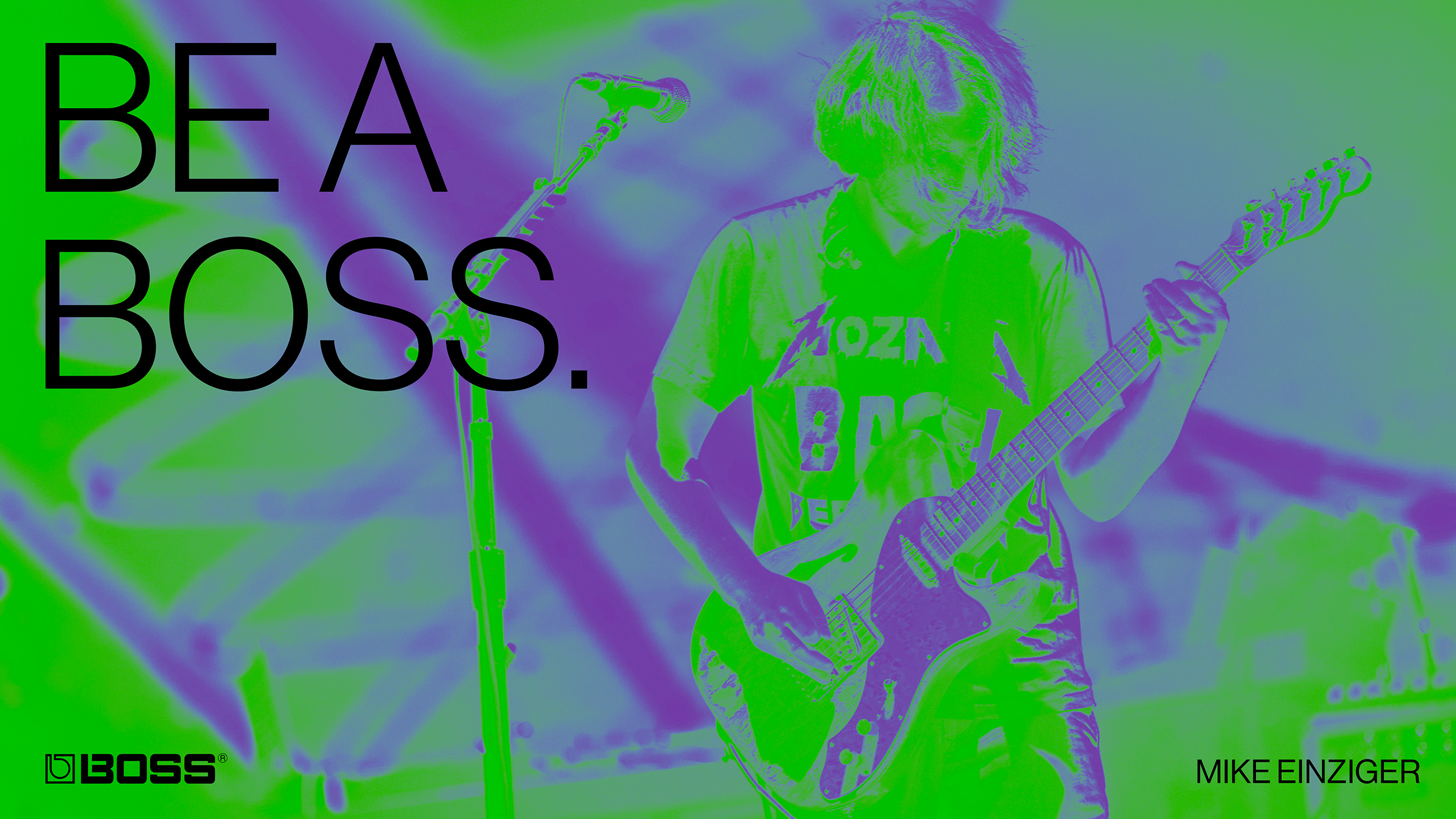
Be A Boss
A self-initiated/spec campaign for BOSS—the industry leader in guitar pedals and effects whose products have been used by some of most famous artists and musicians of all time.
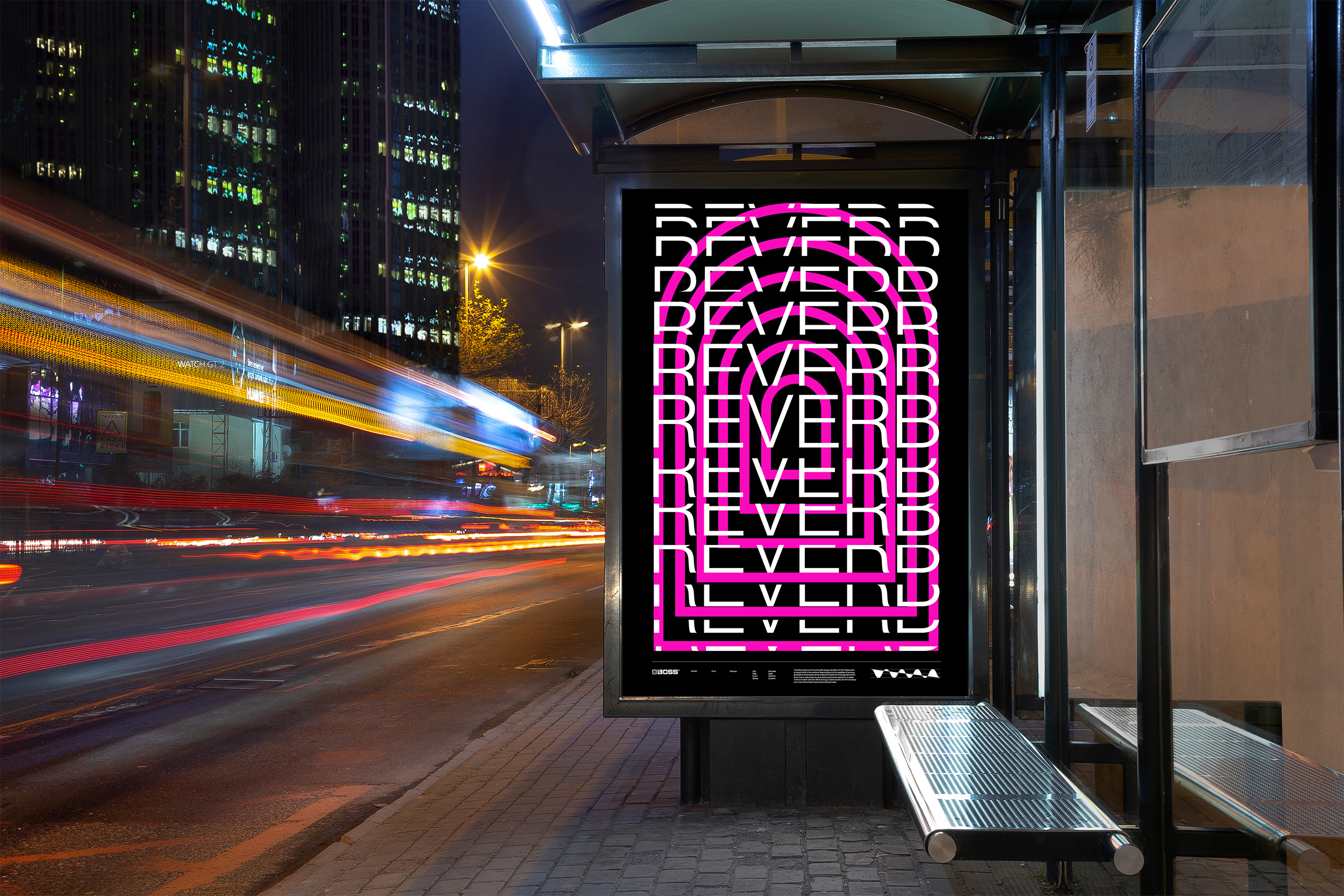
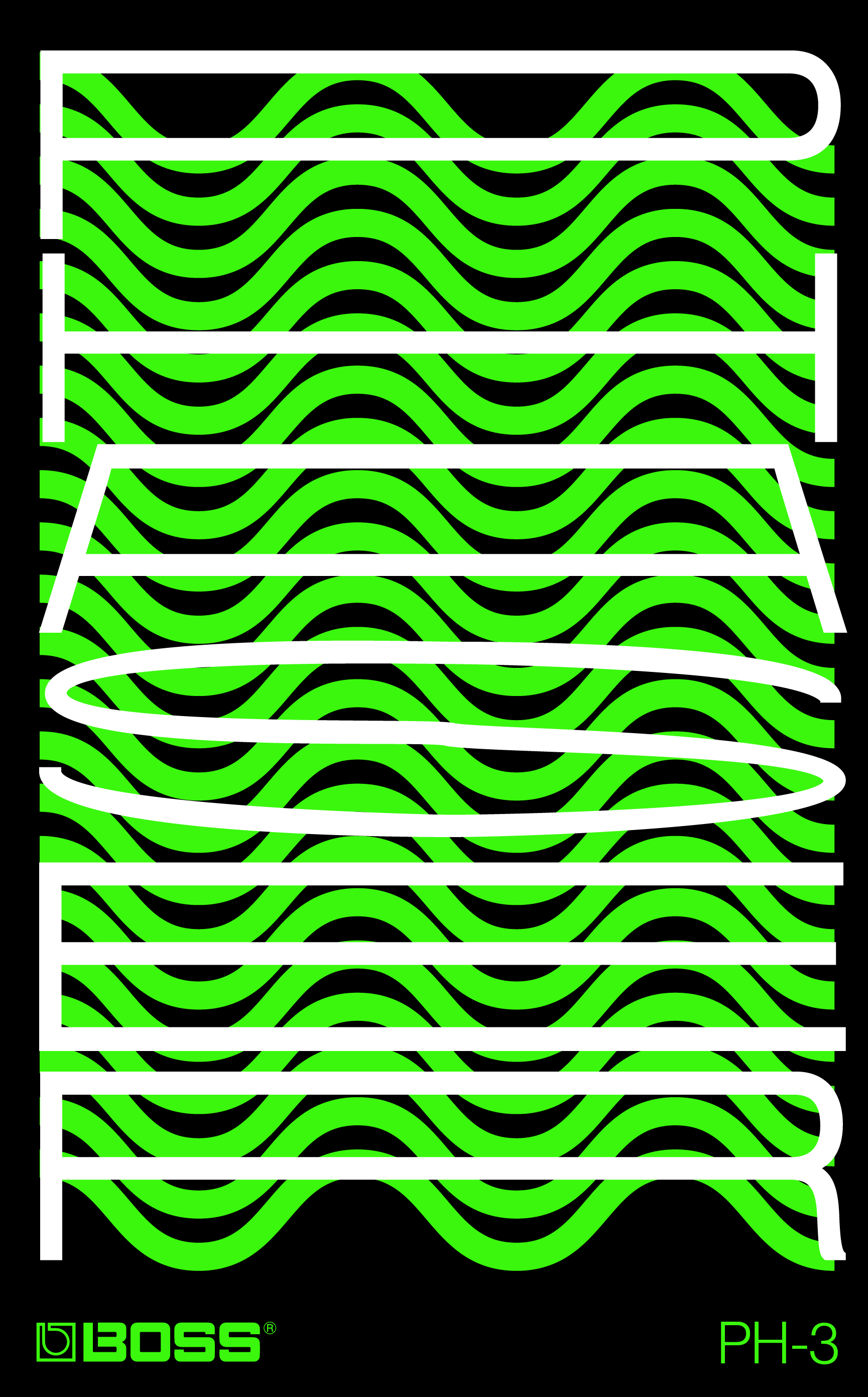
The Campaign
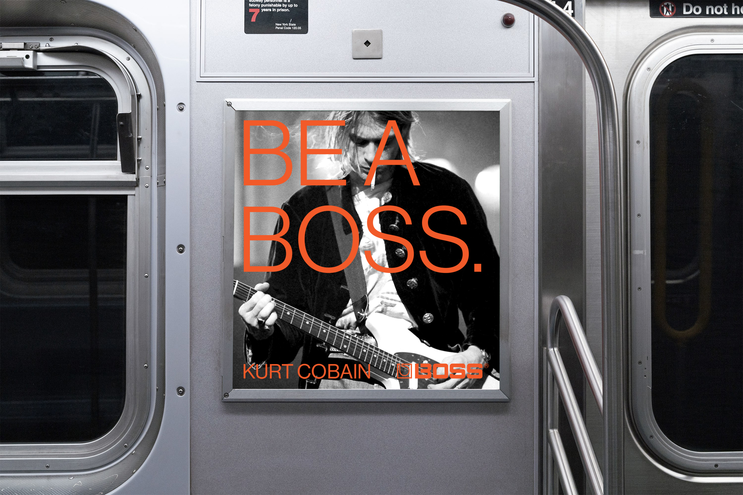
Featuring iconic musicians known for using BOSS pedals,
“BE A BOSS” highlights the way each guitarist shapes
and controls their own signature sound through the
different combination of pedals they choose.
“BE A BOSS” highlights the way each guitarist shapes
and controls their own signature sound through the
different combination of pedals they choose.
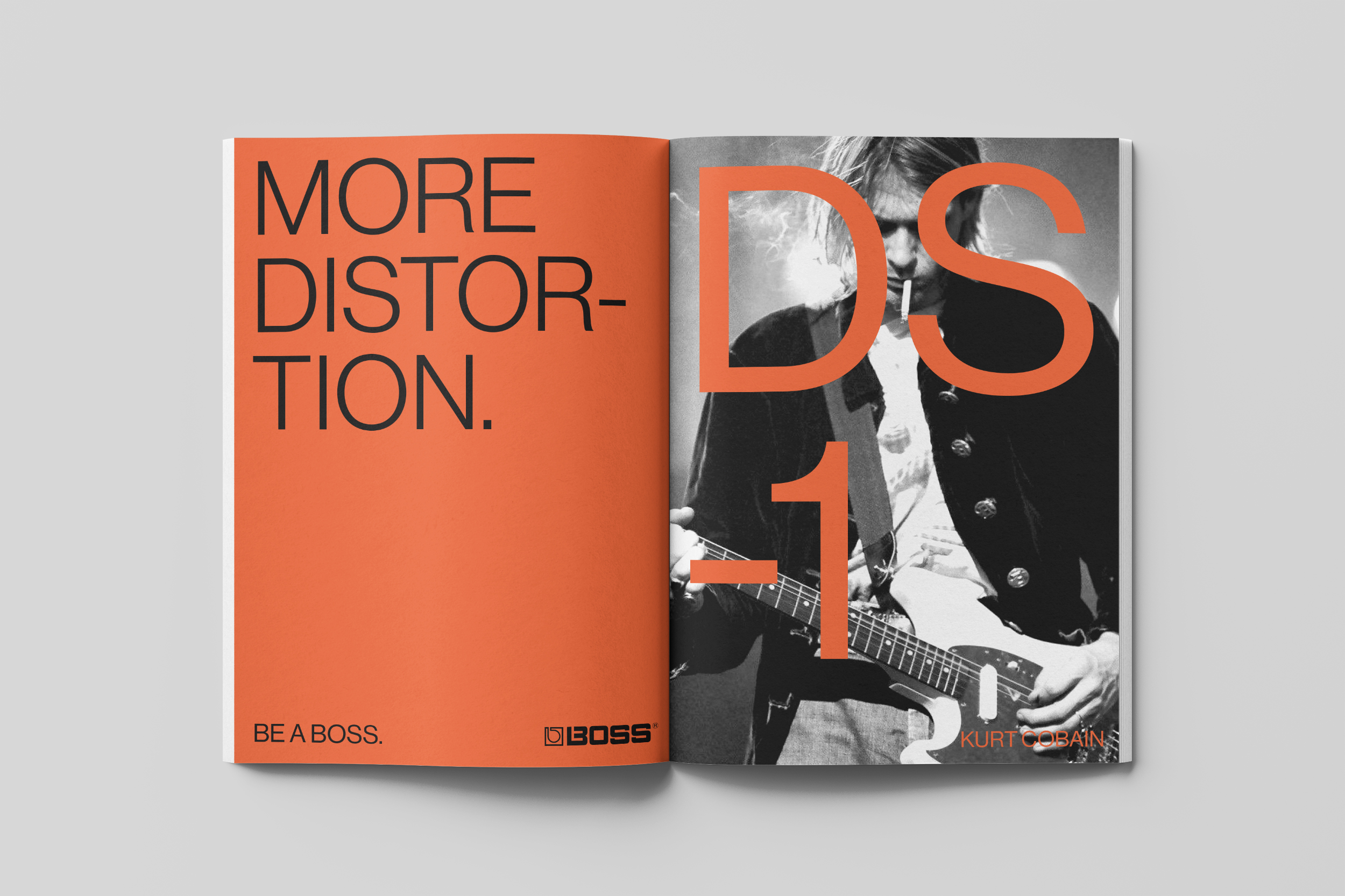
The secondary tagline “More________.” promoted the
idea that you can never have enough effects.
idea that you can never have enough effects.

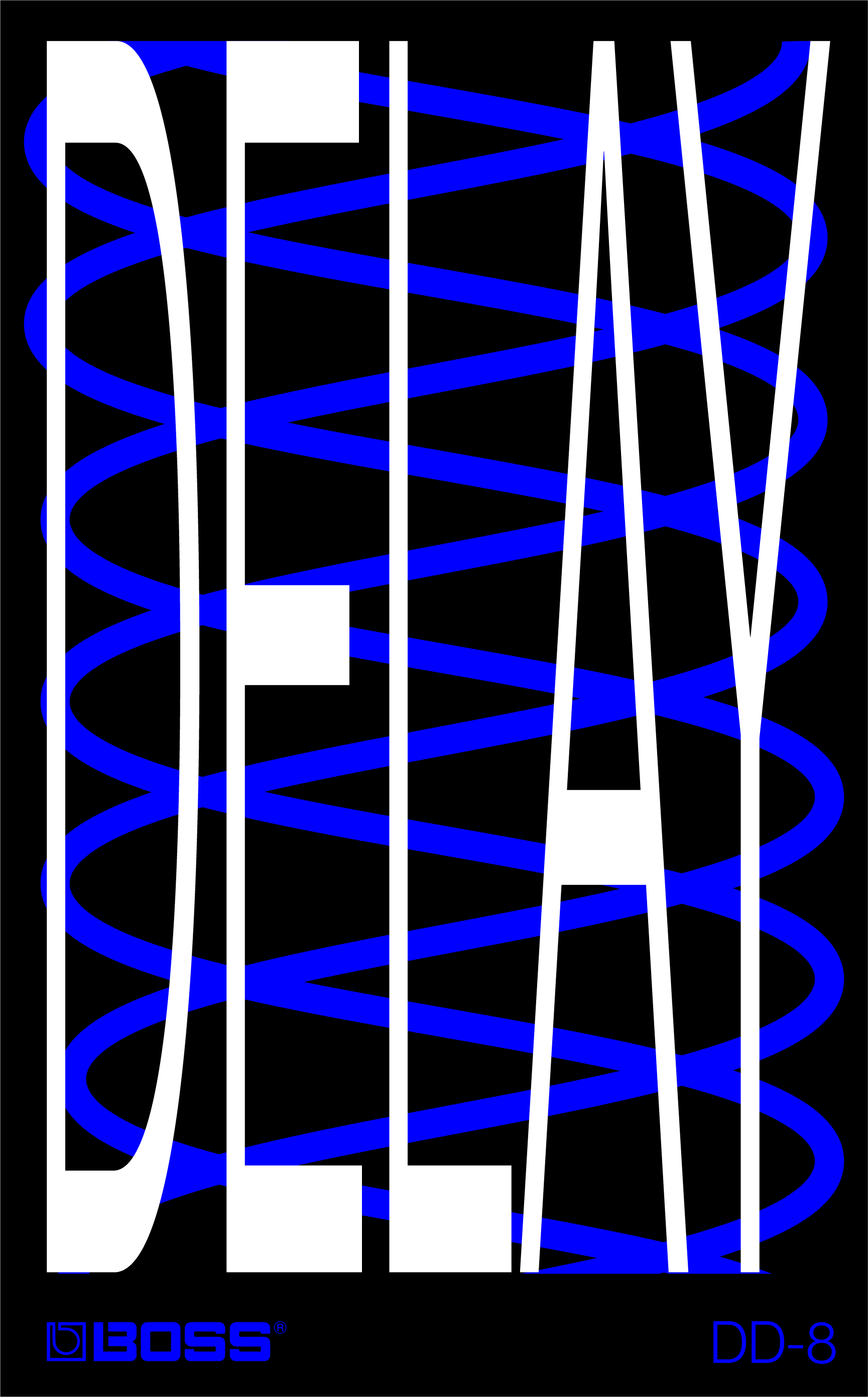

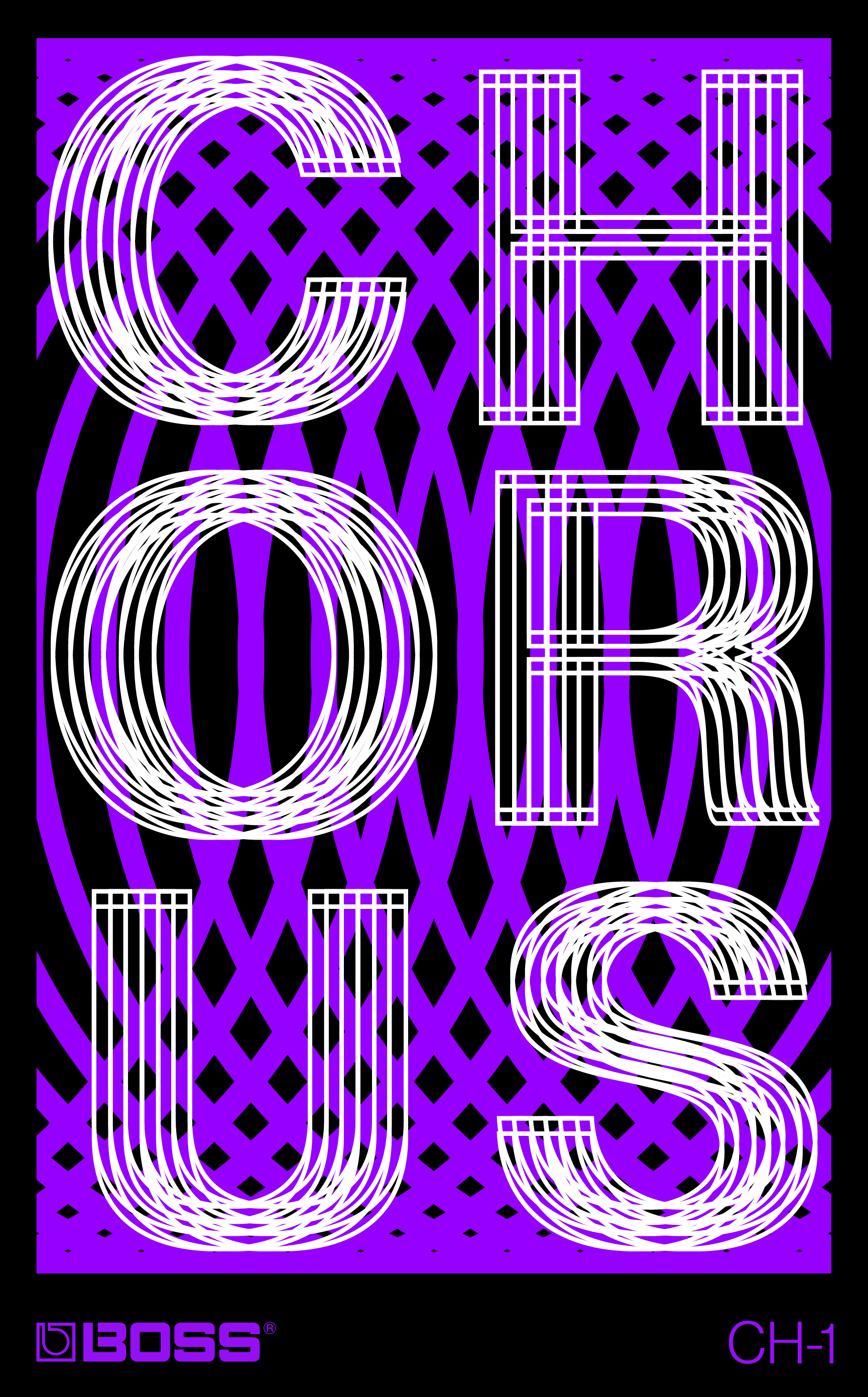
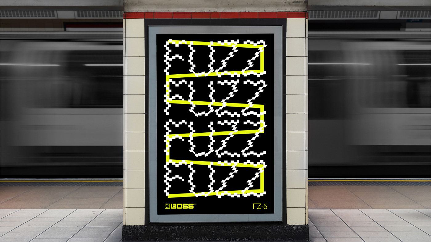
Custom type treatments were combined with a graphic visualization of each effect’s sonic waveform as viewed through an oscilloscope.


Color & Typography
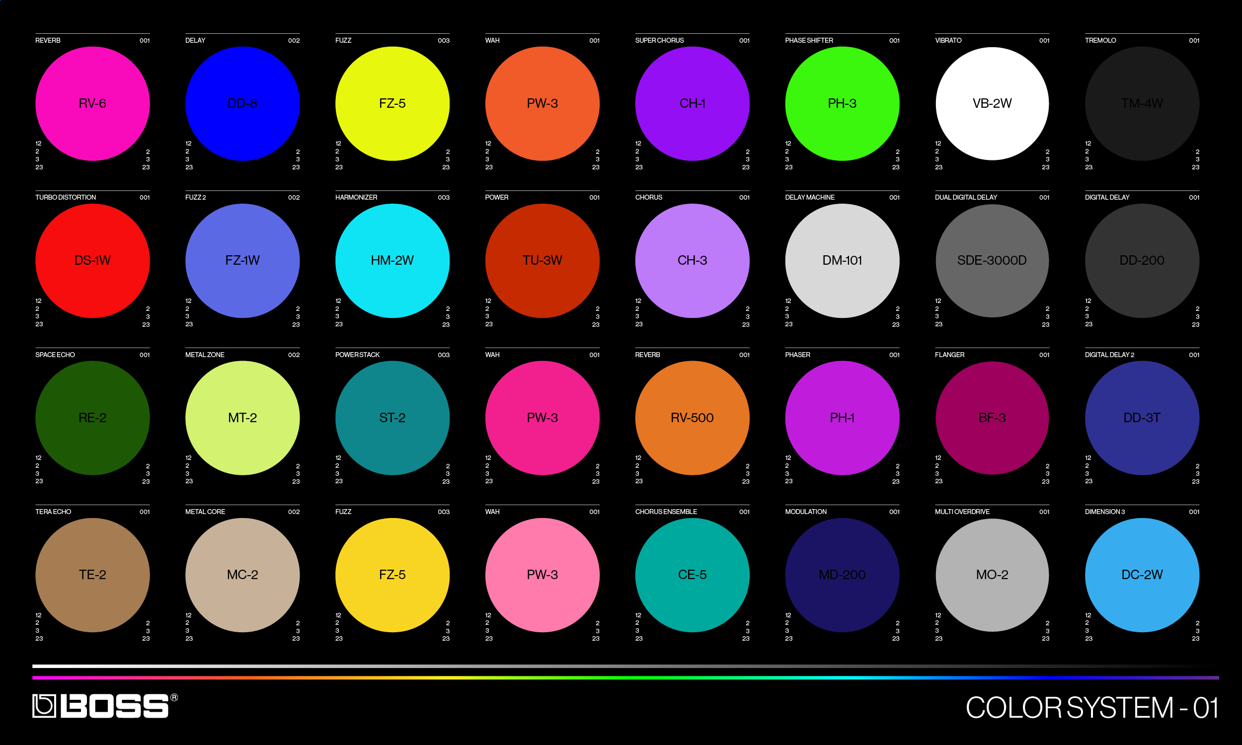

The color-coded system assigned each individual pedal to a separate hue. Highly saturated and vibrant neon colors communicate the energy of music and also represent a live electric current.
Neue Haas Grotesk by Christian Schwartz was chosen for its precise clarity and to reflect the utilitarian functionality of the pedals themselves.
Neue Haas Grotesk by Christian Schwartz was chosen for its precise clarity and to reflect the utilitarian functionality of the pedals themselves.
The campaign utilized a flexible grid system.


Motion
The motion system brought the typography to life,
simulating a kinetic, visual representation of each
pedal effect.
simulating a kinetic, visual representation of each
pedal effect.
OOH


Social
Print
TV End Card
Agency:
Studio B
(Personal Work)
Client:
BOSS
Sector:
Music
Type:
Campaign
What I Did:
Art Direction
Design
Animation
Studio B
(Personal Work)
Client:
BOSS
Sector:
Music
Type:
Campaign
What I Did:
Art Direction
Design
Animation
This was a self-initiated personal project.
Challenge:
Guitar sales are down and guitar-based music is being challenged by the popularity of new music genres. BOSS pedals needed to create a campaign that generated excitement and re-captured the iconic and innovative spirit of the brand as well as their diverse lineup of products.
Insight:
Guitar players are addicted to collecting pedals and can never have “enough.”
Solution:
“BE A BOSS” is a campaign that highlights the way each guitarist shapes and controls their own signature sound through the different combination of pedals they choose. Informed by the insight that guitarists love to collect pedals, a secondary tagline “More________.” promoted the idea that you can never have enough effects.
Visually striking, animated posters combined custom type treatments with a graphic visualization of each effect’s sonic waveform as viewed through an oscilloscope.
Neue Haas Grotesk typeface by Christian Schwartz was chosen to reflect the utilitarian functionality of the pedals themselves while highly saturated and vibrant neon colors communicate the energy of music and also represent a live electric current.
Finally, the campaign also uses photos of real musical bosses—iconic artists and musicians known for using BOSS pedals.
Result:
The campaign is both a celebration of the past and a look towards the future—empowering customers to take control of their creative and musical destinies.
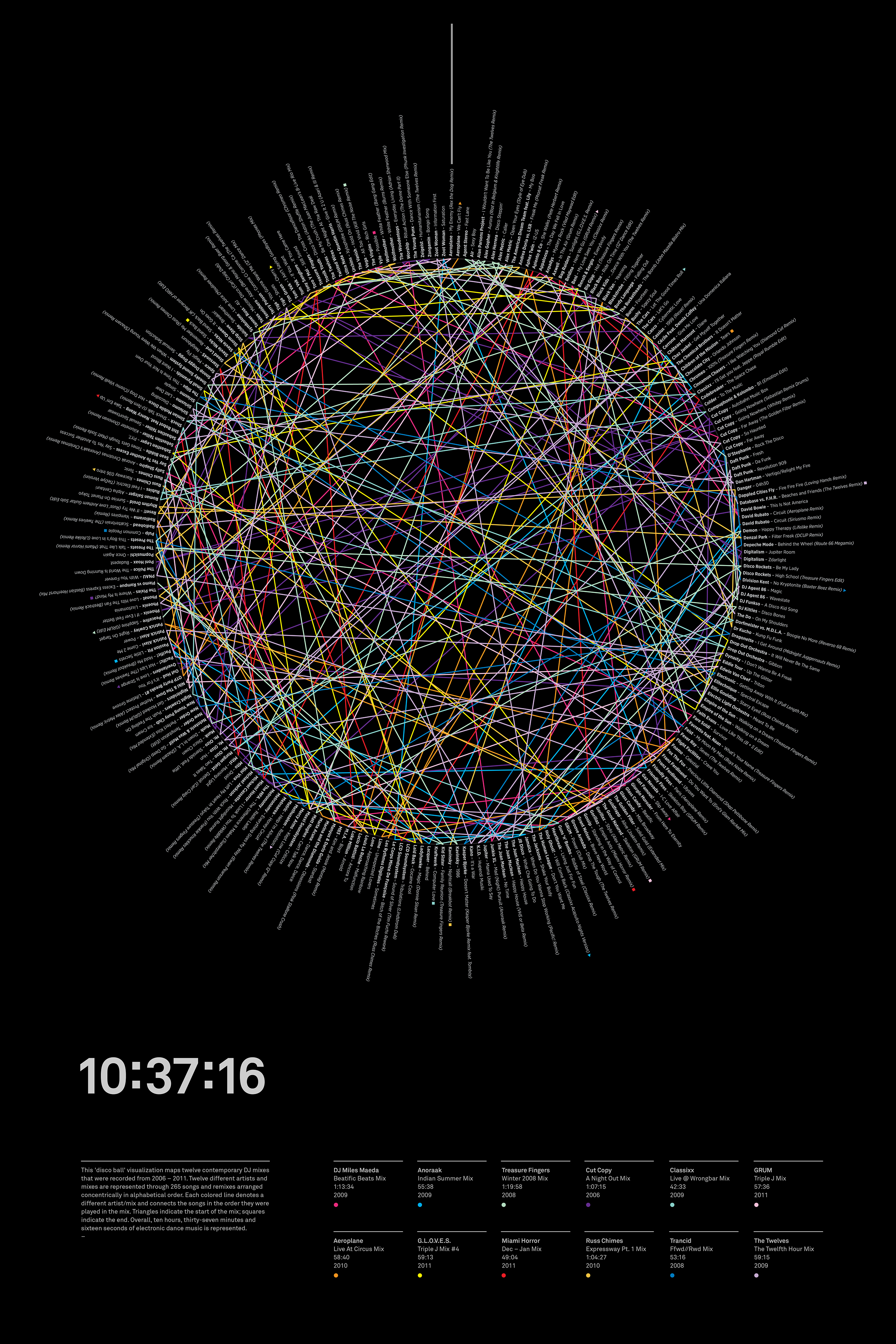
Bloghouse
A “discoball” data visualization mapping 12 DJ sets across 10 hours, 37 minutes and 16 seconds of “Bloghouse” electronic dance music.
Agency:
Studio B
(Personal Work)
Type:
Poster Design
Data Visualization
Role:
Art Direction
Design
Studio B
(Personal Work)
Type:
Poster Design
Data Visualization
Role:
Art Direction
Design
Bloghouse was a cultural movment, party scene and electronic dance music microgenre during the mid to late 00’s.
Using a discoball for its strong associations with dance and nightclub culture, this “discoball” data visualization maps twelve contemporary “Bloghouse” DJ mixes that were recorded from 2006 – 2011. Twelve different artists and mixes are represented through 265 songs and remixes arranged concentrically in alphabetical order. Each colored line denotes a different artist/mix and connects the songs in the order they were played in the mix. Triangles indicate the start of the mix; squares indicate the end. Overall, approximately ten hours, thirty-seven minutes and sixteen seconds of electronic dance music is represented.
4-Color Offset Print
24” x 36”
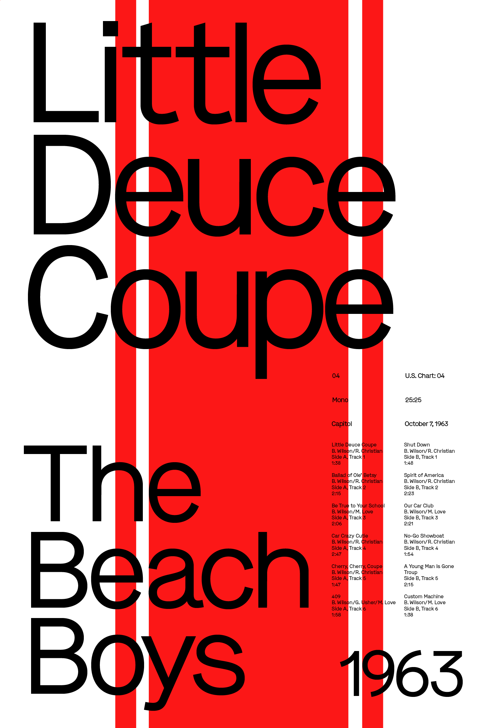
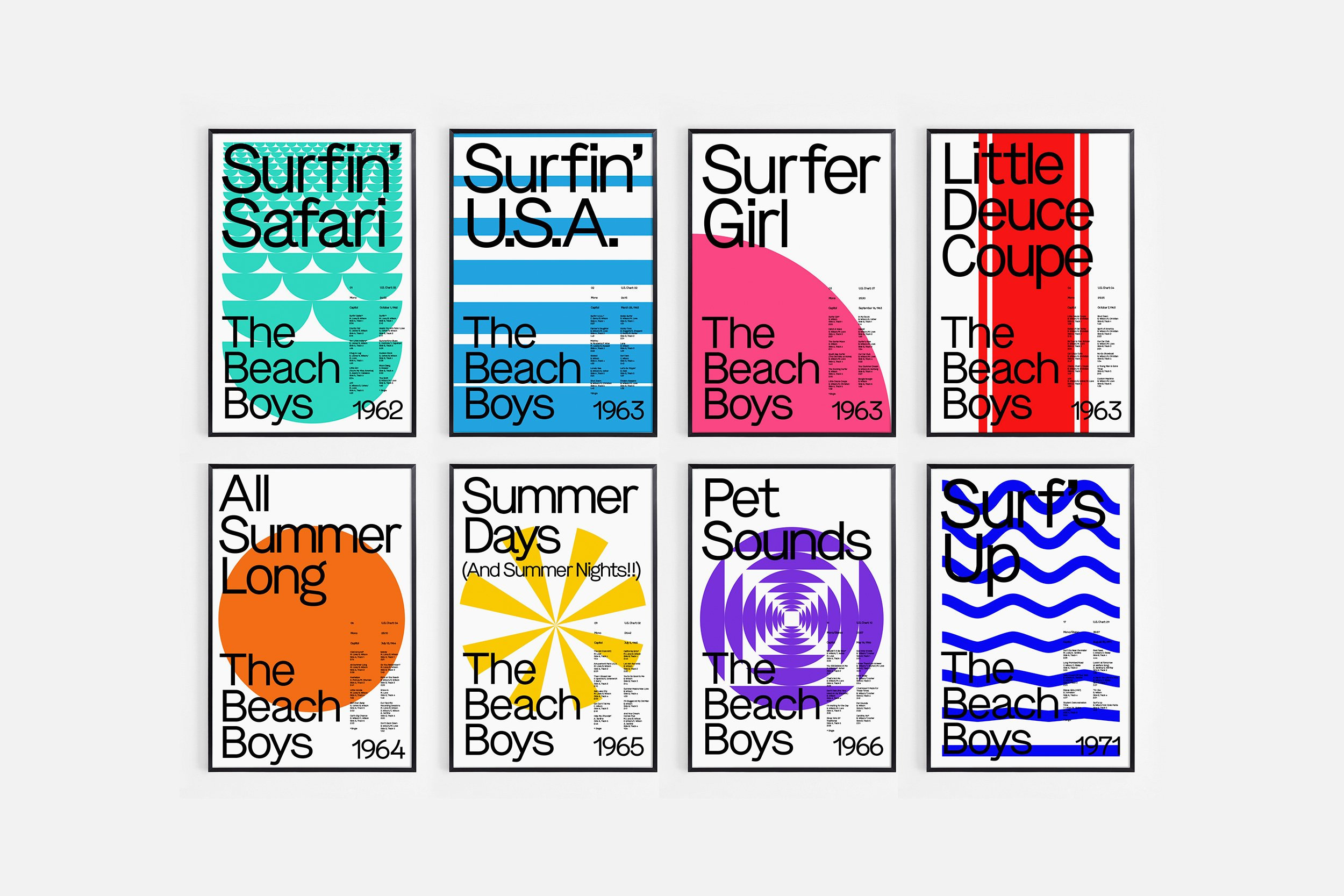
Good Vibrations
A poster series inspired by California Rock band The Beach Boys.


Agency:
Studio B
(Personal Work)
Type:
Poster Design
Data Visualization
Role:
Art Direction
Design
Studio B
(Personal Work)
Type:
Poster Design
Data Visualization
Role:
Art Direction
Design
A poster series featuring 8 key studio albums from Southern California Rock/Pop band The Beach Boys that were released from 1962–1971. Each poster documents the album name, order released in their discography, highest U.S. chart position, audio format, record label, date released and track information.
The grid-based design, bold colors and Swiss typography reflect the diverse mix of Swiss, Psychedelic, Pop and Op Art design influences of the period.
4-Color Offset
24” x 36”
The grid-based design, bold colors and Swiss typography reflect the diverse mix of Swiss, Psychedelic, Pop and Op Art design influences of the period.
4-Color Offset
24” x 36”