Mind Mischief
A self-initiated / spec work visual identity and campaign for psychedelic-pop band Tame Impala inspired by my passion for music and lettering.
Logo
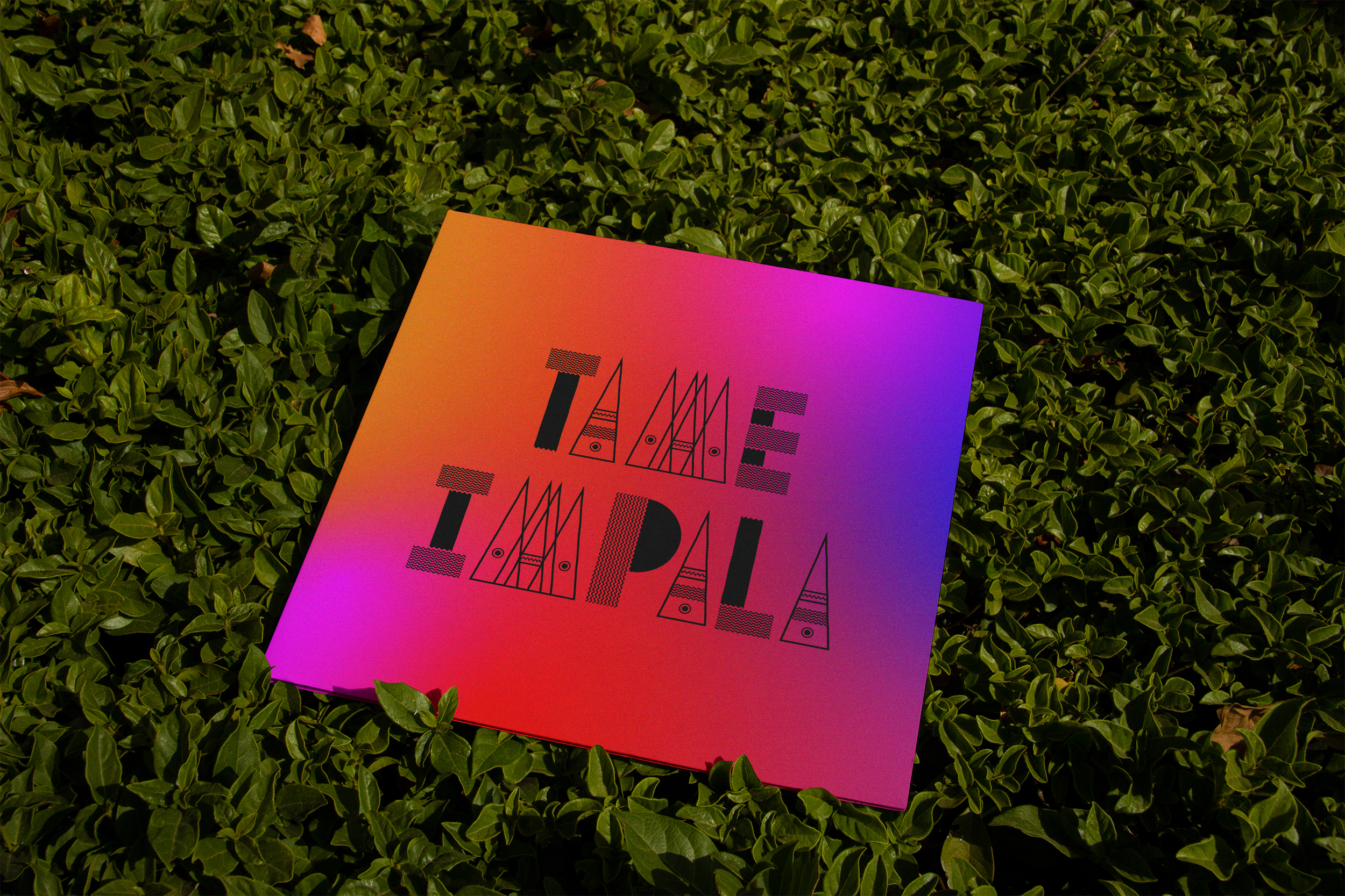
Informed by the music, the custom wordmark was designed to be semi-transparent and also psychedelic in nature.
An animated, abstract, neon gradient was a visual representation of the song name.
An animated, abstract, neon gradient was a visual representation of the song name.
Microsite
The brand identity also utilized Microgramma—
Tame Impala’s official brand typeface.
Tame Impala’s official brand typeface.
Social


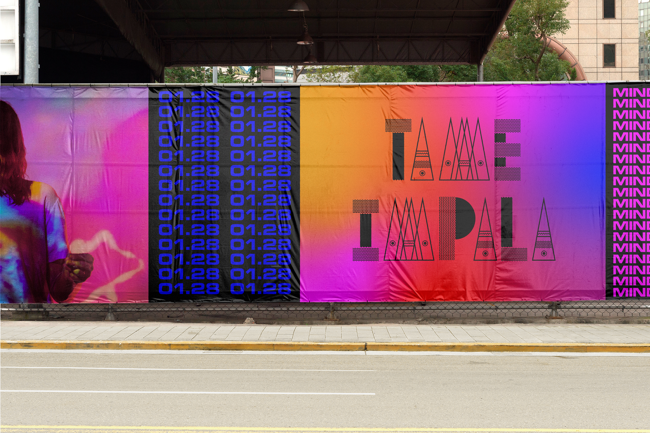
The campaign was extended across digital and printed touchpoints.
Collateral


OOH


Live Show

Agency:
Studio B
(Spec Work)
Client:
Tame Impala
Sector:
Music & Entertainment
Type:
Visual Identity
Campaign
What I Did:
Everything
Studio B
(Spec Work)
Client:
Tame Impala
Sector:
Music & Entertainment
Type:
Visual Identity
Campaign
What I Did:
Everything
This was a self-initiated personal project initially inspired by my passion for lettering.
Challenge:
Tame Impala needed a campaign and visual identity to promote the release of their new single “Mind Mischief.”
Insight:
The name Tame Impala was inspired by the animals indigenous to South Africa.
Solution:
Informed by the psychedelic nature of the music, a custom lockup was created and a highly saturated, animated, abstract, gradient color field was used to symbolize a restless mind. Stacked and repeating typography typeset in the brands official typeface Microgramma was used to reflect the heavily processed and looping effects within the song. The full campaign extended across both physical and digital touchpoints.
Results:
The new identity connects the music to the band in an authentic and unique way.