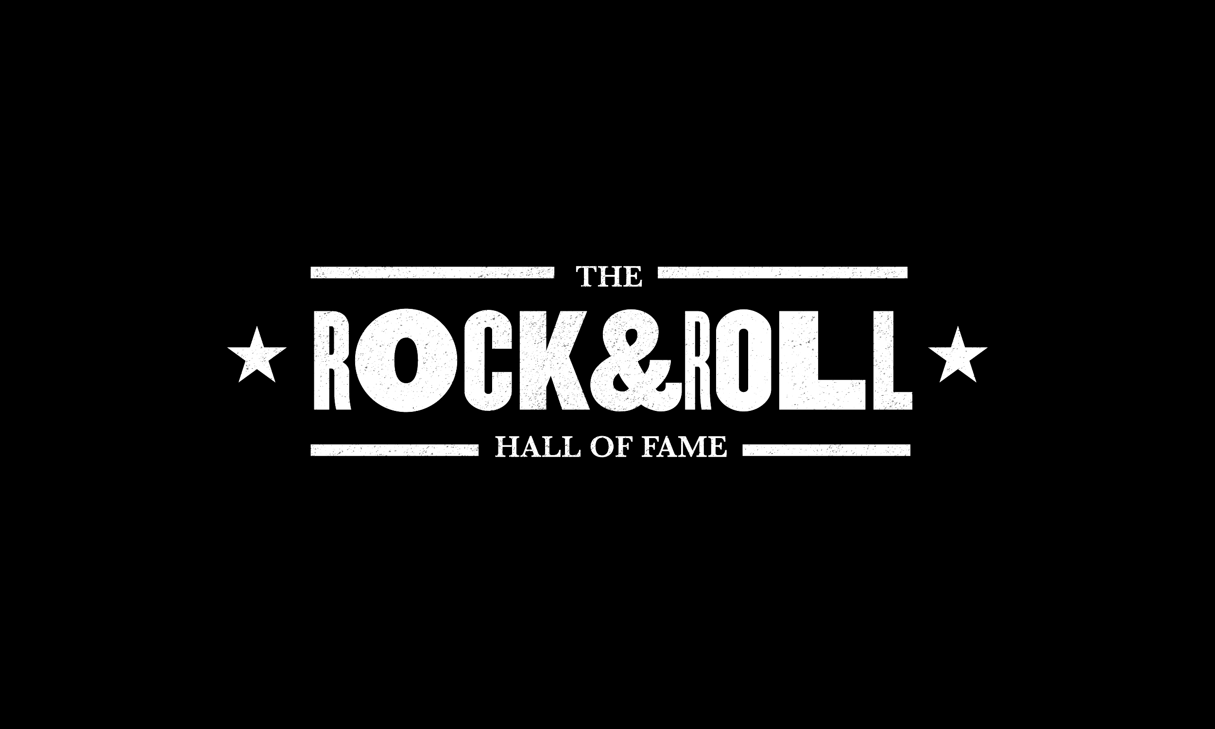
Let’s Rock
Inspiration
![]()
![]()

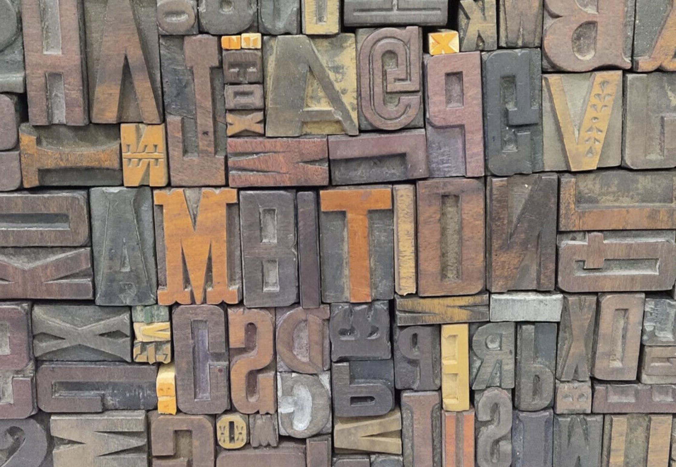
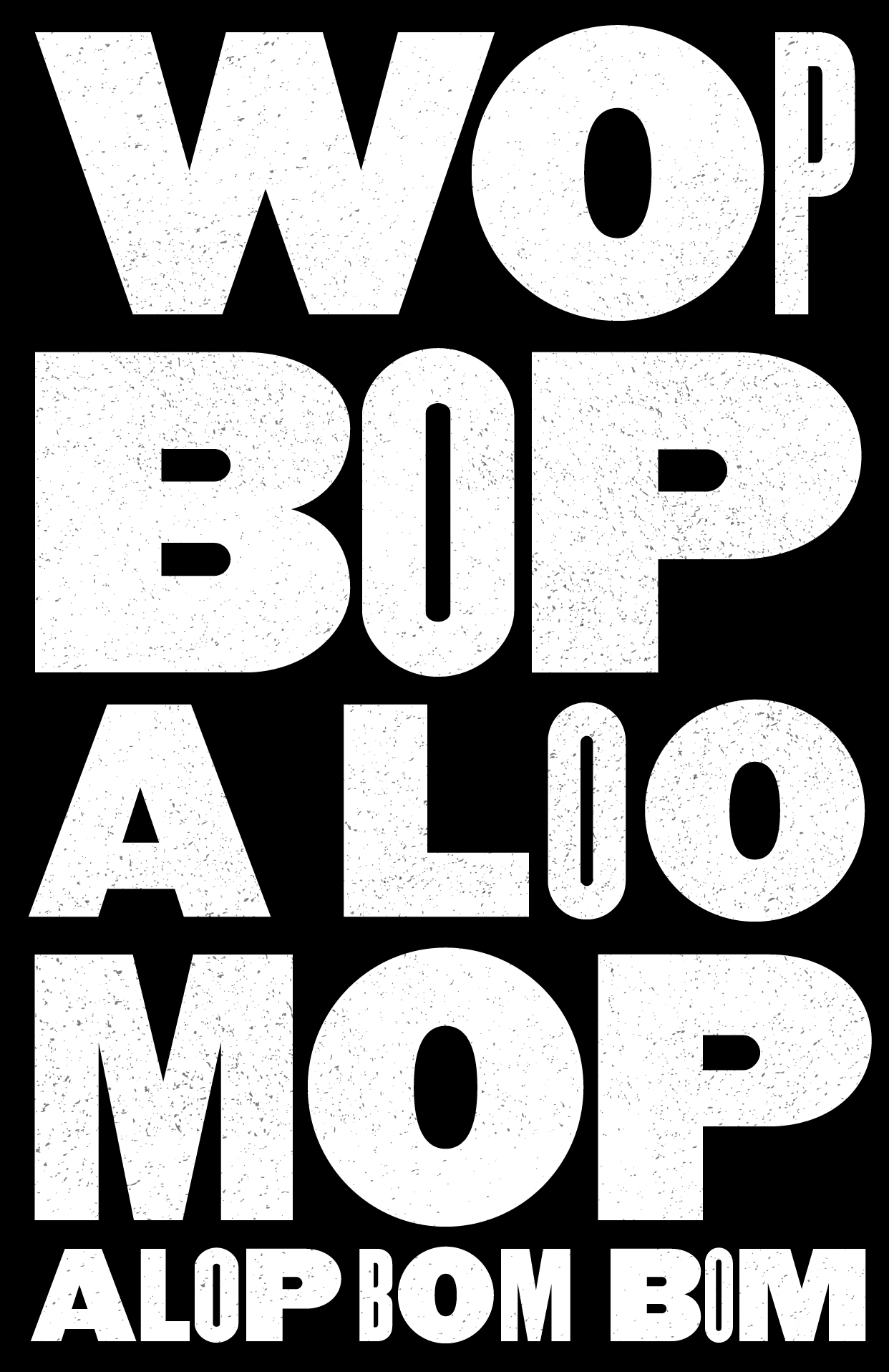
The visual language of the campaign was informed by American letterpress printing that was used in the mid-20th Century to create concert posters.
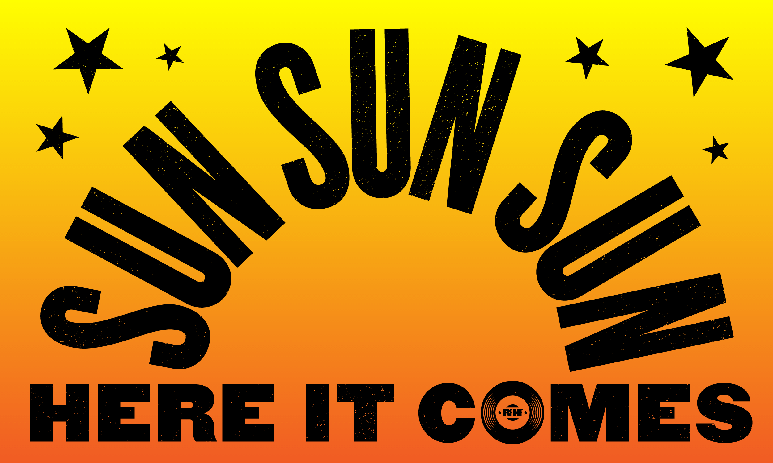
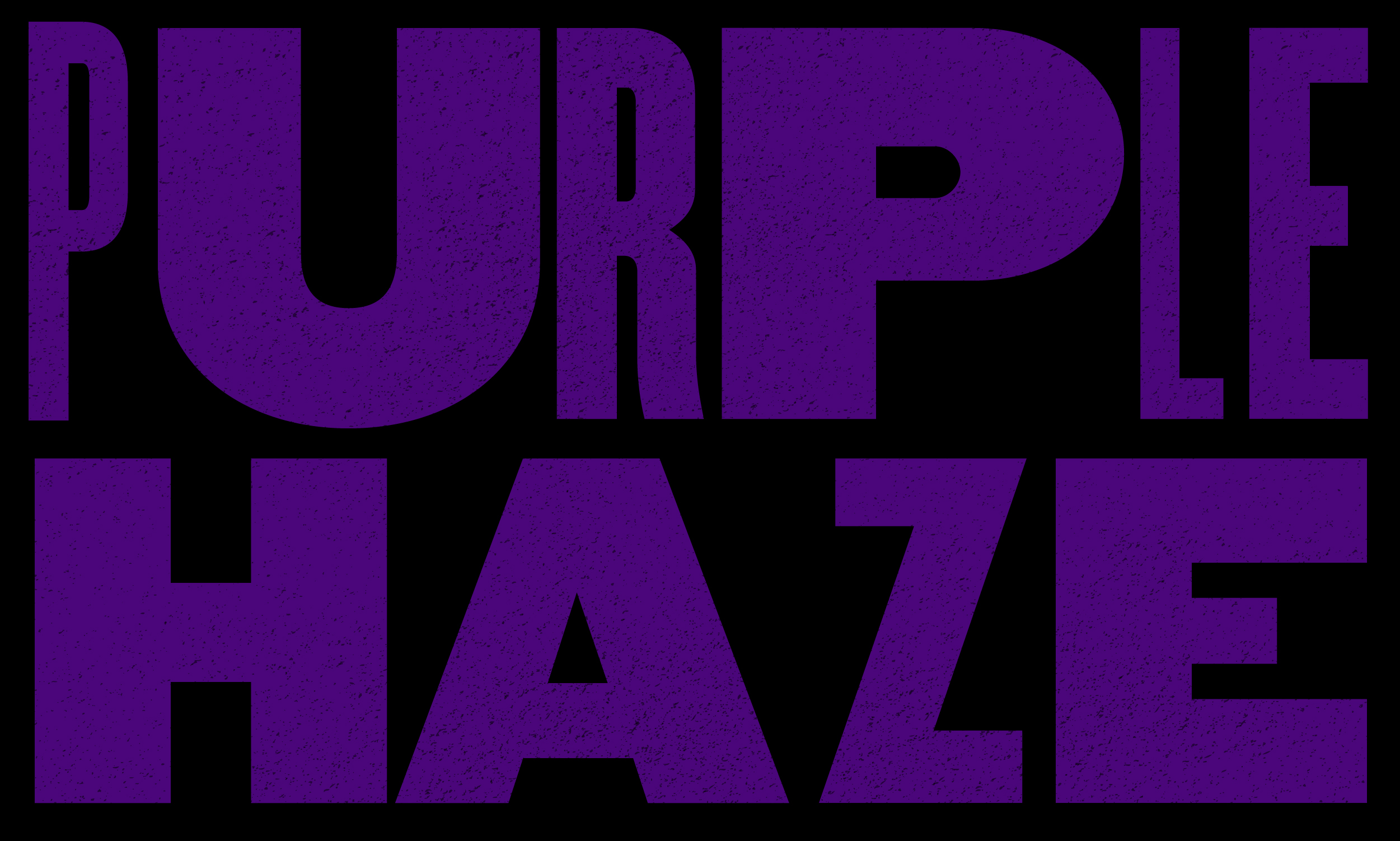
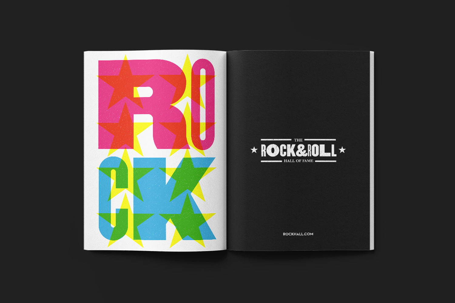
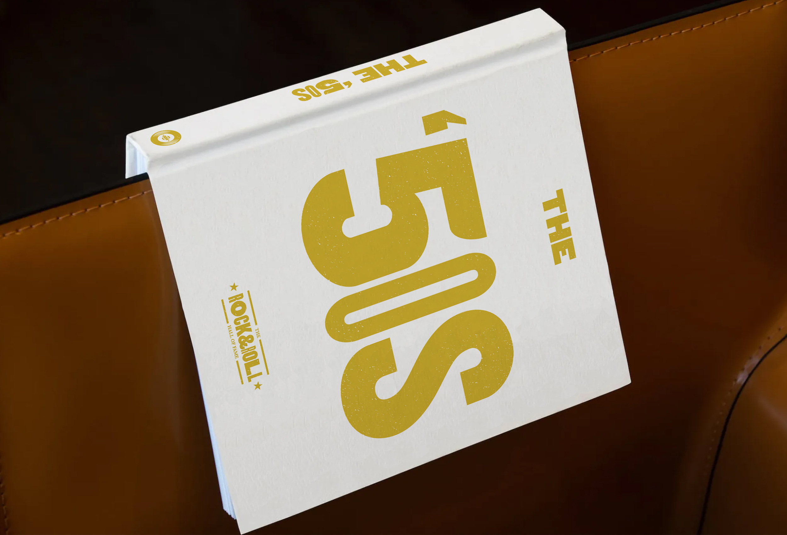
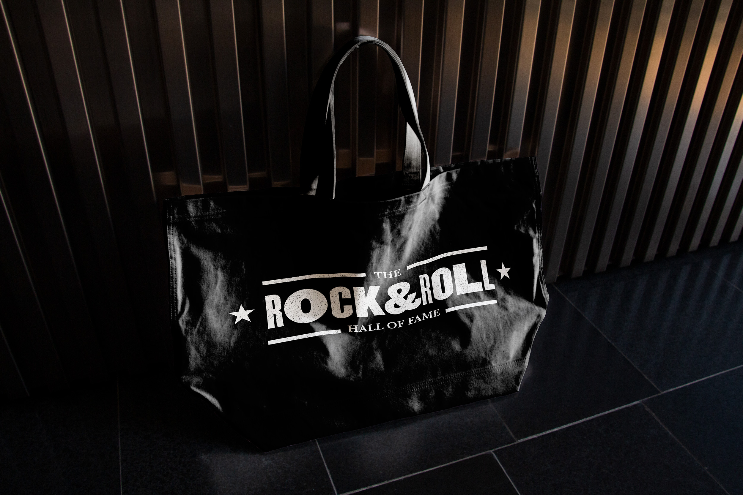
Logo
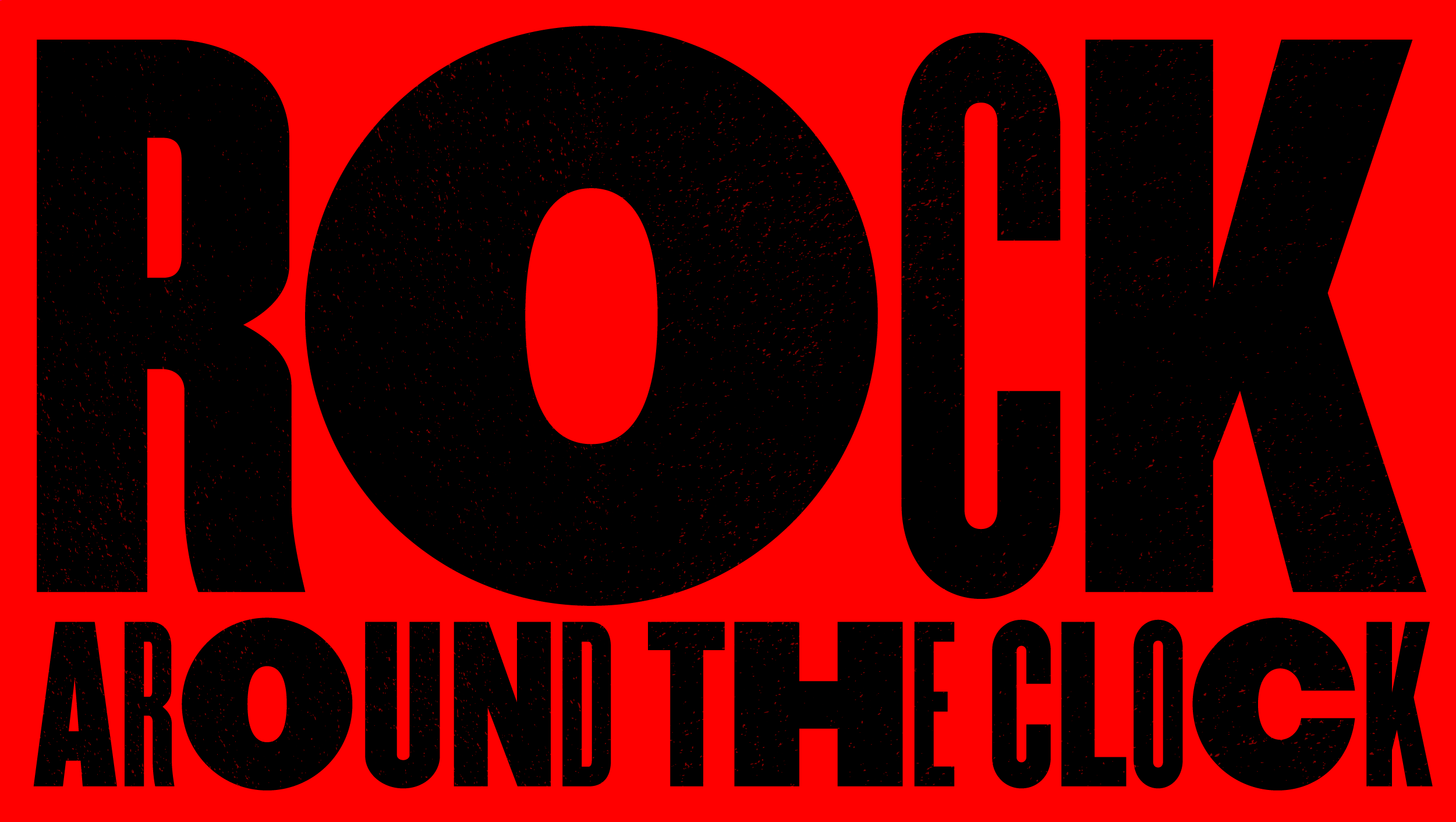
The distinctive new emblem was carefully designed to be recognizable at both small and large sizes and speaks to the tradition of letterpress printing.
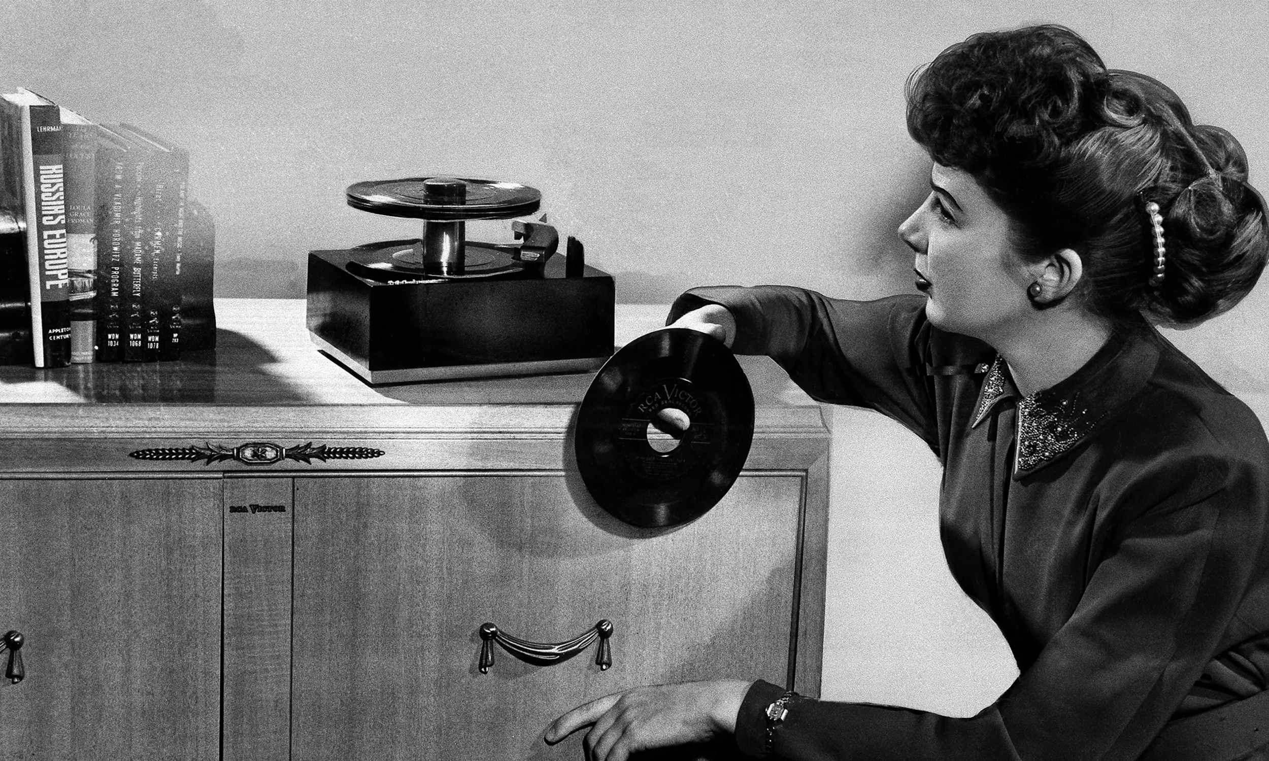

The pictorial brand mark is a 45 RPM single record—the most popular musical format during the golden age of Rock & Roll in the 1950s.
Bookended by two stars, they symbolize both stardom and the letterpress tradition.
Bookended by two stars, they symbolize both stardom and the letterpress tradition.
Color & Typography


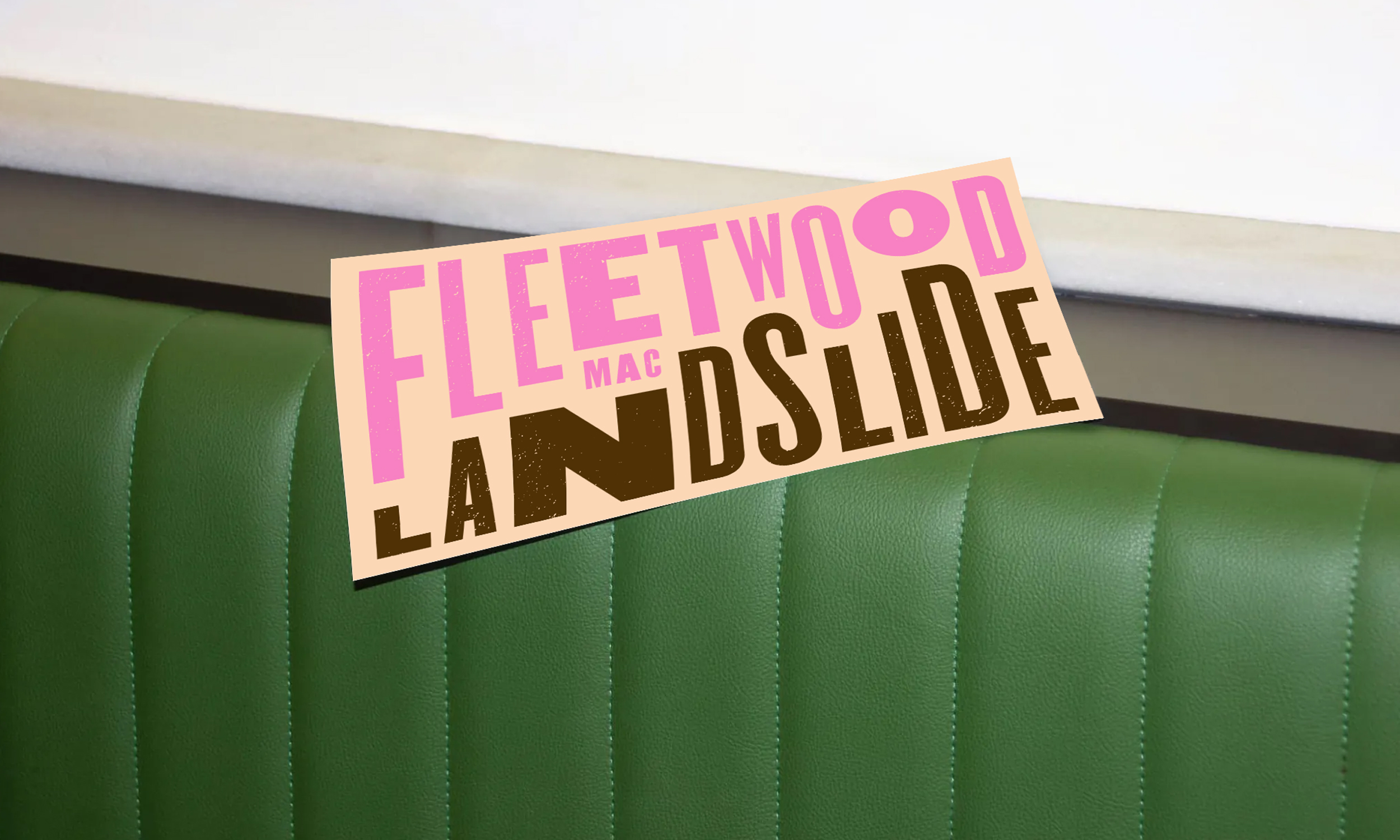
Utilizing traditional letterpress printing techniques, the full-spectrum color palette uses a combination of solid colors, neon “day-glo” gradients and transparent overprinting for maximum visual impact when viewed from far away.
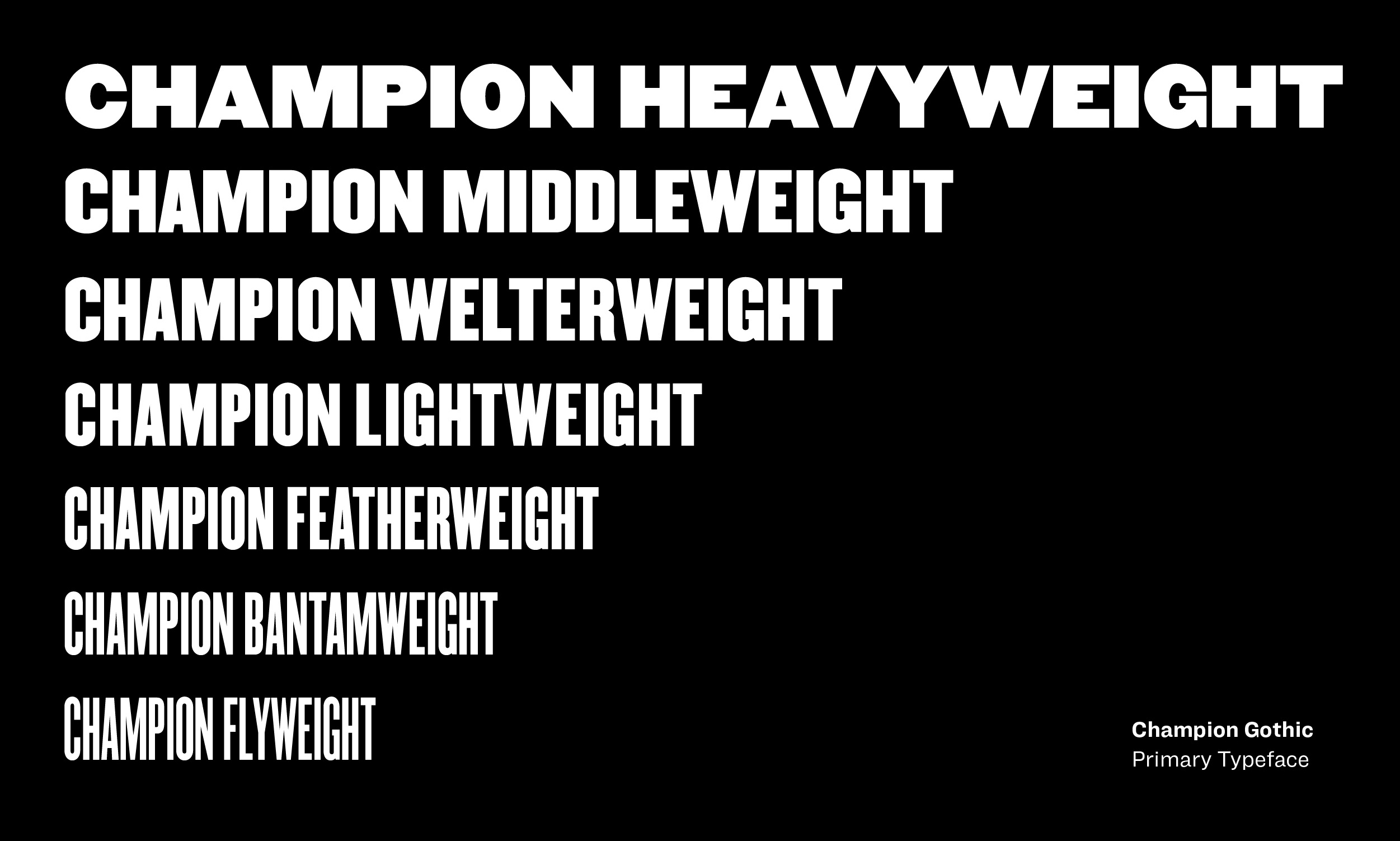
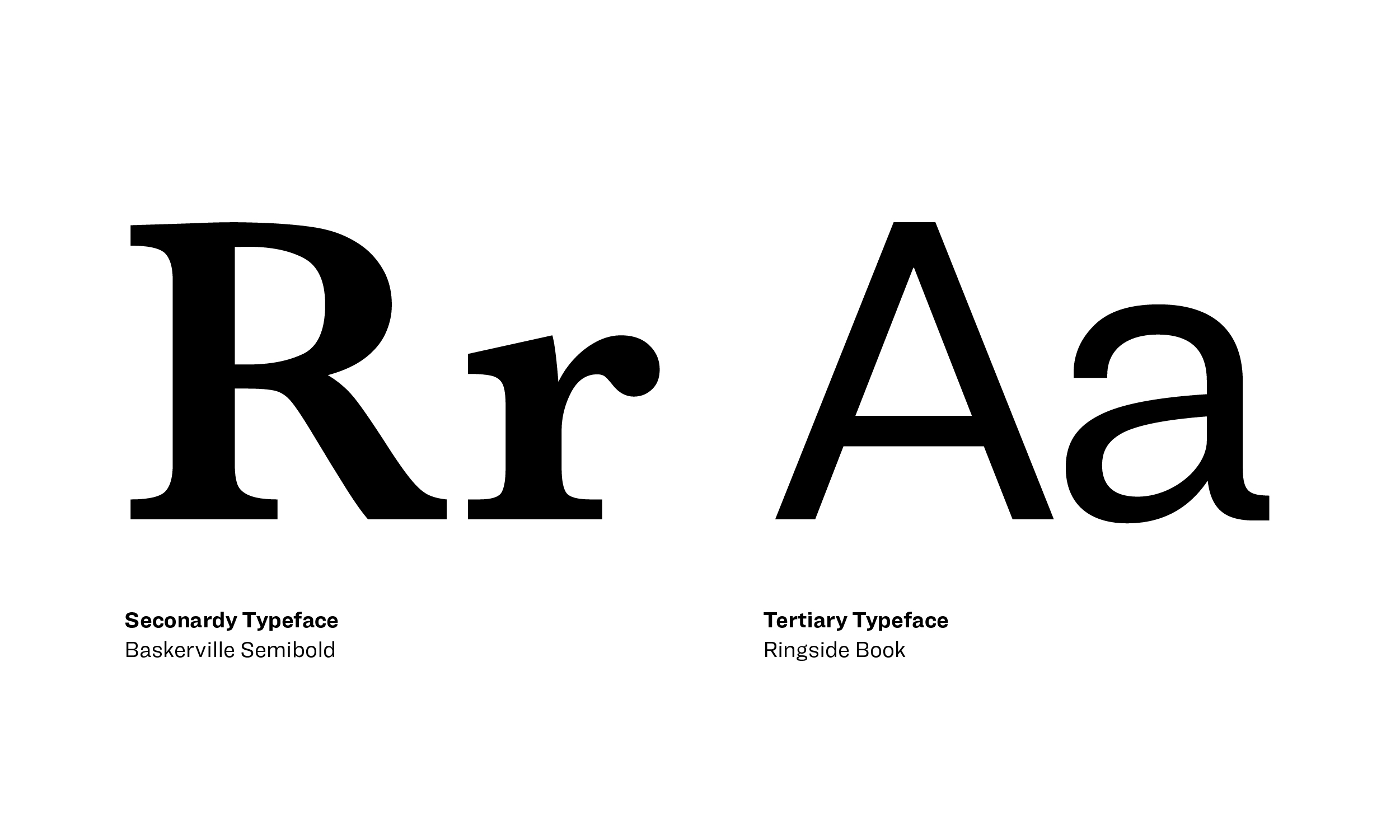
The primary typographic voice of the identity utilizes Champion Gothic by Hoefler&Co.—a bold display typeface in 7 weights that is inspired by American wood type. Baskerville Semibold is used as a complementary, secondary typeface. Also by H&C, Ringside Book is used for body copy and was designed specifically for small text sizes. The campaign type treatment included imperfect spacing and a subtle grain texture that added a visual authenticity to the campaign.
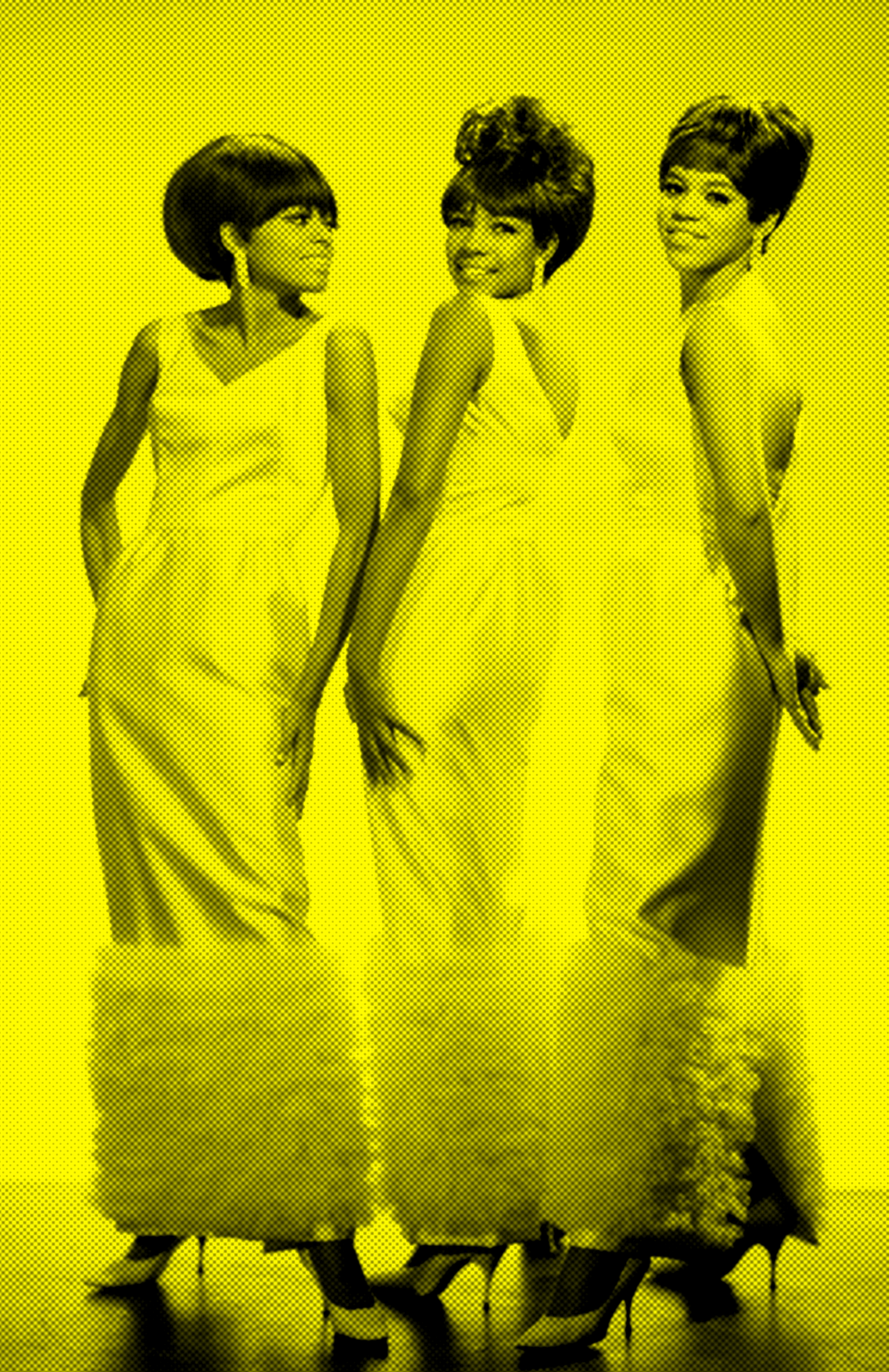
Photography

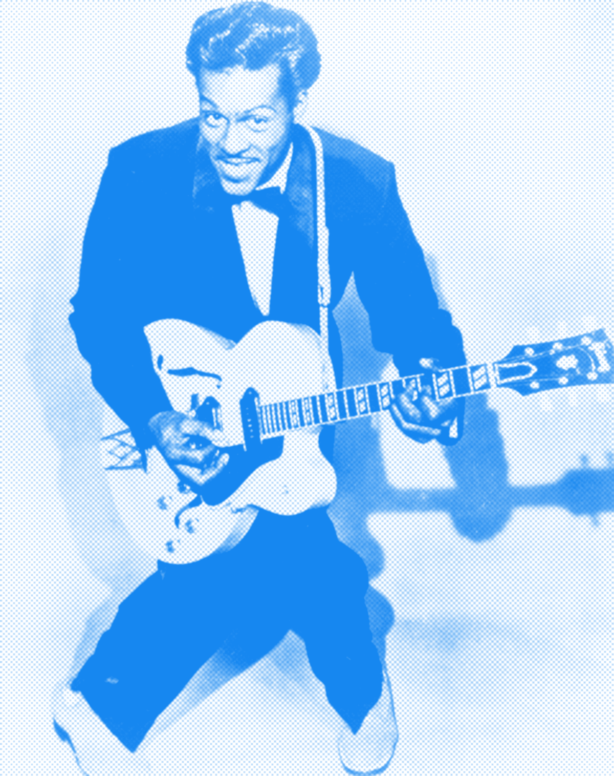
The photography style used halftone dot patterns that can be seen on the early rock and roll concert posters from the ‘50s.
The Campaign
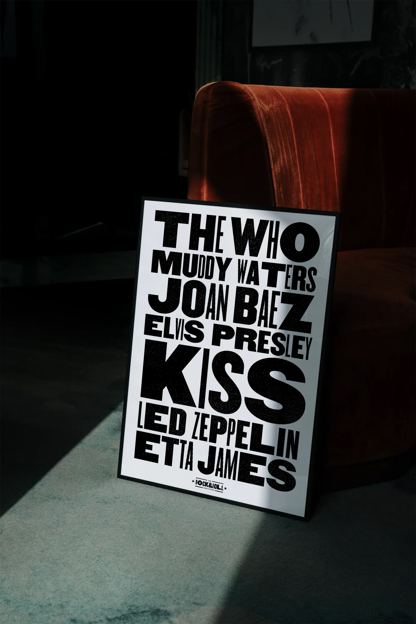
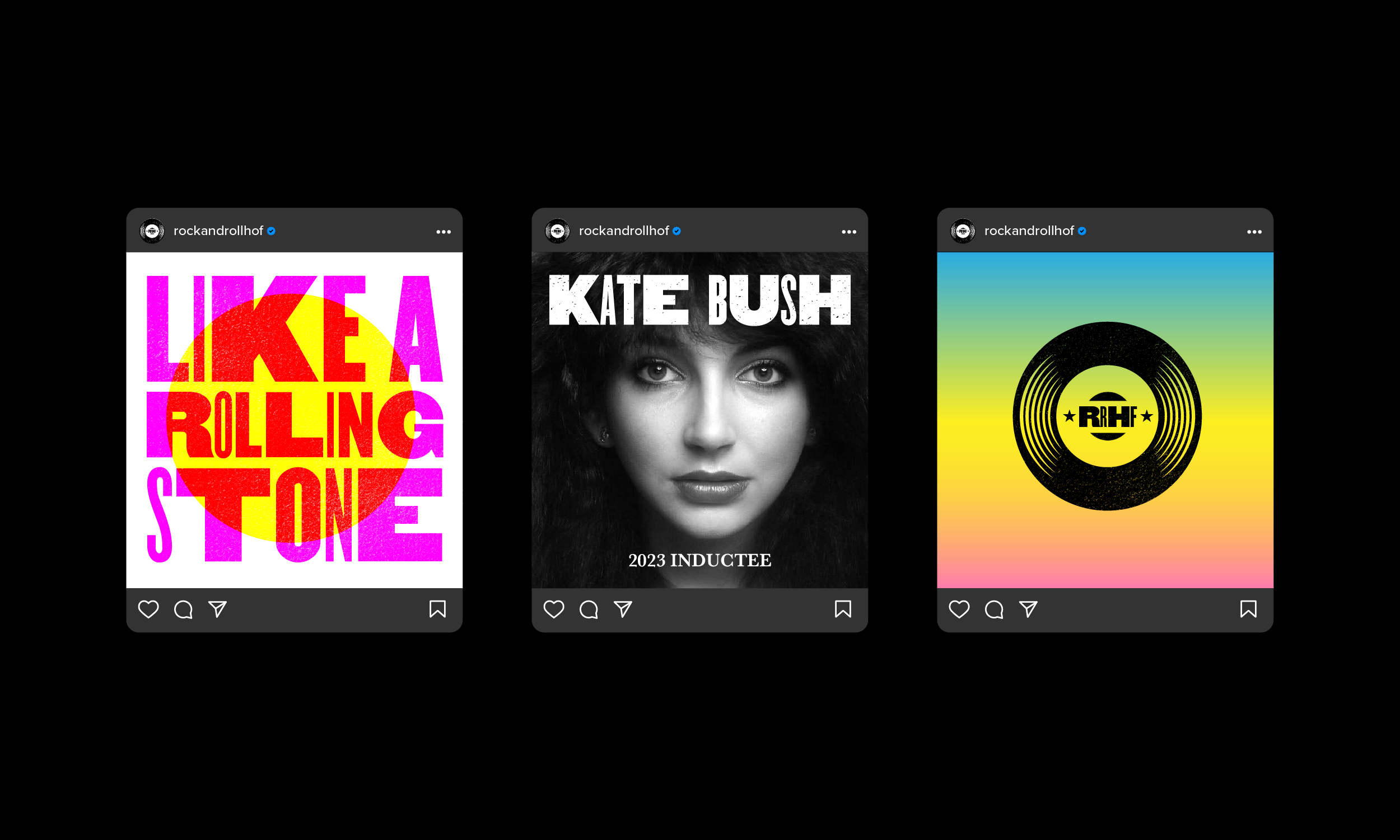
Targeted towards music buffs, the campaign featured iconic artists, songs, and lyrics from the Rock & Roll canon.
Reflecting the attitude, energy and fearless spirit of Rock and Roll, the campaign combined bold typography, photography, and color for maximum visual and emotional impact.
Reflecting the attitude, energy and fearless spirit of Rock and Roll, the campaign combined bold typography, photography, and color for maximum visual and emotional impact.


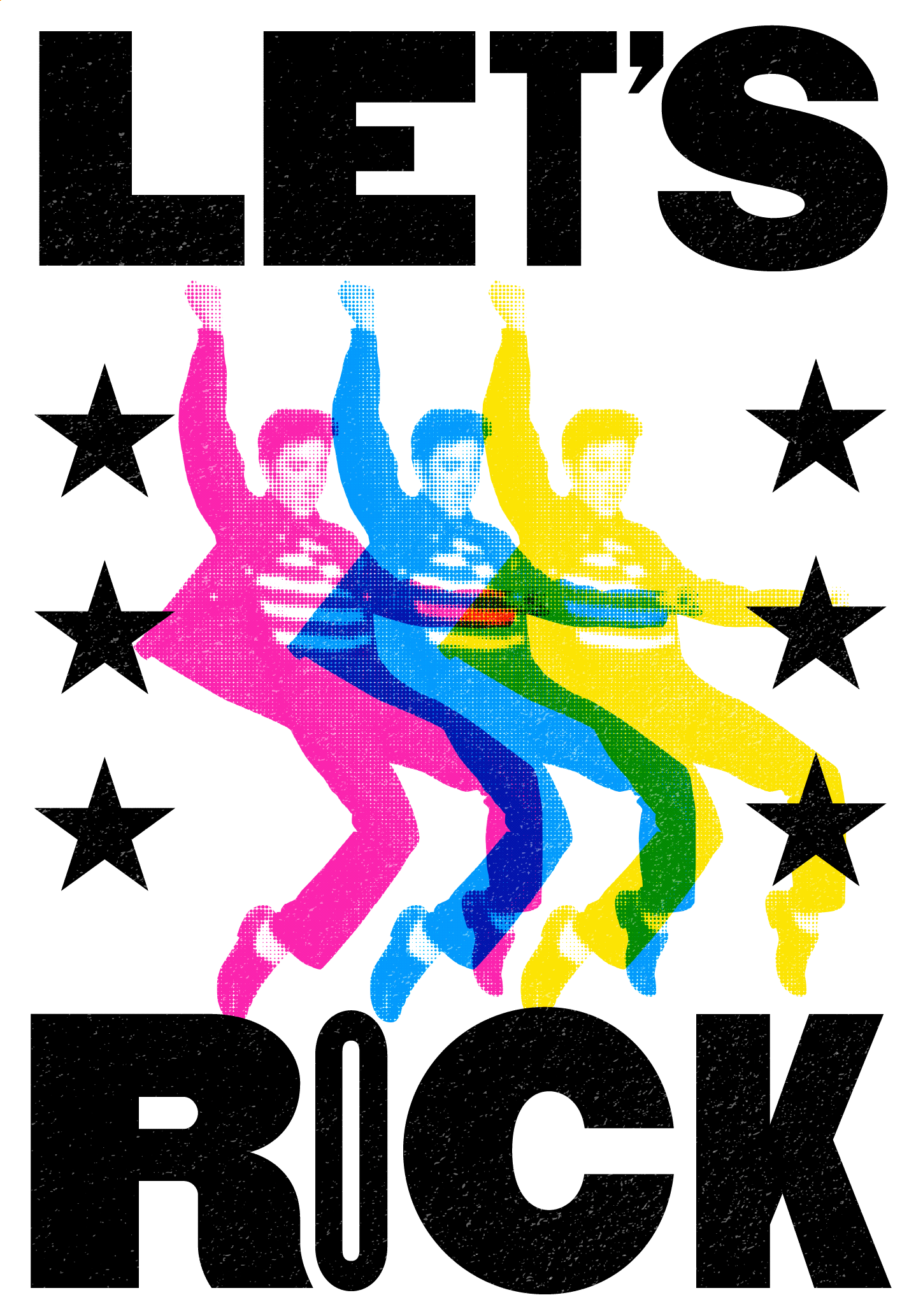

Taken from the lyrics of Elvis Presley’s 1957 #1 single Jailhouse Rock, the campaign was titled “Let’s Rock.”
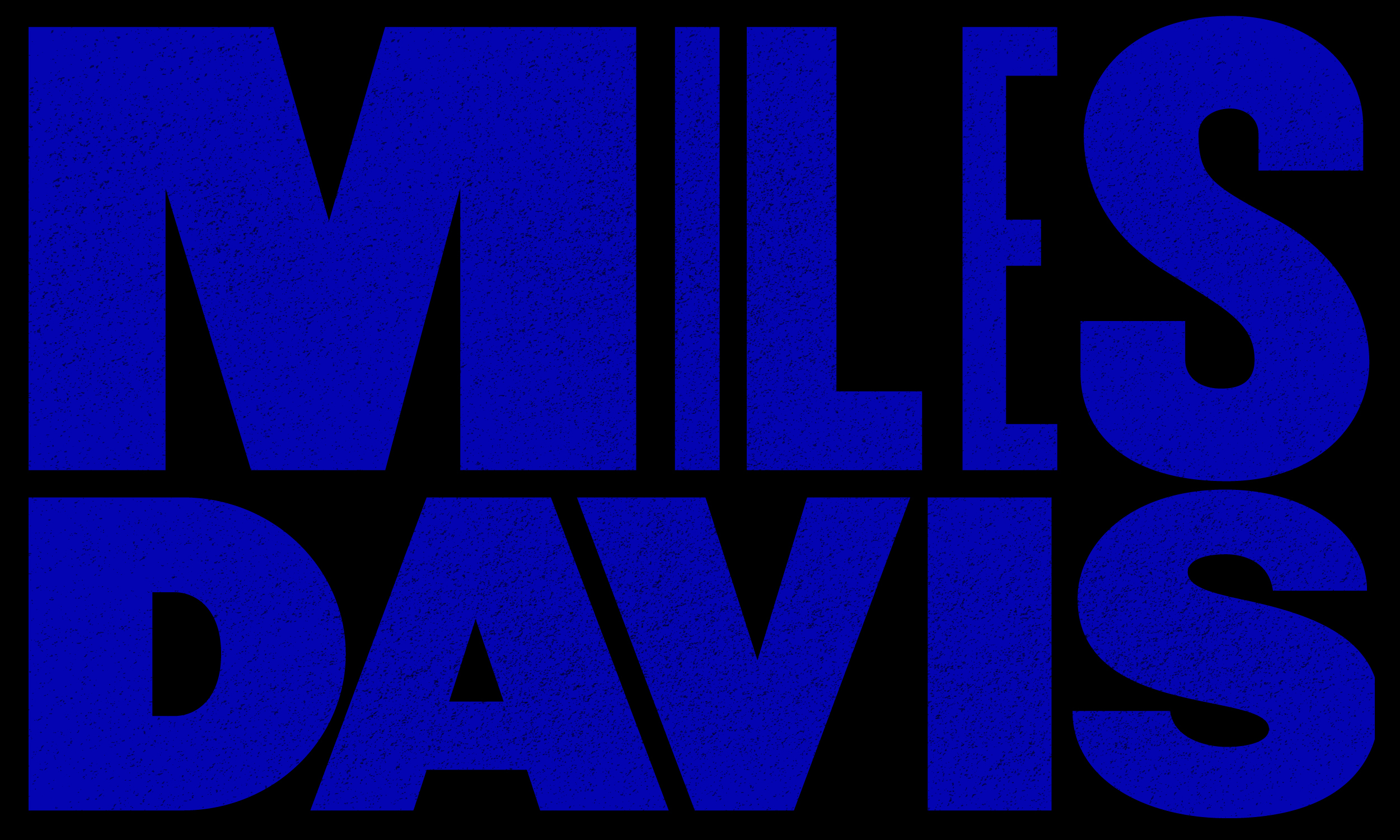

The extreme visual contrast between the different letterform weights creates a “singing” typographic rhythm that reflects the dynamic highs and lows of music.


Using color and form to reflect the subject matter, the flexible design system allowed for multiple approaches.


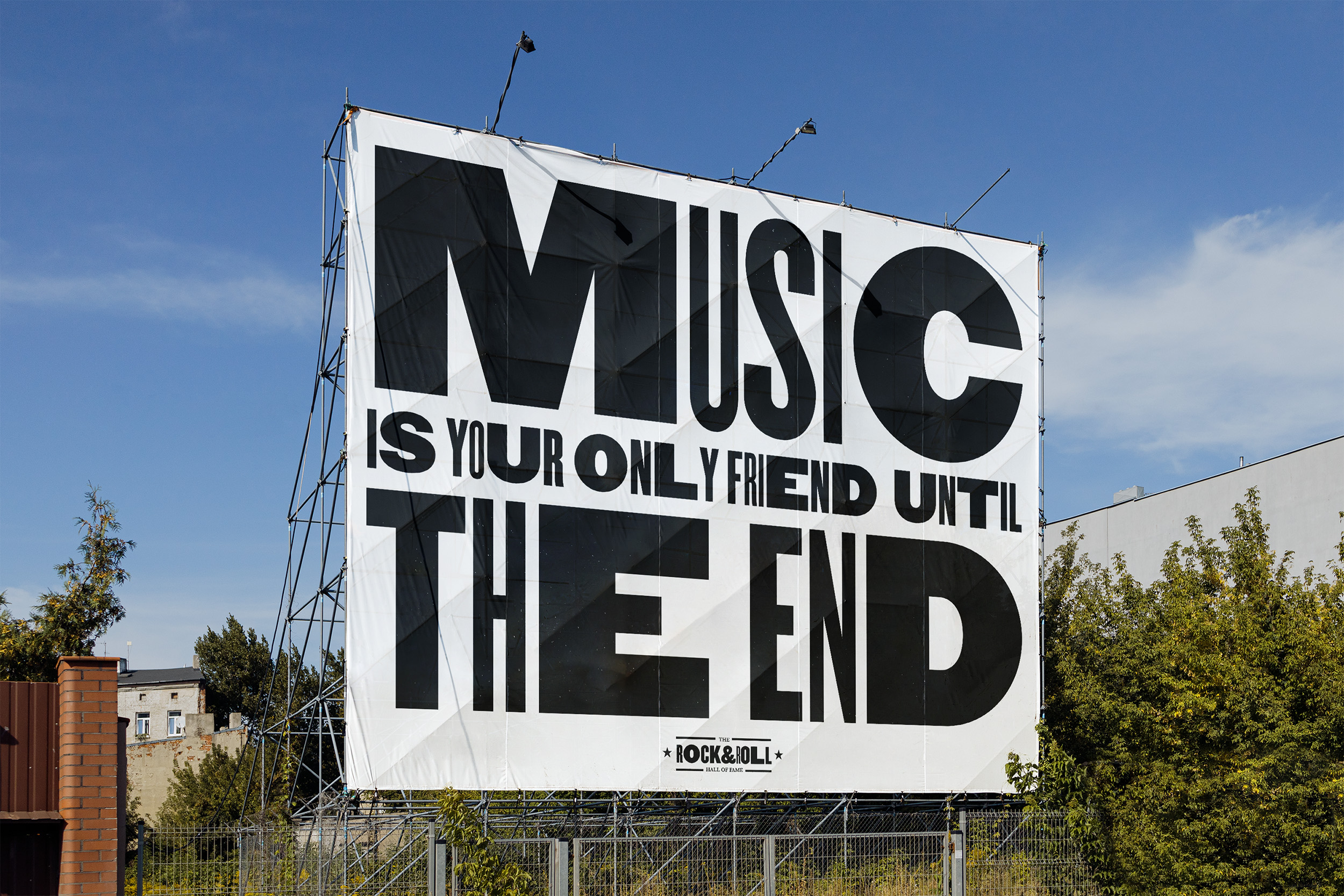
OOH

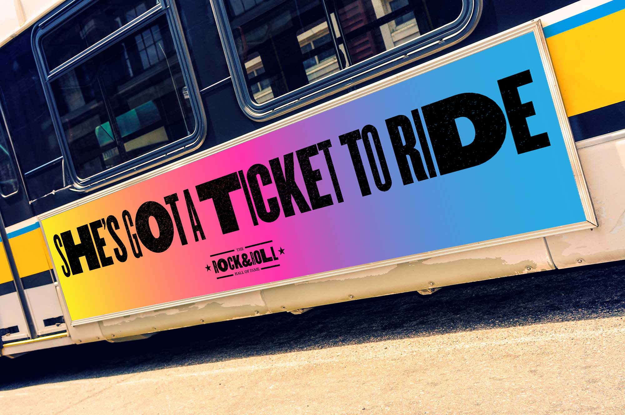


Using the meaning of the artists, songs and lyrics to play off the surrounding environment, each OOH ad was targeted to a specific location for maximum impact.

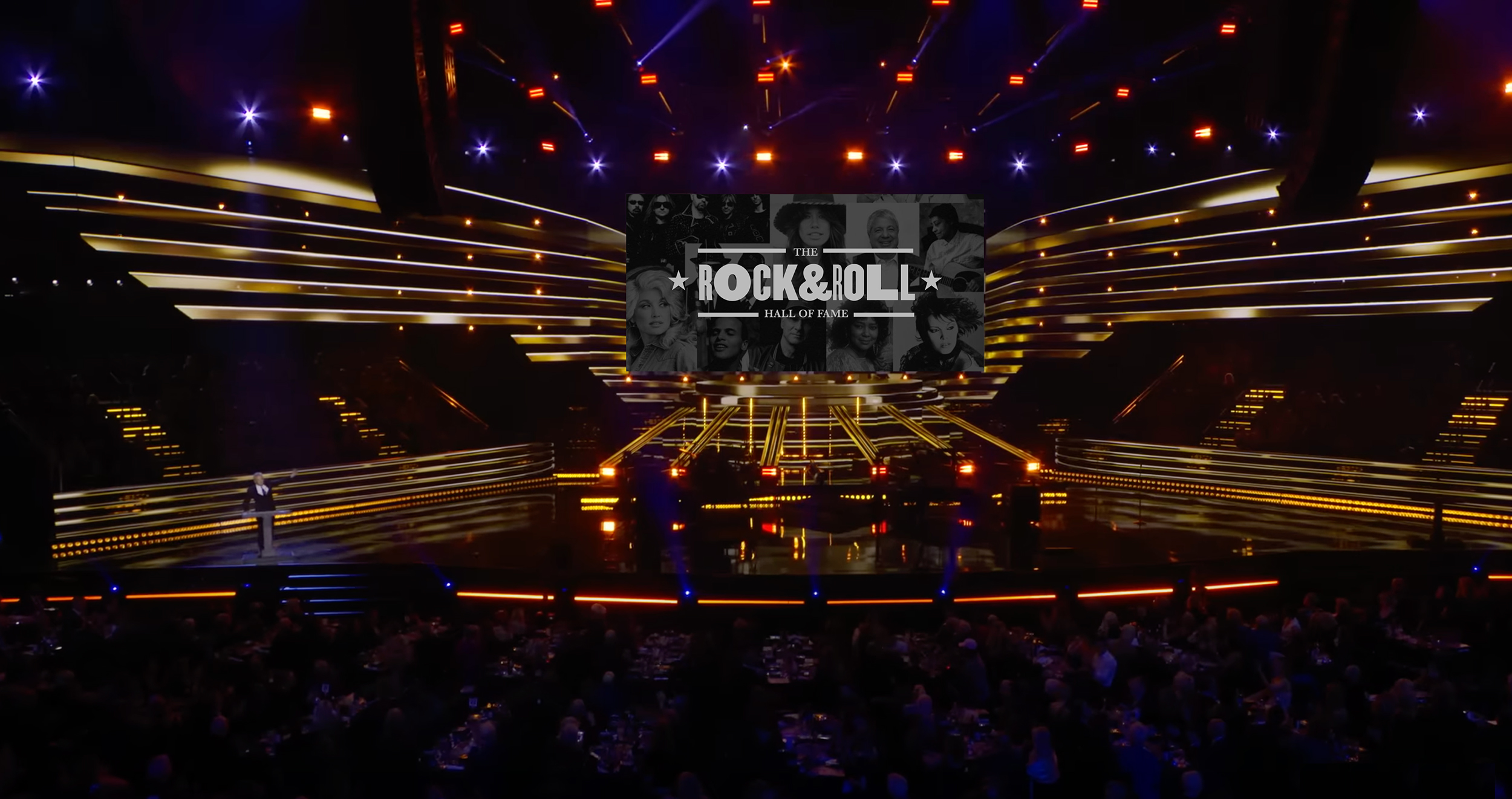
Induction Ceremony

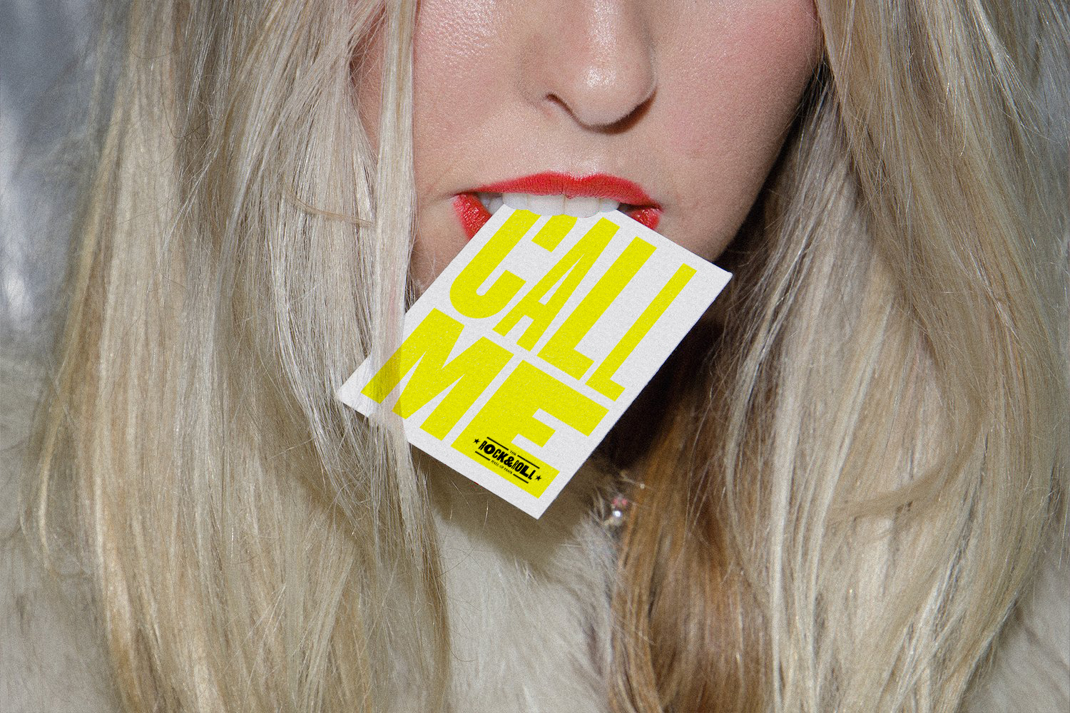
Social
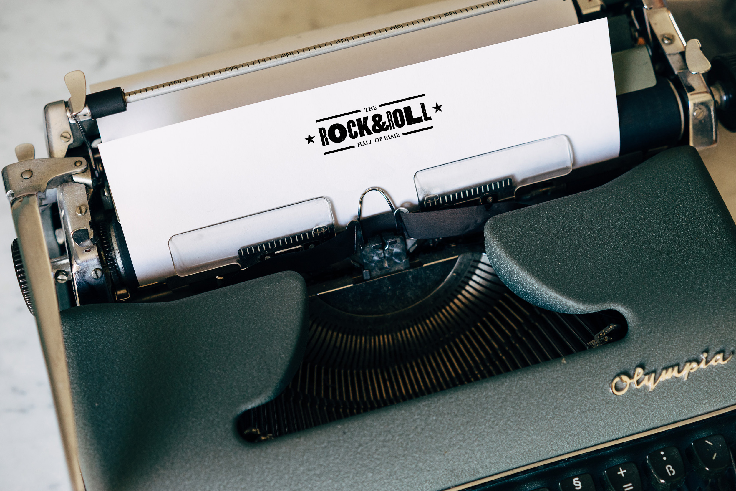
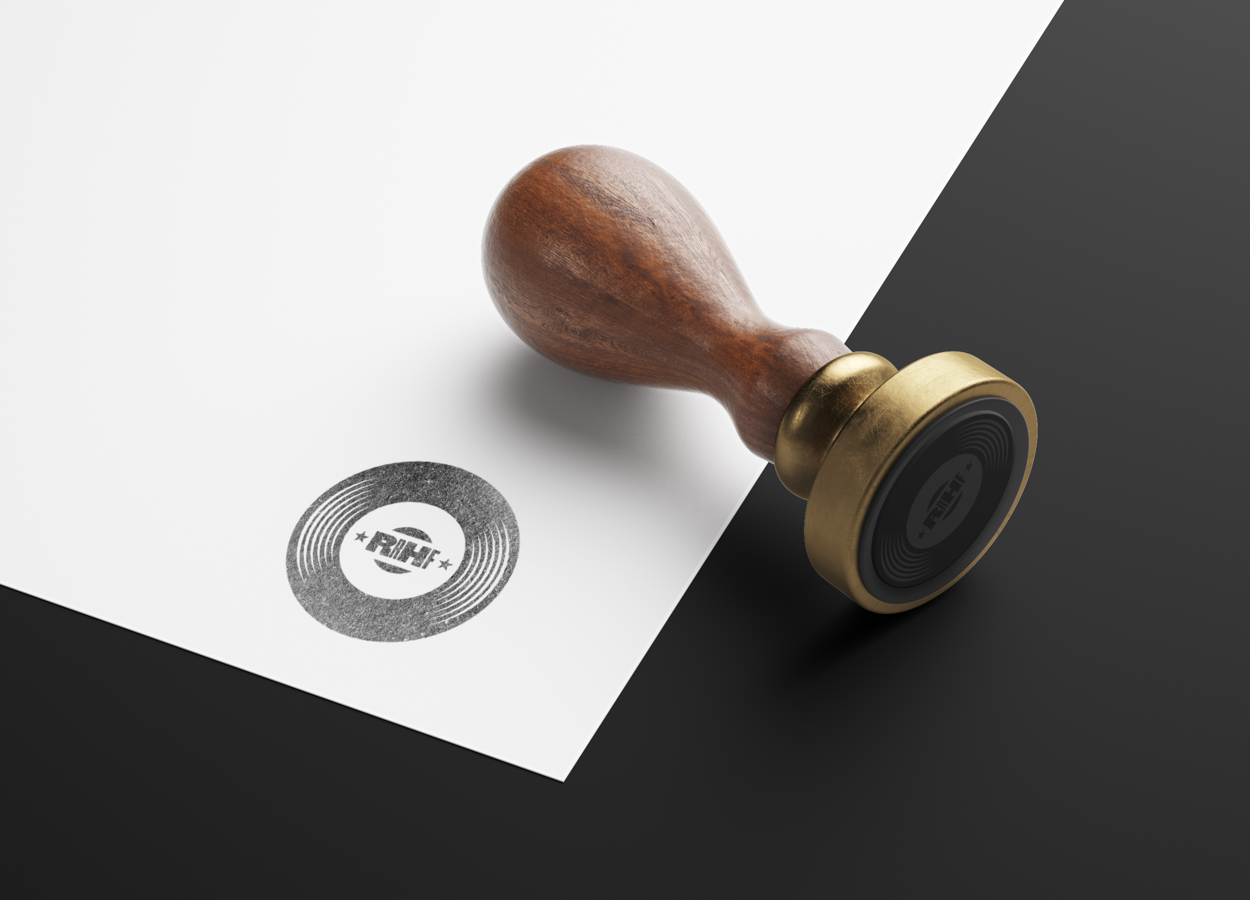
Merch


Agency:
Studio B
(Personal Work)
Client:
The Rock & Roll Hall of Fame
Sector:
Arts & Culture
Type:
Brand Identity
Campaign
What I Did:
Art Direction
Animation
Design
Studio B
(Personal Work)
Client:
The Rock & Roll Hall of Fame
Sector:
Arts & Culture
Type:
Brand Identity
Campaign
What I Did:
Art Direction
Animation
Design
This was a self-initiated personal project.
Challenge:
The Rock & Roll Hall of Fame is a museum and hall of fame in Cleveland, Ohio. The museum documents the history of rock music and the artists and people who have influenced its development.
The current identity feels visually disconnected with a mix of different typefaces and styles being used. It also feels too modern, too clinical, and lacking in the rich heritage and character that originally defined rock and roll music. The brief was to develop a rebrand and campaign launch for the RRHOF that celebrated the American heritage of the music as well as the timeless spirit and appeal of the music and culture that continues to live on today.
Insight:
Rock & Roll is seen as “traditional” and is becoming less popular with new generations.
Solution:
The new logo and campaign draws inspiration from the early beginnings of the Rock and Roll era in the 1950s that featured “boxing style” letterpress concert posters and fluorescent, day-glo inks.
Framed by two bars on the top and bottom containing the subordinate typography, the distinctive new emblem was carefully designed to be recognizable at both small and large sizes. Bookended on either side by two stars—they symbolize both stardom and the letterpress tradition. The pictorial brand mark is a 45 RPM single record—the most popular musical format during the golden age of Rock & Roll in the 1950s.
The primary typographic voice of the identity utilizes Champion Gothic by Hoefler&Co.—a bold display typeface in 7 weights that is inspired by American wood type. Baskerville Semibold is used as a complementary, secondary typeface. Also by H&C, Ringside Book is used for body copy and was designed specifically for small text sizes and with the same aesthetic characteristics as Champion. The campaign type treatment included imperfect spacing and a subtle grain texture that added visual authenticity and character to the campaign.
In a contemporary sea of generic, homogenous identities, the visual language of the campaign is bold, unique and a refreshing homage to the past. Using color and form to reflect the subject matter, the flexible design system allowed for multiple approaches. The extreme visual contrast between the different letterform weights creates a “singing” typographic rhythm that reflects the dynamic highs and lows of music.
Taken from the lyrics of Elvis Presley’s 1957 #1 hit single Jailhouse Rock, the campaign was titled “Let’s Rock.” Reflecting the attitude, energy and fearless spirit of Rock and Roll, the campaign combined bold typography, photography, and color for maximum emotional impact. Targeted towards music buffs, the campaign features well known and recognizable lyrics from iconic songs and artists currently in the Rock & Roll Hall of Fame.
Informed by traditional letterpress printing processes, the campaign uses a combination of solid colors, neon “day-glo” gradients as well as transparent, overprinting techniques. These methods were traditionally used for maximum visual impact when viewed from far away. The use of a strict grid system was also avoided in an effort to embrace the quirky, imperfect spacing that is a hallmark of letterpress.
The photography style also uses halftone dot patterns that can be seen on the early Rock and Roll concert posters from the 1950s.
Each OOH ad was targeted to a specific location—using the meaning of the artists, songs and lyrics to play off the surrounding environment for maximum visual and conceptual impact.
Dynamic, kinetic typography animations were also used to bring the lyrics to life with eye catching and bold animations that placed an emphasis on the poetry and power of the lyrics.
Results:
The new identity generates excitement while also capturing the heritage and deep history of the music.