Coast Brewing Co.
A fictional craft beer company inspired by the rich history and lifestyle of Southern California surf culture.

Logo

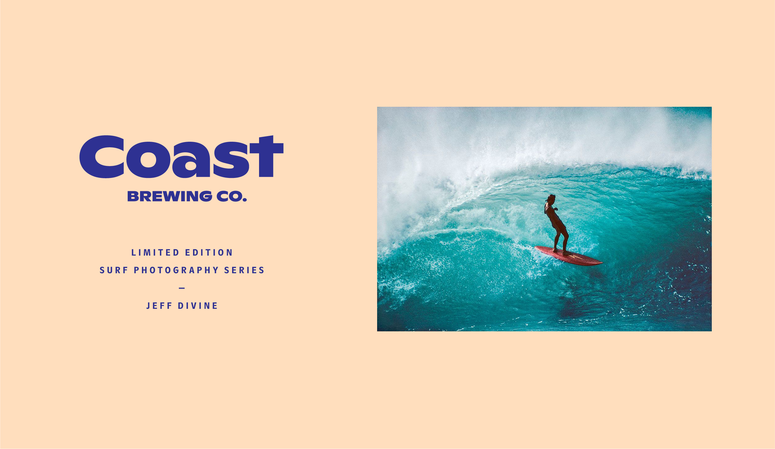
Like waves slowly rolling in, the extended letterforms give the logo a relaxed, calming and “laid back” feel.
Brand Mark
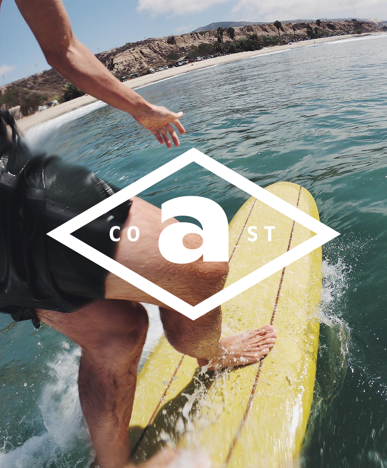
Acting as a visual mnemonic, a breaking ocean wave is reflected in the negative space of the letterform mark.
Website
Package


The cans feature unique artwork based on different seasonal lines released throughout the year.

Color & Typography

Avoiding the interlocking letterforms used in classic surf posters, ABC Ginto Nord is a playful, geometric-humanist, sans serif typeface by Dinamo that mimics the soft curves of ocean waves.
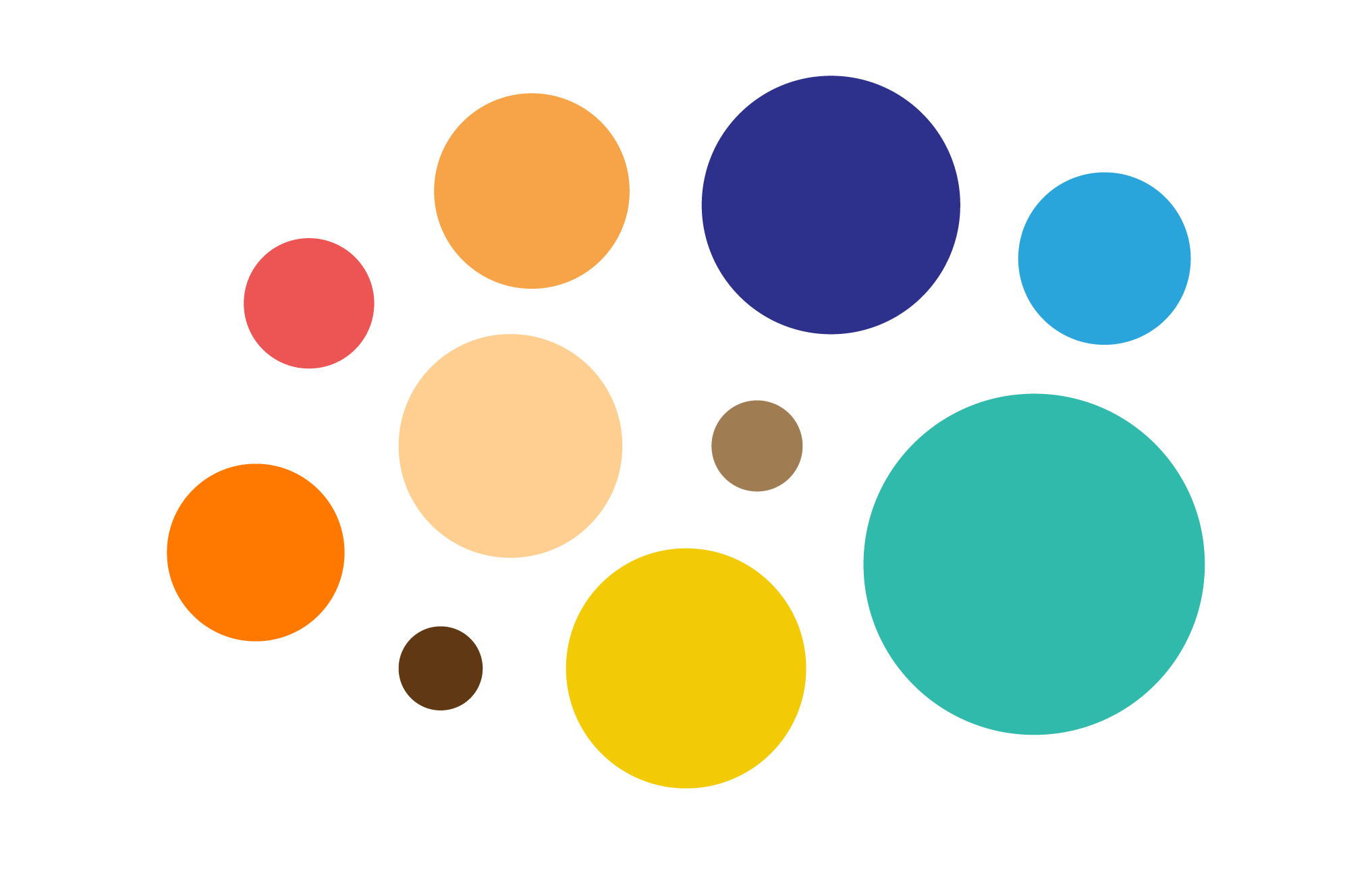
The vibrant and natural color palette was inspired by cool and warm tones commonly found in the coastal environment.
Grid System

The grid system was based on a flexible, modular layout.
Photography


High-key, colorful, lifestyle photography of people and places was used to communicate the essence of the brand.
Lockups


Illustration


![]()
![]()
![]()
Collaborations


Limited edition brand collaborations feature iconic surf artists and photographers.

Collateral


Social & OOH


Agency:
Studio B
(Personal Work)
Client:
Coast Brewing Co.
Sector:
Food & Beverage
Type:
Brand Identity
What I Did:
Art Direction
Illustration
Design
Animation
Studio B
(Personal Work)
Client:
Coast Brewing Co.
Sector:
Food & Beverage
Type:
Brand Identity
What I Did:
Art Direction
Illustration
Design
Animation
This was a self-initated personal project.
Challenge:
The brief was to create a unique, craft beer brand identity that celebrated Southern California’s rich surfing culture and history and also captured the timeless freedom, playfulness and youthful spirit of surfing. The brand also needed the flexibility to be able to grow and expand in the future.
Insights:
Southern California is famous for its rich surf culture and history.
Surfing is seen as a quintessential summertime activity.
Surfing is primarily a fun, youthful, recreational activity.
Solution:
While there are hundreds of craft beer brands, many are generic and lack character and originality. Coast Brewing Co. draws on the rich history, longstanding traditions and lifestyle of surfing in Southern California that has become a cultural phenonmenon, sport and popular lifestyle specific to the region.
Embracing the youthful spirit, vitality and lifestyle of surf culture, the visual language of the brand is driven by fun, playful illustrations and a vibrant, coastal-inspired color palette.
ABC Ginto Nord was used for the wordmark—a contemporary, geometric-humanist typeface by Dinamo Type Foundry, that mimics the soft, rounded curves of ocean waves. The high x-height in the extended weight of the letterforms gives the logo a “laid back” and relaxed quality. Reflecting a breaking ocean wave in the negative space, the letterform A acts as a visual mnemonic and was naturally employed as the letterform brand mark.
A suite of lockups further extended the brand language and the rich, down-to-earth color palette features a combination of warm and cool tones commonly found in the coastal environment.
Drawing on the influence of Mid-century modern graphic designers Paul Rand and Saul Bass, hand-drawn, custom illustrations were created using flat colors and shapes. Stylistic variations allowed for maximum flexiblity across different seasonal product lines.
Art directed lifestyle photography sought to communicate summer, youth and fun by using warm color tones and dreamy, overexposed images.
Results:
The new identity captures the spirit and history of surf culture in an authentic way.