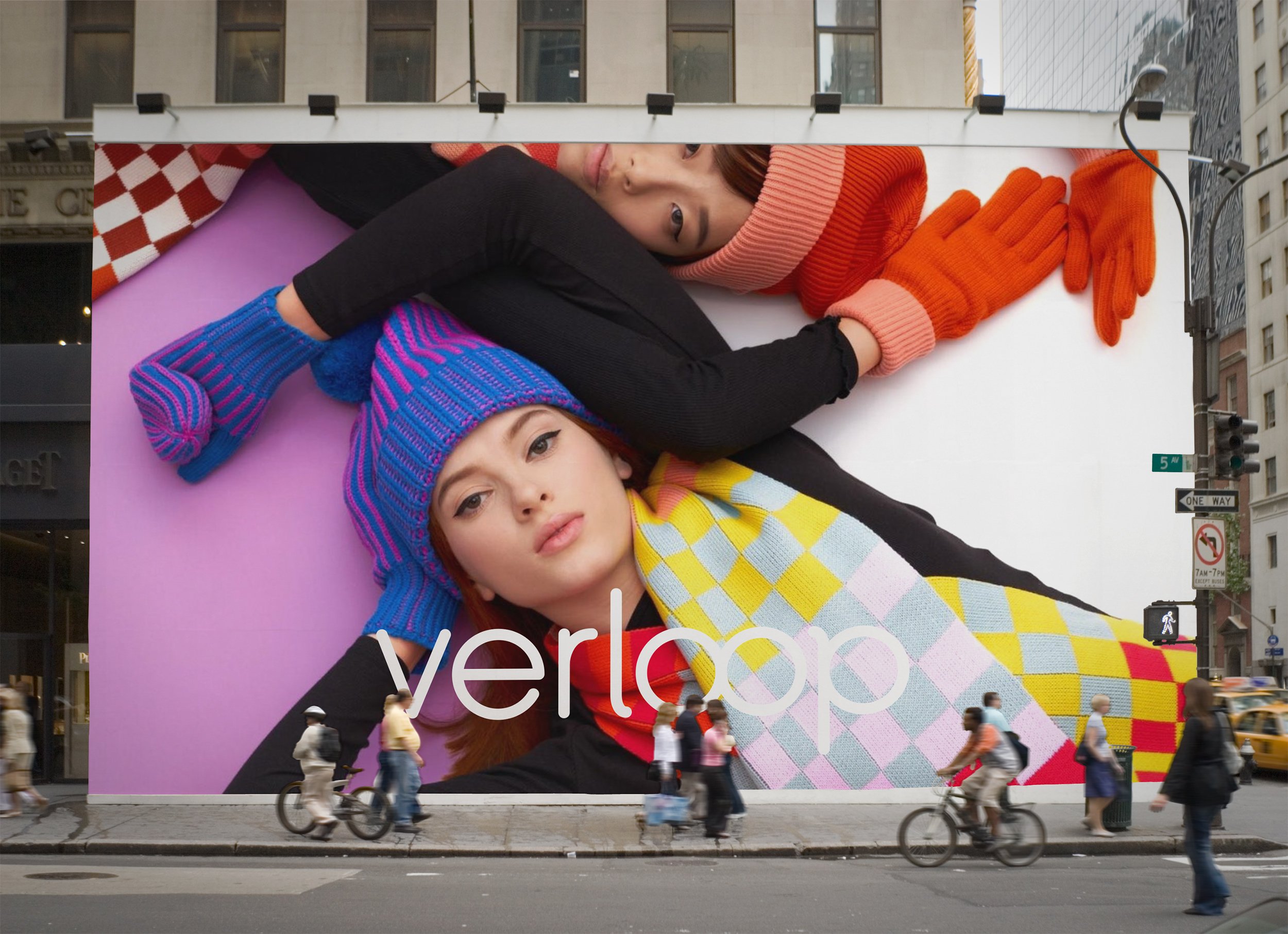
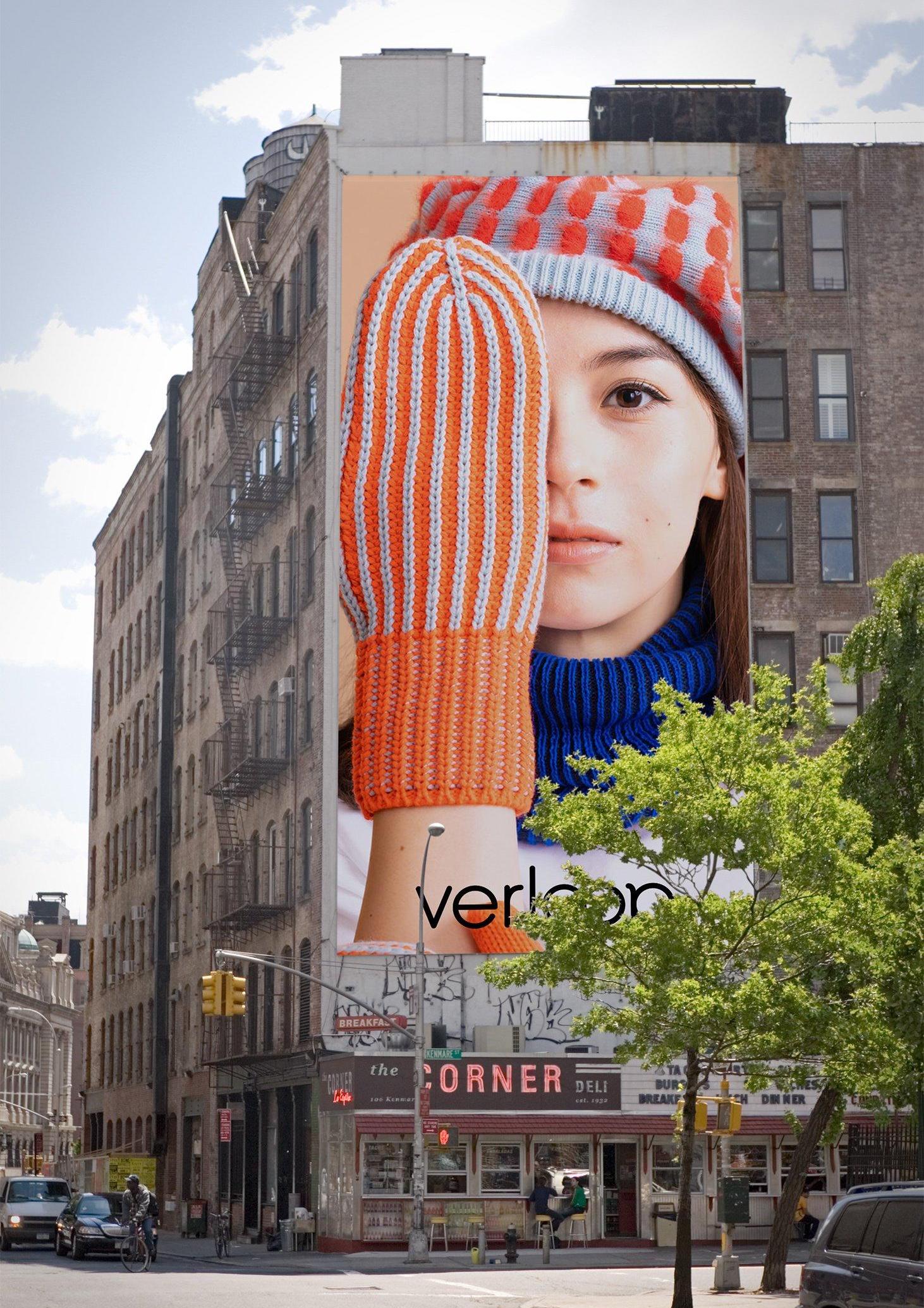
Verizon
Global brand identity refresh for Verizon that launched in June 2024. Designed in collaboration with Turner Duckworth SF and Verizon.

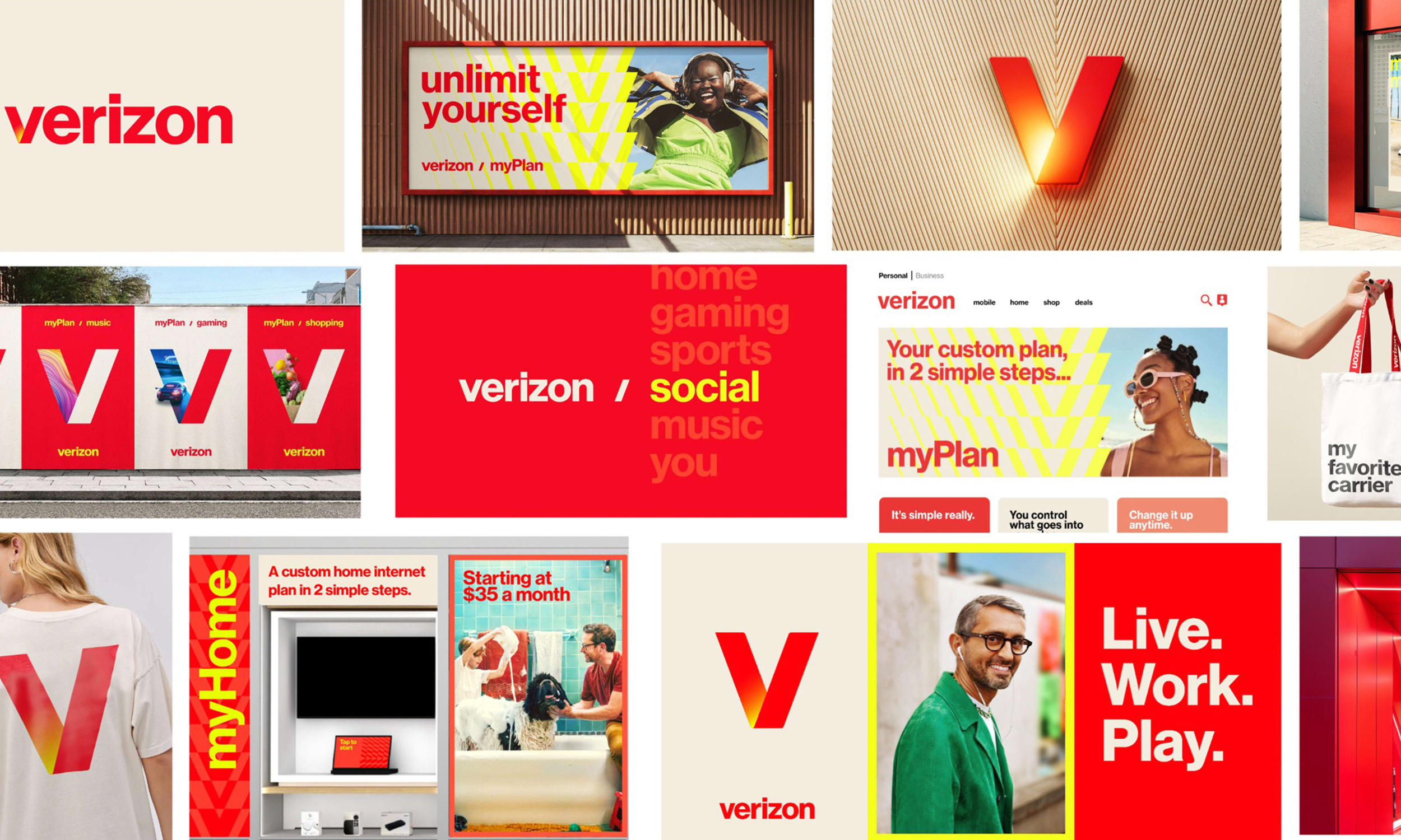
The new identity is an open and flexible system that enables the
brand to speak to different audiences and engage with culture.
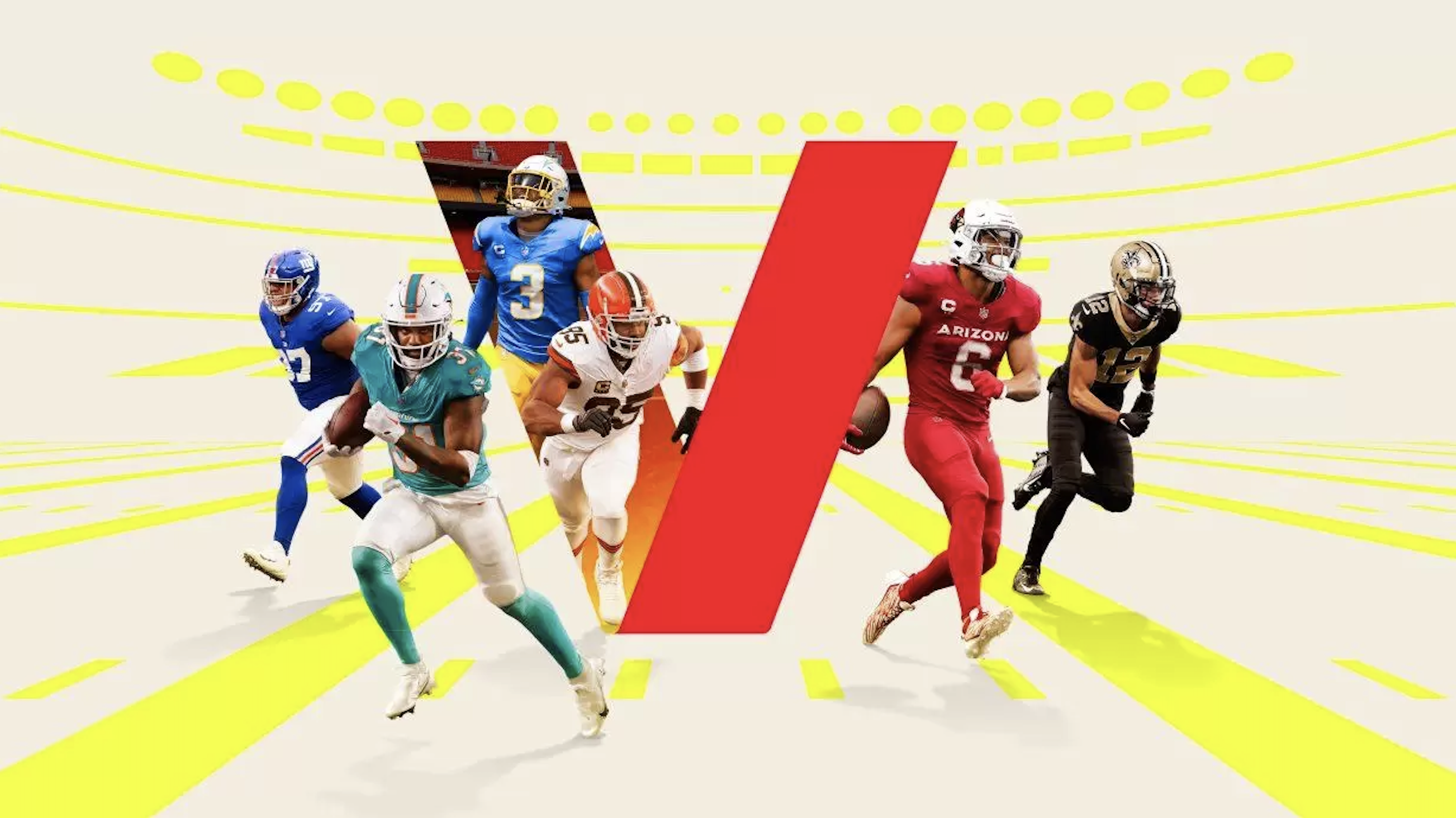
The glowing “sun” V embodies energy, connection and power and reflects back on Verizon’s name—a portmanteau of veritas and horizon.
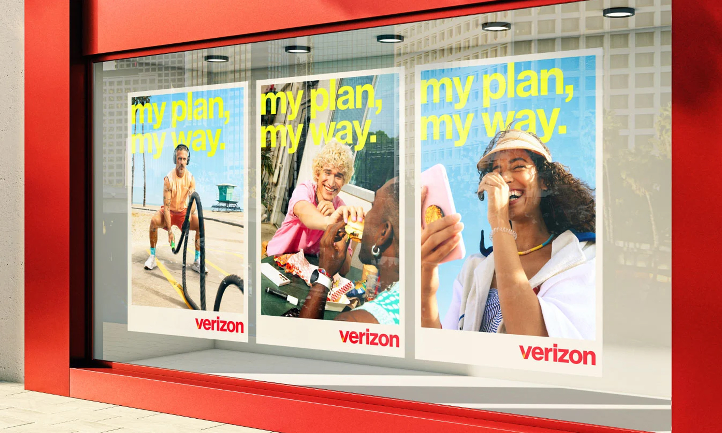
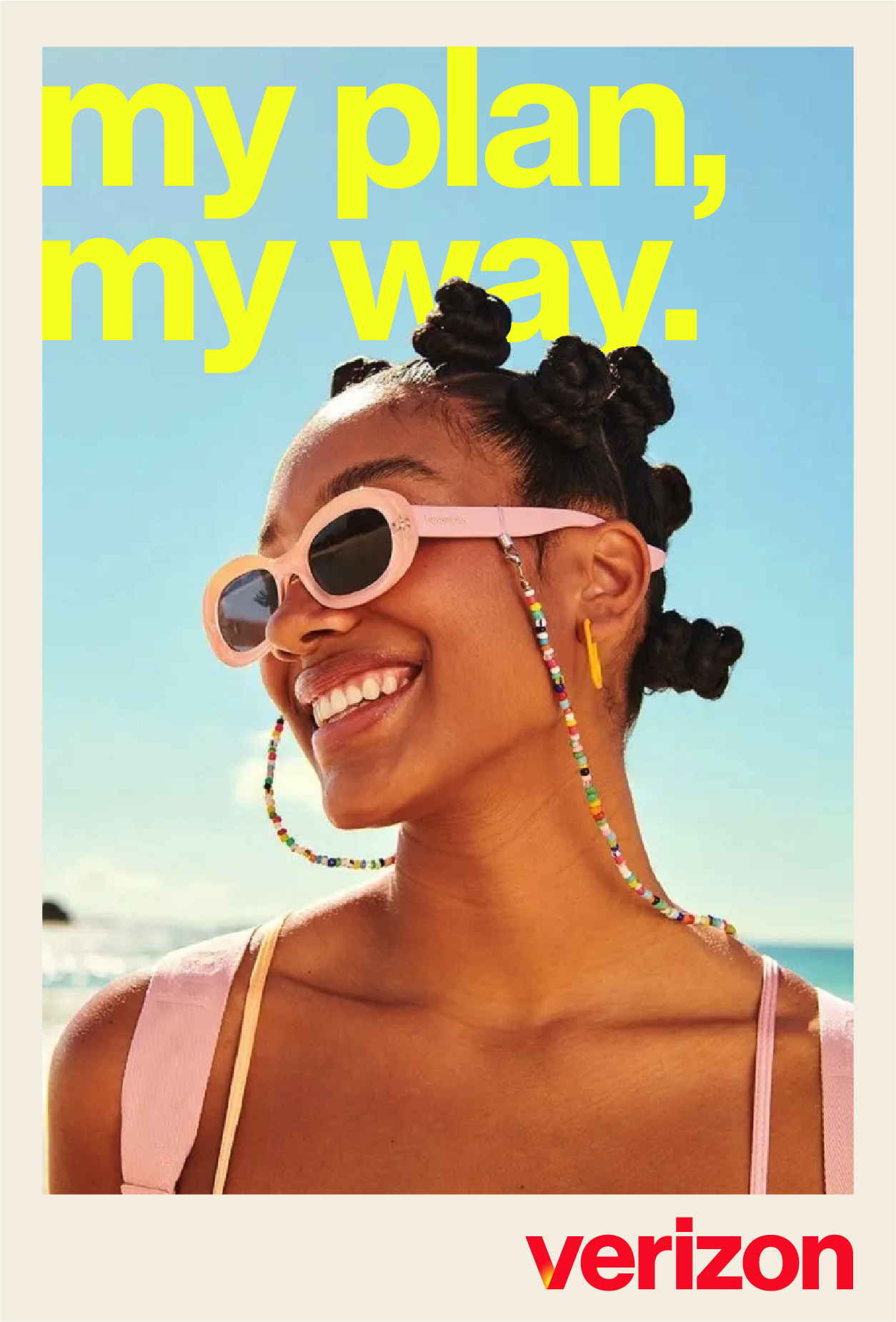
Combined with bold typography, the new photography celebrates empowered
individuals, free to express and enjoy themselves out in the world.

The vibrant color palette driven by red and yellow infuses the brand with energy and youthfulness.

Monotype designed a custom cut of Neue Haas Grotesk in 3 weights.

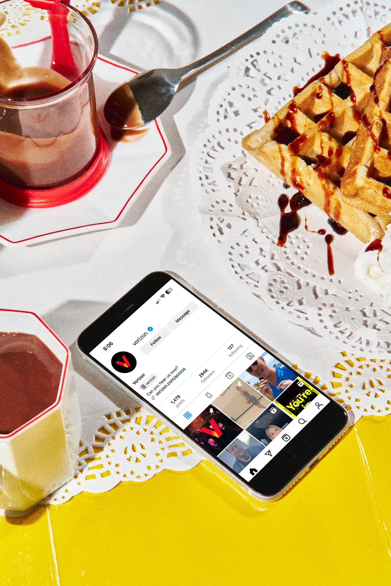
“Verizon is a strong, trusted brand that plays a critical role in people’s lives, but most of what we do is often invisible and behind the scenes. We want to make the invisible, visible.”
—Verizon CMO, Leslie BerlandThrough personalized plans, the brand empowers consumers
to choose how they want to be entertained and connected.
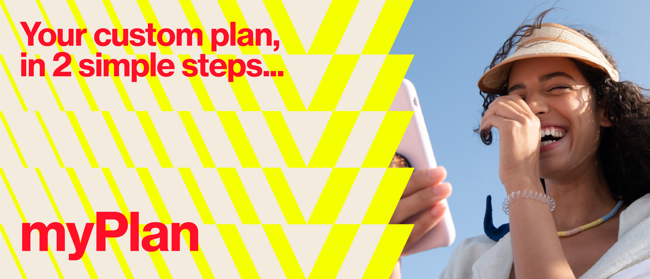
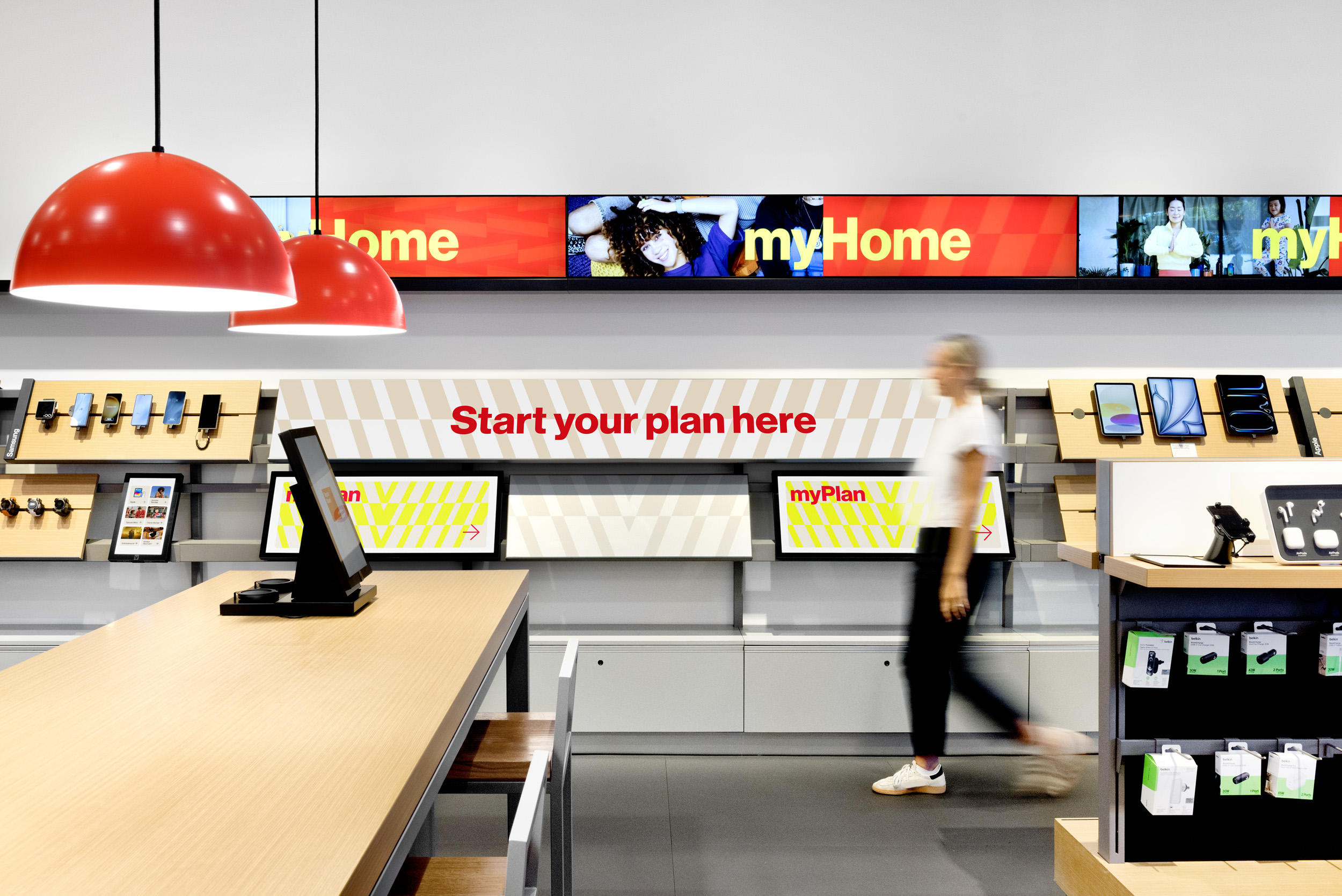
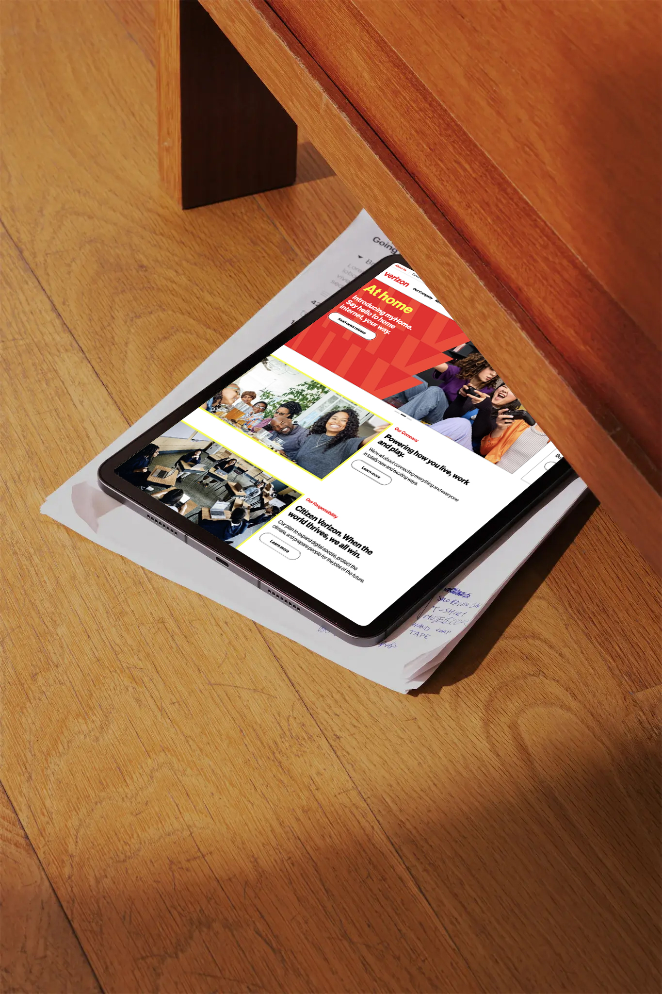
Dynamic graphic patterns further extend the brand
language while allowing for maximum flexibility.

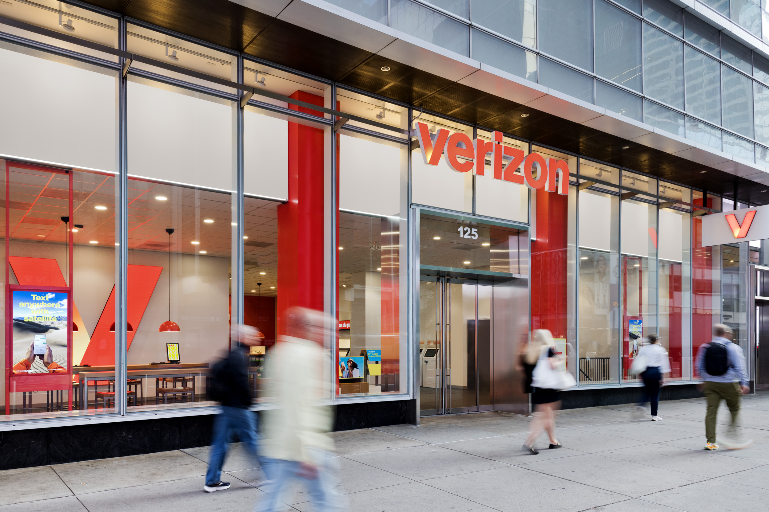
Updated signage at Verizon’s flagship store in NYC.

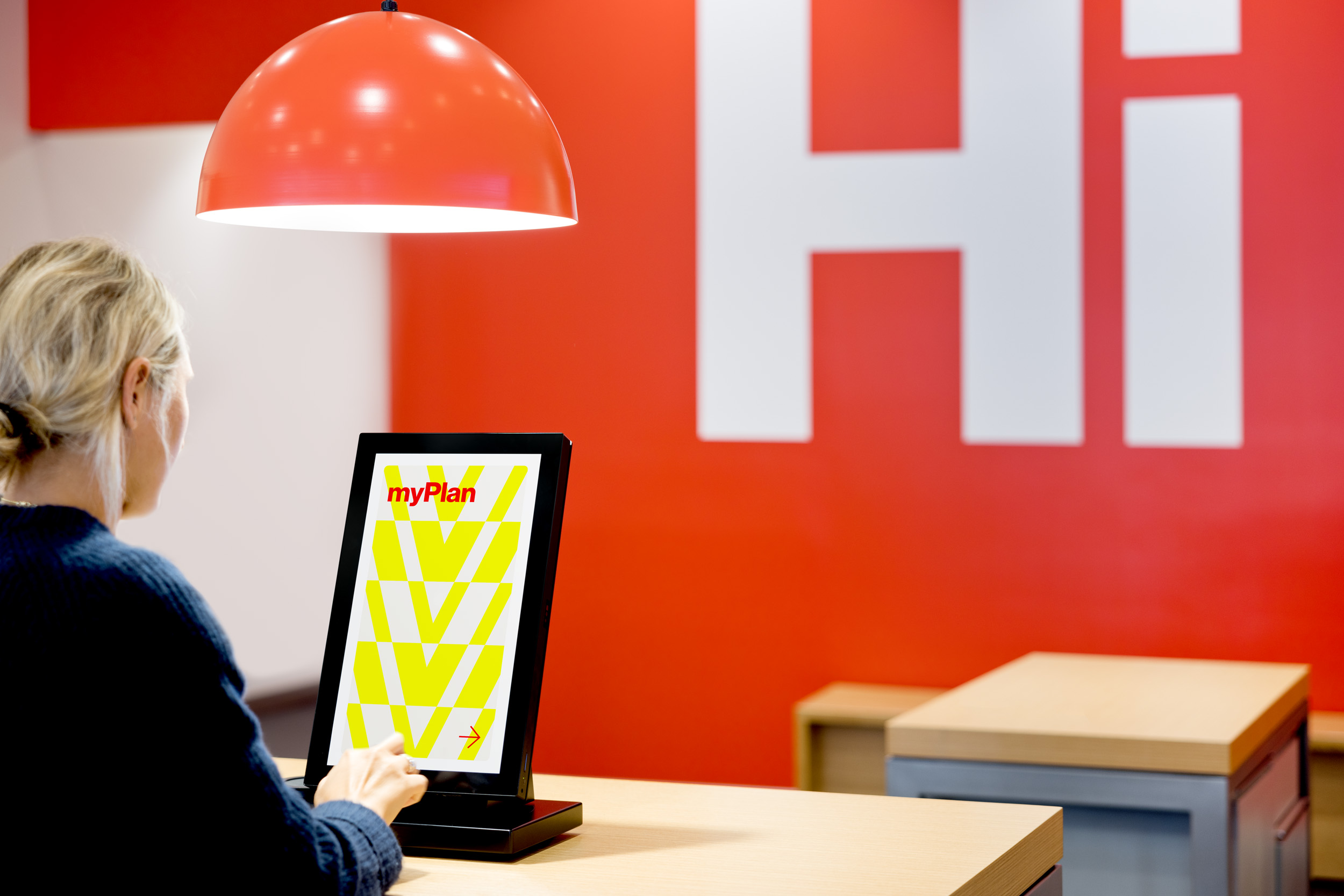
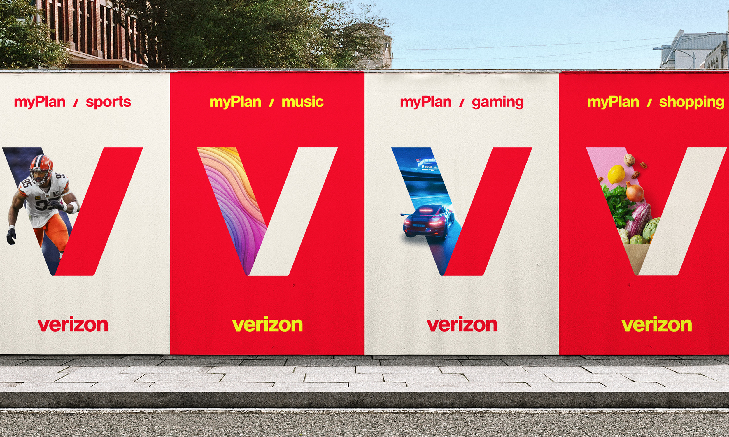
The V lettermark also becomes a portal into the world of
Verizon by highlighting all of the things Verizon has to offer.
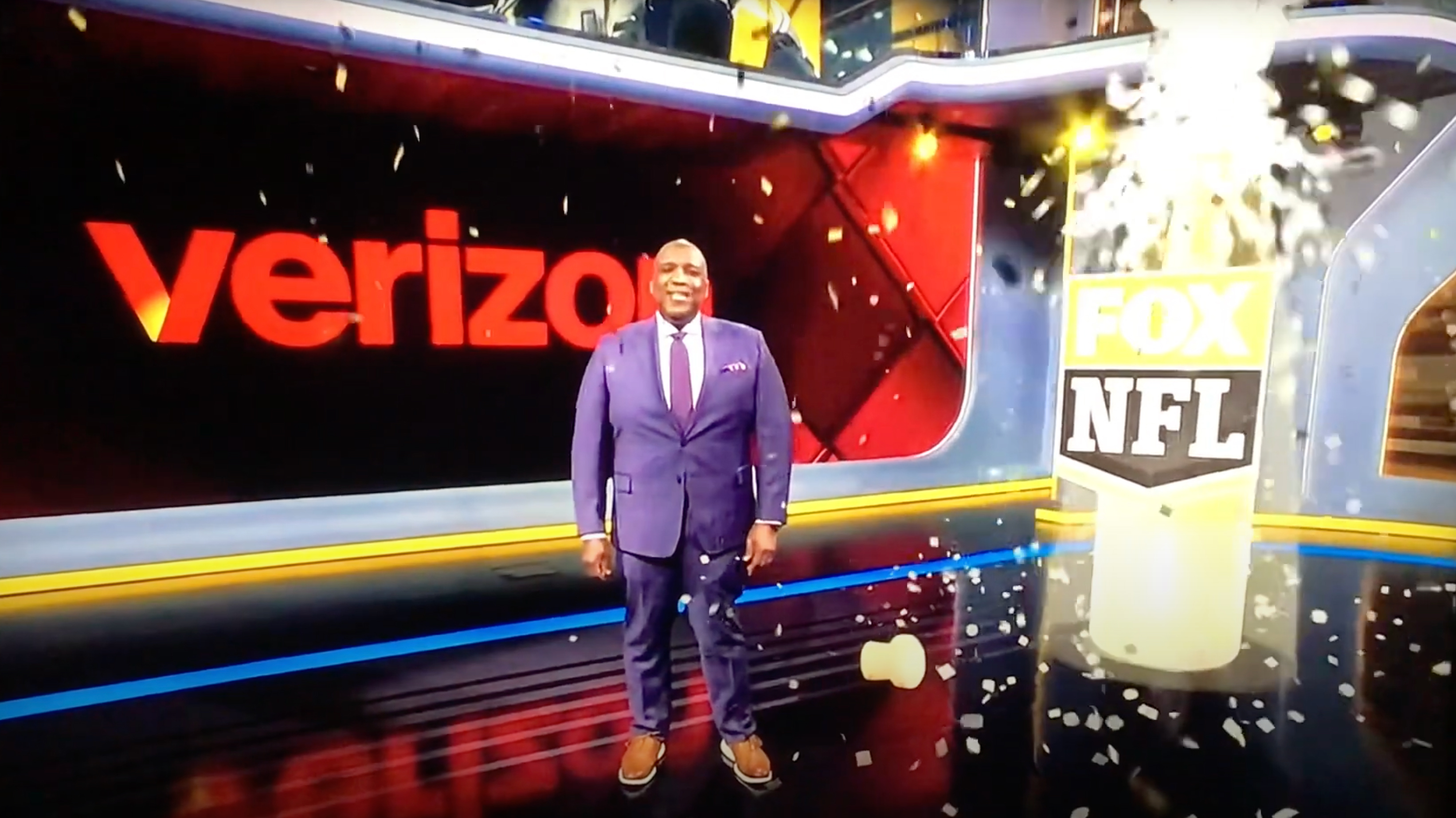

The refresh was also applied across all of Verizon’s B2B segment as well,
incorporating different color palettes and visual patterns.


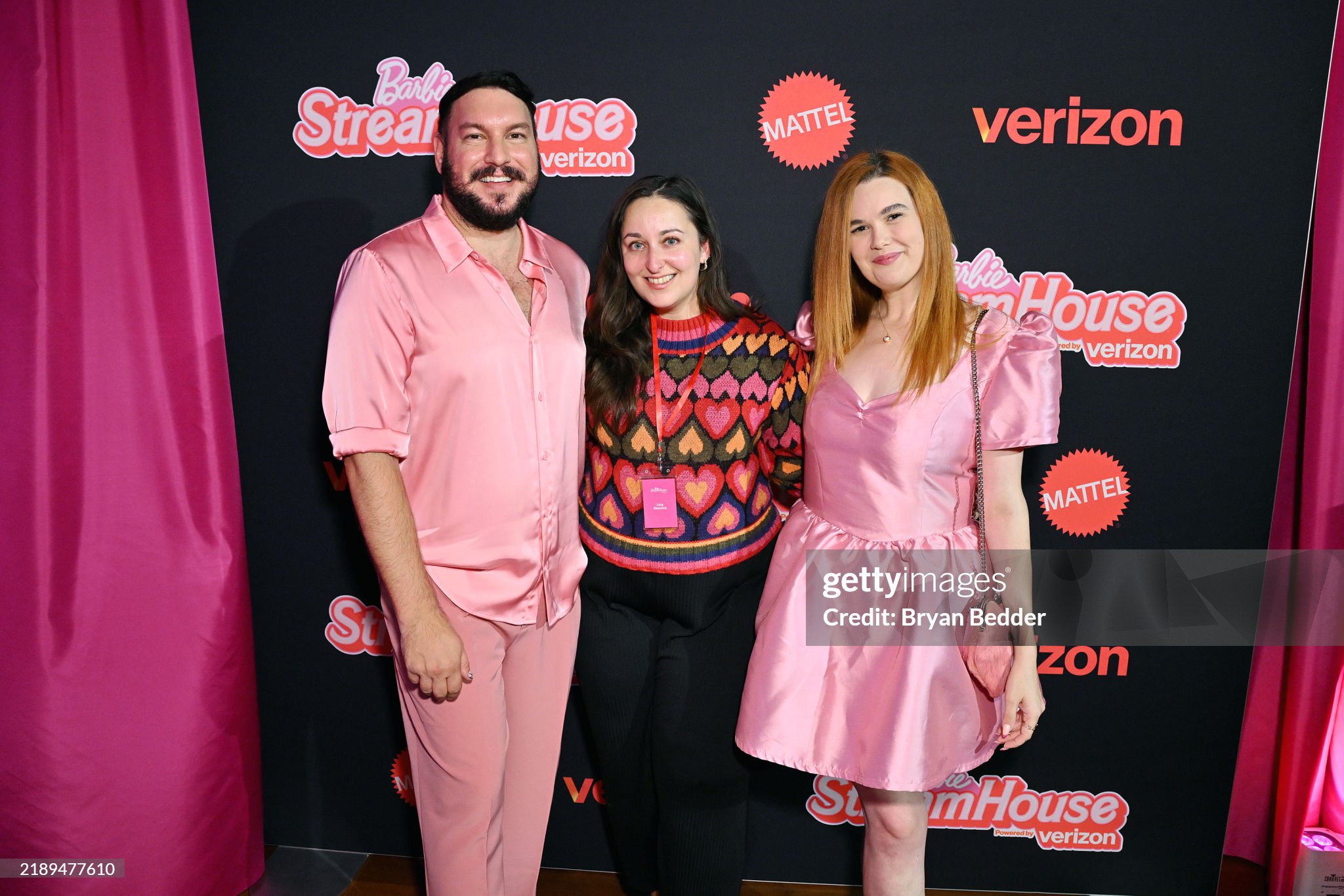
The scalable identity is also flexible enough to include holiday campaigns, collaborations and brand activations.

Agency:
Turner Duckworth SF
Client:
Verizon
Sector:
Tech, B2B/B2C
Type:
Brand Identity
Position:
Senior Designer
What I Did:
Logo Design
Visual Identity
Graphics Creation
Apparel Design
B2B Design
Brand Research
Team:
Hans Vestberg, CEO, Verizon
Leslie Berland, CMO, Verizon
Ricardo Aspiazu, SVP Creative, Verizon
Chris Garvey, ECD
Jared Britton, CD
Dan Kennington, CD
Katie Barger, Sr. Designer
Matt Knight, Sr. Designer
Bennett Wantz, Designer
Eli Walters, Designer
Daphne Huang, Designer
Monotype
Press:
Ad Age︎︎︎
Adweek︎︎︎
Fast Company︎︎︎
USA Today︎︎︎
MSN︎︎︎
Challenge:
Reposition Verizon in a way that better reflects Verizon’s current position as a contemporary media brand while also preserving its heritage and showcasing all of its current product offerings. As a data, content and network provider, how can we make the invisible, visible?
Insight:
During consumer testing, there was 99% brand recognition but only 30% of people were able to recognize the existing checkmark icon that was designed by Pentagram as belonging to Verizon. This told us we needed to find a new symbol that Verizon could own.
Solution:
We updated the entire brand identity by creating a flexible design system that emphasized the idea of “connection” throughout all of the different brand expressions. We replaced the existing monochromatic wordmark and check icon with an updated glowing ‘V’ lettermark and vibrant color wordmark that injected the brand with life and better captured the contemporary power, energy and universal reach of the brand. The flexibility of the lettermark also speaks to the personalized and customizable nature of the brand for consumers and businesses alike.
A complete visual overhaul for both the consumer and business arms included new graphic patterns, typefaces, color palettes and photography styles while still remaining grounded in the brands roots of Swiss Modernism.
The new identity is also flexible enough to be used for seasonal campaigns, collaborations and activations and premiered with Verizon’s collaboration with Barbie for the 2024 holiday season.
Pulling inspiration from the company’s heritage, the new identity celebrates individuals and speaks to the contemporary energy and personal experience of everything Verizon offers as a leading technology and media provider in the 21st Century.
Result:
The new mark and identity was launched globally across the entire Verizon brand in June 2024 and injects new life, energy and flexibility into a brand that had become outdated, unrecognizable and constrained. The identity attracted significant online chatter and attention from several major media outlets.
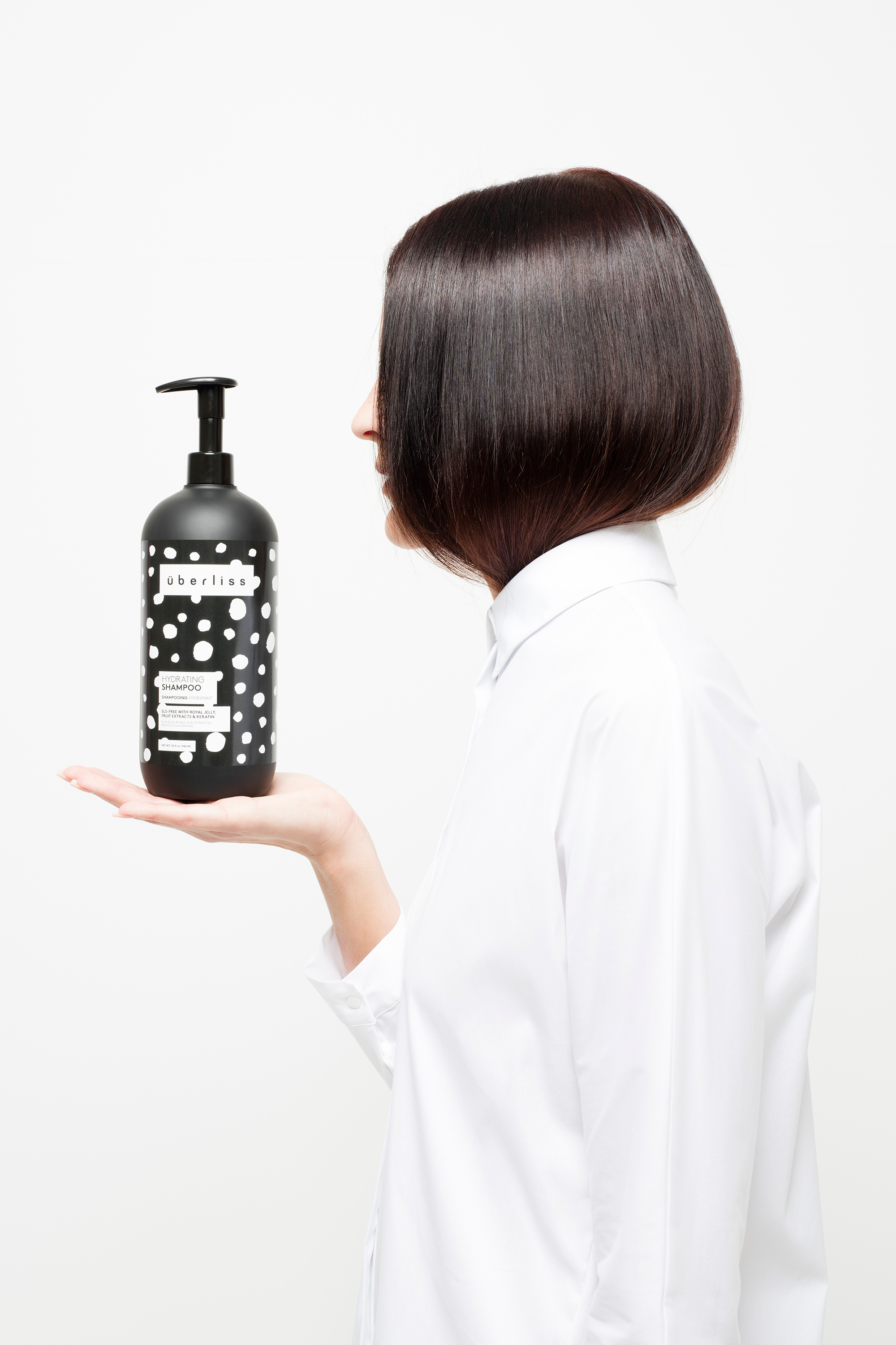
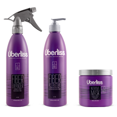
Überliss


Previous Branding
Inspiration

Explorations
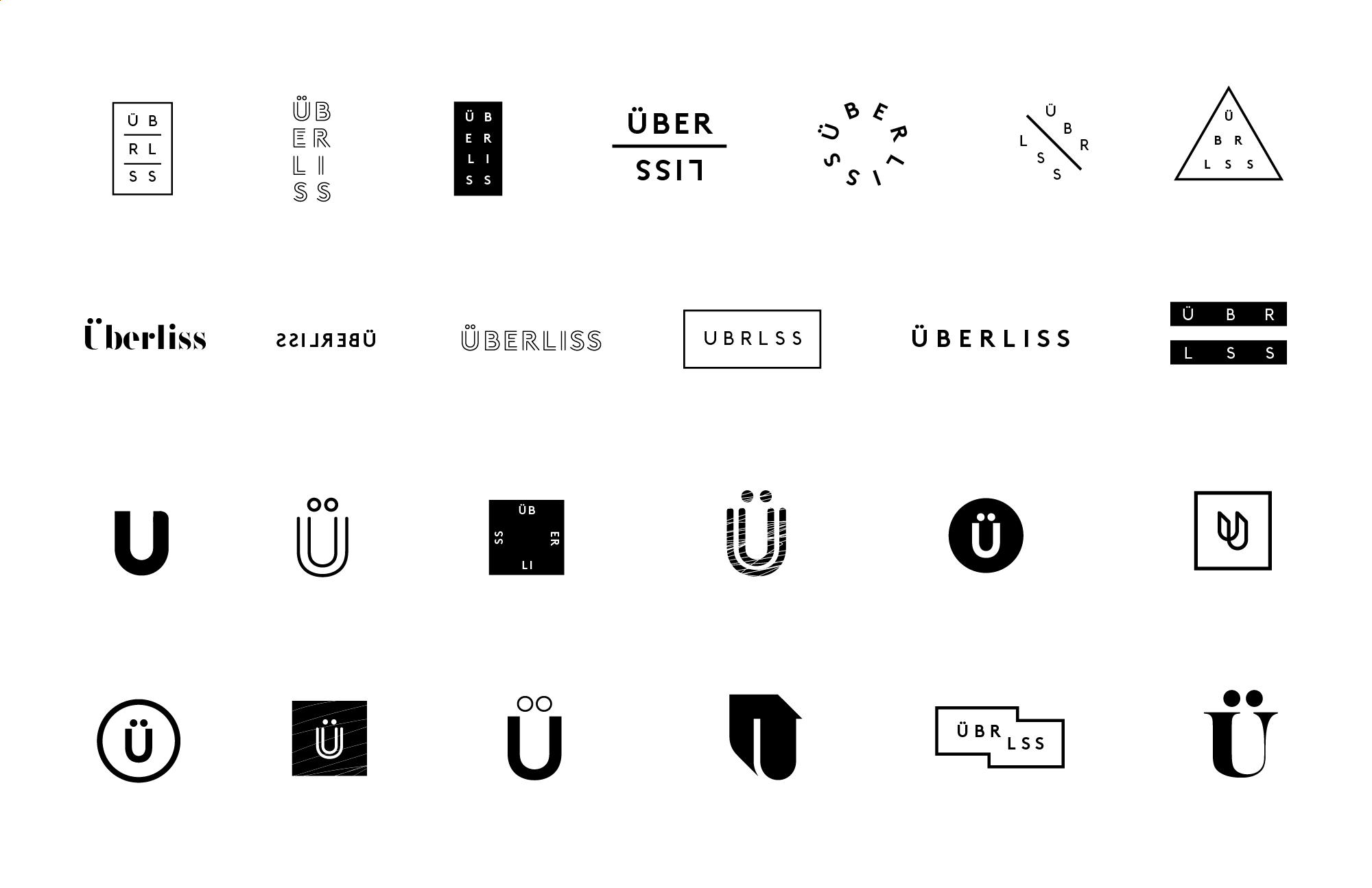

Logo
To preserve brand equity and recognizability, we opted to retain and slightly modify the existing custom wordmark.
To ensure visual contast, the wordmark was placed inside a frame by using lowercase and opening up the tracking. Adjustments were also made to the diacritical marks for visual uniformity. The new emblem allows for more flexibility while retaining the character of the original logo.
To ensure visual contast, the wordmark was placed inside a frame by using lowercase and opening up the tracking. Adjustments were also made to the diacritical marks for visual uniformity. The new emblem allows for more flexibility while retaining the character of the original logo.
Website

The responsive website prioritized usability and functionality through clean, grid-based design and typography.
Typography & Color
LL Brown is a contemporary, geometric, sans serif by Lineto and was chosen for its legibility and elegant sophistication.
A black and white color palette introduced an elevated high fashion aesthetic and a timeless stylishness.
A black and white color palette introduced an elevated high fashion aesthetic and a timeless stylishness.
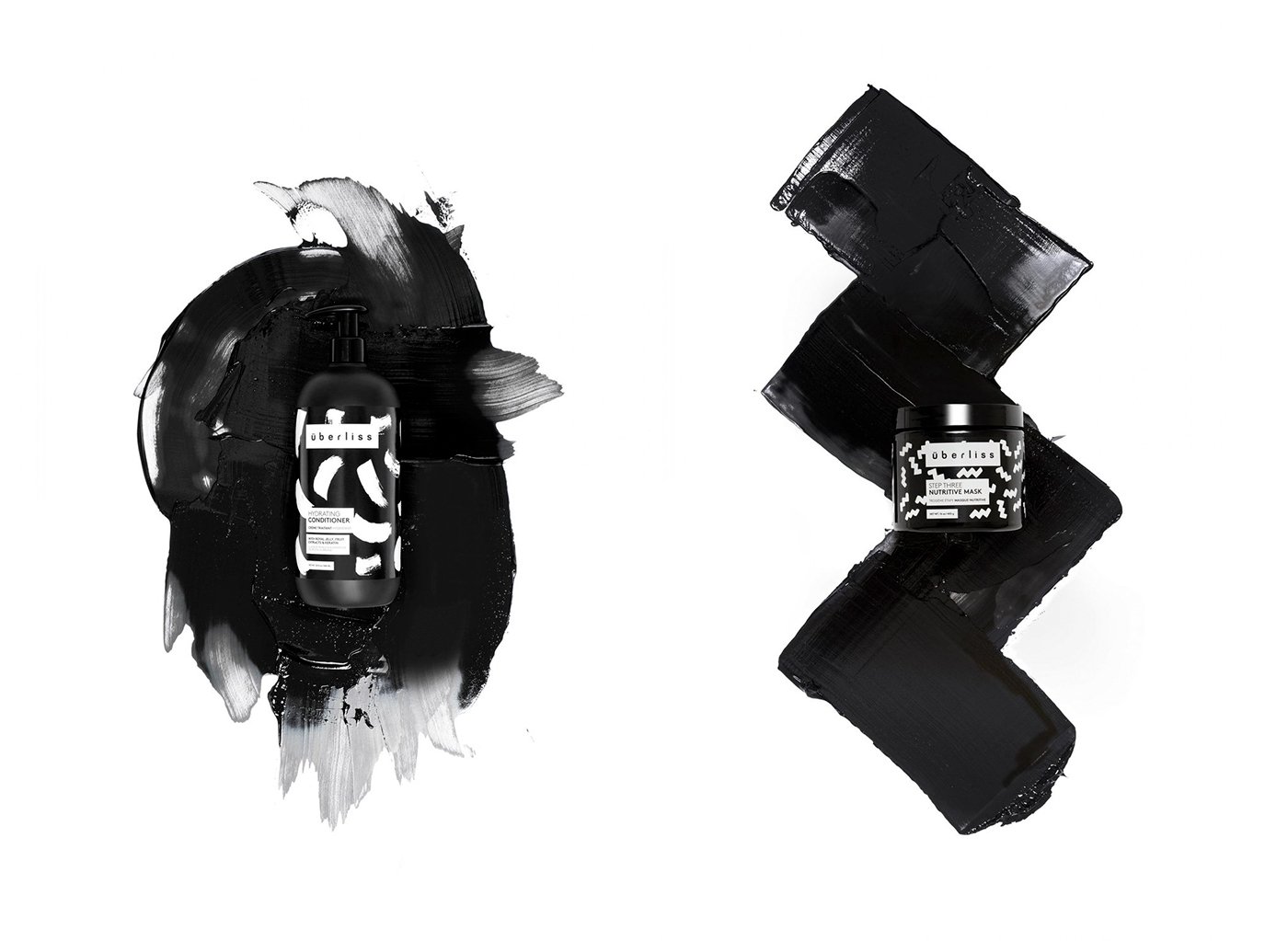
The Patterns
Using paint, I created a series of handmade patterns. The patterns have a playful rebelliousness and the viscous nature of the paint also reflected the nature of the products themselves.
Using paint, I created a series of handmade patterns. The patterns have a playful rebelliousness and the viscous nature of the paint also reflected the nature of the products themselves.
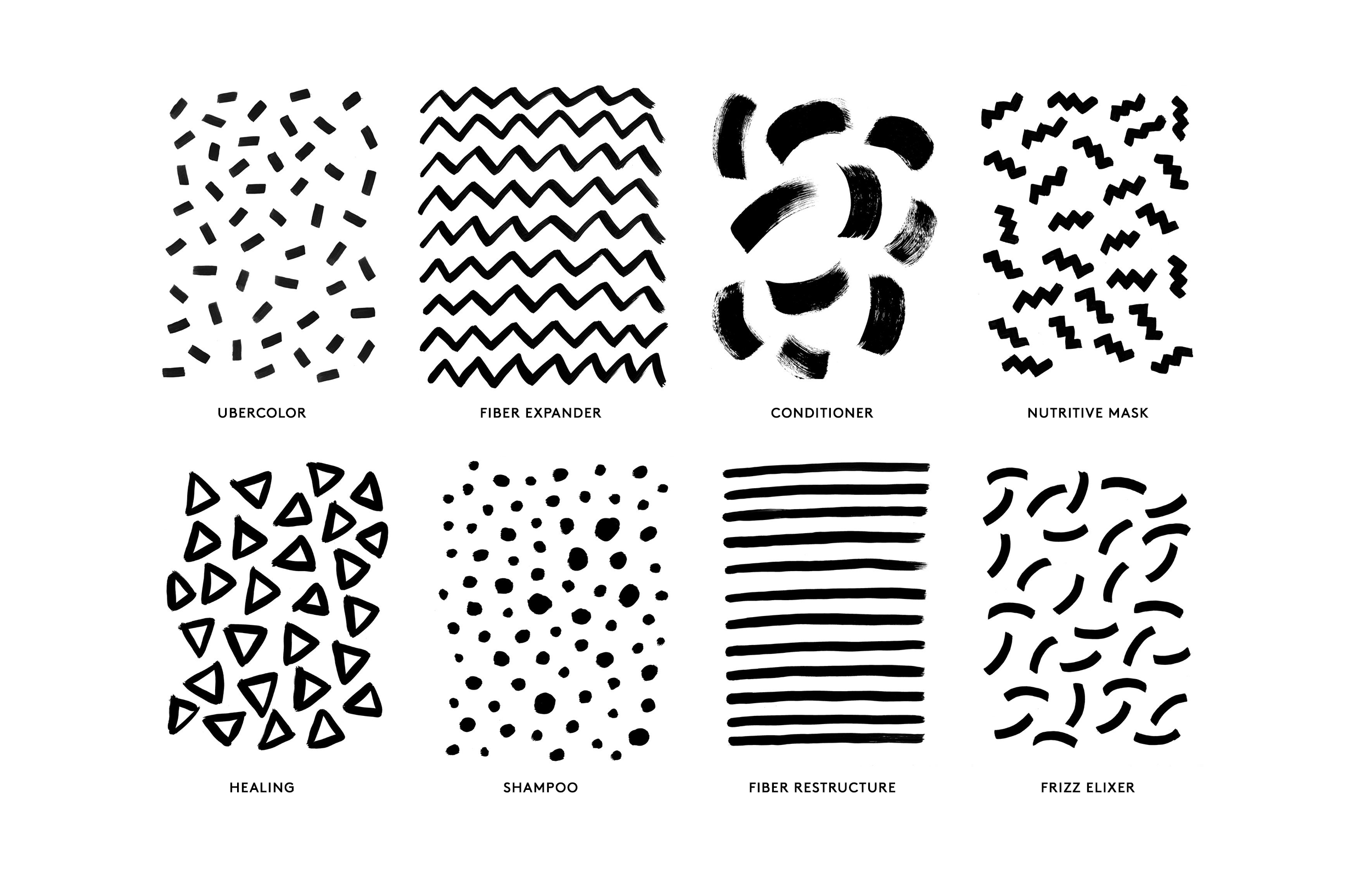
The System
Keeping all the typography within a left justified fixed frame, the interchangeable patterns were used to define each separate product line. This flexible system was designed to be customizable for future releases, allowing the brand to grow and expand.

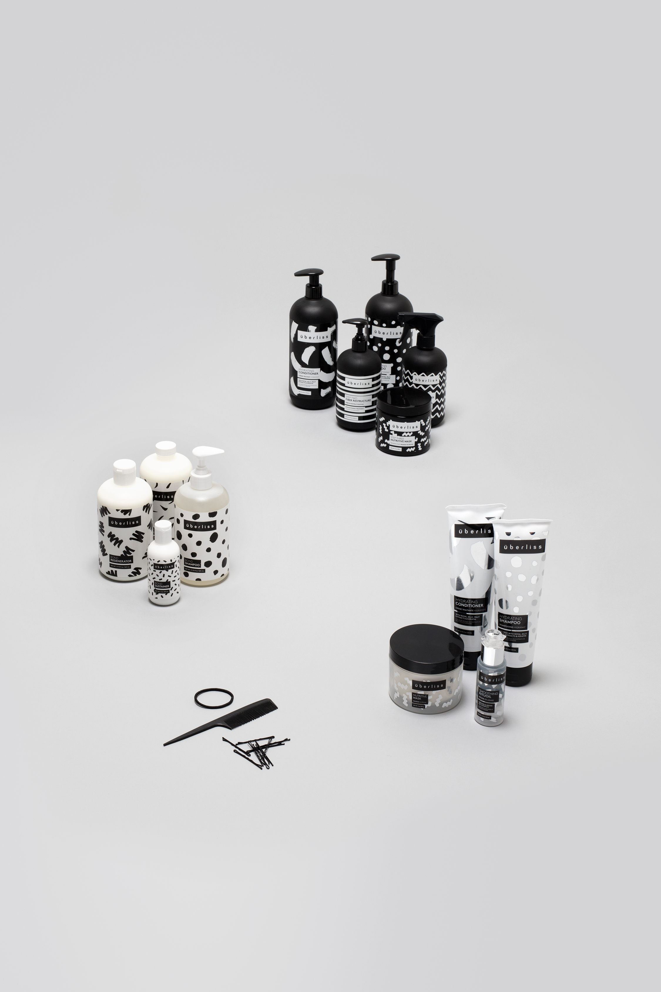
The Maintenance Collection
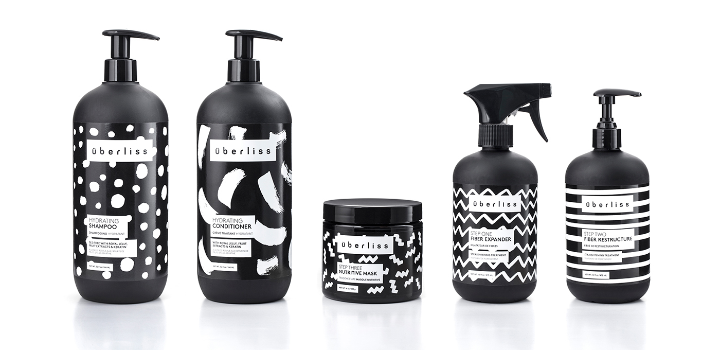
The Keratin Collection

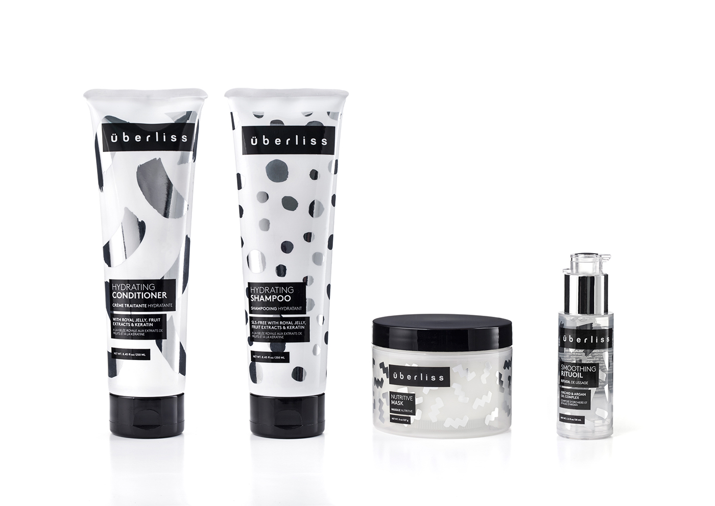
The Bond Collection
Social
Print & Collateral


Tradeshow
![]()
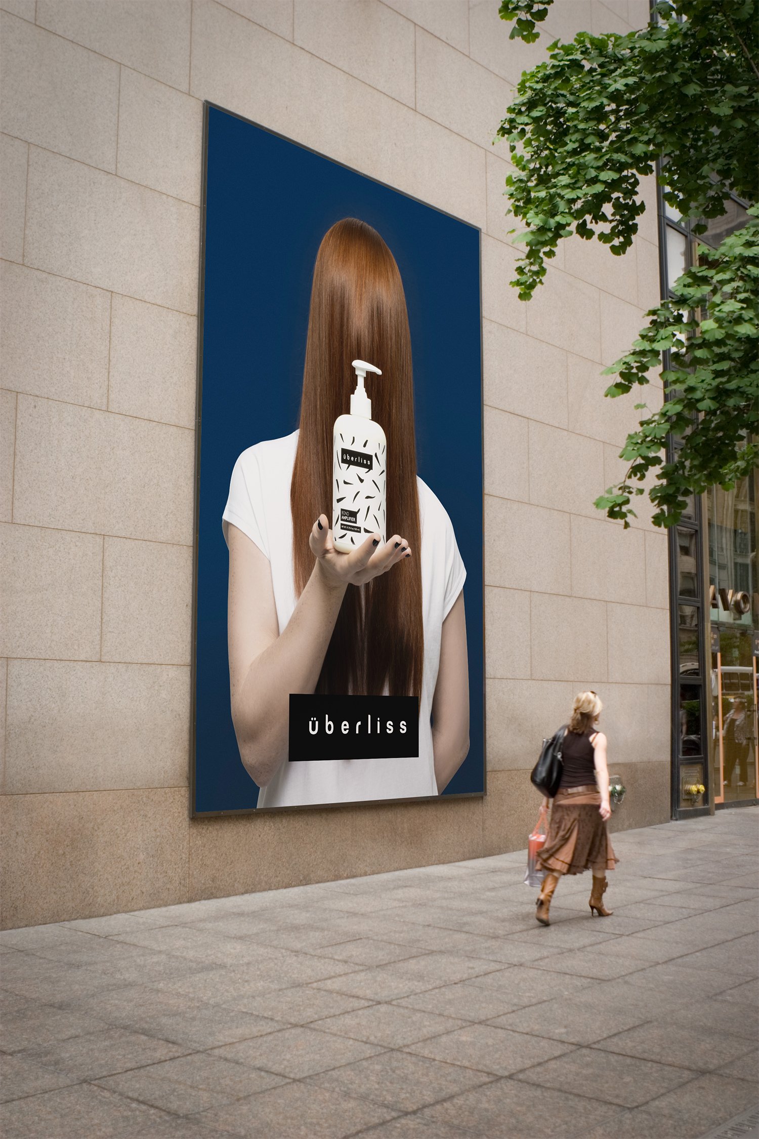
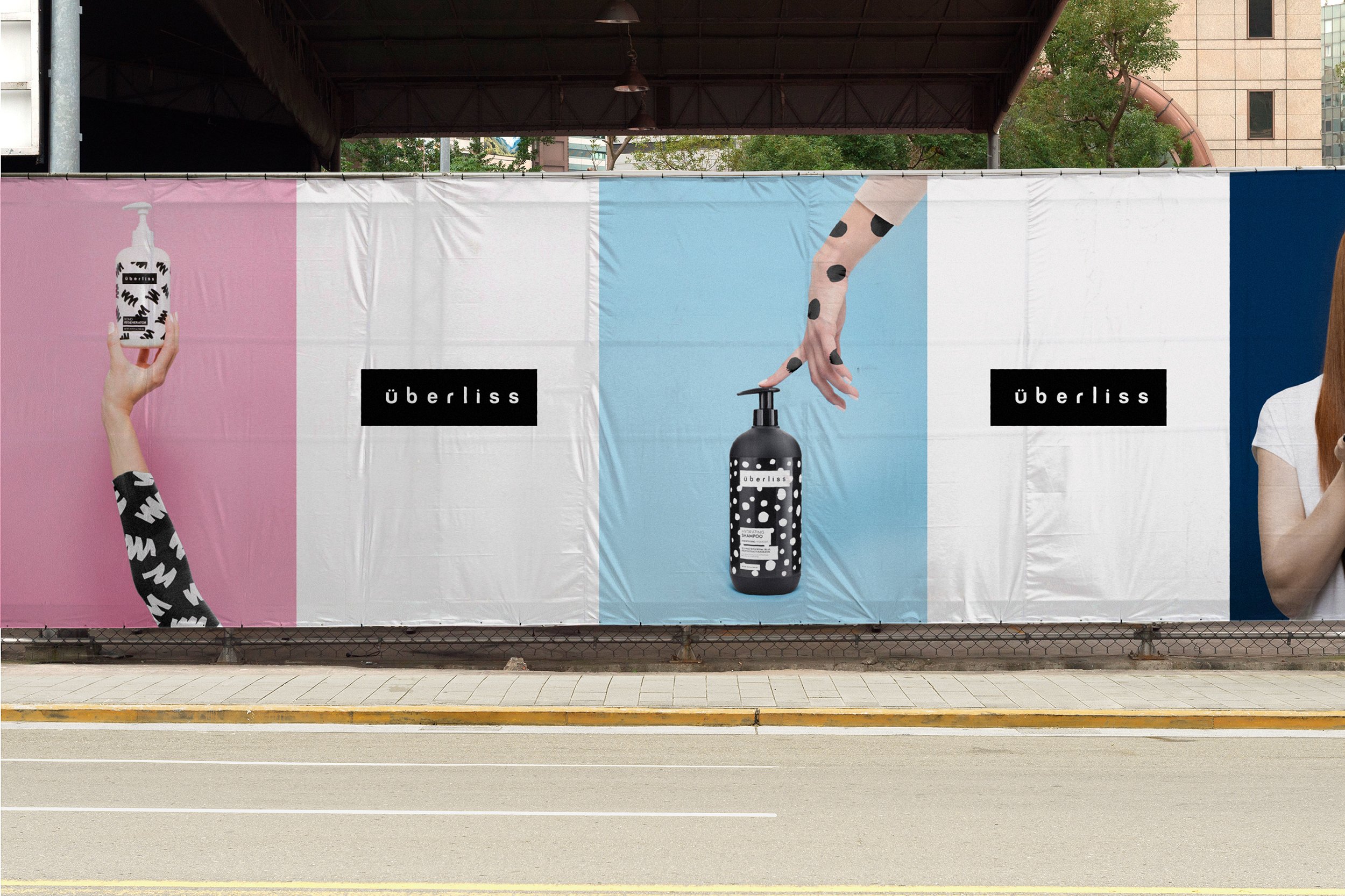
Advertising & OOH

For the campaign, stylish and minimal art directed photography placed emphasis on the products and patterns.

Brand Guidelines

Agency:
FormNation
Client:
Überliss
Sector:
Health & Beauty, B2C
Type:
Brand Identity
Position:
Lead Designer
What I Did:
Logo Design
Pattern Design
Website Design
Print Design
Package Design
Visual Identity
Brand Guidelines
Team:
Jan Habraken, CD
Lotte Van Velzen, AD
Rachael Elle, Graphic Designer
Alissia Melka-Teichroew, Styling
Lisa Klappe, Photography
Press:
Computer Arts Magazine
Brand Magazine
The Dieline︎︎︎
Wallpaper︎︎︎
Graphic Design USA︎︎︎
iDN︎︎︎
Challenge:
Überliss specializes in creating products that deliver amazing shine, softness, and silkiness all while showcasing exotic and natural ingredients with the help of cutting edge research. They approached us to develop a complete brand refresh that would better reflect how their products make their customers feel confident, bold and stylish while also reflecting core brand values of honesty, rebelliousness, youthfulness and vibrancy.
Additionally, the different product lines in the brand all needed to be unique with the ability to easily expand and grow in the future.
Insight:
The company has its origins in the Brazilian haircare industry, where smooth and straight hair is a beauty ideal. The word Überliss means “Super Smooth.”
Solution:
Retaining the original wordmark to preserve existing brand equity and recognition, the logo was slightly modified and placed inside of a frame.
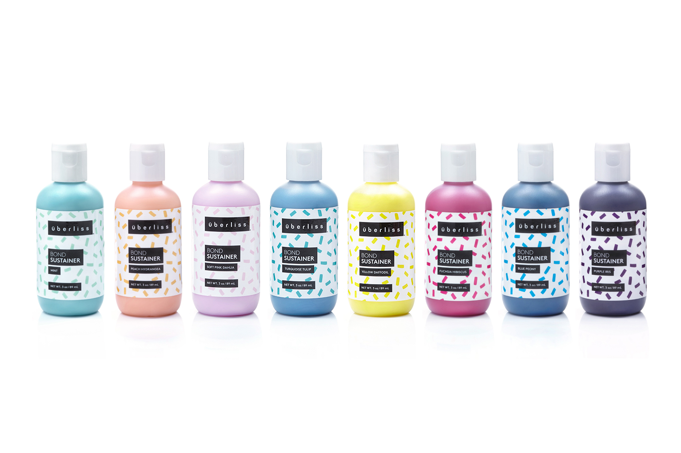
The new identity and package designs are centered around a flexible graphic system that is primarily driven by a mix of bold, hand-painted patterns designed for maximum visual impact and pop on the shelf.
Inspired by what each product does for the hair, while also speaking to the organic and viscous nature of the product itself, they cover both the brand’s salon-only and white-bottled consumer line of products. The patterns were designed as a flexible system that could grow and evolve as the brand added new product lines in the future.
LL Brown is a contemporary, geometric sans by Lineto and was chosen for its legibility and elegant sophistication. The black and white color palette communicated an elevated high fashion aesthetic and timeless stylishness.
Stylish and minimal art directed photography placed emphasis on the products and patterns.
Results:
The new visual identity embodies the core ideals of the brand and customer while also differentiating itself from the competition. The identity was successfully implemented across the entire brand with significant YoY increases in website conversions, revenue and site traffic.
Überliss specializes in creating products that deliver amazing shine, softness, and silkiness all while showcasing exotic and natural ingredients with the help of cutting edge research. They approached us to develop a complete brand refresh that would better reflect how their products make their customers feel confident, bold and stylish while also reflecting core brand values of honesty, rebelliousness, youthfulness and vibrancy.
Additionally, the different product lines in the brand all needed to be unique with the ability to easily expand and grow in the future.
Insight:
The company has its origins in the Brazilian haircare industry, where smooth and straight hair is a beauty ideal. The word Überliss means “Super Smooth.”
Solution:
Retaining the original wordmark to preserve existing brand equity and recognition, the logo was slightly modified and placed inside of a frame.
The new identity and package designs are centered around a flexible graphic system that is primarily driven by a mix of bold, hand-painted patterns designed for maximum visual impact and pop on the shelf.
Inspired by what each product does for the hair, while also speaking to the organic and viscous nature of the product itself, they cover both the brand’s salon-only and white-bottled consumer line of products. The patterns were designed as a flexible system that could grow and evolve as the brand added new product lines in the future.
LL Brown is a contemporary, geometric sans by Lineto and was chosen for its legibility and elegant sophistication. The black and white color palette communicated an elevated high fashion aesthetic and timeless stylishness.
Stylish and minimal art directed photography placed emphasis on the products and patterns.
Results:
The new visual identity embodies the core ideals of the brand and customer while also differentiating itself from the competition. The identity was successfully implemented across the entire brand with significant YoY increases in website conversions, revenue and site traffic.
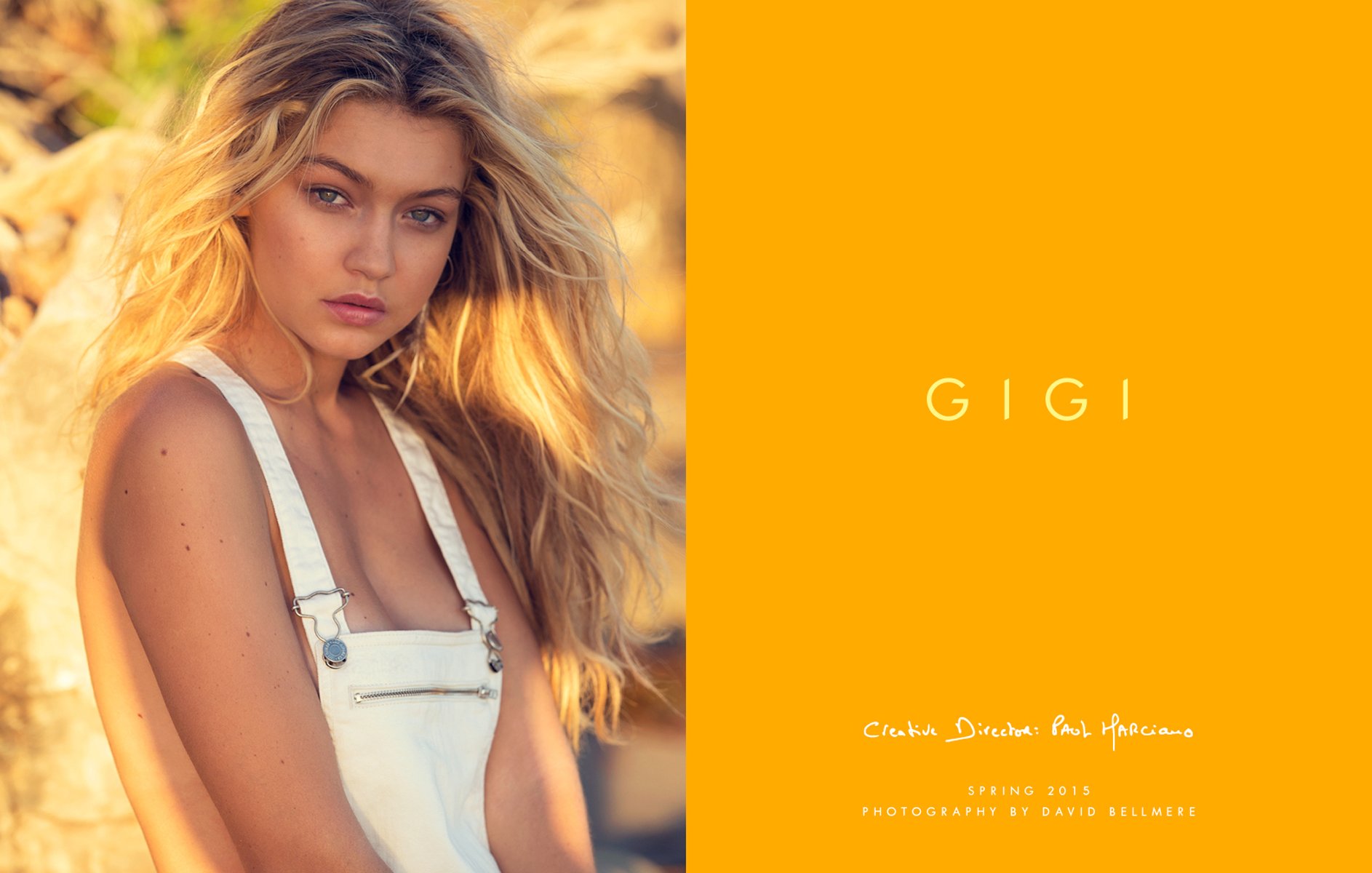
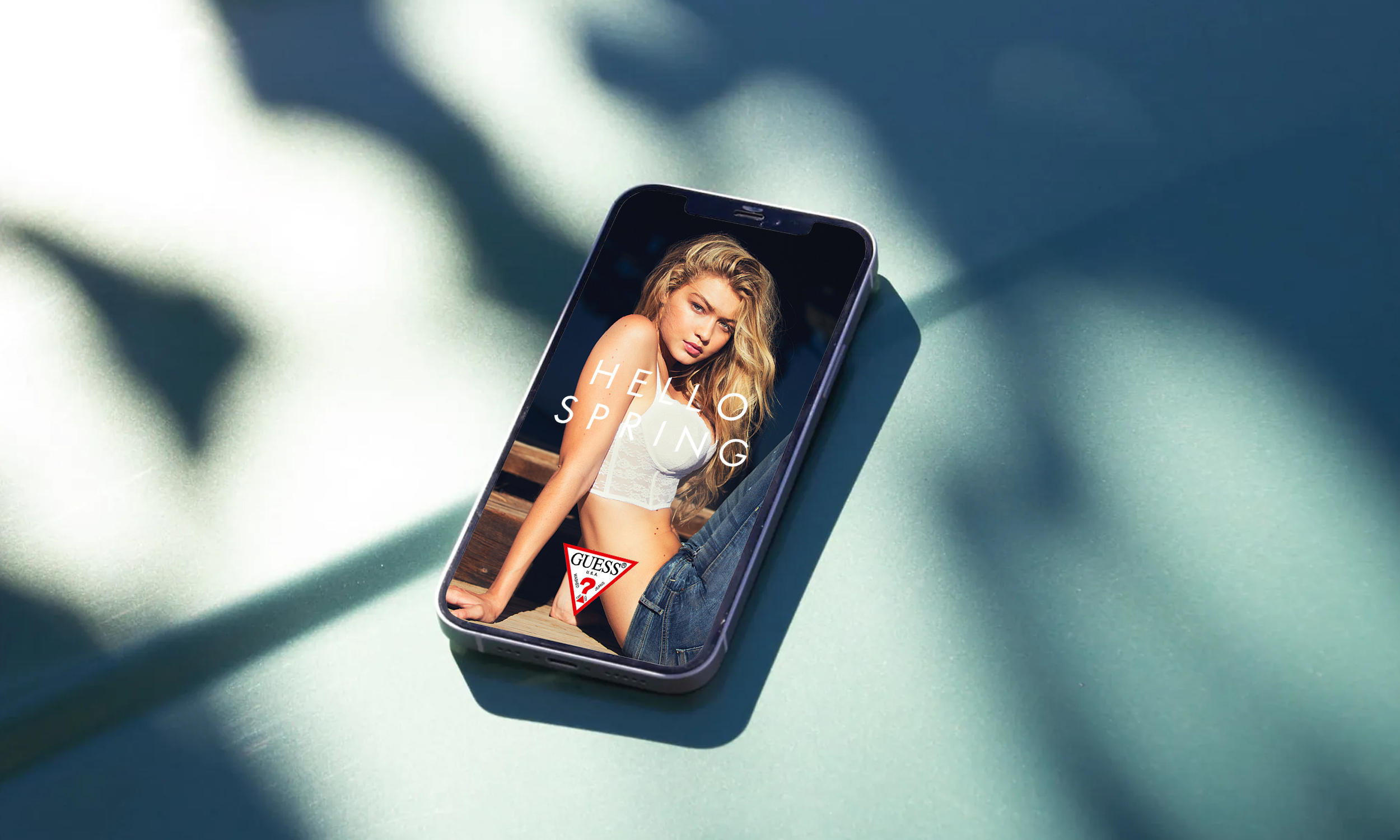
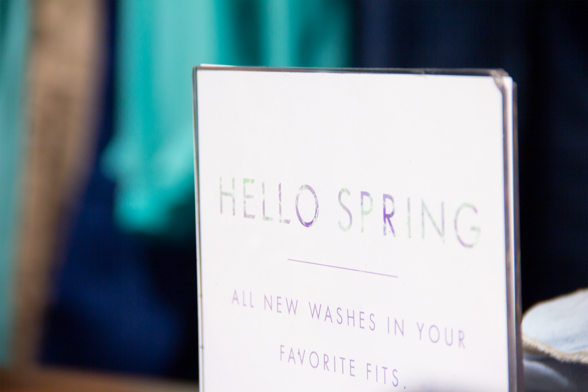
Hello Spring
I collaborated with L.A. fashion brand GUESS? on their 2015 Hello Spring global marketing campaign.
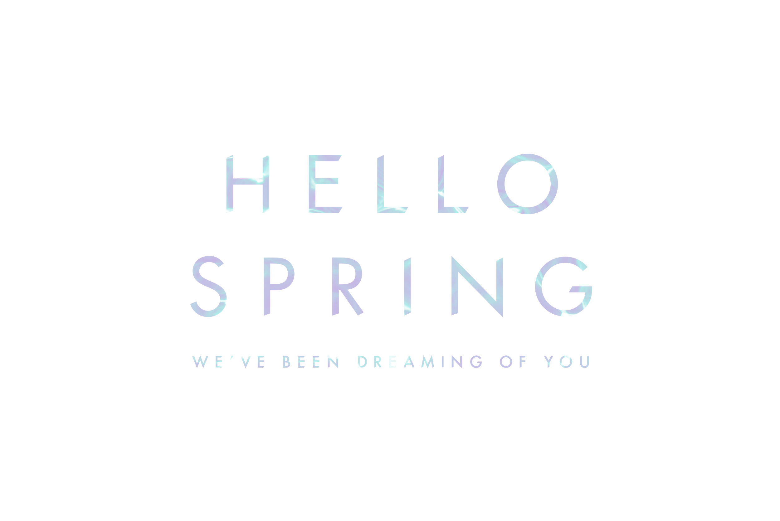
The Typeface

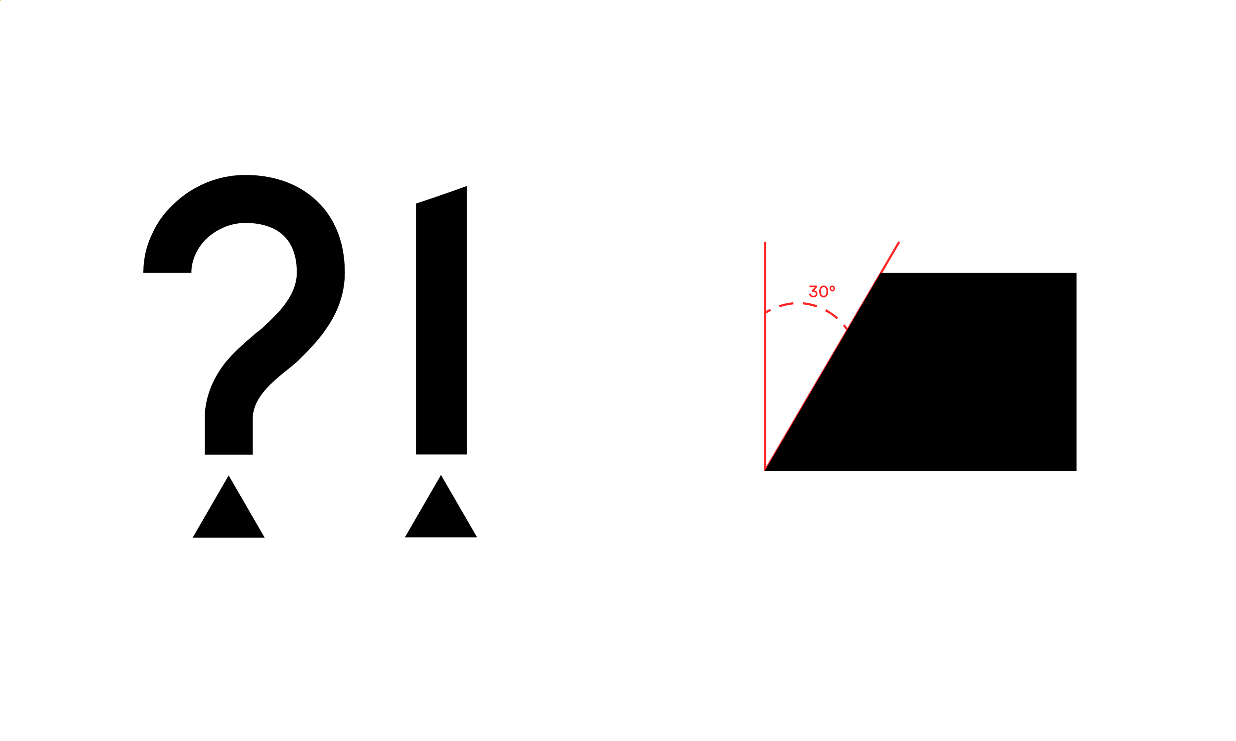
Based off their existing brand typeface Futura, the angles of the equilateral triangle in the iconic GUESS emblem were appropriated in the terminals of the letterforms by rotating the logo in 45 degree increments.
The subtle but noticeable changes
allowed for maximum usability at both
large and small sizes.
allowed for maximum usability at both
large and small sizes.
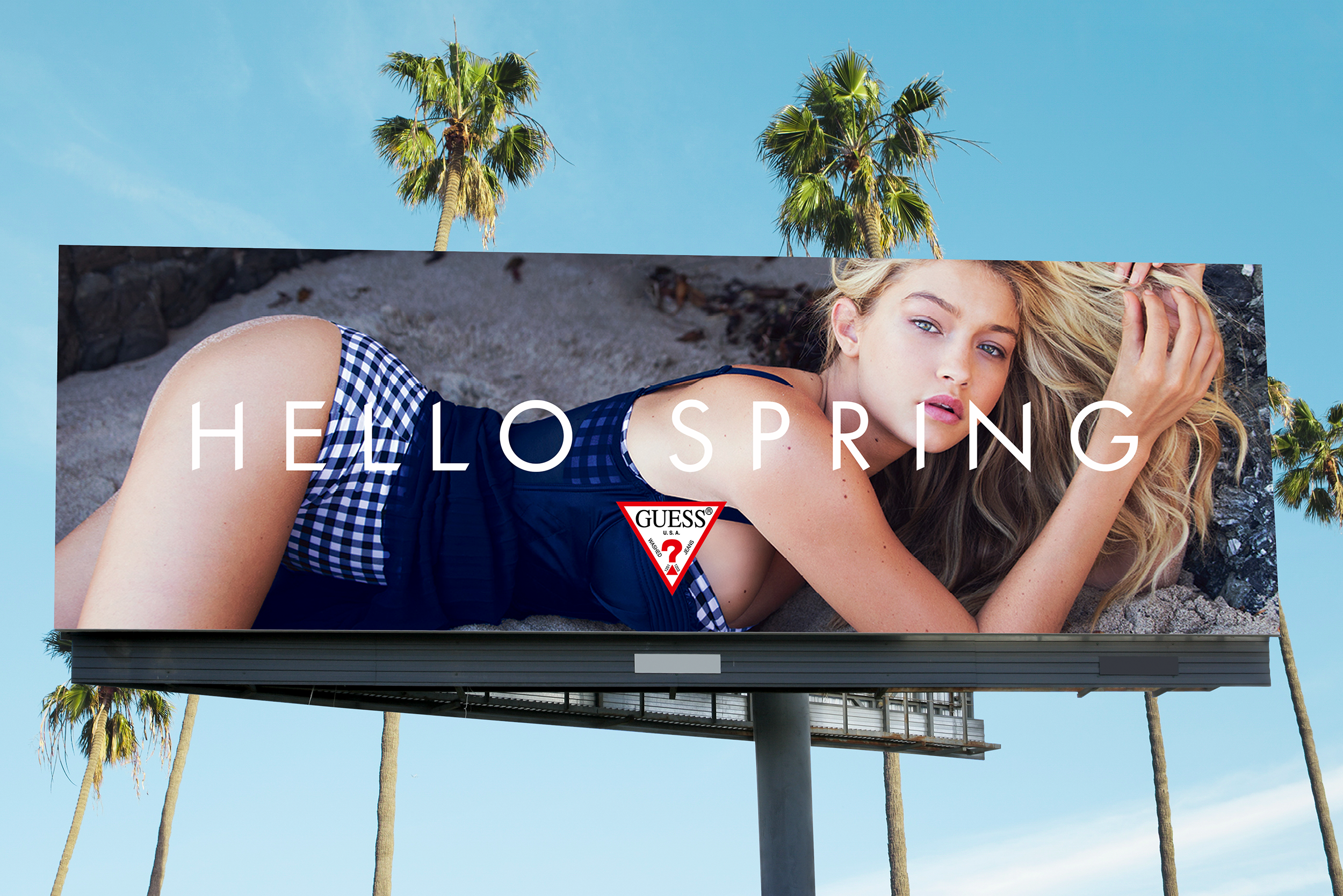
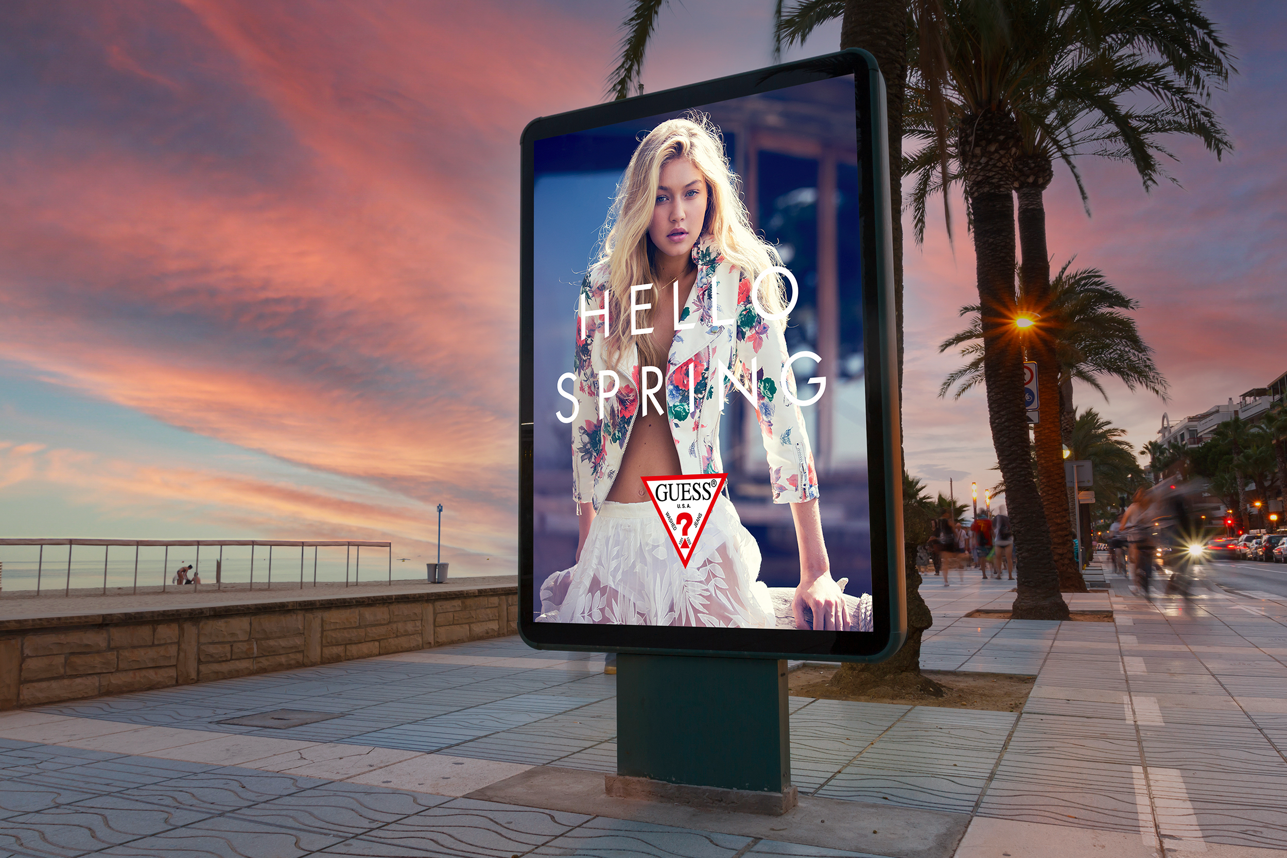
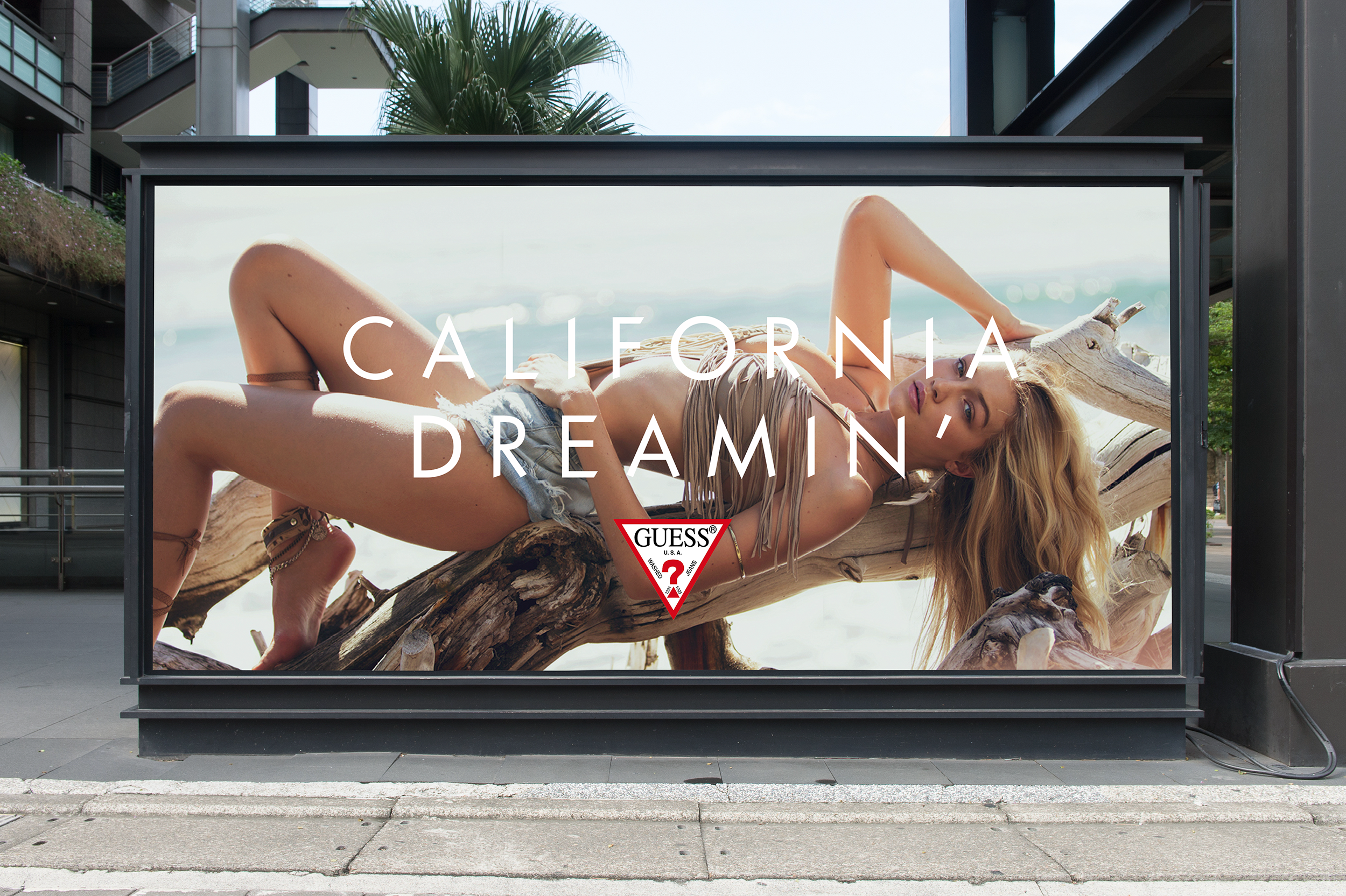
The Campaign


The typeface was used for the different campaign slogans.
Website
Social

Advertising & OOH
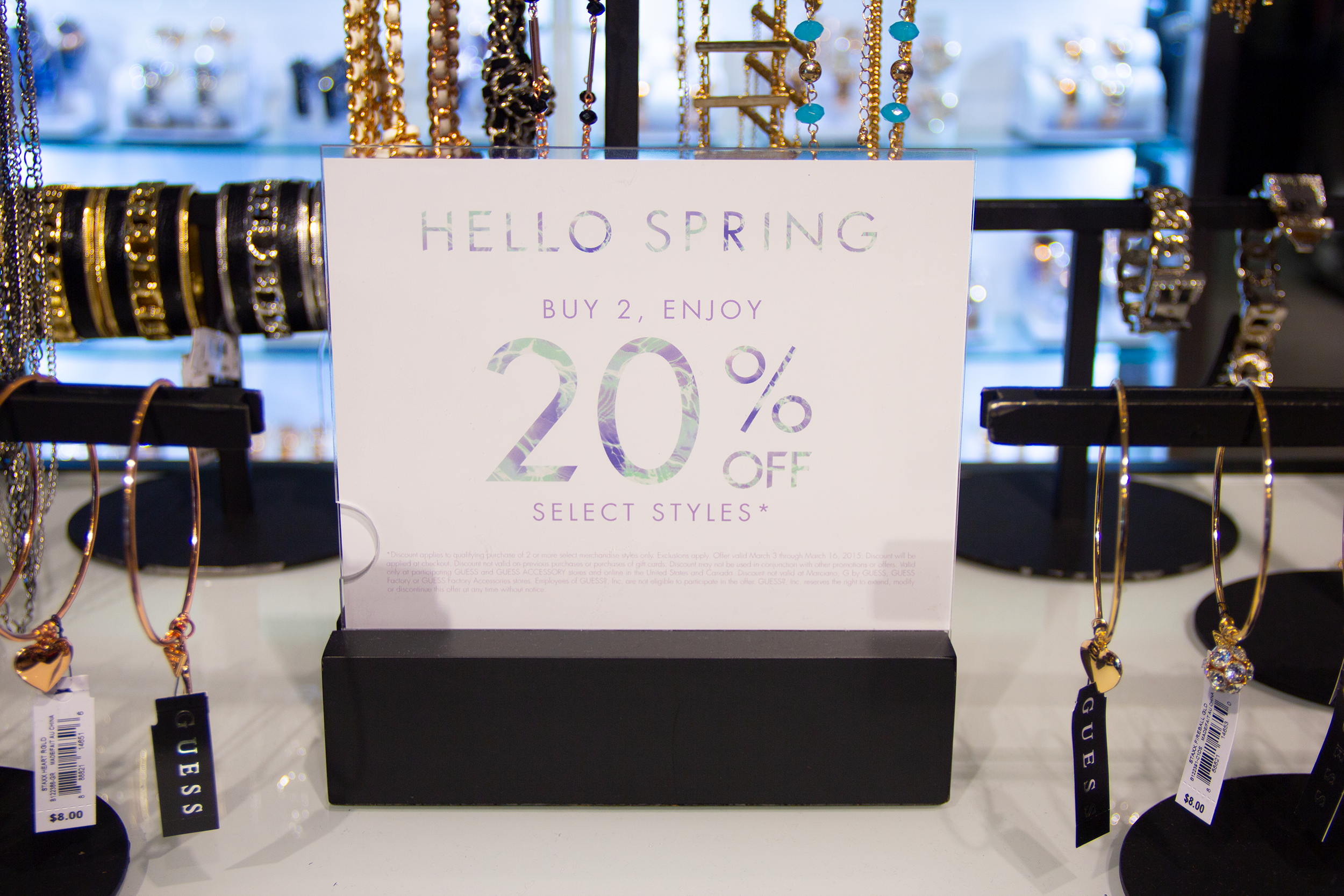
In-Store


Campaigns


The typeface was used for several more GUESS? campaigns.

Agency:
Studio B
Client:
GUESS?
Sector:
Fashion/Retail, B2C
Type:
Campaign
Typeface
Position:
Lead Designer
What I Did:
Typeface Design
Print Design
Retail Design
OOH
Team:
Paul Marciano, ECD
Rob Chong, CD
David Belmere, Photography
Sergio Bautista, Camera / Editing
Studio B
Client:
GUESS?
Sector:
Fashion/Retail, B2C
Type:
Campaign
Typeface
Position:
Lead Designer
What I Did:
Typeface Design
Print Design
Retail Design
OOH
Team:
Paul Marciano, ECD
Rob Chong, CD
David Belmere, Photography
Sergio Bautista, Camera / Editing
Challenge:
Founded in 1981, GUESS? is a globally recognized fashion brand known for it’s youthful, sexy and adventurous image as well as its iconic ad campaigns featuring high-profile models. GUESS? wanted to create a custom typeface that reflected their brand values of young, sexy and timeless and that could also be used on their website and for their marketing campaigns.
Insight:
The GUESS? triangle badge logo is iconic and highly recognizable by the public.
Solution:
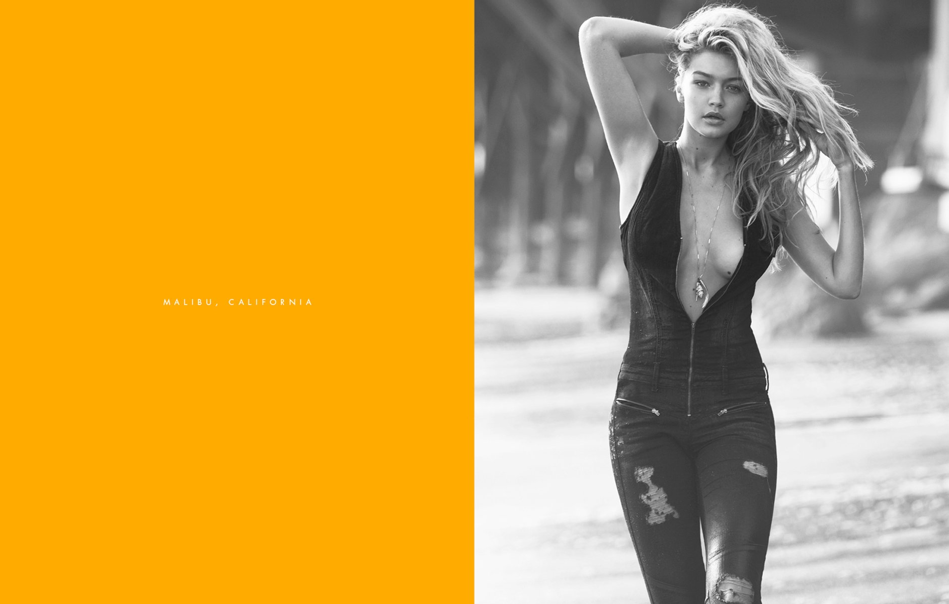
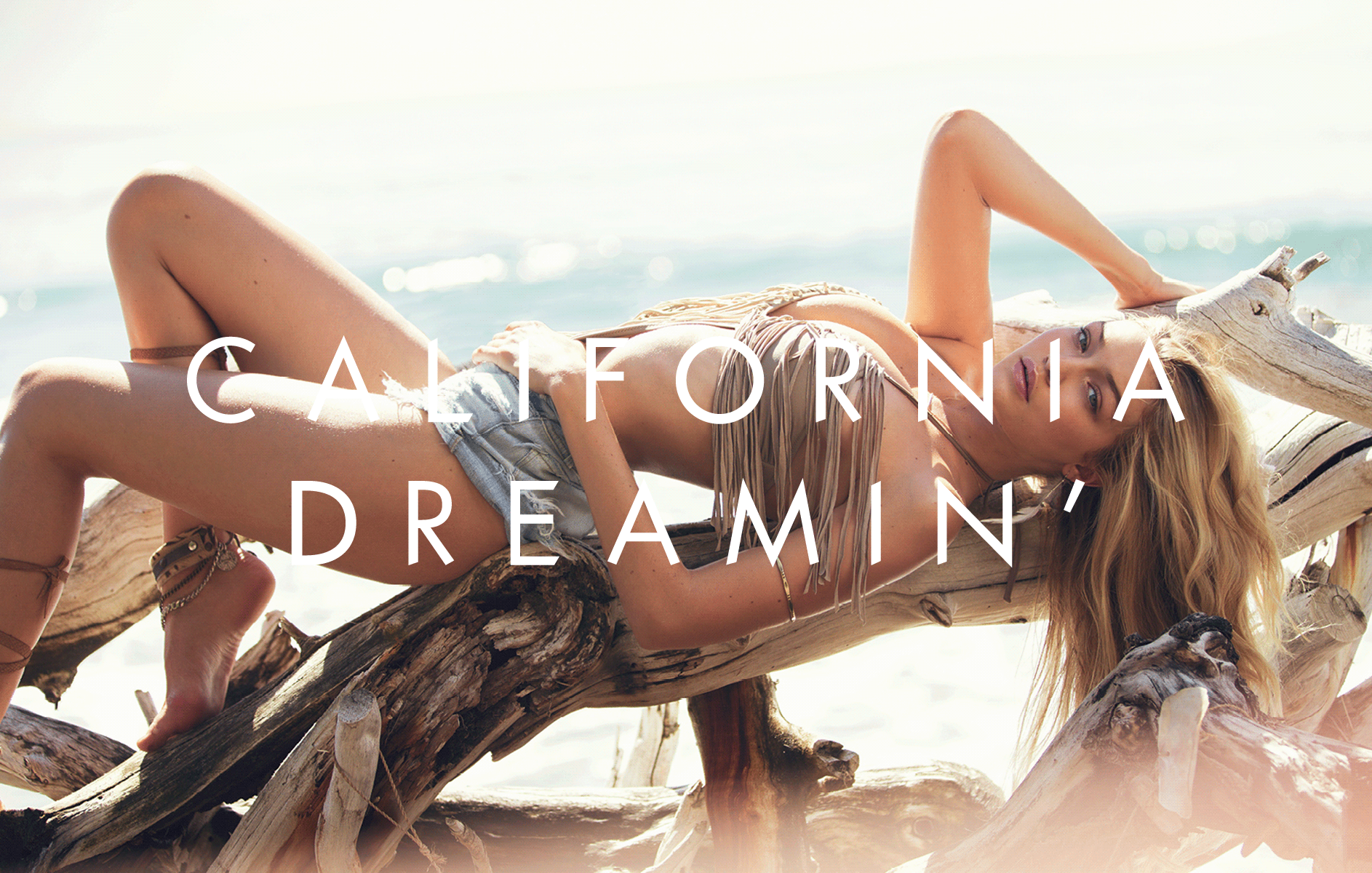
I collaborated with GUESS? to create a custom typeface in five weights that could be used for their global ad campaigns and on their e-commerce website. Based off their existing brand typeface Futura—a geometric sans serif by Paul Renner—the angles of the equilateral triangle in the iconic GUESS emblem were appropriated in the terminals of the letterforms by rotating the logo in 45 degree increments. The final result was an elevated, unique and custom typeface that GUESS? could own. Highly usable, the subtle but noticable changes worked well at both small and large sizes. The campaign and typeface premiered internationally in retail stores and on their website as part of their 2015 "Hello Spring" global campaign featuring model Gigi Hadid.
The 2015 “Hello Spring” campaign featured photographs of model Gigi Hadid taken in Malibu, California. Reflecting the season, a soft, pastel, watercolor type treatment was applied to the typeface and used on the website and for the in-store window displays.
Alternate glyphs and puncutation contained triangles in the diacritical marks further extending the brand language in a playful and signature way.
Results:
The typeface premiered in Spring 2015 on the global brand e-commerce site and in the “Hello Spring” global ad campaign. The typeface was featured for several years throughout different GUESS? campaigns and commercials across a range of print and digital touchpoints.
Founded in 1981, GUESS? is a globally recognized fashion brand known for it’s youthful, sexy and adventurous image as well as its iconic ad campaigns featuring high-profile models. GUESS? wanted to create a custom typeface that reflected their brand values of young, sexy and timeless and that could also be used on their website and for their marketing campaigns.
Insight:
The GUESS? triangle badge logo is iconic and highly recognizable by the public.
Solution:
I collaborated with GUESS? to create a custom typeface in five weights that could be used for their global ad campaigns and on their e-commerce website. Based off their existing brand typeface Futura—a geometric sans serif by Paul Renner—the angles of the equilateral triangle in the iconic GUESS emblem were appropriated in the terminals of the letterforms by rotating the logo in 45 degree increments. The final result was an elevated, unique and custom typeface that GUESS? could own. Highly usable, the subtle but noticable changes worked well at both small and large sizes. The campaign and typeface premiered internationally in retail stores and on their website as part of their 2015 "Hello Spring" global campaign featuring model Gigi Hadid.
The 2015 “Hello Spring” campaign featured photographs of model Gigi Hadid taken in Malibu, California. Reflecting the season, a soft, pastel, watercolor type treatment was applied to the typeface and used on the website and for the in-store window displays.
Alternate glyphs and puncutation contained triangles in the diacritical marks further extending the brand language in a playful and signature way.
Results:
The typeface premiered in Spring 2015 on the global brand e-commerce site and in the “Hello Spring” global ad campaign. The typeface was featured for several years throughout different GUESS? campaigns and commercials across a range of print and digital touchpoints.
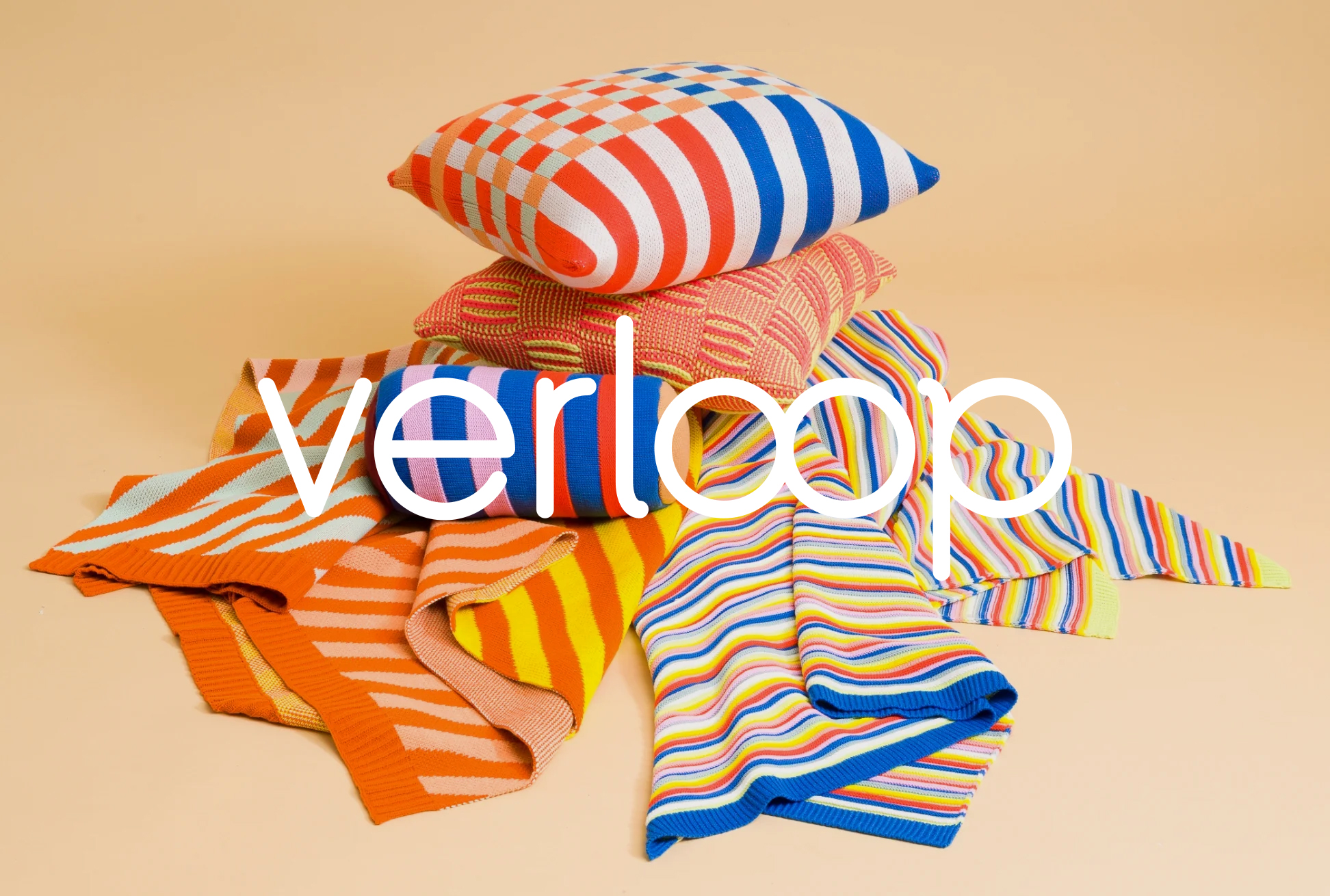
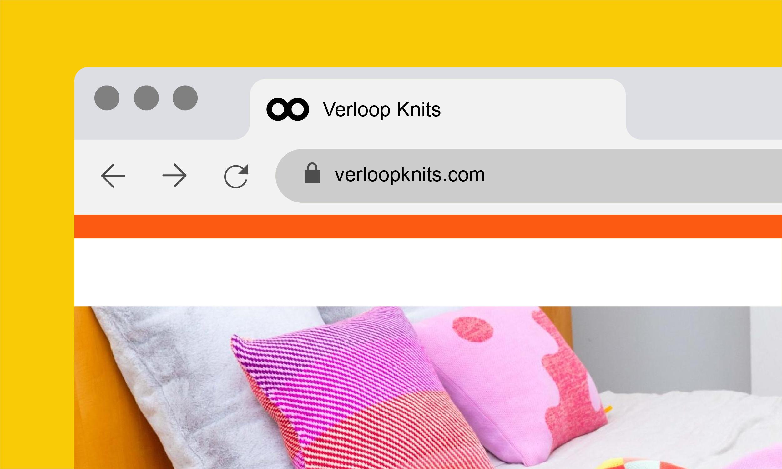
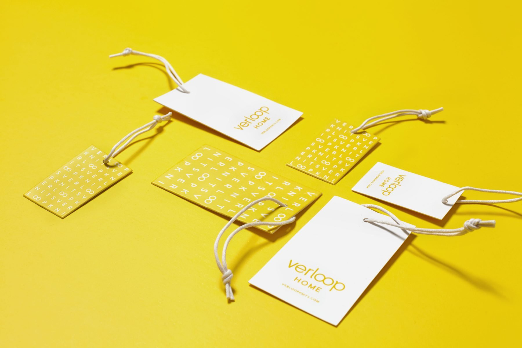
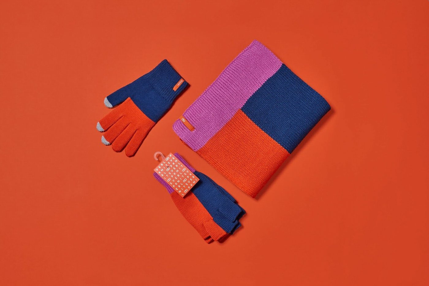
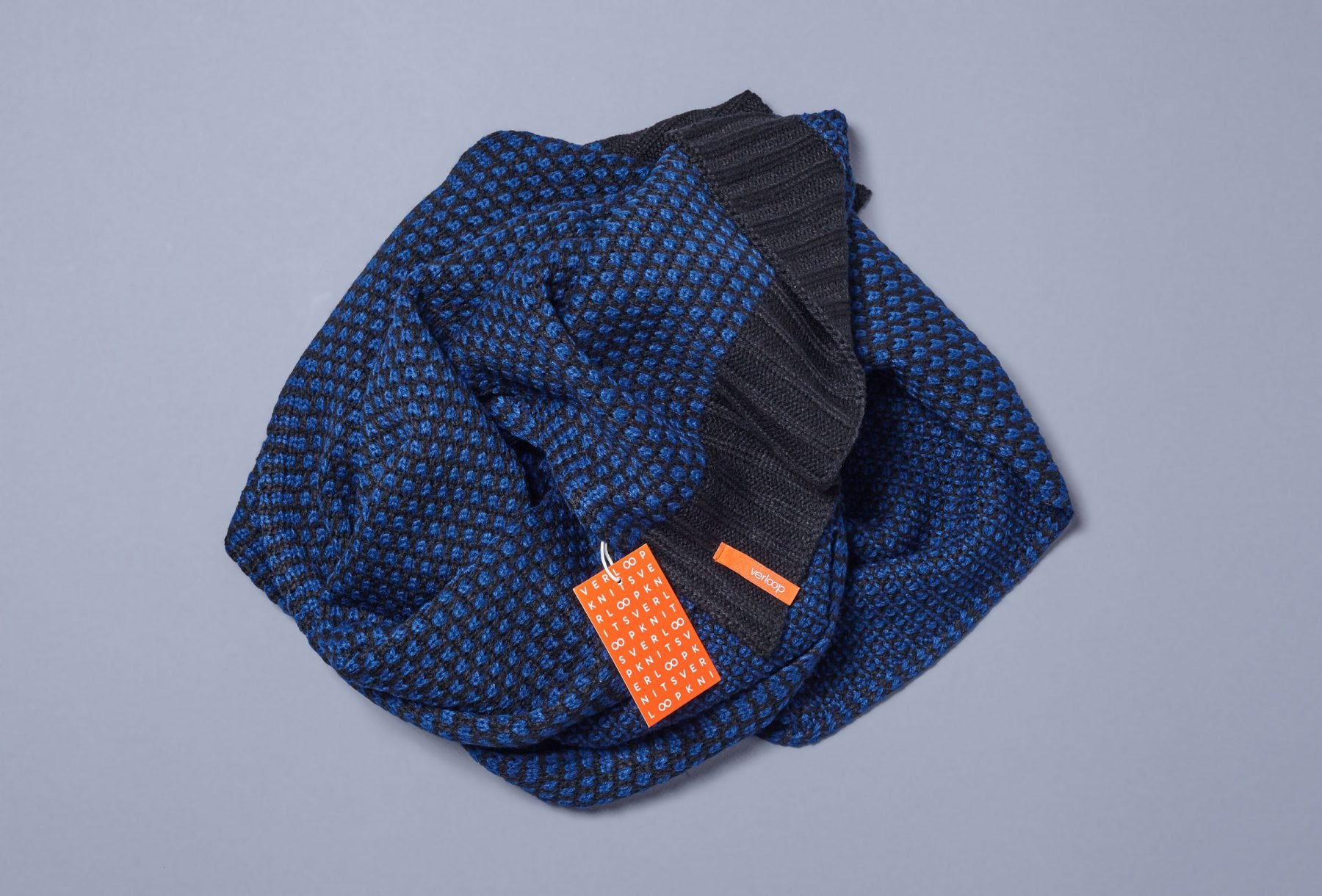
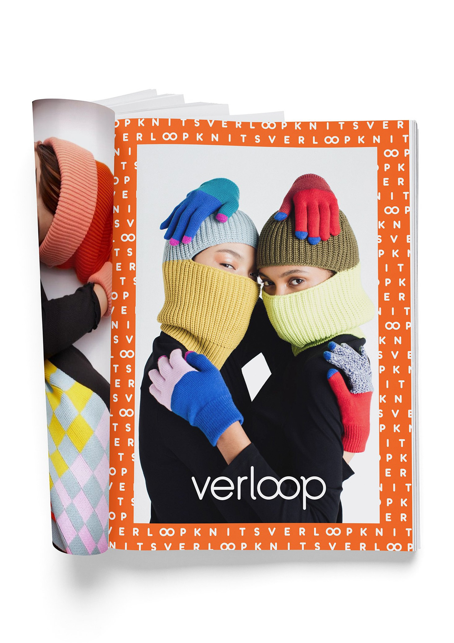
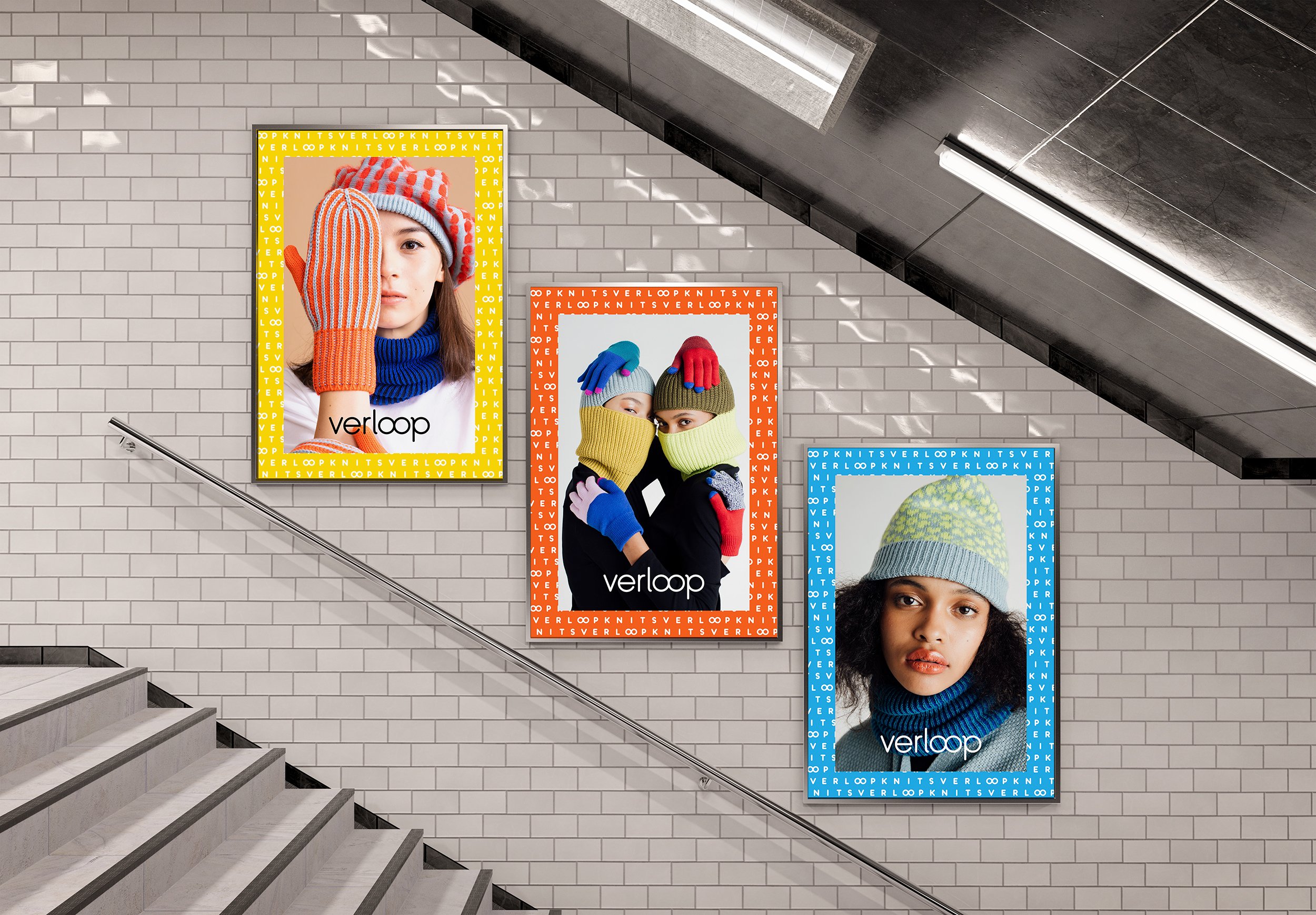
Verloop Knits
Brand identity refresh for Verloop Knits—an innovative, contemporary, D2C, knitwear brand that creates unique accessories by infusing traditional knits with unexpected details, materials and industrial techniques. Designed in collaboration with FormNation Design.
Inspiration

Visual Explorations


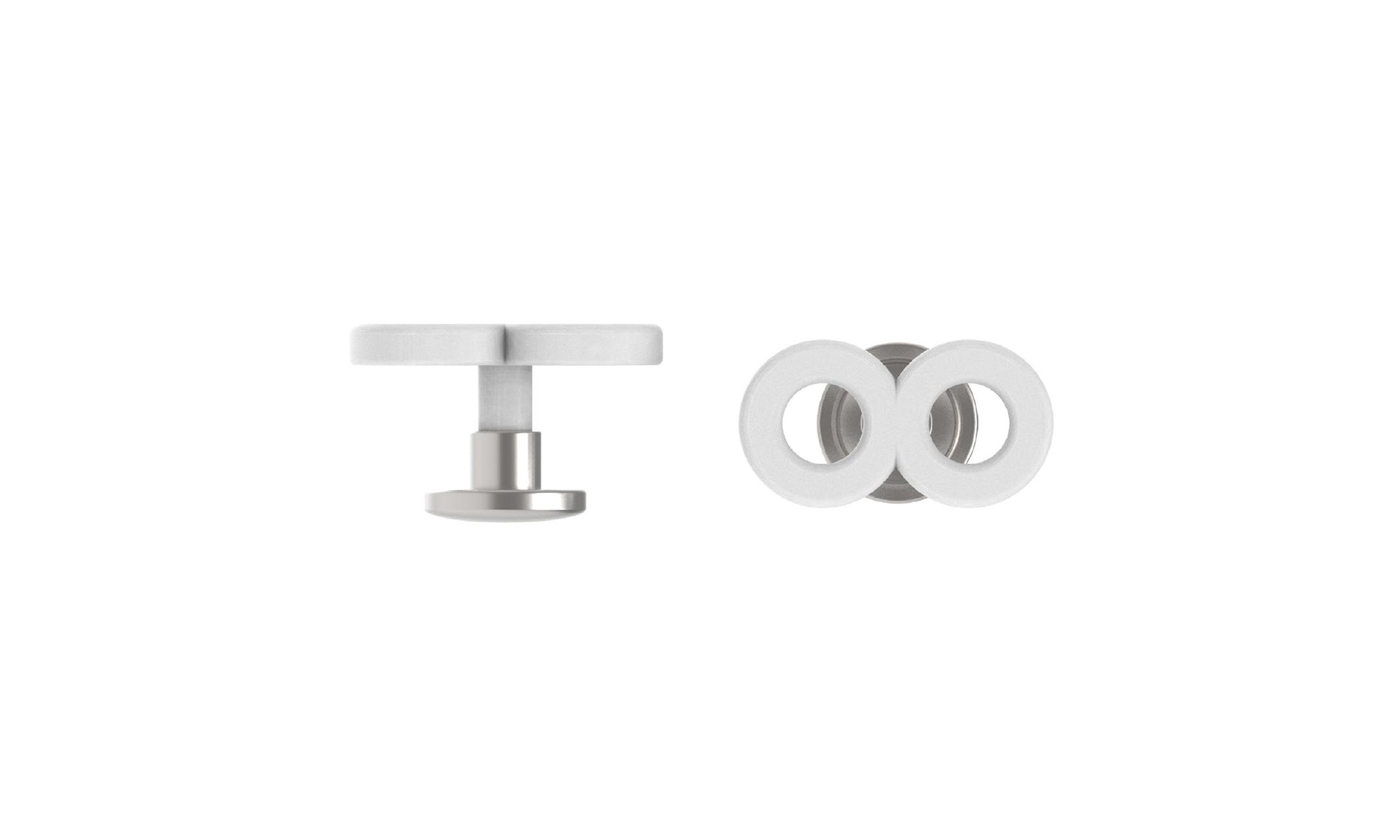
Logo
The redesigned, rounded, monoline,
custom wordmark communicated a soft,
playful, friendliness and contemporary
innovation without being pretentious.
Like the products themselves, the “infinity loop” brand icon reflects the continuous nature of a knitted piece of fabric.
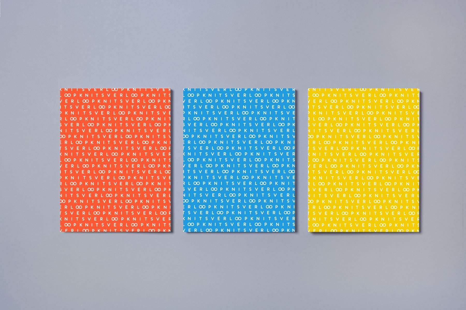
The Pattern


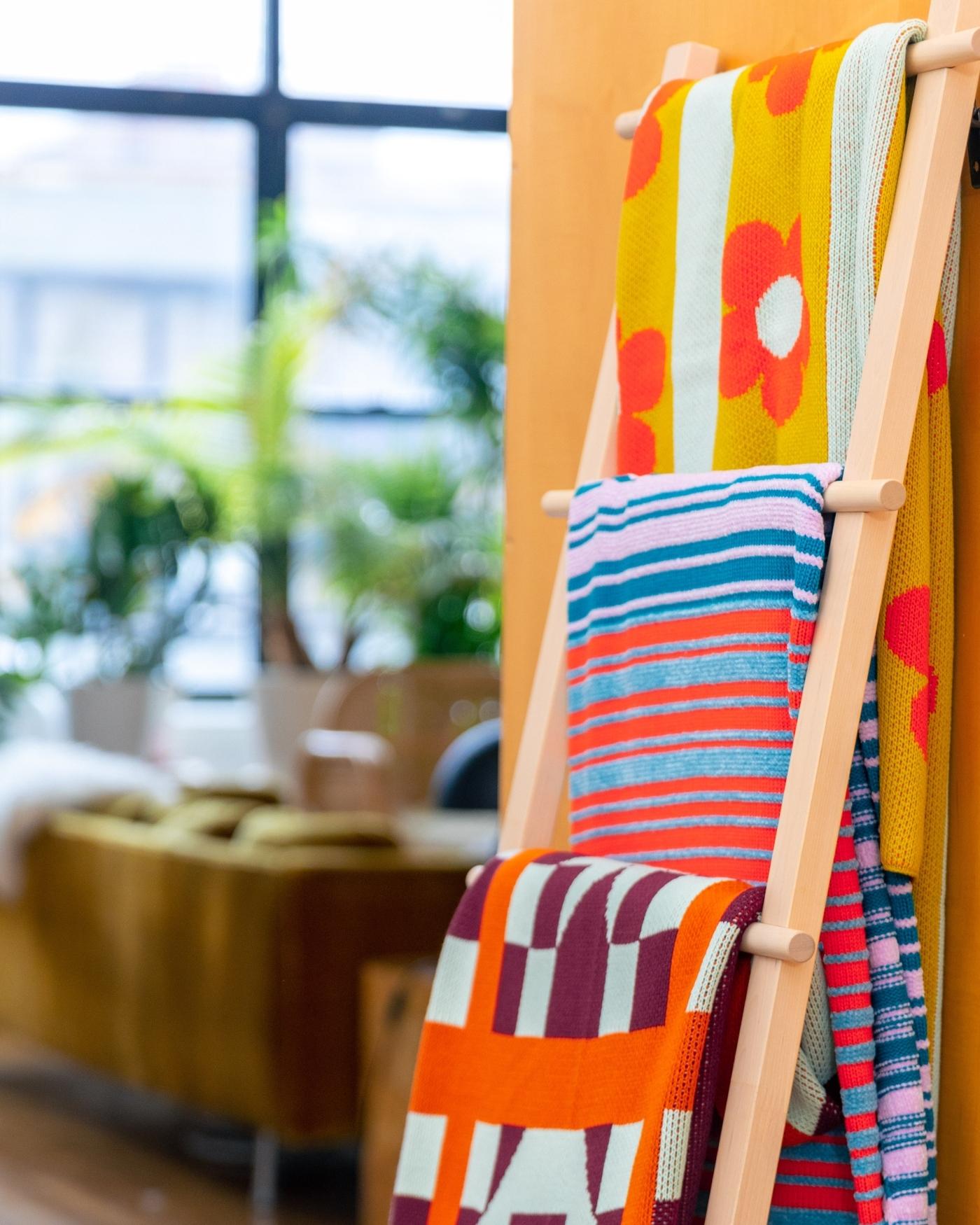
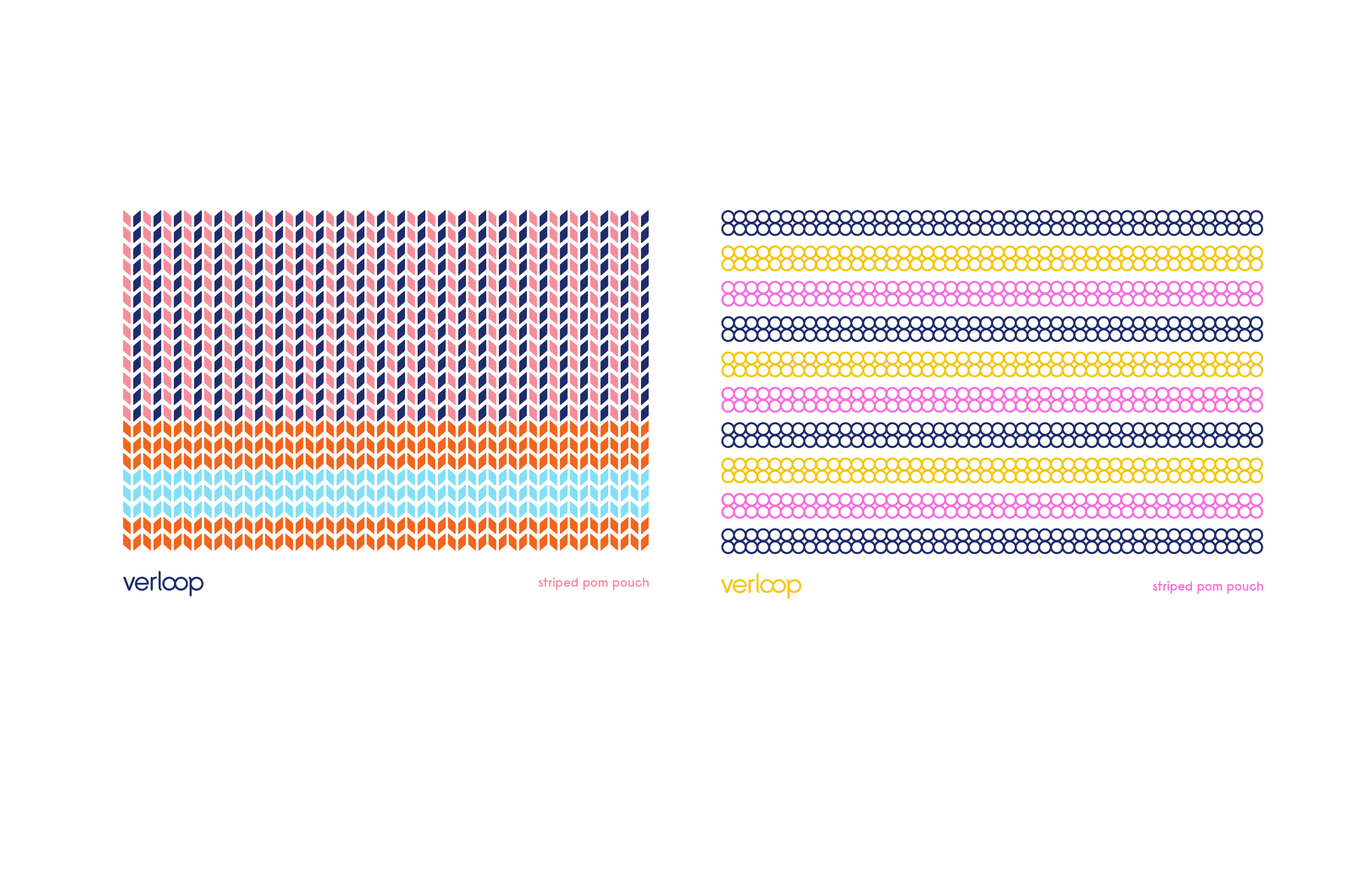
A tactile brand pattern was created to mimic the texture of knitted fabric.
Color & Typography


The bold and cheerful color palette was informed by the colorful yarn used in the products.
Konigsberg is a rounded, monoline typeface that communicated a sense of softness and visual uniformity when used as a pattern.
Konigsberg is a rounded, monoline typeface that communicated a sense of softness and visual uniformity when used as a pattern.
Website
The website featured a modular grid based design that focused on clear navigation, functionality and ease of use.
Print
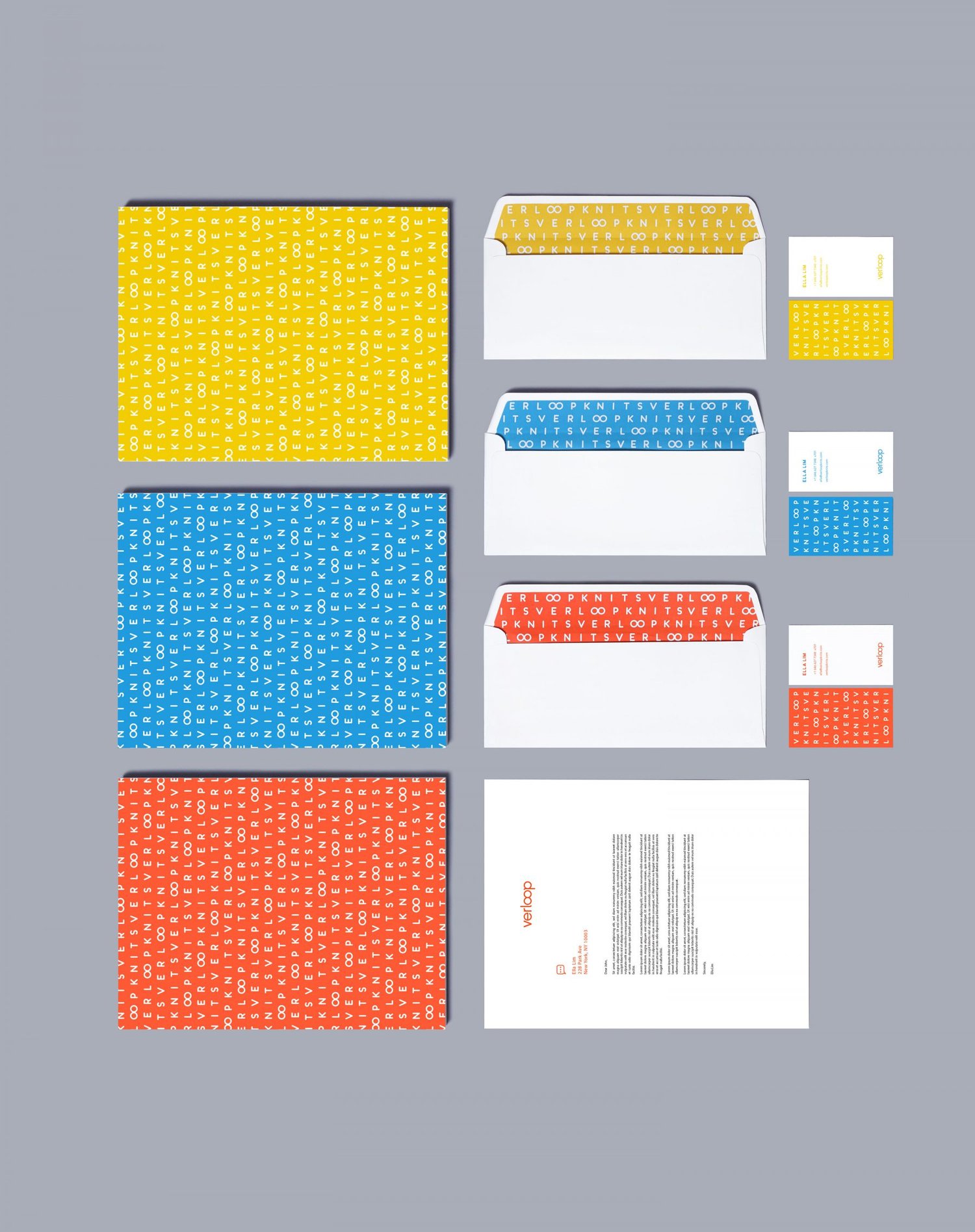
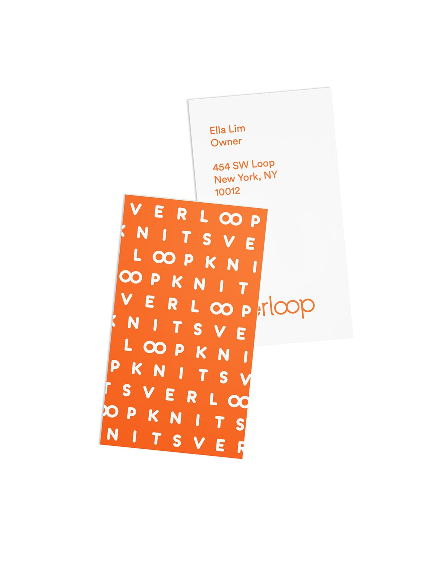


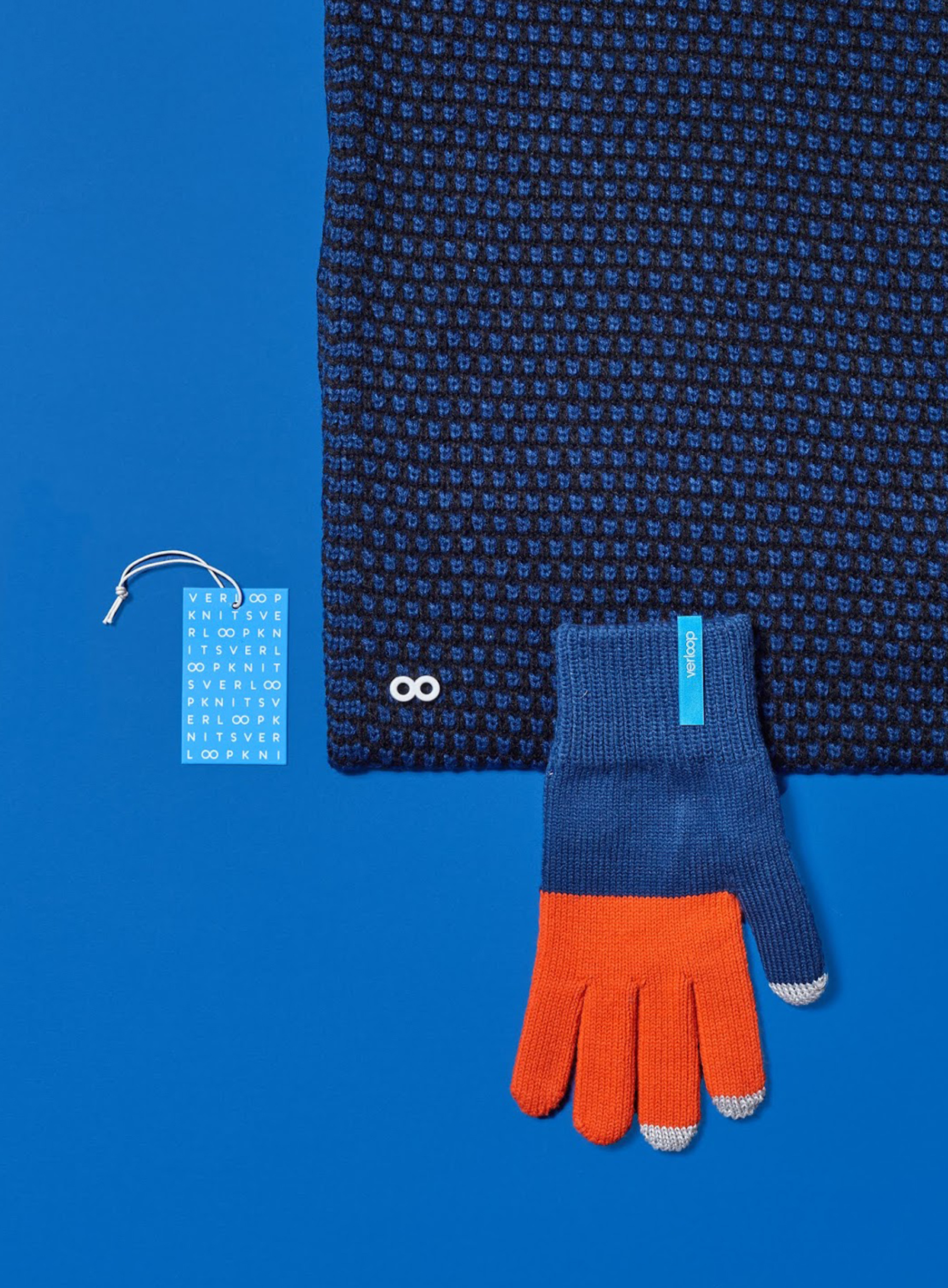

The branding system was unified across print and digital touchpoints including social, packaging and OOH ads.
Social
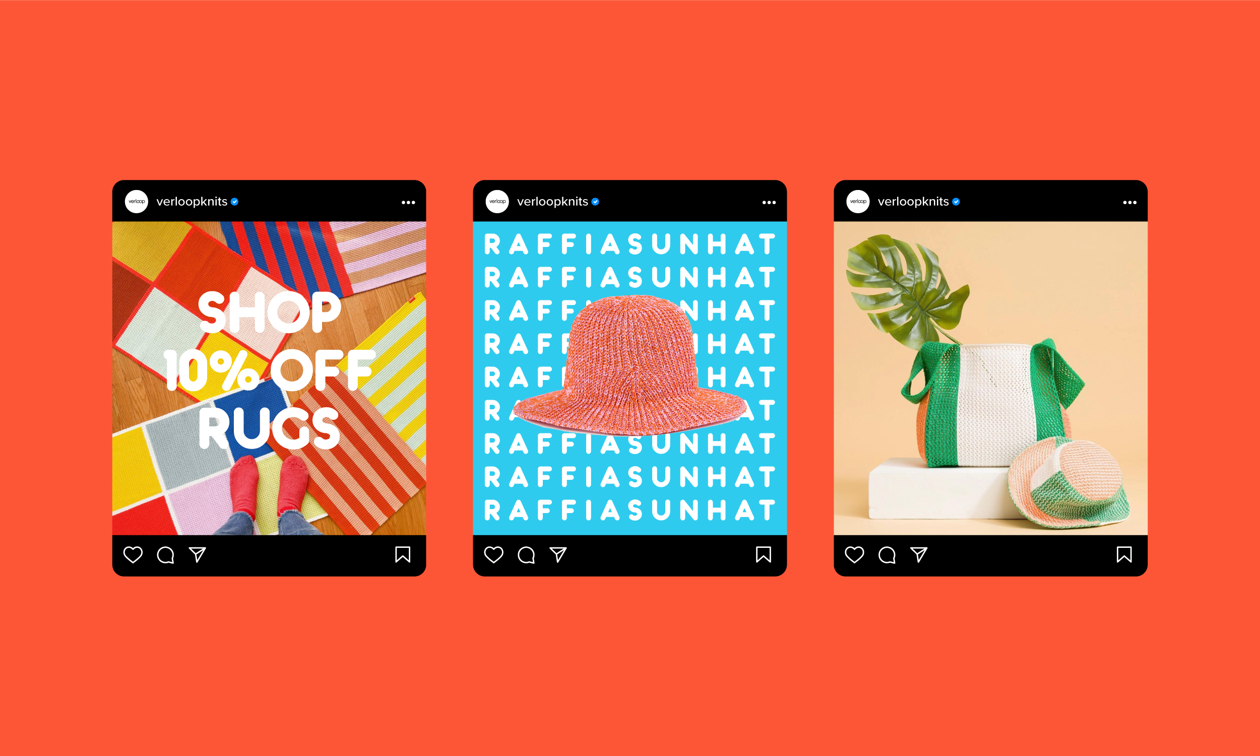
Package

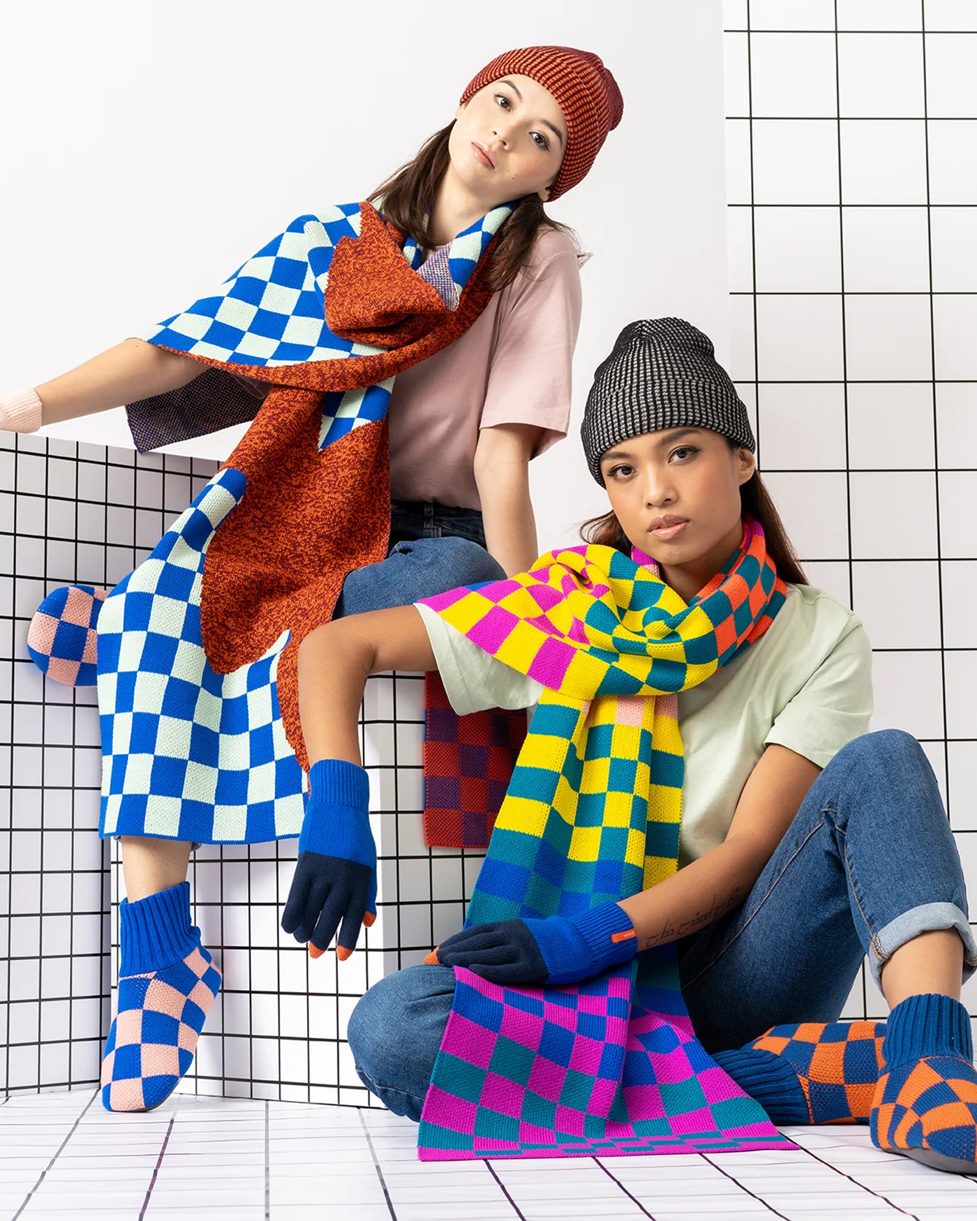
Advertising & OOH
Letting the products speak for themselves, the campaign used pattern, color and photography to tell the brand story.

Agency:
FormNation
Client:
Verloop Knits
Sector:
Fashion/Retail, B2C
Type:
Brand Identity
Position:
Lead Designer
What I Did:
Logo Design
Visual Identity
Website Design
Package Design
Animation
Brand Guidelines
OOH
Team:
Jan Habraken, CD
Lotte Van Velzen, AD
Rachael Elle, Graphic Designer
Alissia Melka-Teichroew, Styling
Lisa Klappe, Photography
Challenge:
Verloop Knits approached us because the brand was disconnected and they needed a brand identity refresh to unify their brand language across all touchpoints and better reflect the spirit and nature of their products.
Insight:
Verloop means “process” in Dutch.
Solution:
Informed by their products, I designed a new custom, rounded, monoline wordmark that communicated softness and friendliness. Woven into the logo, the two O letterforms were also joined to represent a circular, “infinity loop” brand mark that is symbolic of a continuous piece of thread.
The brand typeface is Konigsberg—a soft, monoline typeface that was chosen for its visual uniformity when used as a pattern and as a counterpart to the wordmark.
A typographic brand pattern was created to represent the weave and tactile nature of the products while the cheerful and bold color palette was informed by the innovative and colorful spirit of the brand and products.
Results:
The new identity was successfully implemented across the entire brand ecosystem and resulted in significant increases in site traffic, conversions and YoY e-comm revenue.
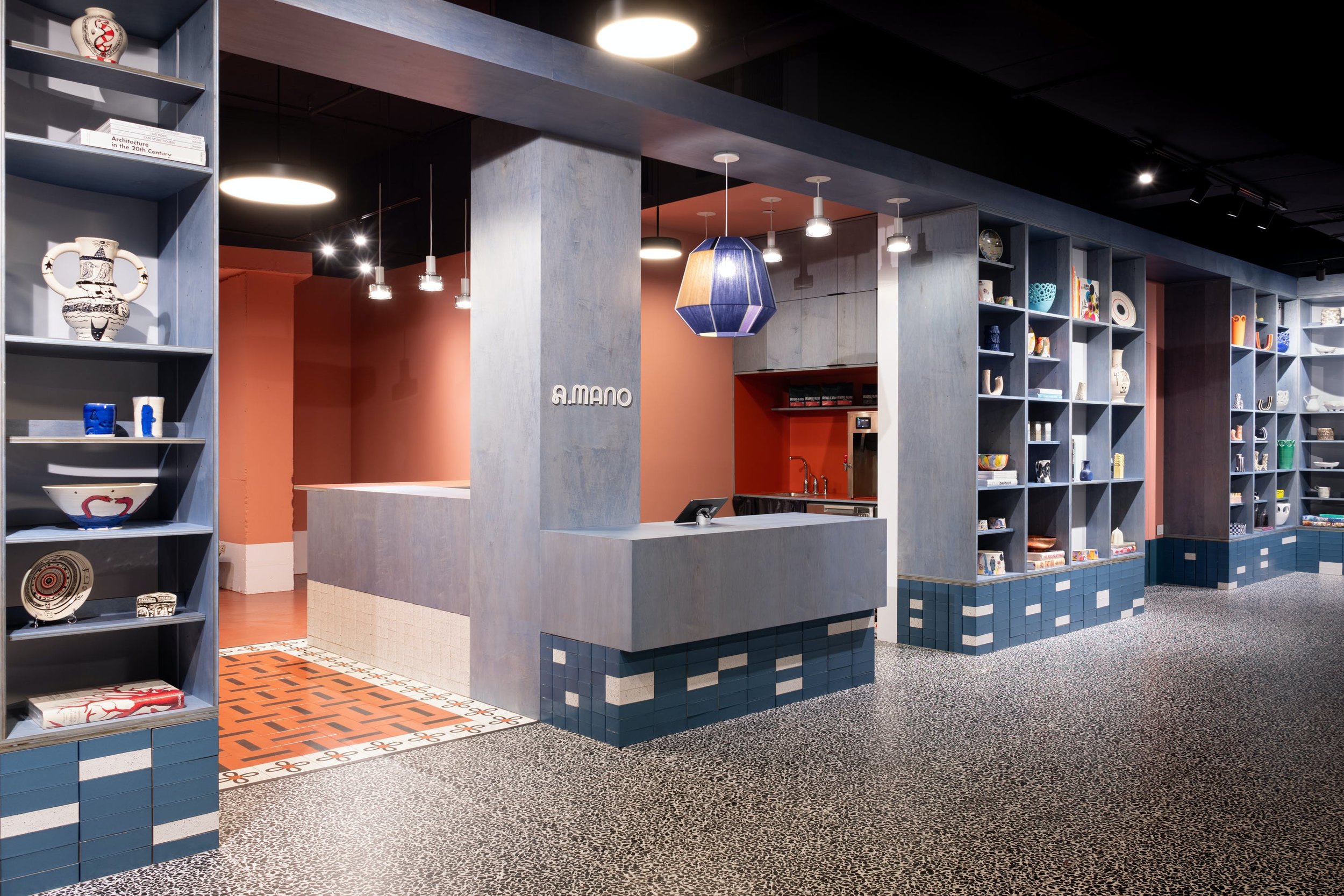
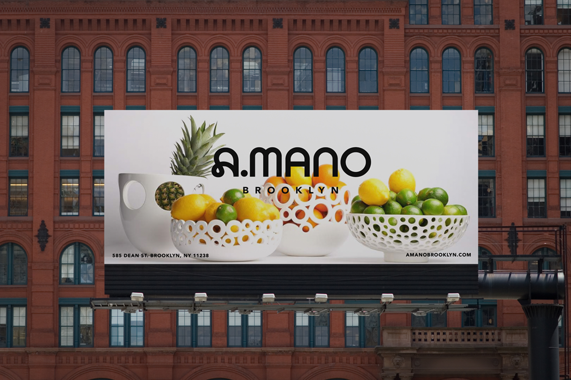
A.MANO Brooklyn
Brand identity refresh for A.MANO Brooklyn—a unique, home décor retail shop featuring ceramics by local artists, vintage art and up-cycled fine furniture. Designed in collaboration with Sergio Mannino Studio.
Previous Branding
![]()
Inspiration
![]()
![]()
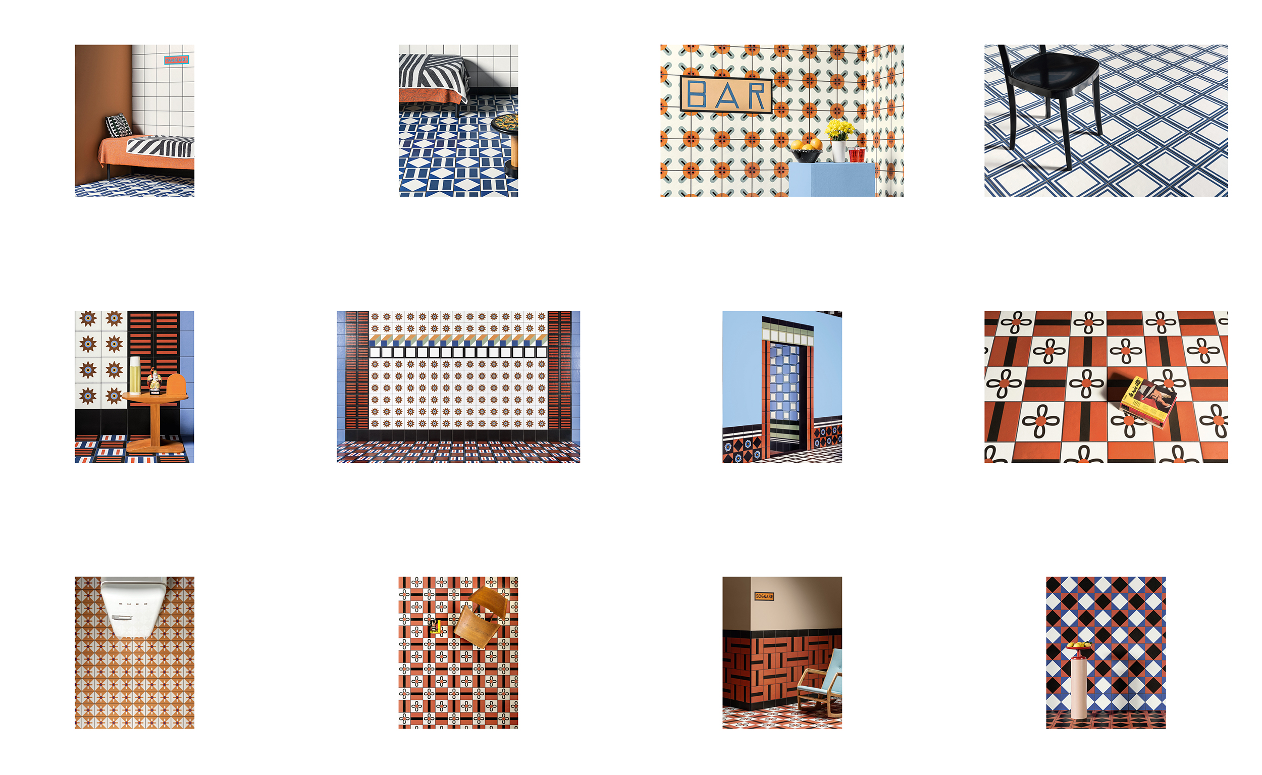
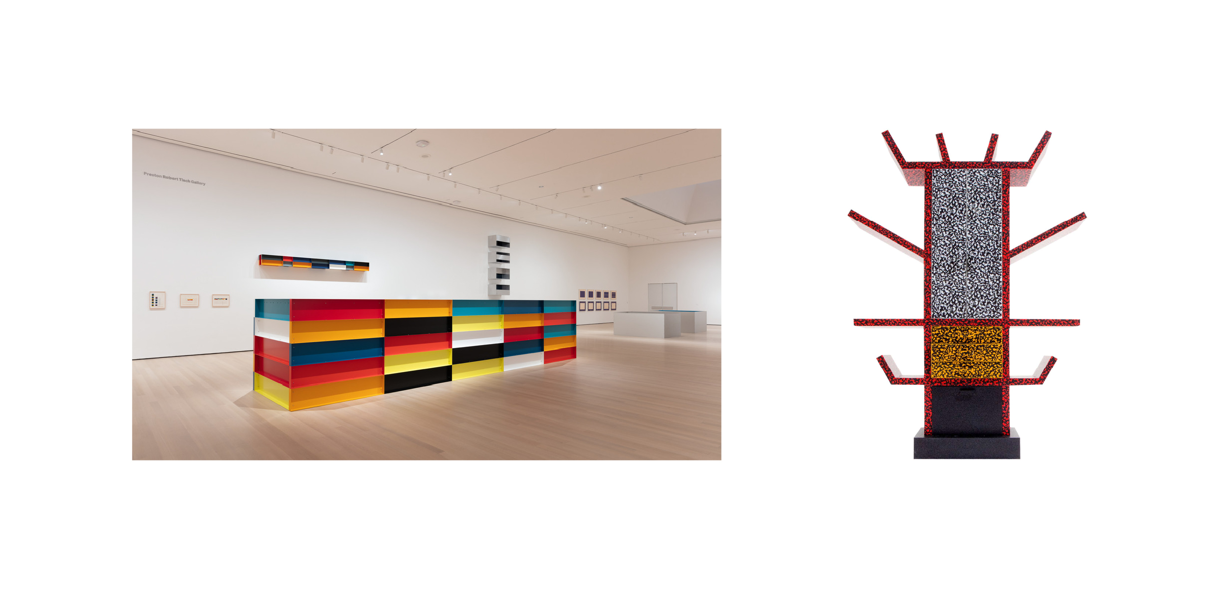
Fusing Italian postmodernism and American minimalism, the brand language of the new identity combines various design aesthetics from funky to minimalist to industrial, and draws inspiration from iconic artists such as Donald Judd, Nathalie Du Pasquier and Ettore Sottsass with a unique, modern flair.
Explorations
![]()
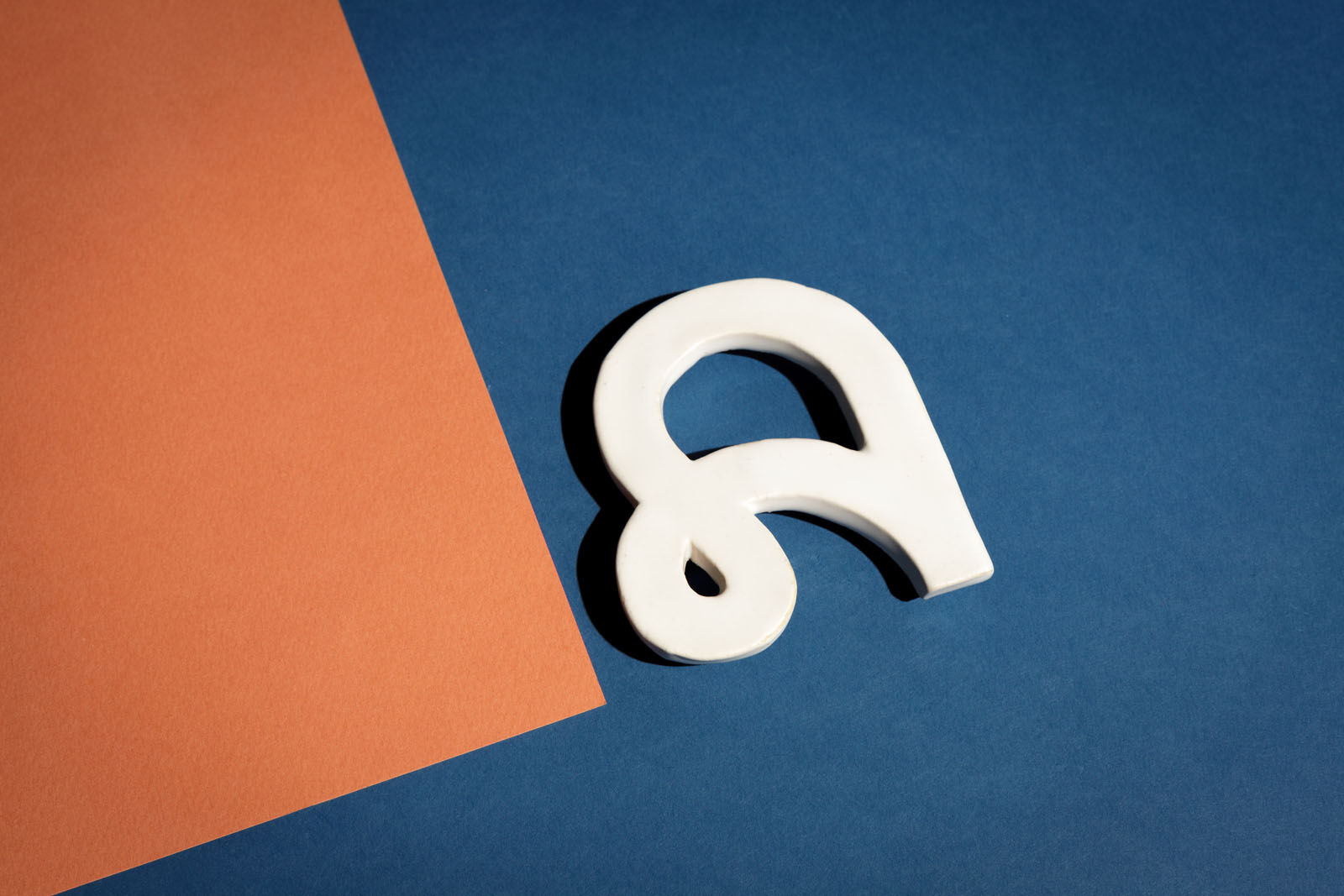
Logo
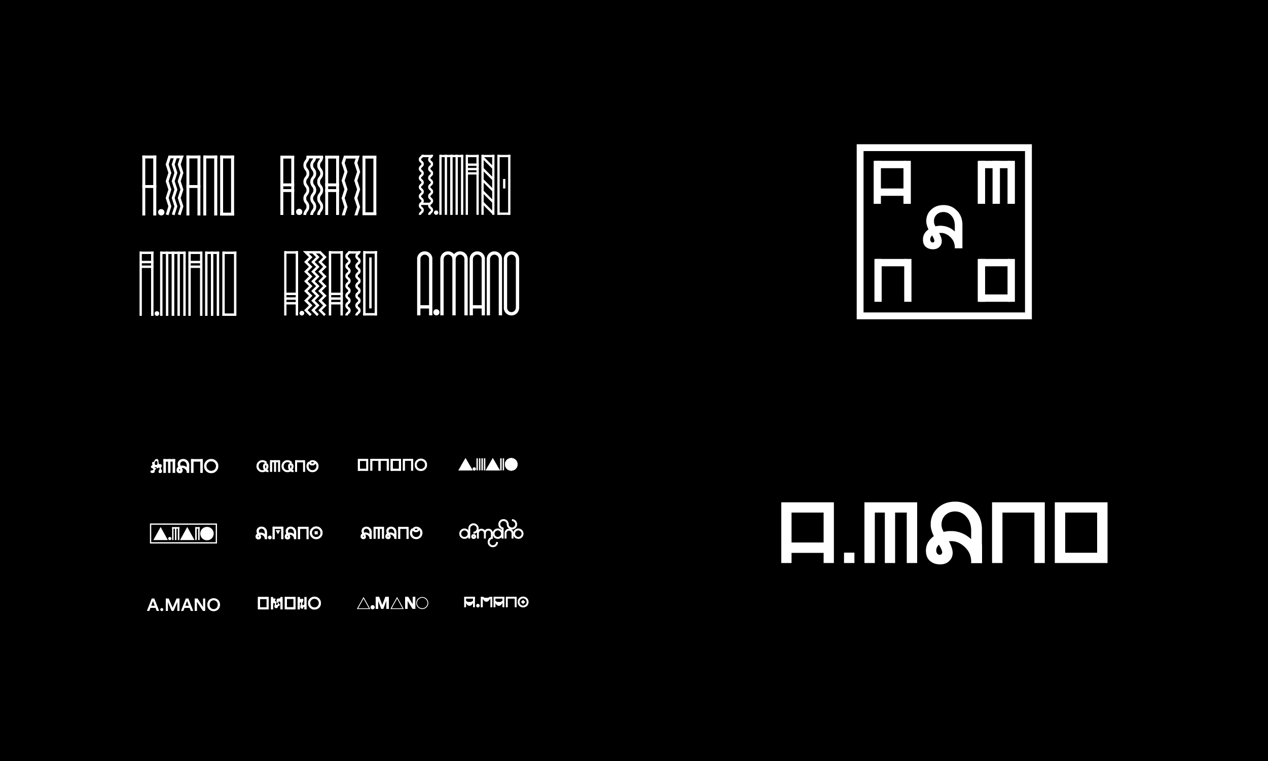


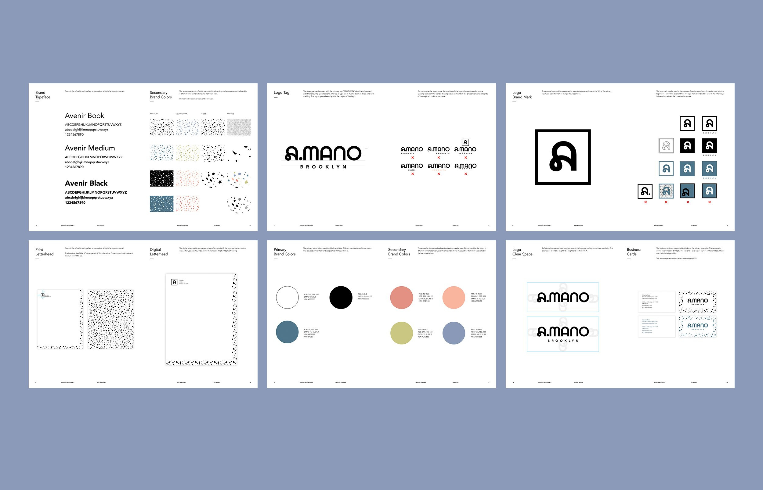
The logo signature was flexible and designed to be used in four possible configurations.
Drawing from many influences, the custom wordmark echoes the modernist lines, handmade pottery and floor tile motifs inside the store.
The brand mark features two different configurations for maximum flexibility.
Drawing from many influences, the custom wordmark echoes the modernist lines, handmade pottery and floor tile motifs inside the store.
The brand mark features two different configurations for maximum flexibility.
Website
The responsive website featured a modular, grid-based design that was visually unified with the store design and rebranding.
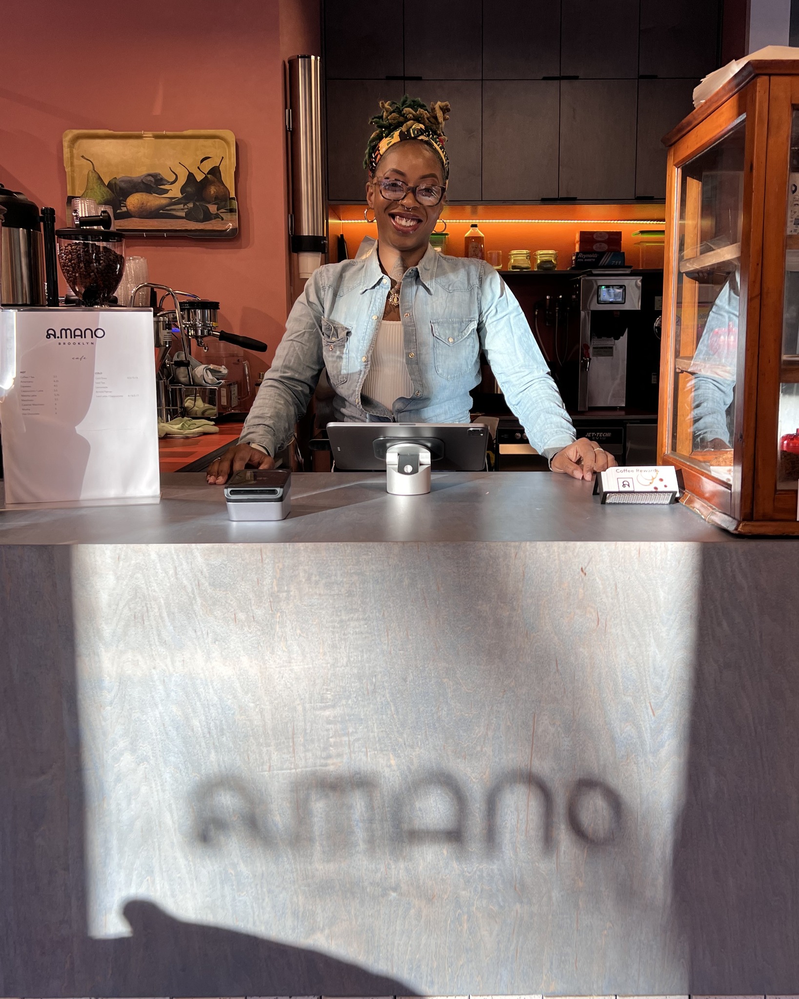
The Store
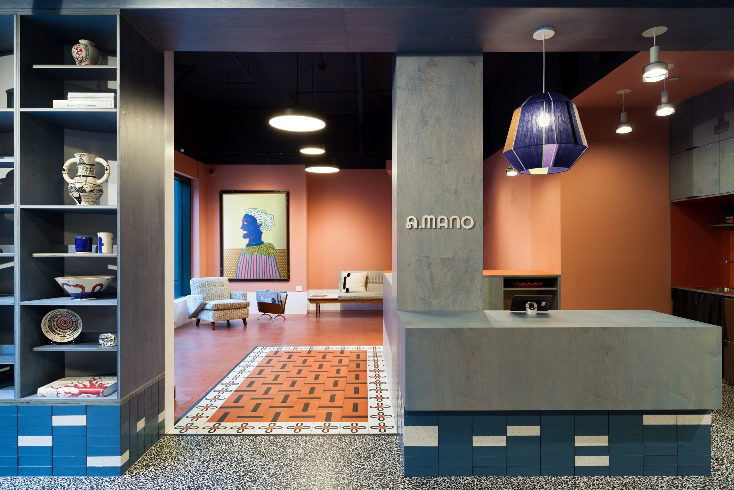
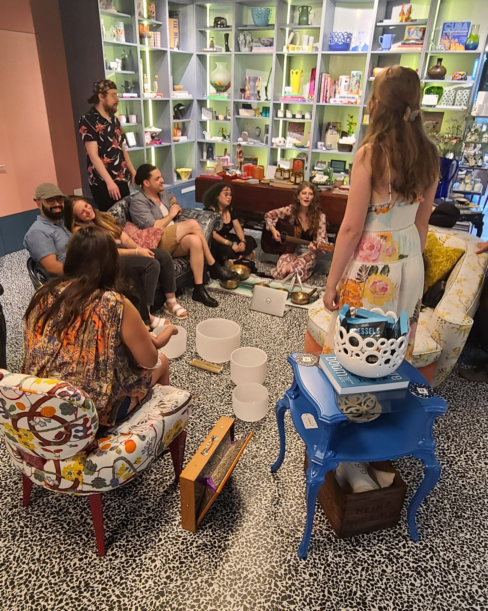
In competition with the online market, the shop seeks to redefine the idea of a contemporary retail space and serves as a physical hub for artists, residents and retailers to collaborate and connect.

Typeset in Radim Pesko’s quirky, contemporary typeface Lÿno, the playful loop of the capital A is echoed in the loop of the floor tiles by Mutina.
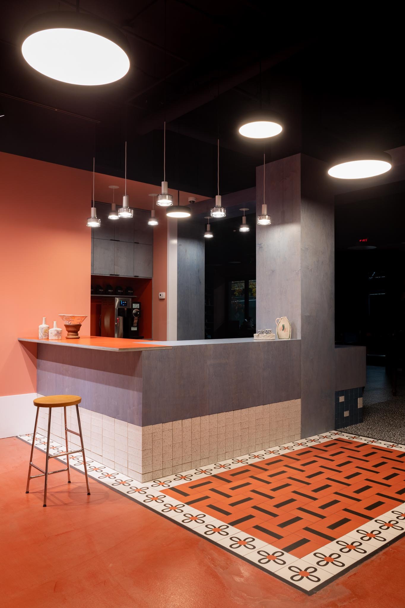


Reflecting a diverse mix of influences, the raw, stained, plywood shelves were inspired by American minimalist artist Donald Judd.
The coffee area features a ceramic “rug” of Mattonelle Margherita tiles by Mutina, designed by iconic Memphis artist Nathalie Du Pasquier.
The coffee area features a ceramic “rug” of Mattonelle Margherita tiles by Mutina, designed by iconic Memphis artist Nathalie Du Pasquier.
Color & Typography
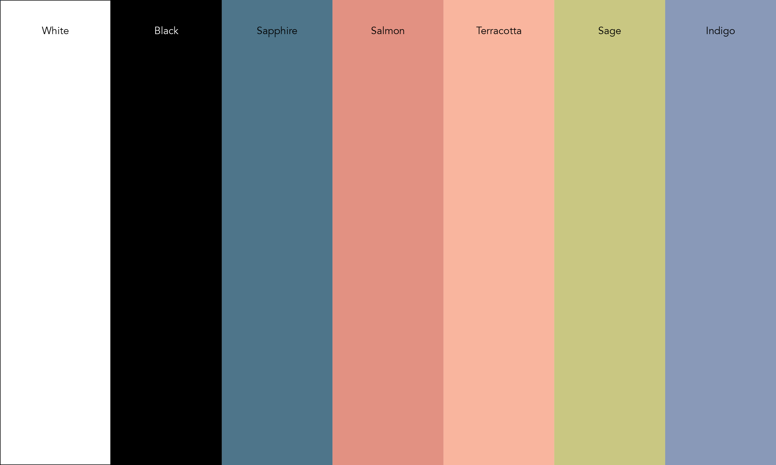
The brand color palette featured muted earth tones
informed by the materials used inside the store and
reflects warmth, comfort and nature.
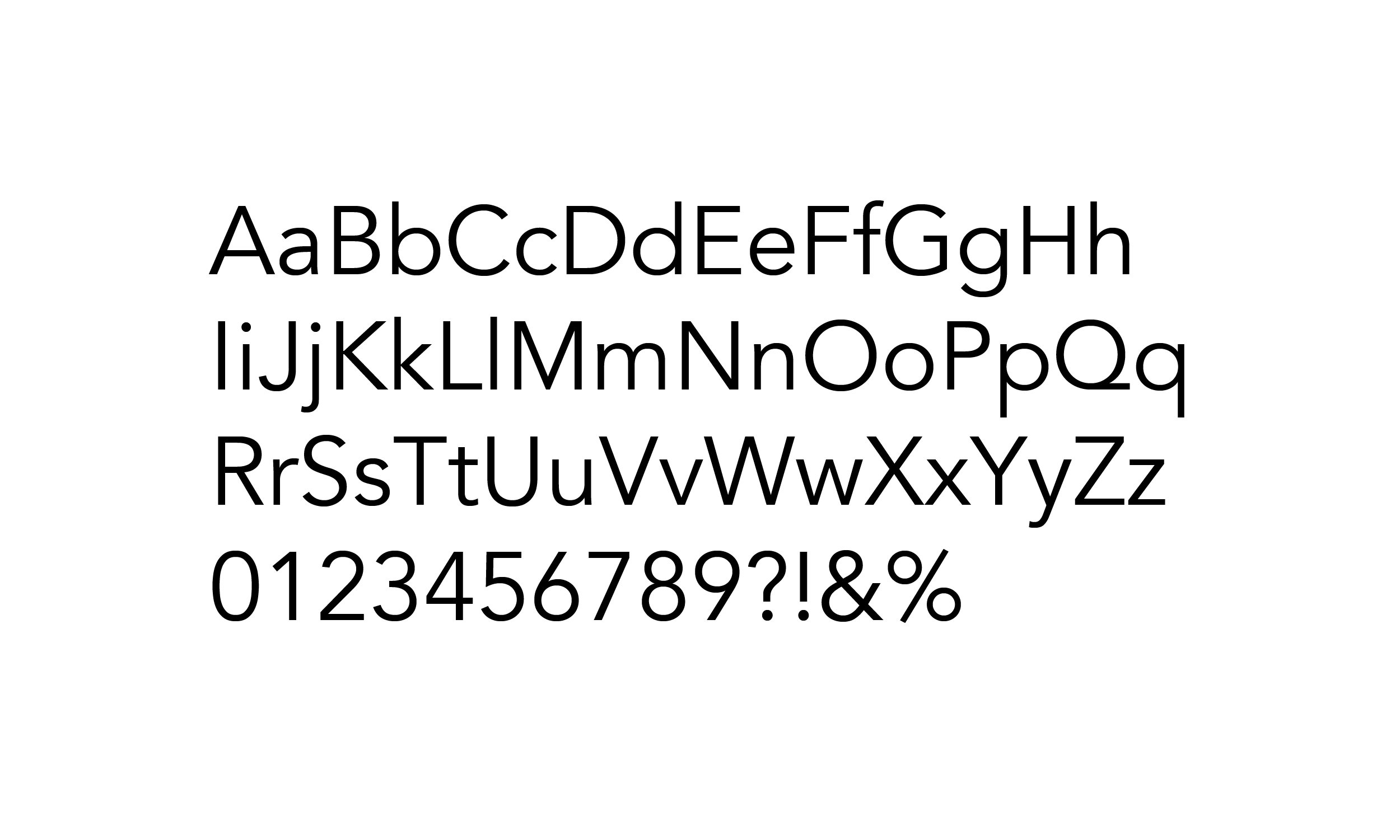
Avenir Typeface by Adrian Fruitger was selected for
its crisp, clean functionality and flexibility across plaforms.
informed by the materials used inside the store and
reflects warmth, comfort and nature.
Avenir Typeface by Adrian Fruitger was selected for
its crisp, clean functionality and flexibility across plaforms.
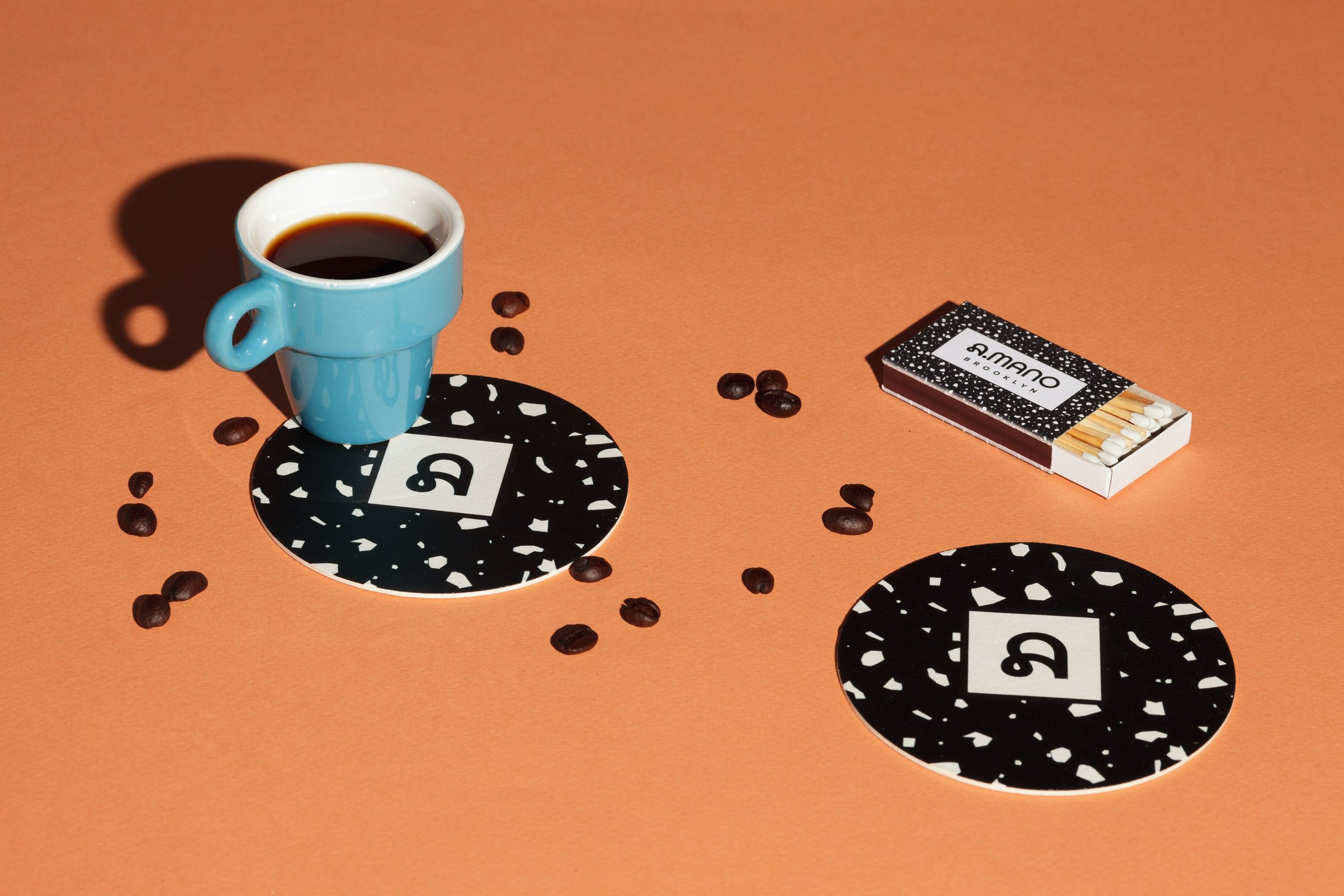
Brand Pattern
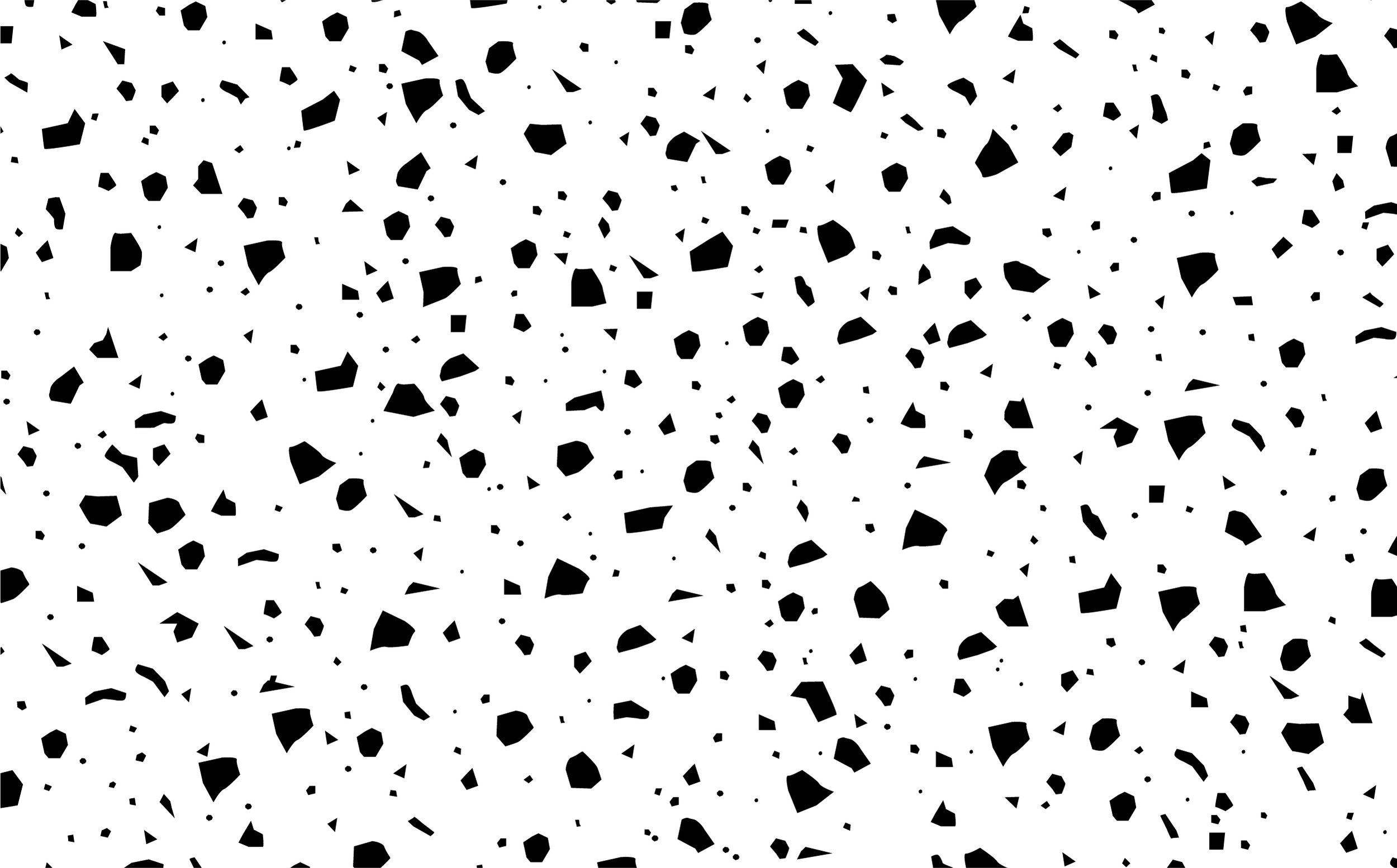

Inspired by radical, postmodern, Memphis Milano founder and artist Ettore Sottsass, a digital, brand terrazzo pattern was created to complement the black and white porcelain Florim Italian floor tiles that were used for the floor.
Social
Print


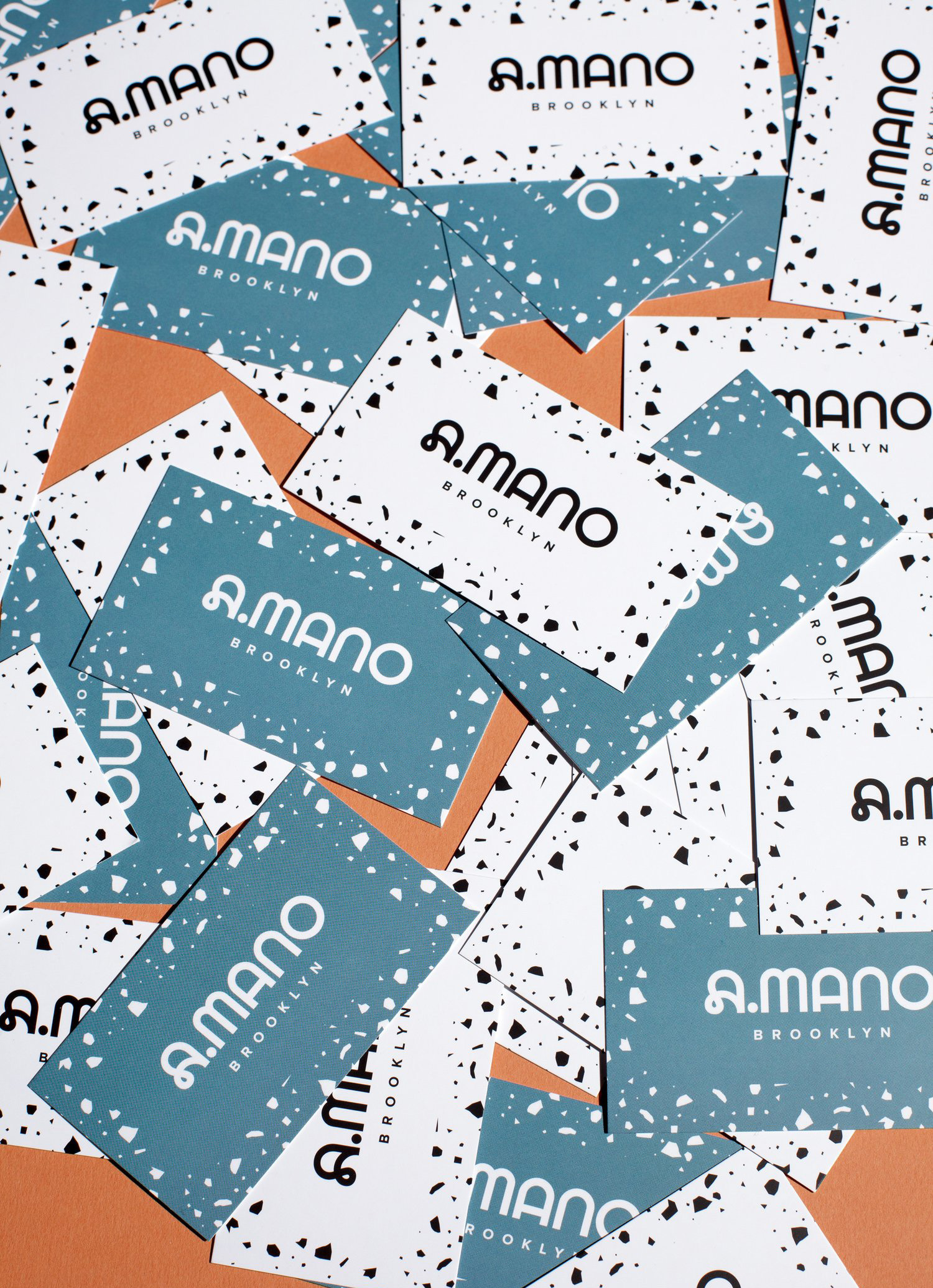
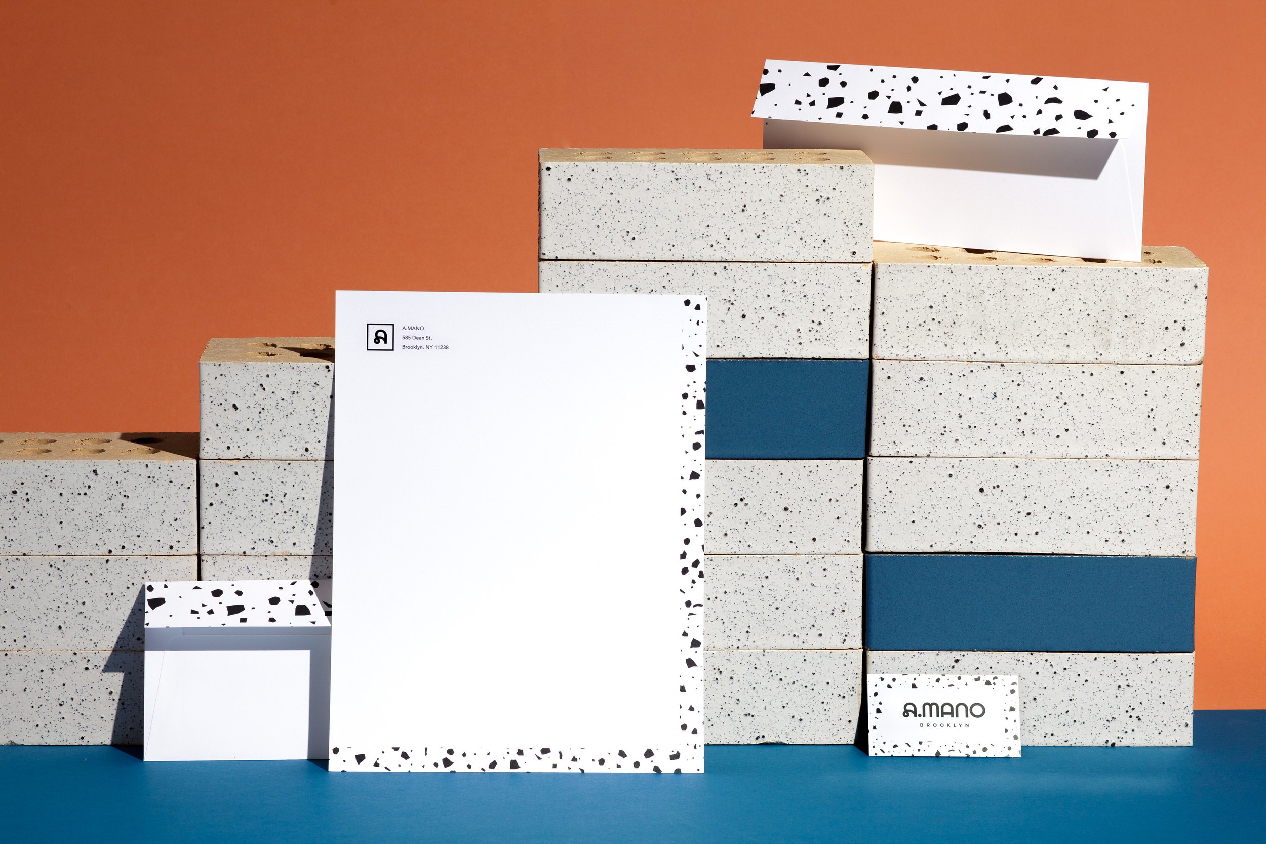
The identity extended across both print and digital collateral, and
brand guidelines and a tool kit were developed for the internal
design team.
brand guidelines and a tool kit were developed for the internal
design team.
OOH

Brand Guidelines
Agency:
Sergio Mannino Studio
Client:
A.MANO Brooklyn
Sector:
Arts & Culture/Retail, B2C
Type:
Brand Identity
Position:
Lead Designer
What I Did:
Visual Identity
Logo Design
Pattern Design
Website Design
Brand Guidelines
Collateral Design
Digital Design
OOH
Team:
Sergio Mannino, CD
Jan Habraken, CD
Martina Guandalini, AD
Awards/Press:
FRAME Awards 2022 Honorable Mention︎︎︎
2023 ICFF Interiors Awards Finalist︎︎︎
Platform Magazine #36
dLv STORE BOOK 2023
Interior Design Magazine’s
Best of the Year Awards Finalist
Challenge:
A Mano = “By Hand” (Italian)
A.MANO Brooklyn approached us to develop a brand identity refresh that included a complete redesign and buildout of their store interior in Brooklyn.
I worked with Sergio Mannino Studio to develop the new brand identity from concept to execution. The interior of the store was being redesigned and both the identity and interior needed to be visually and thematically unified while reflecting the eclectic nature of the brand and repositioning them as an attractive physical destination in a digital world.
Insight:
People still enjoy the social experience of shopping in person.
Solution:
Fusing Italian postmodernism and American minimalism, the brand language of the new identity combines various design aesthetics from funky to minimalist to industrial, and draws inspiration from iconic artists such as Donald Judd, Nathalie Du Pasquier and Ettore Sottsass with a unique, modern flair.
Drawing visual inspiration from the materials used inside the store, a new, flexible wordmark and brand terrazzo pattern was created. The custom wordmark specifically referenced the Mutina floor tiles by Memphis artist Nathalie Du Pasquier, echoing the rounded curves of the flower in the tops of all the letterforms while the A letterform was borrowed from Radim Pesko’s quirky, contemporary typeface Lÿno. The influence of Donald Judd can be seen in the geometric precision of the M and N letterforms. The organic curves of the wordmark also hinted at the stores deep connection to the pottery community. For maximum flexibility, the logo signature was designed to used in four different configurations.
Reflecting Sergio Mannino’s Italian heritage and based off the white porcelain Florim Italian floor tiles inspired by Ettore Sottsass, a digital brand terrazzo pattern was created and optimized for use at large and small sizes. The brand color palette also reflected the materials used inside the store through a rich palette of warm and cool muted earth tones with an additional accent of green. Avenir by Adrian Fruiter was chosen for its clean, geometric influence and flexibility across multiple platforms to maintain brand integrity.
The identity extended across print and digital touchpoints and a toolkit and brand guidelines were developed for the internal design team.
Result:
The new identity was rolled out across all of the brand touchpoints and successfully repositioned the brand as a unique, attractive and desirable space to socialize, shop and connect.