A.MANO Brooklyn
Brand identity refresh for A.MANO Brooklyn—a unique, home décor retail shop featuring ceramics by local artists, vintage art and up-cycled fine furniture. Designed in collaboration with Sergio Mannino Studio.
Previous Branding
![]()
Inspiration
![]()
![]()
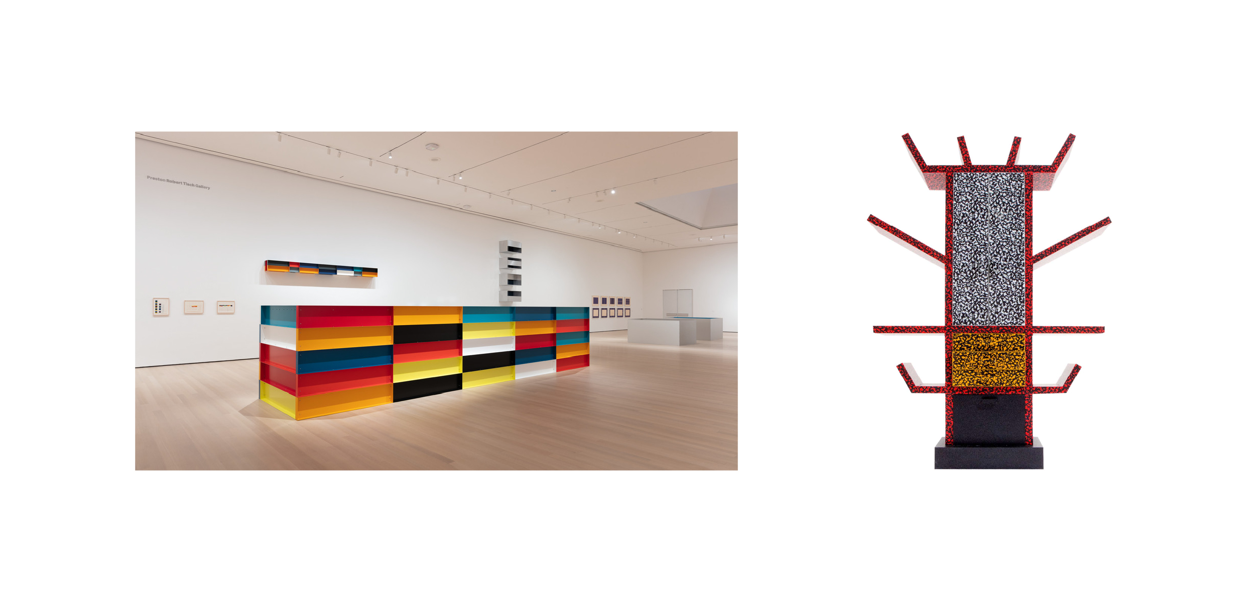
Fusing Italian postmodernism and American minimalism, the brand language of the new identity combines various design aesthetics from funky to minimalist to industrial, and draws inspiration from iconic artists such as Donald Judd, Nathalie Du Pasquier and Ettore Sottsass with a unique, modern flair.
Explorations
![]()
Logo


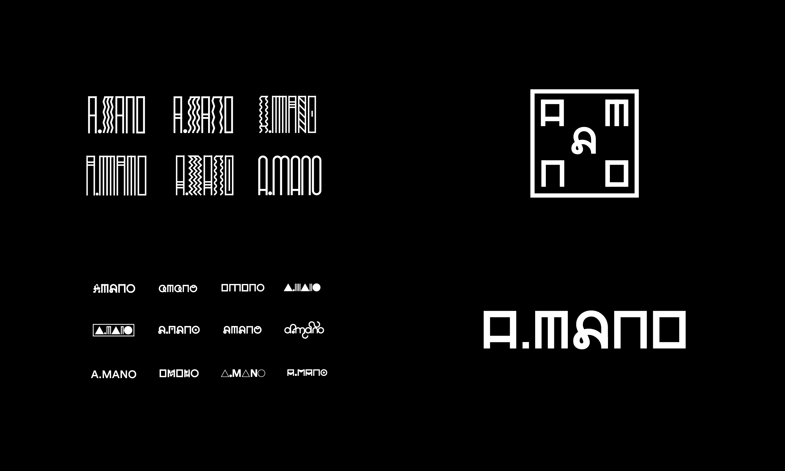
The logo signature was flexible and designed to be used in four possible configurations.
Drawing from many influences, the custom wordmark echoes the modernist lines, handmade pottery and floor tile motifs inside the store.
The brand mark features two different configurations for maximum flexibility.
Drawing from many influences, the custom wordmark echoes the modernist lines, handmade pottery and floor tile motifs inside the store.
The brand mark features two different configurations for maximum flexibility.
Website
The responsive website featured a modular, grid-based design that was visually unified with the store design and rebranding.
The Store
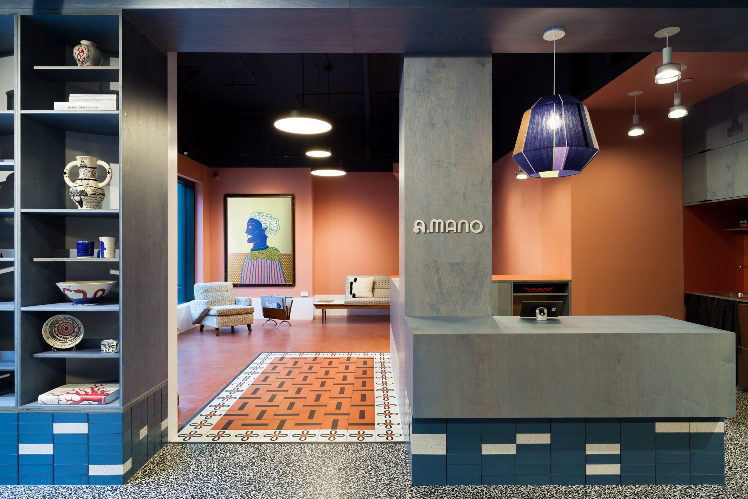
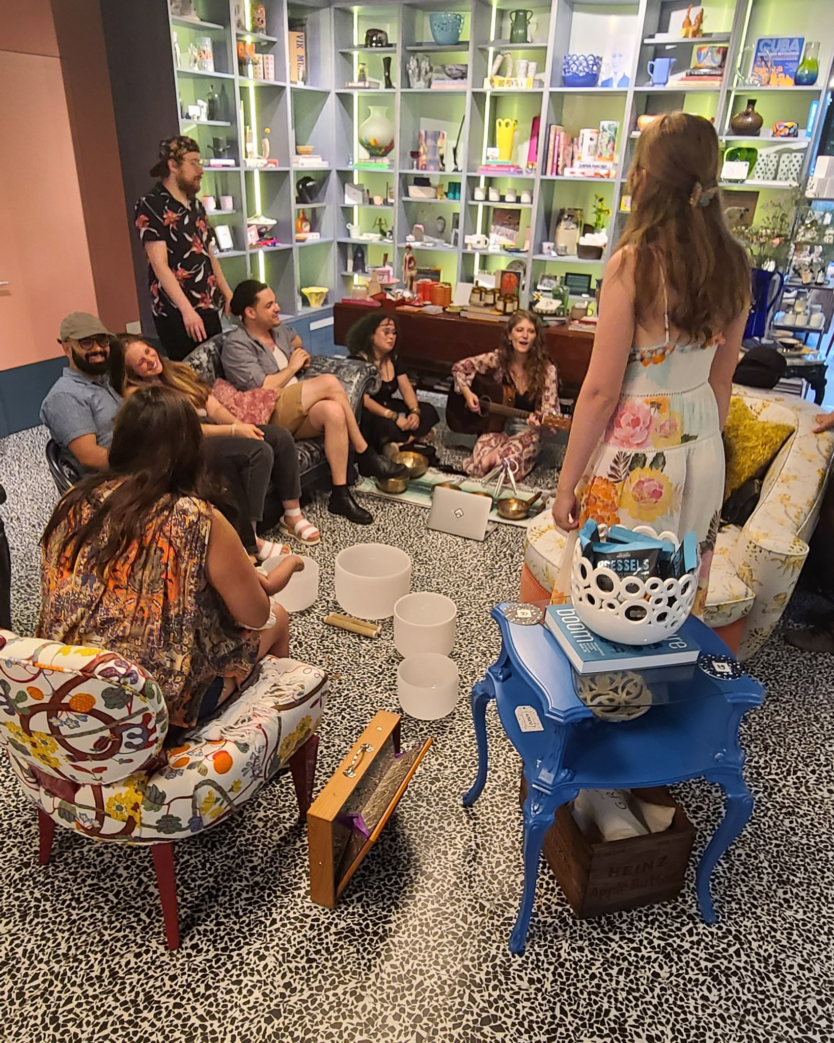
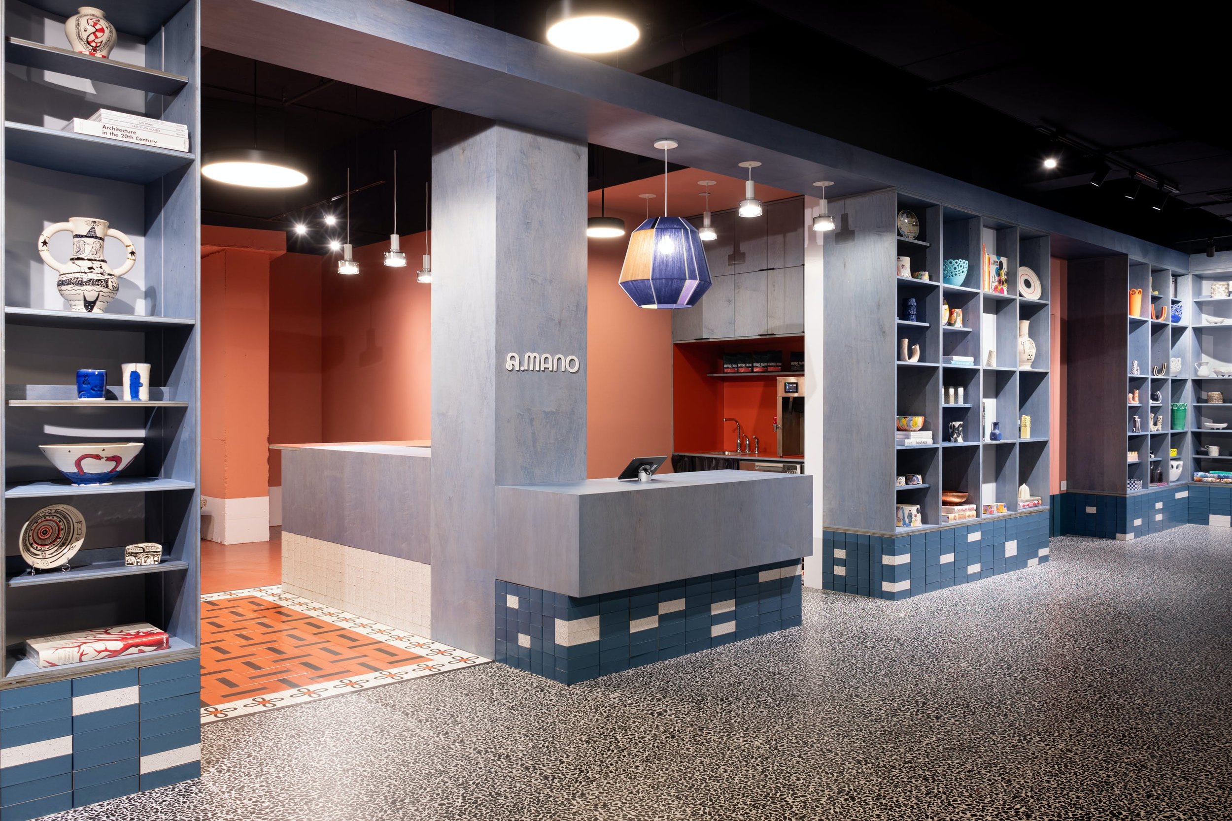
In competition with the online market, the shop seeks to redefine the idea of a contemporary retail space and serves as a physical hub for artists, residents and retailers to collaborate and connect.
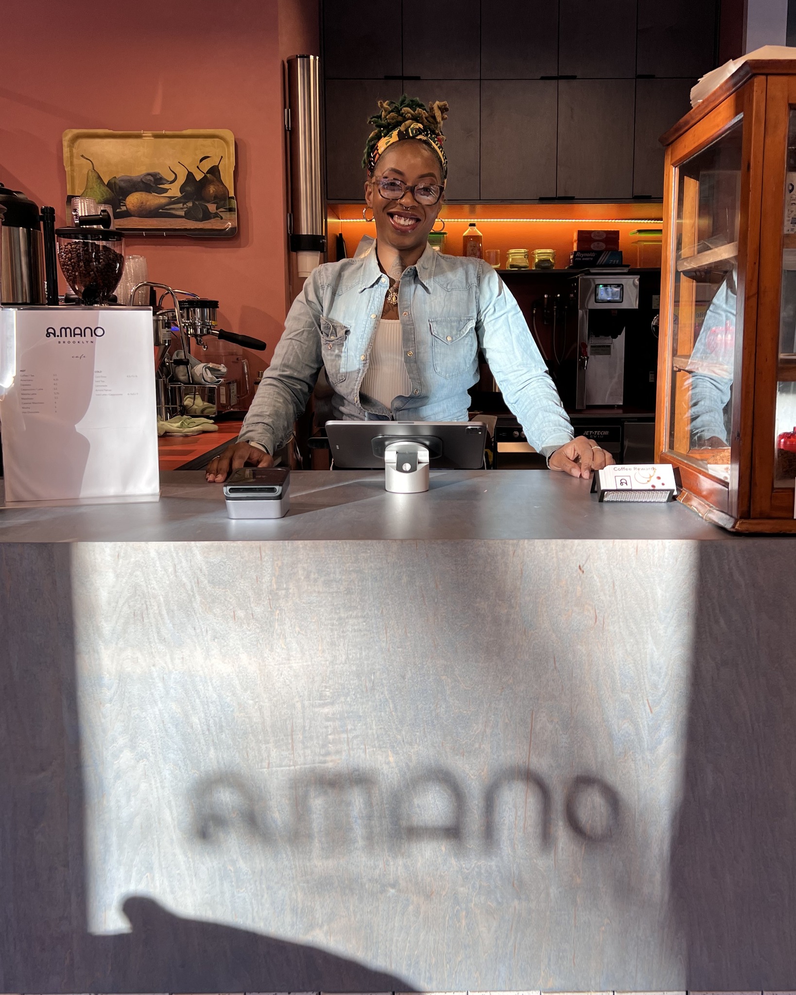


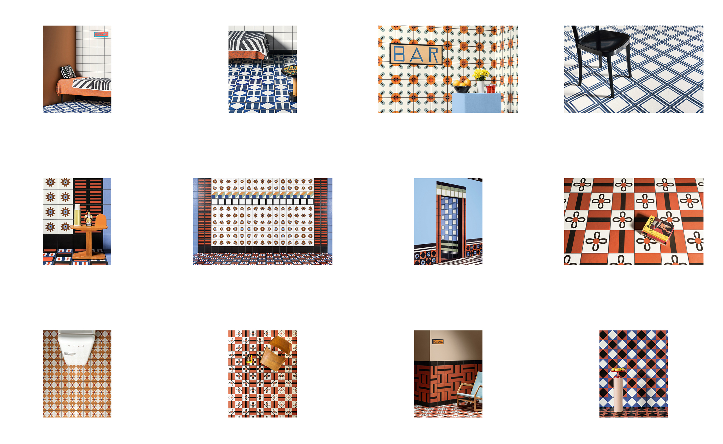
Typeset in Radim Pesko’s quirky, contemporary typeface Lÿno, the playful loop of the capital A is echoed in the loop of the floor tiles by Mutina.
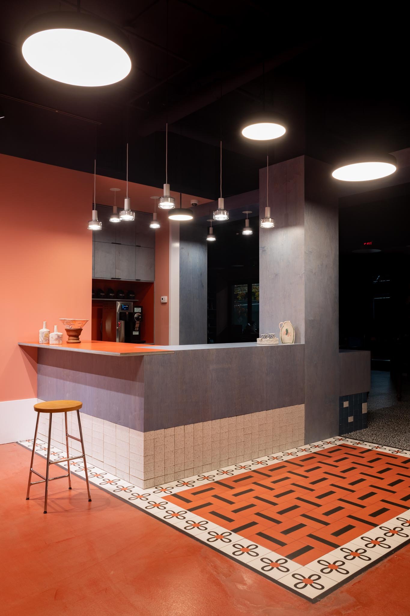


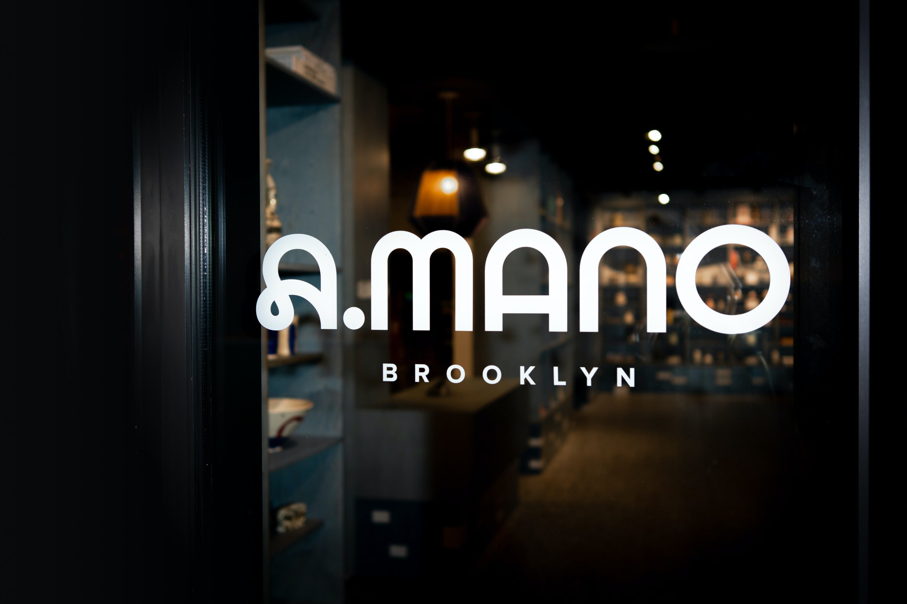

Reflecting a diverse mix of influences, the raw, stained, plywood shelves were inspired by American minimalist artist Donald Judd.
The coffee area features a ceramic “rug” of Mattonelle Margherita tiles by Mutina, designed by iconic Memphis artist Nathalie Du Pasquier.
The coffee area features a ceramic “rug” of Mattonelle Margherita tiles by Mutina, designed by iconic Memphis artist Nathalie Du Pasquier.
Color & Typography
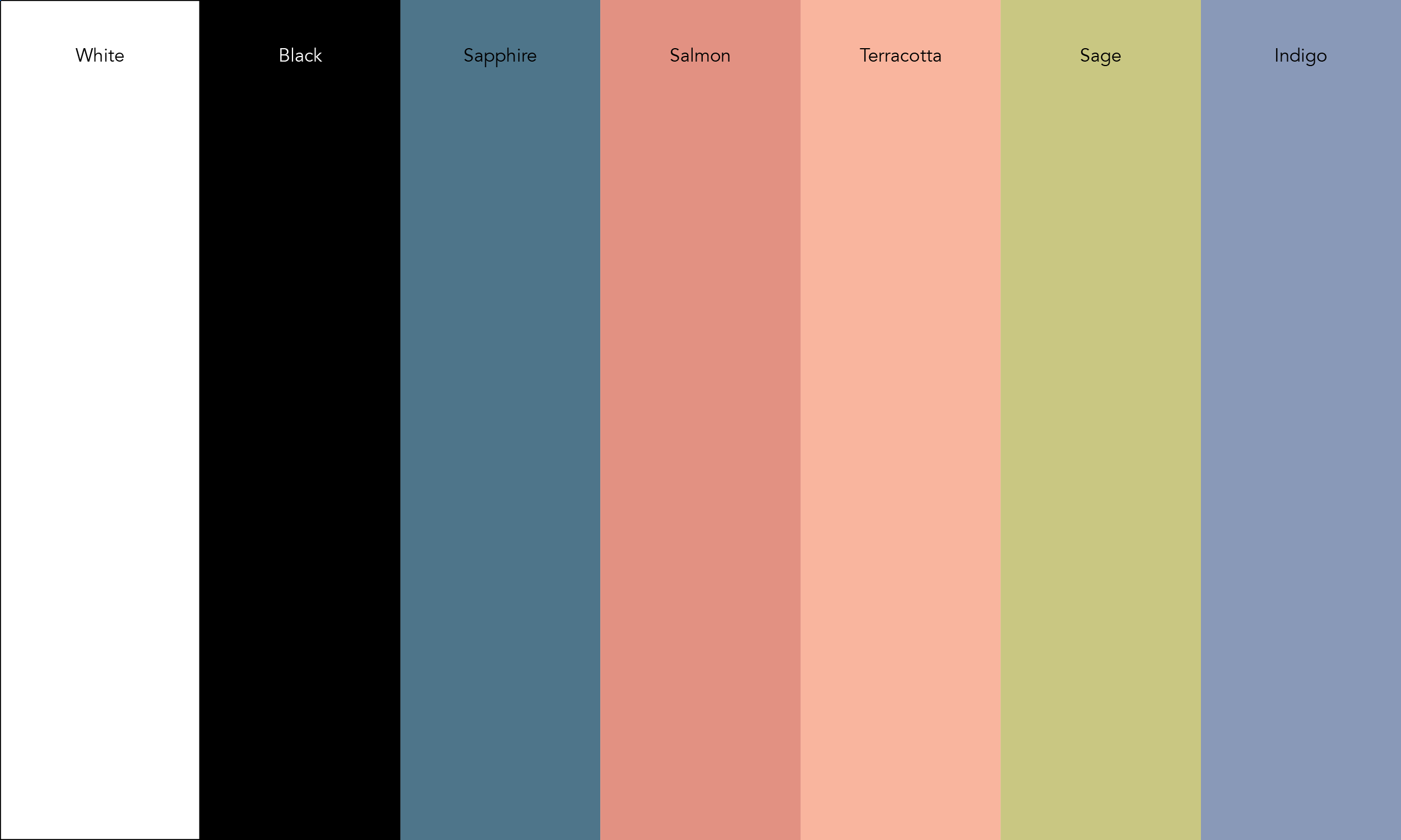
The brand color palette featured muted earth tones
informed by the materials used inside the store and
reflects warmth, comfort and nature.
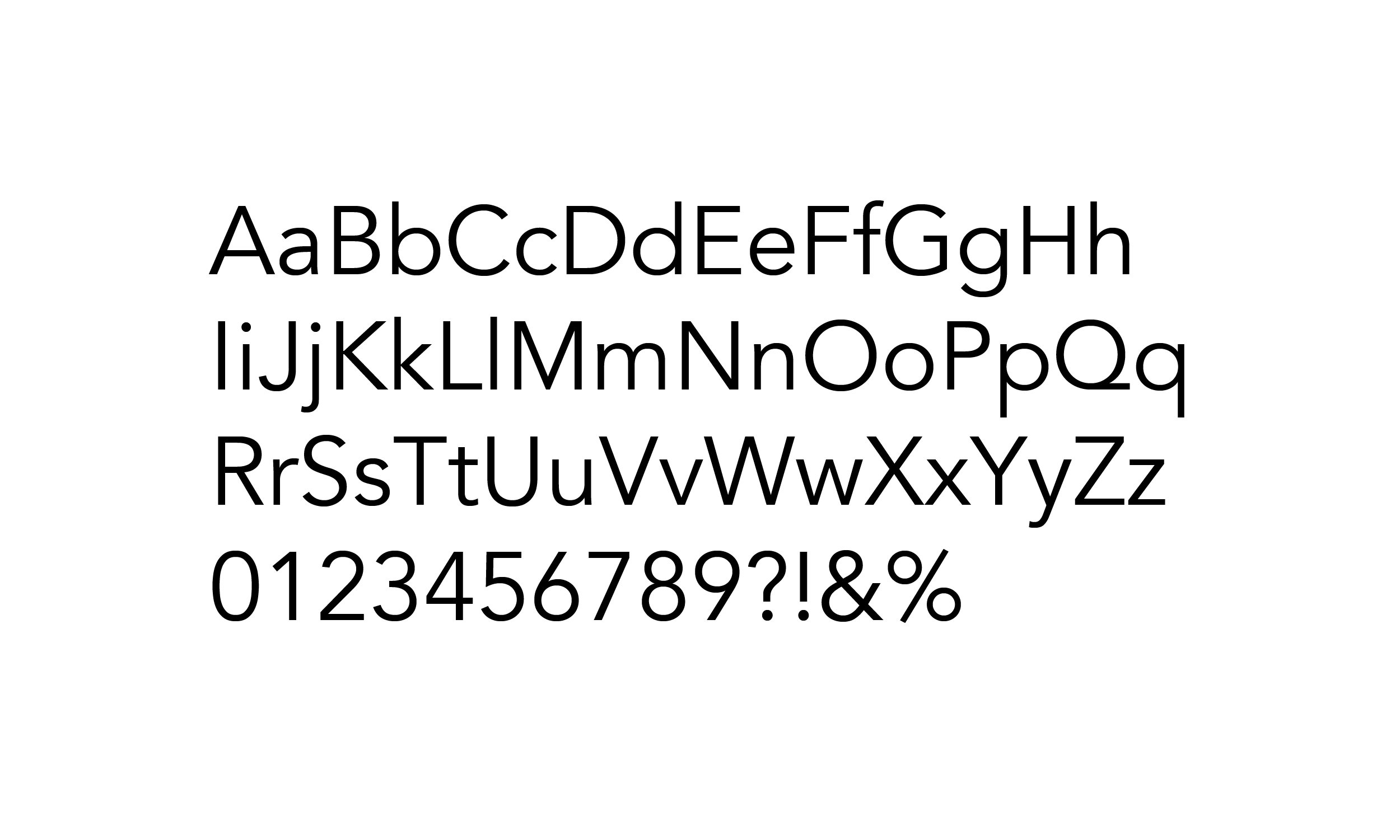
Avenir Typeface by Adrian Fruitger was selected for
its crisp, clean functionality and flexibility across plaforms.
informed by the materials used inside the store and
reflects warmth, comfort and nature.
Avenir Typeface by Adrian Fruitger was selected for
its crisp, clean functionality and flexibility across plaforms.
Brand Pattern


Inspired by radical, postmodern, Memphis Milano founder and artist Ettore Sottsass, a digital, brand terrazzo pattern was created to complement the black and white porcelain Florim Italian floor tiles that were used for the floor.
Social
Print


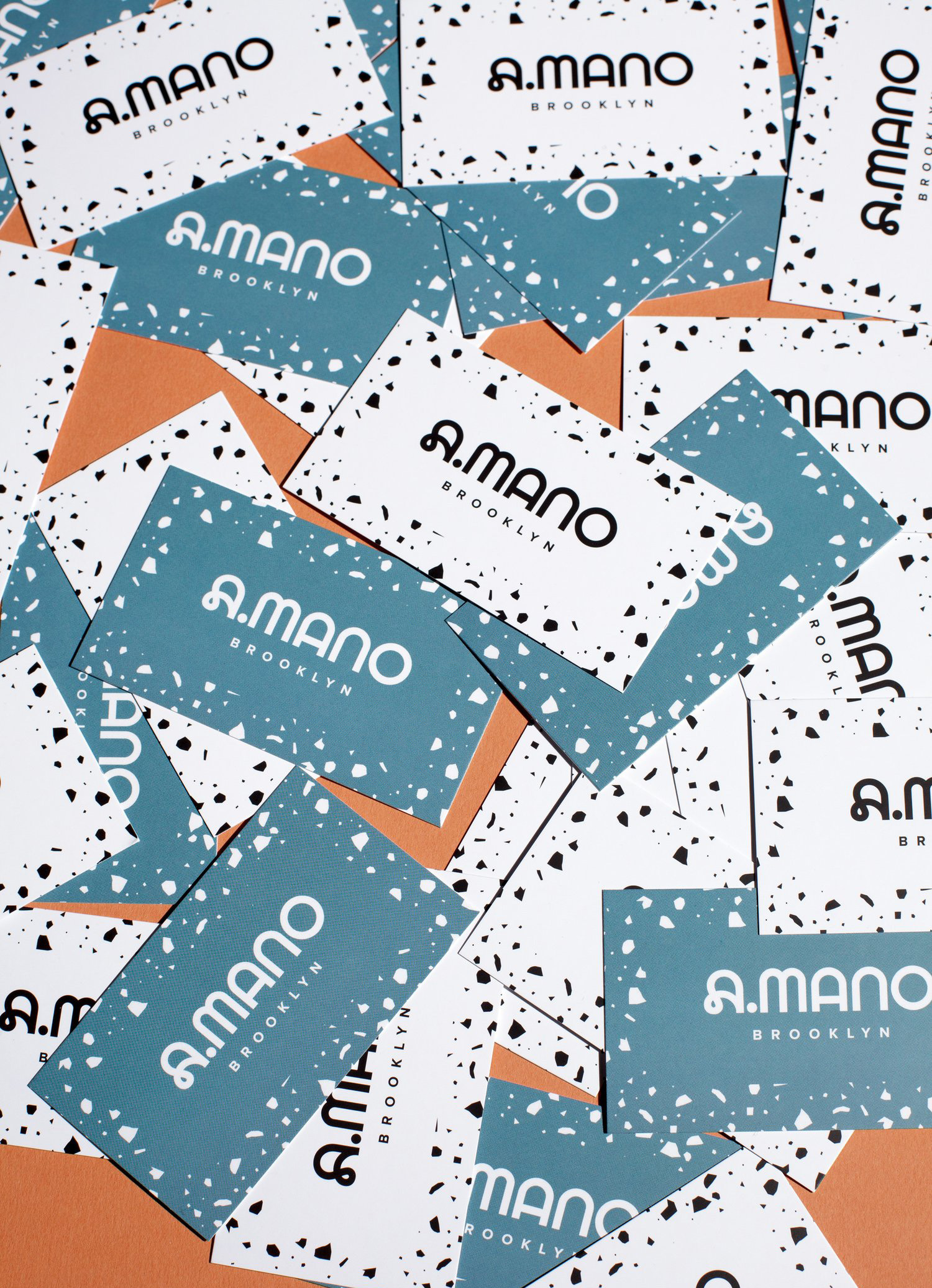
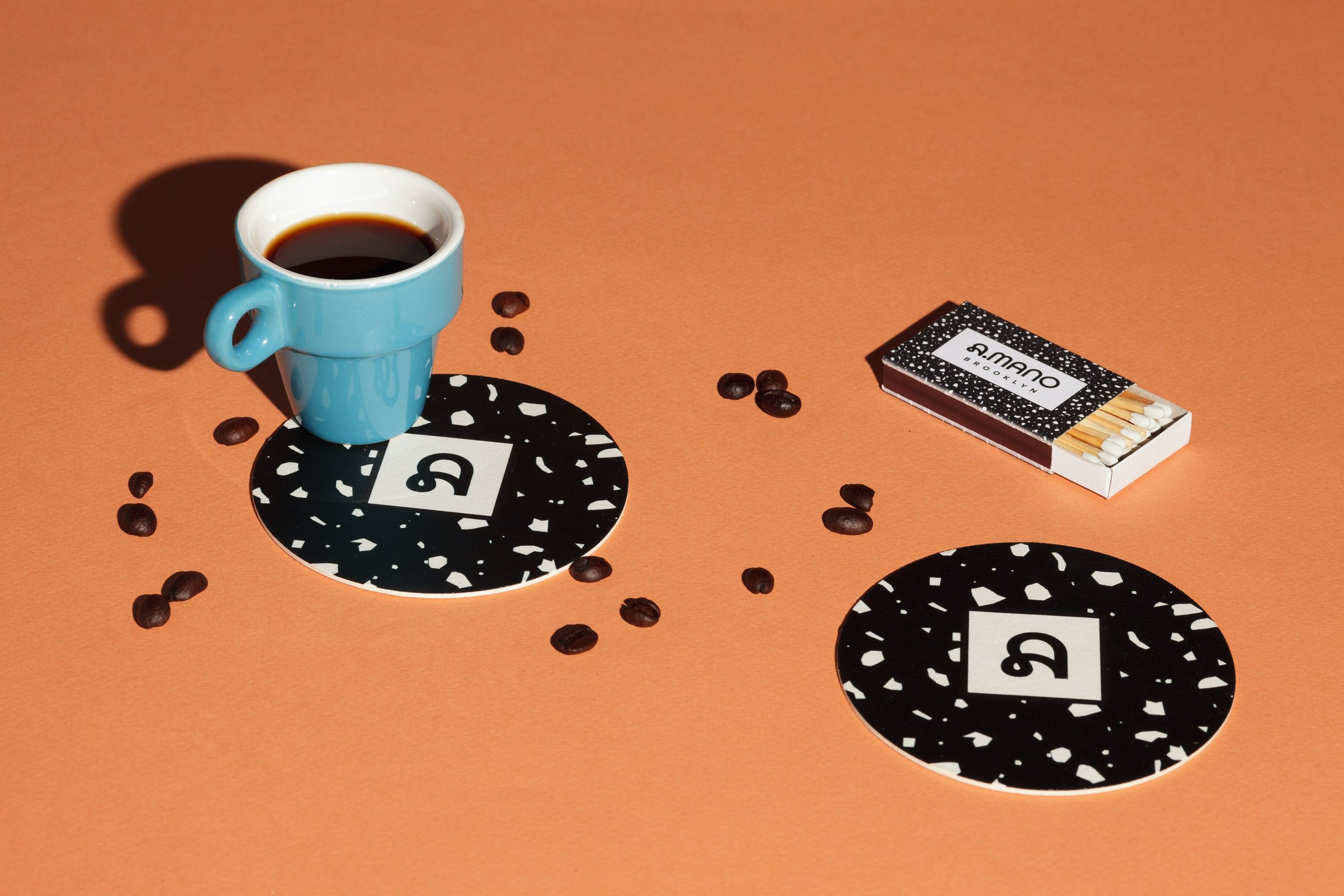
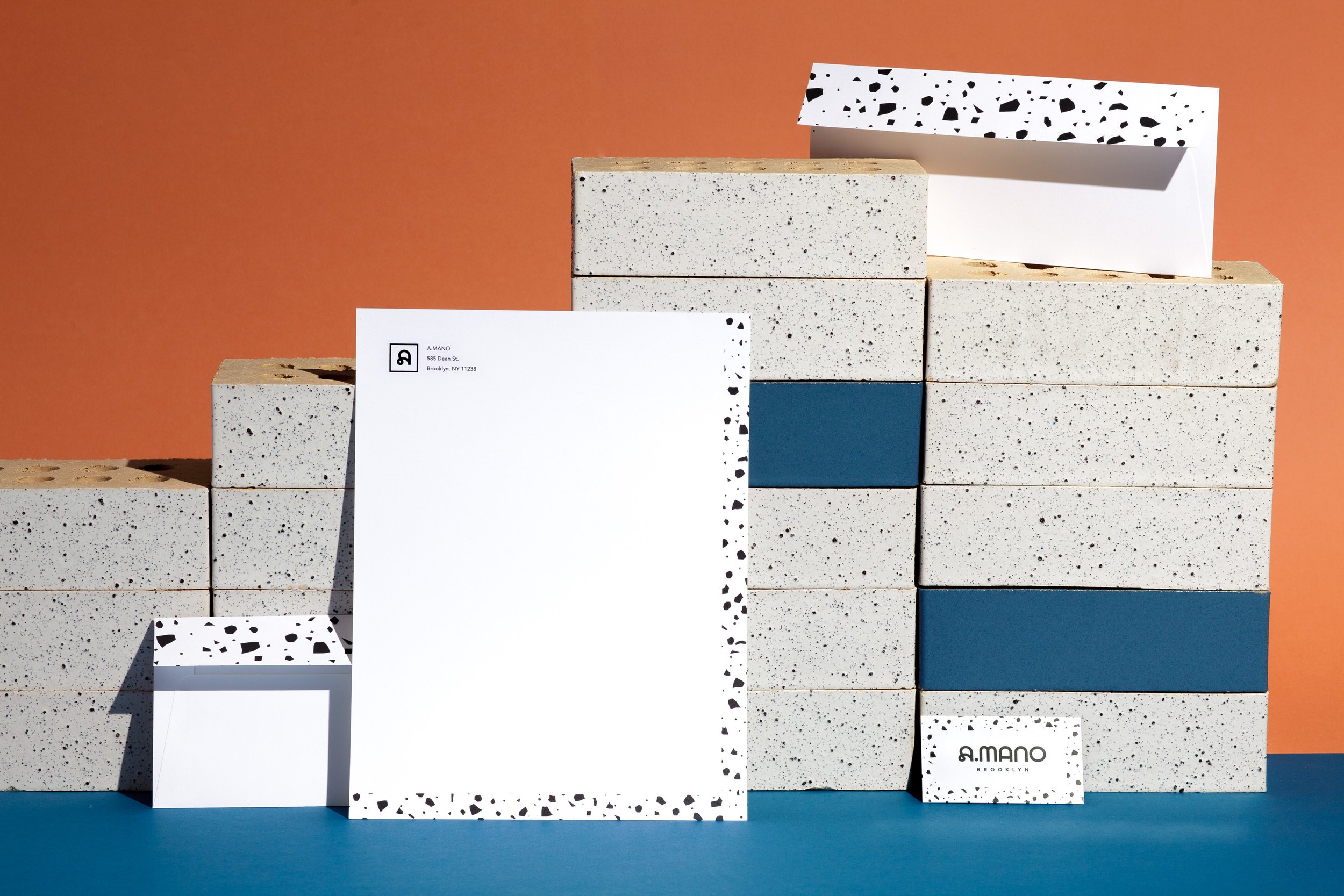
The identity extended across both print and digital collateral, and
brand guidelines and a tool kit were developed for the internal
design team.
brand guidelines and a tool kit were developed for the internal
design team.
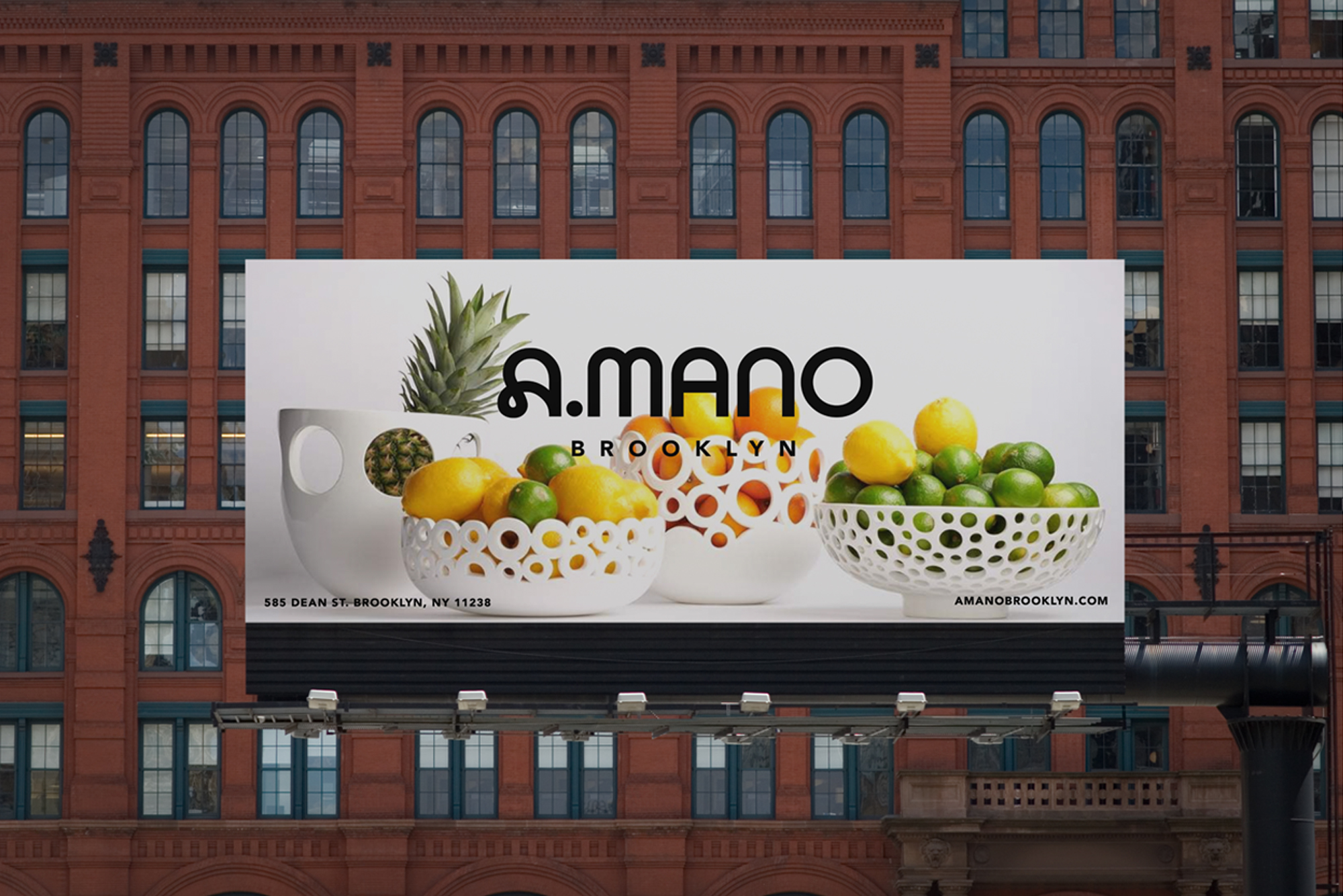
OOH

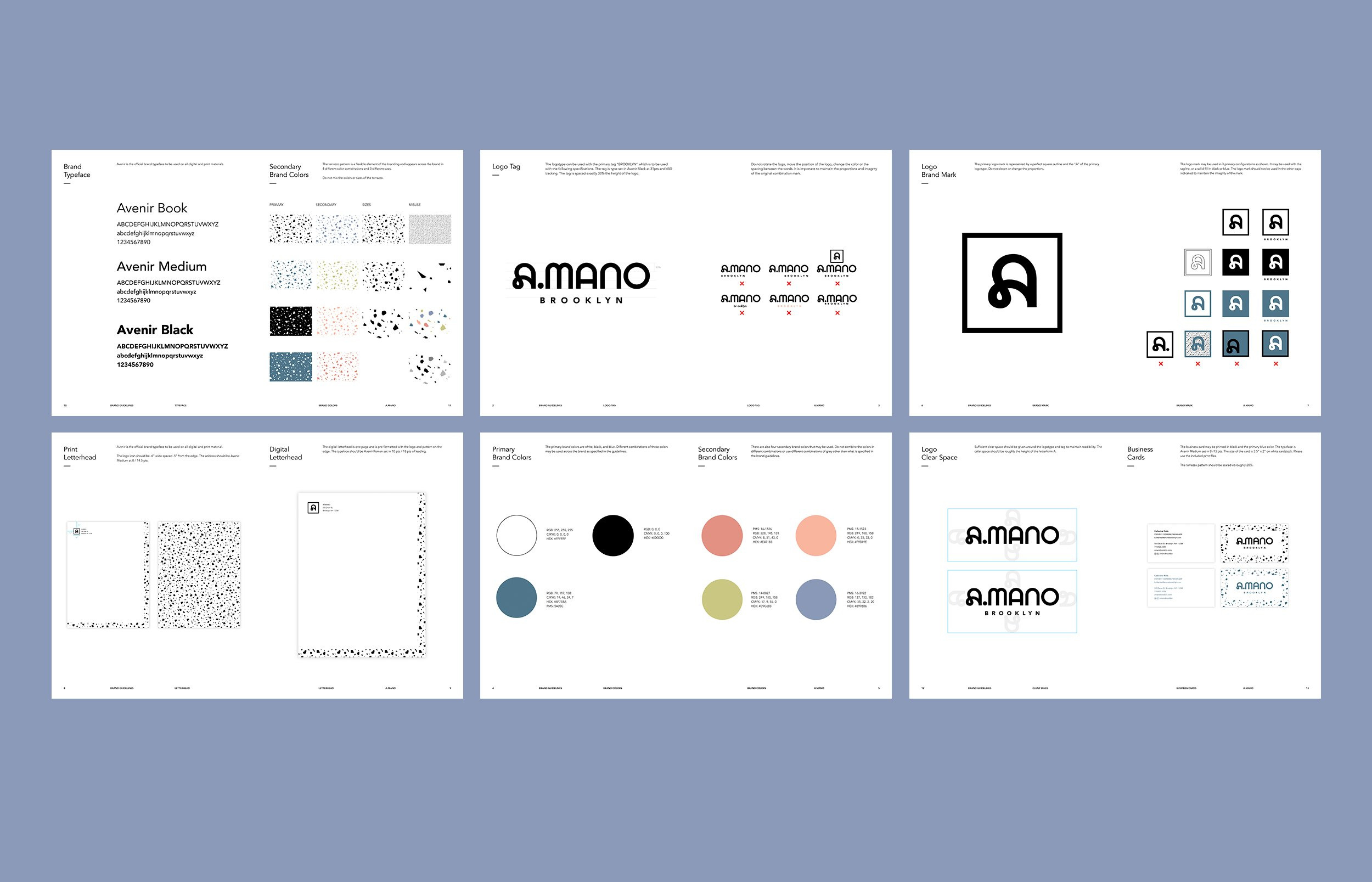
Brand Guidelines
Agency:
Sergio Mannino Studio
Client:
A.MANO Brooklyn
Sector:
Arts & Culture/Retail, B2C
Type:
Brand Identity
Position:
Lead Designer
What I Did:
Visual Identity
Logo Design
Pattern Design
Website Design
Brand Guidelines
Collateral Design
Digital Design
OOH
Team:
Sergio Mannino, CD
Jan Habraken, CD
Martina Guandalini, AD
Awards/Press:
FRAME Awards 2022 Honorable Mention︎︎︎
2023 ICFF Interiors Awards Finalist︎︎︎
Platform Magazine #36
dLv STORE BOOK 2023
Interior Design Magazine’s
Best of the Year Awards Finalist
Challenge:
A Mano = “By Hand” (Italian)
A.MANO Brooklyn approached us to develop a brand identity refresh that included a complete redesign and buildout of their store interior in Brooklyn.
I worked with Sergio Mannino Studio to develop the new brand identity from concept to execution. The interior of the store was being redesigned and both the identity and interior needed to be visually and thematically unified while reflecting the eclectic nature of the brand and repositioning them as an attractive physical destination in a digital world.
Insight:
People still enjoy the social experience of shopping in person.
Solution:
Fusing Italian postmodernism and American minimalism, the brand language of the new identity combines various design aesthetics from funky to minimalist to industrial, and draws inspiration from iconic artists such as Donald Judd, Nathalie Du Pasquier and Ettore Sottsass with a unique, modern flair.
Drawing visual inspiration from the materials used inside the store, a new, flexible wordmark and brand terrazzo pattern was created. The custom wordmark specifically referenced the Mutina floor tiles by Memphis artist Nathalie Du Pasquier, echoing the rounded curves of the flower in the tops of all the letterforms while the A letterform was borrowed from Radim Pesko’s quirky, contemporary typeface Lÿno. The influence of Donald Judd can be seen in the geometric precision of the M and N letterforms. The organic curves of the wordmark also hinted at the stores deep connection to the pottery community. For maximum flexibility, the logo signature was designed to used in four different configurations.
Reflecting Sergio Mannino’s Italian heritage and based off the white porcelain Florim Italian floor tiles inspired by Ettore Sottsass, a digital brand terrazzo pattern was created and optimized for use at large and small sizes. The brand color palette also reflected the materials used inside the store through a rich palette of warm and cool muted earth tones with an additional accent of green. Avenir by Adrian Fruiter was chosen for its clean, geometric influence and flexibility across multiple platforms to maintain brand integrity.
The identity extended across print and digital touchpoints and a toolkit and brand guidelines were developed for the internal design team.
Result:
The new identity was rolled out across all of the brand touchpoints and successfully repositioned the brand as a unique, attractive and desirable space to socialize, shop and connect.
